11 Likes
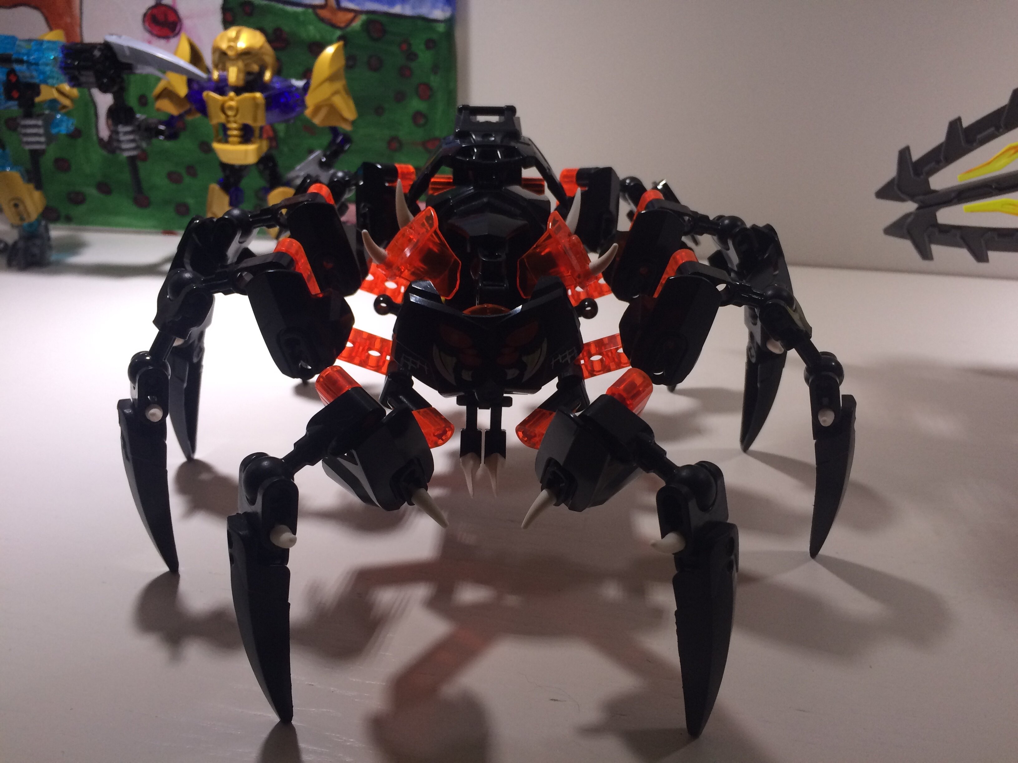
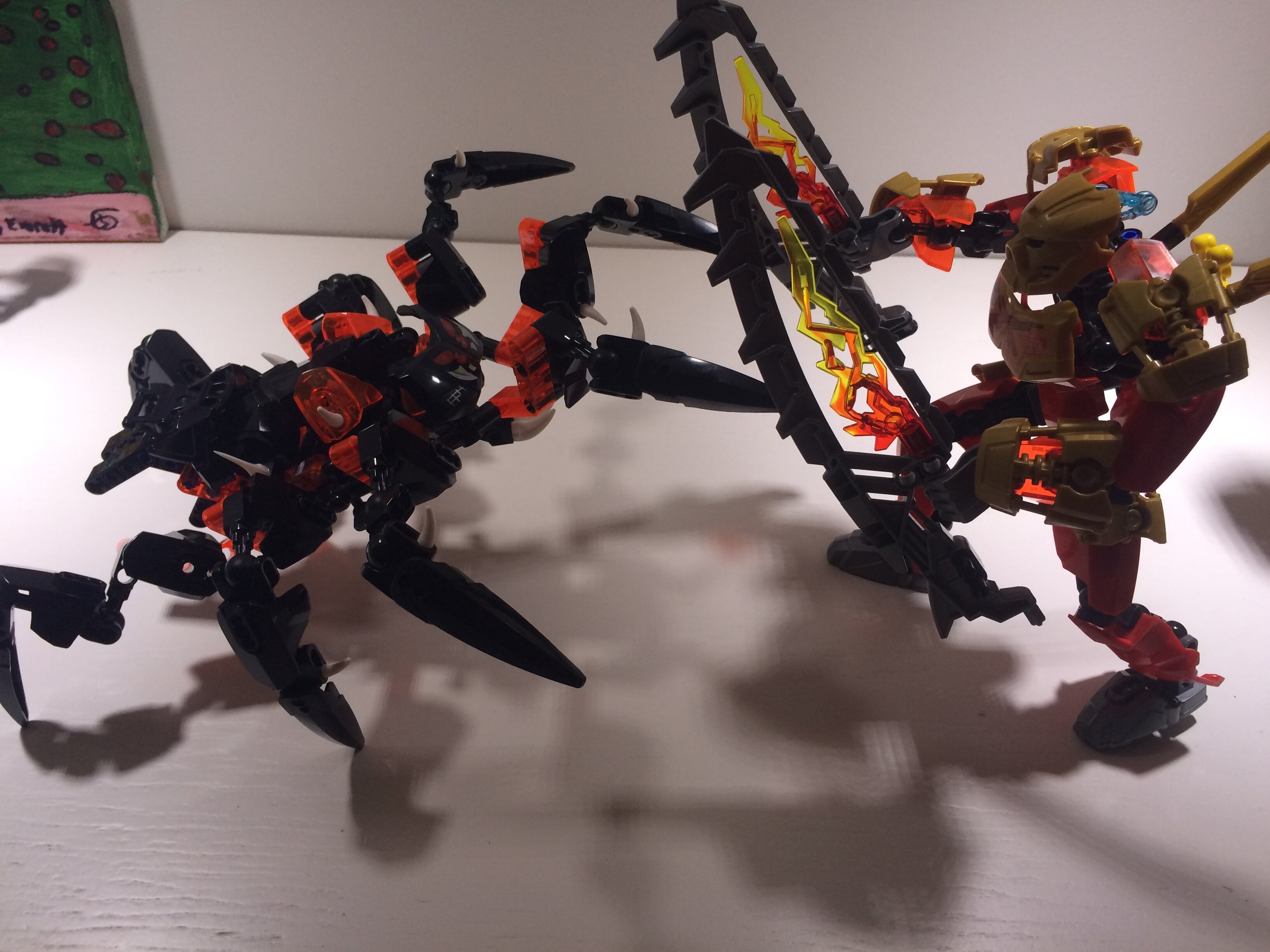
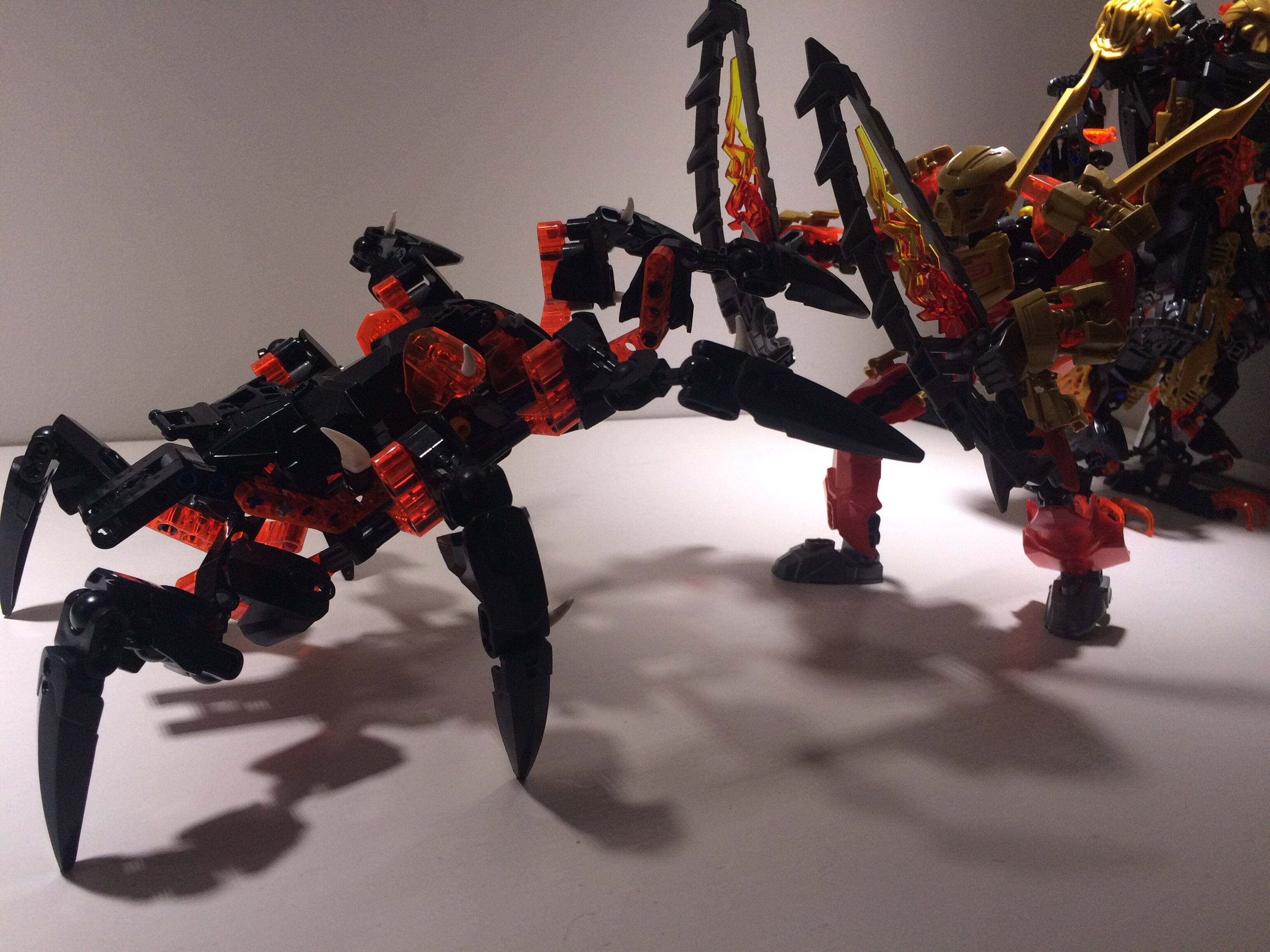
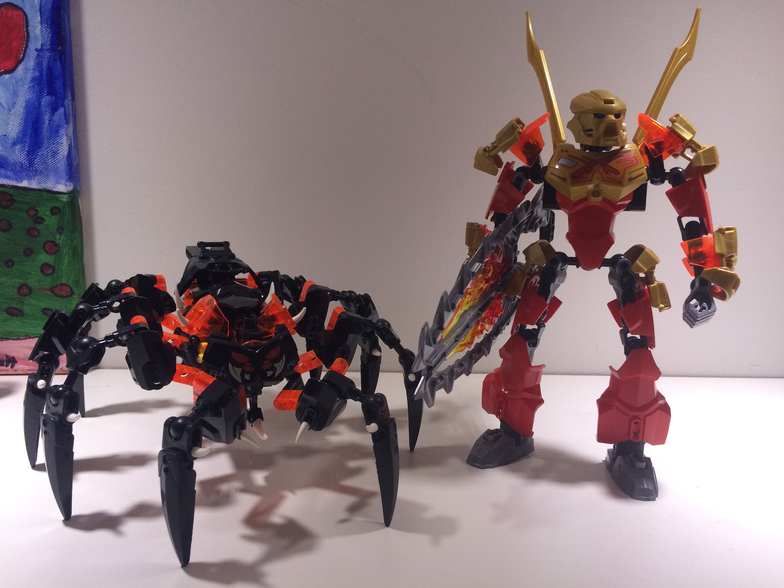
My LoSS
http://i.imgur.com/09NtRq8.jpg
http://i.imgur.com/HY0R8AN.jpg
http://i.imgur.com/aVeTCVd.jpg
6 Likes
It’s not really a mod though, more like an overhaul Moc…
I’m sorry for your LoSS ![]()
9 Likes
Lewa with few changes.
http://i.imgur.com/cAccqG0.jpg
http://i.imgur.com/uCtJ2EX.jpg
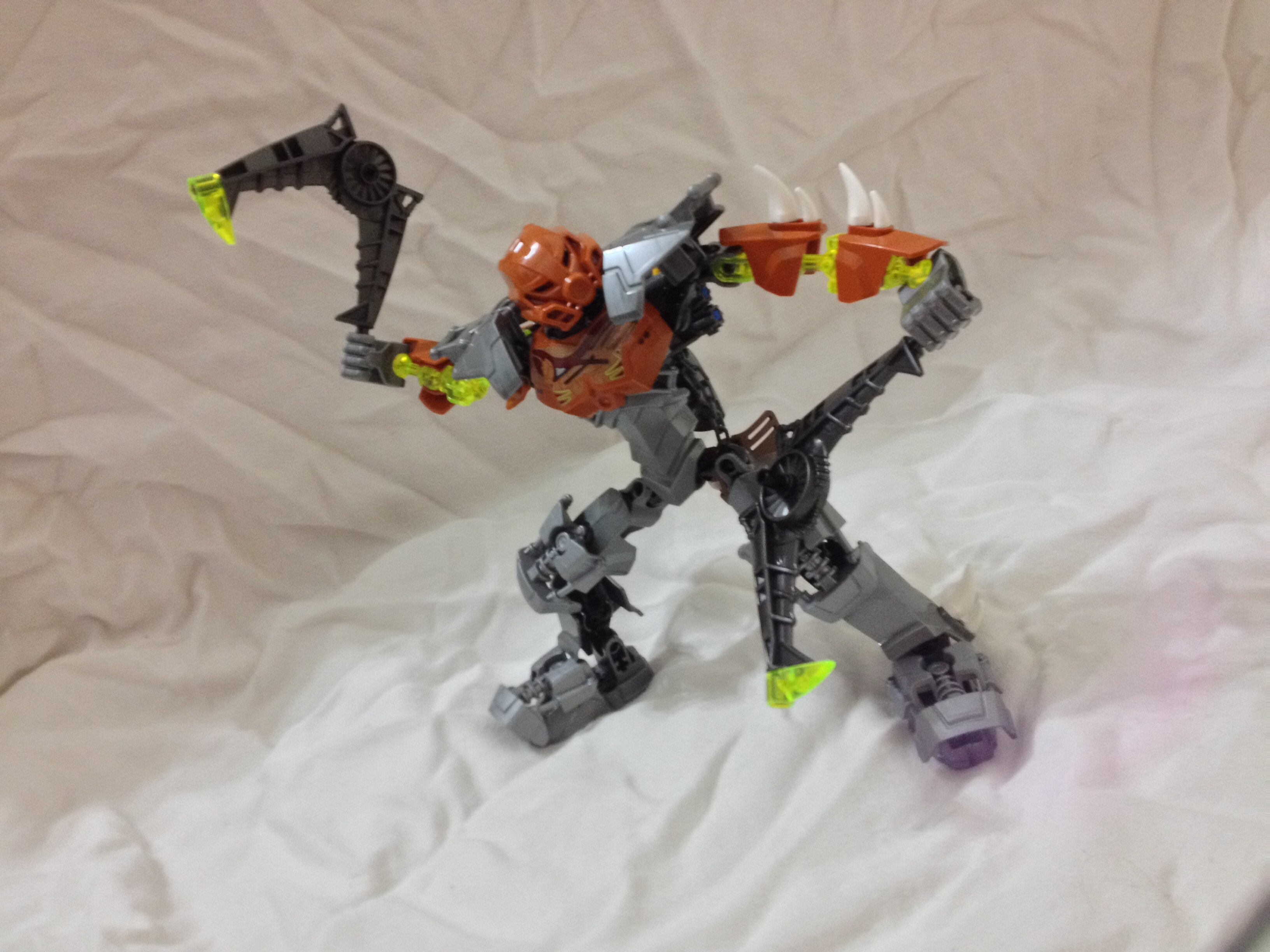
My Onua.
http://i.imgur.com/XxosbWg.jpg
http://i.imgur.com/9iPaivJ.jpg
http://i.imgur.com/Fo2uqEO.jpg
http://i.imgur.com/pL6ikg7.jpg
http://i.imgur.com/XUFPelQ.jpg
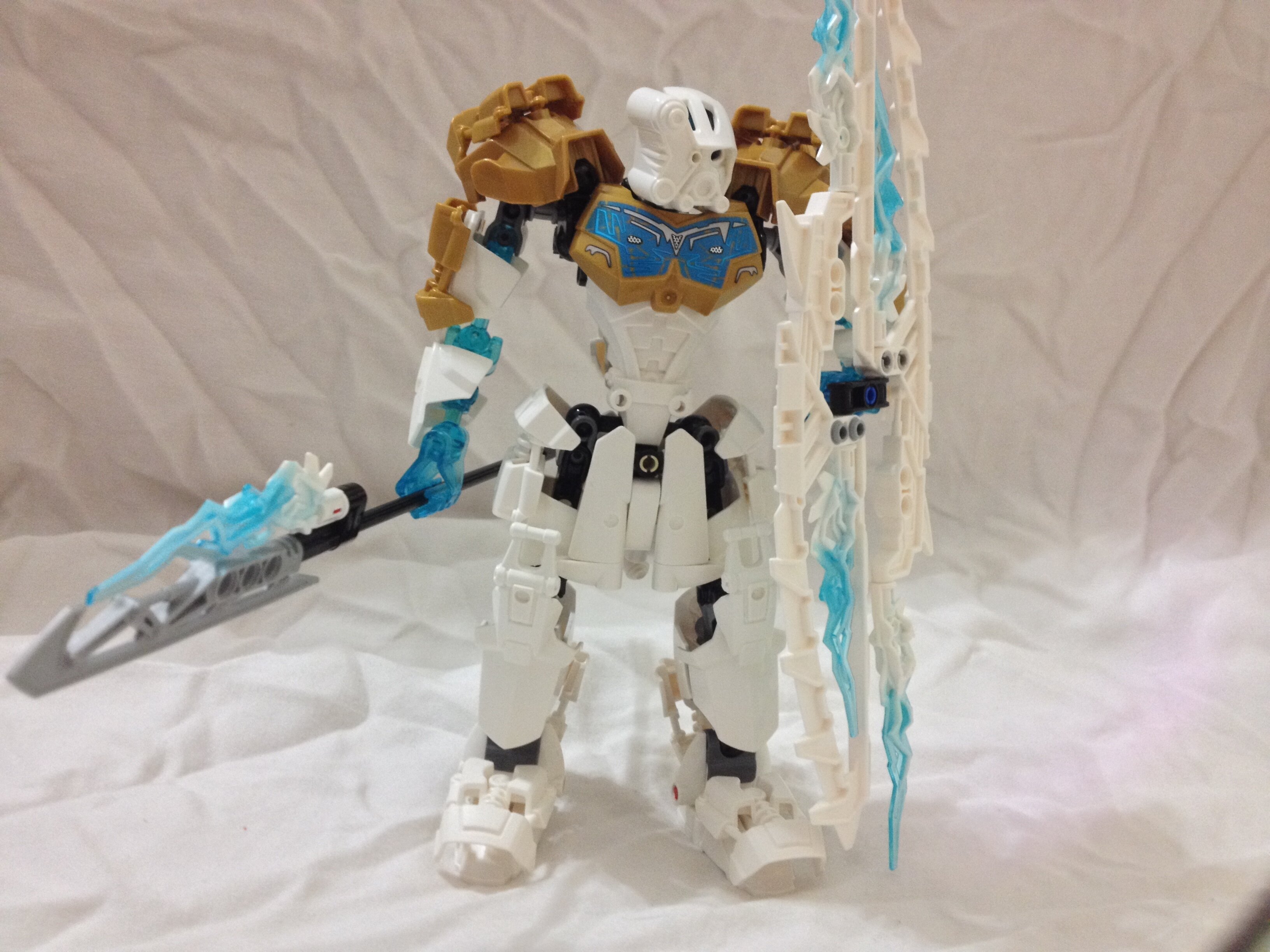
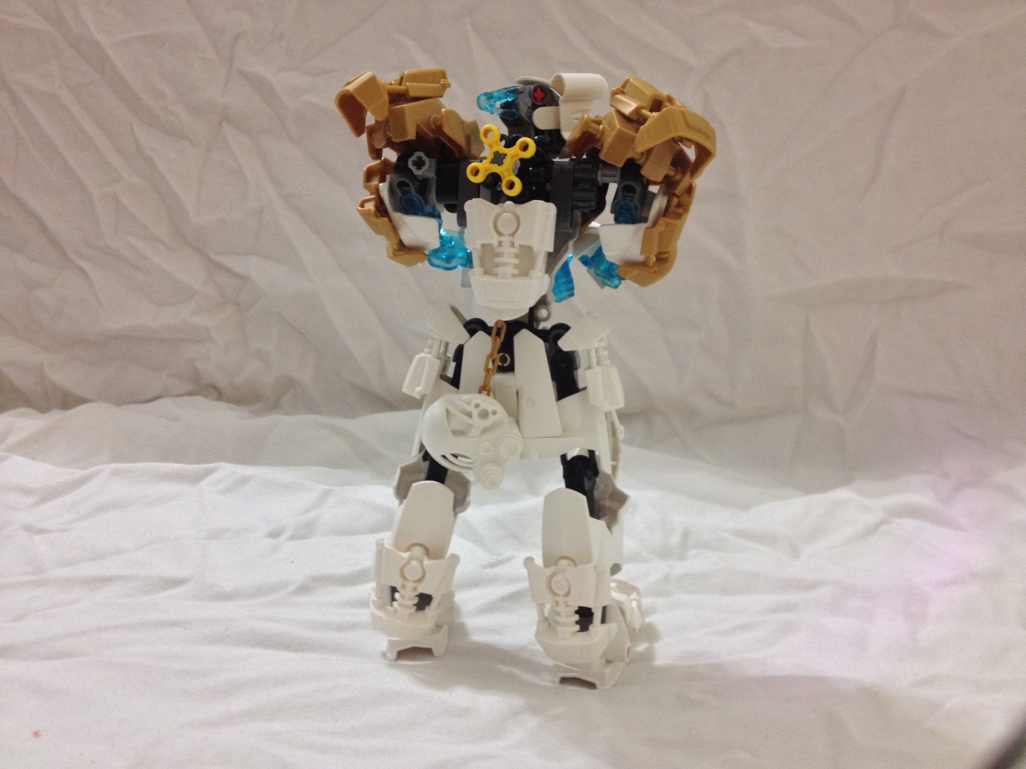
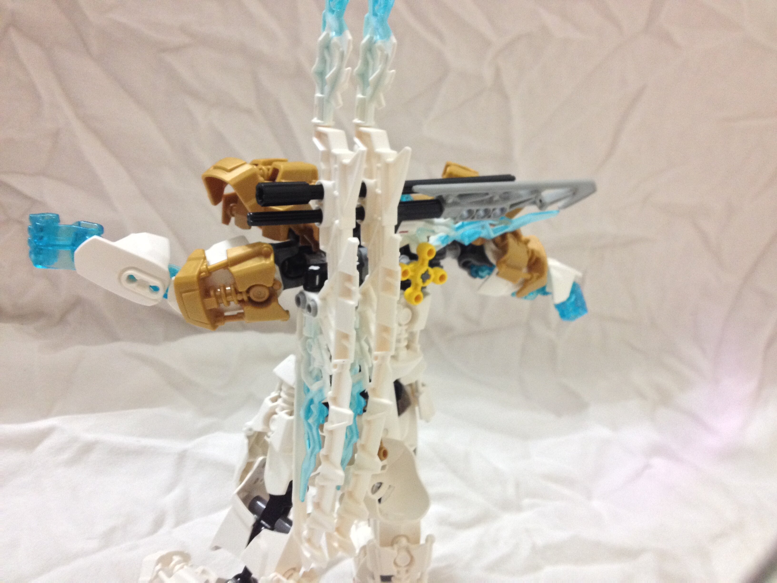
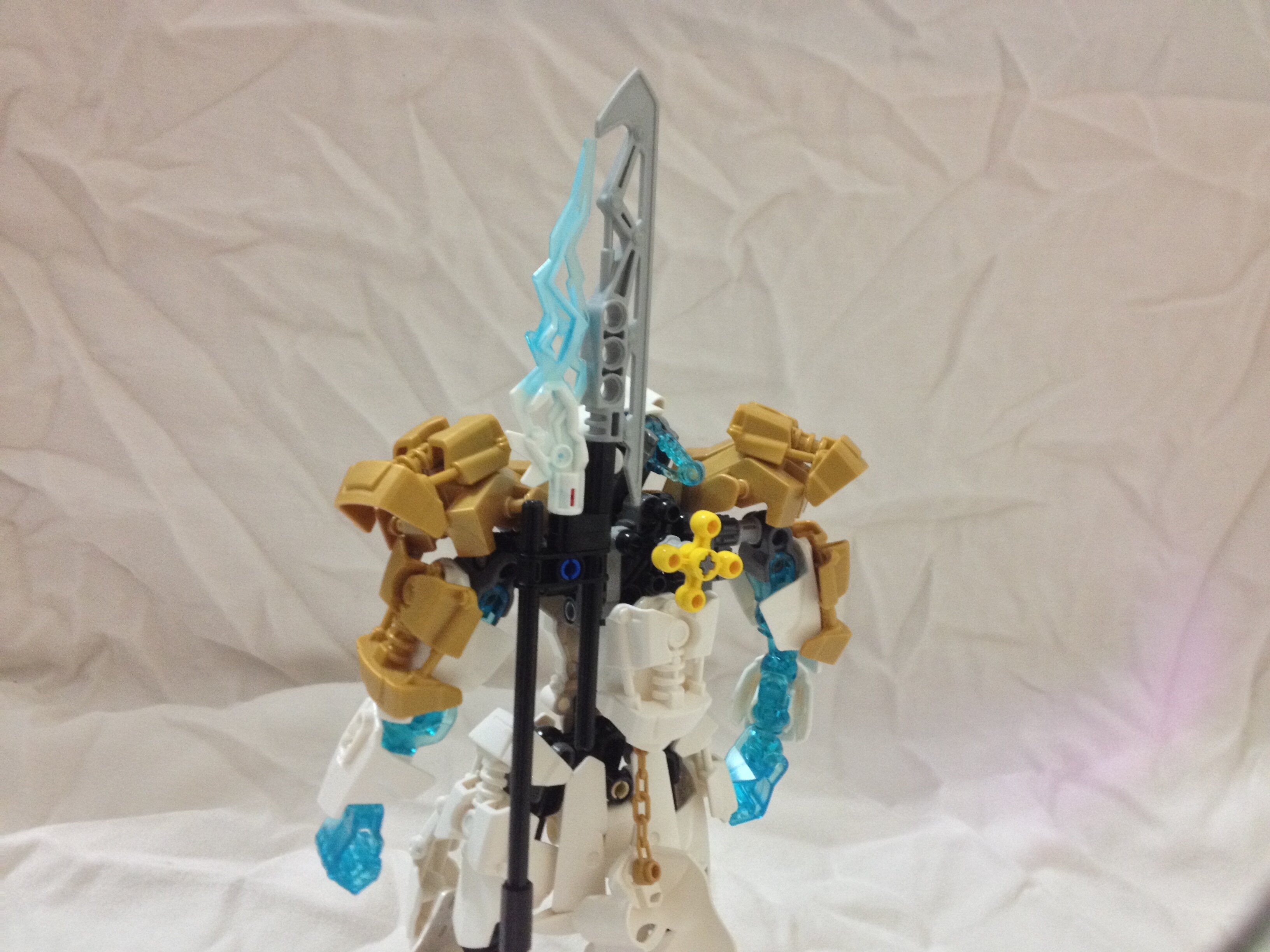
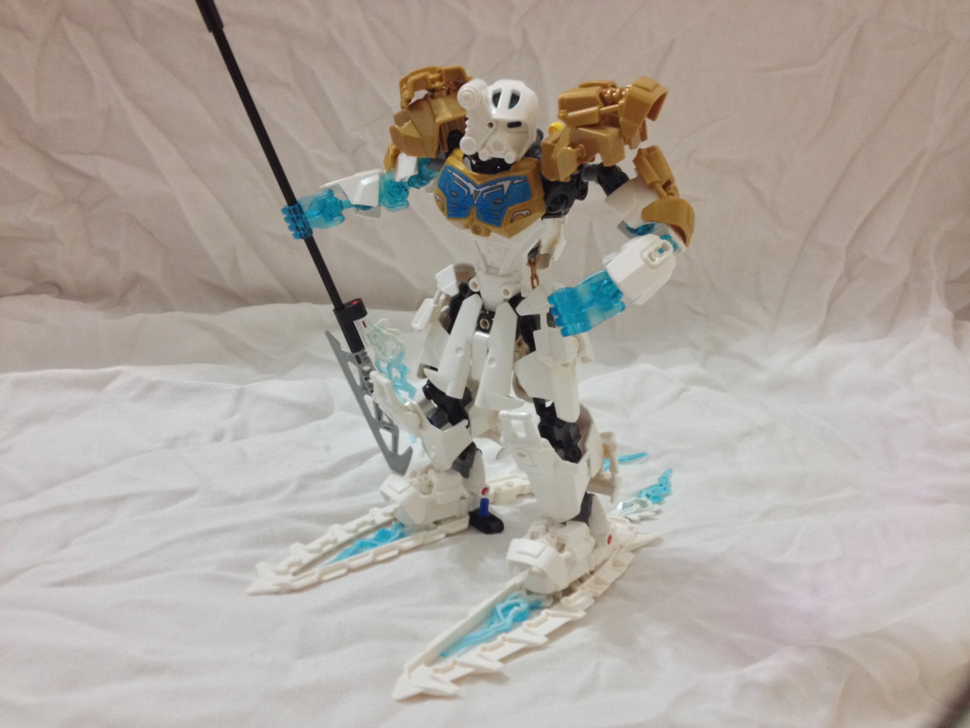
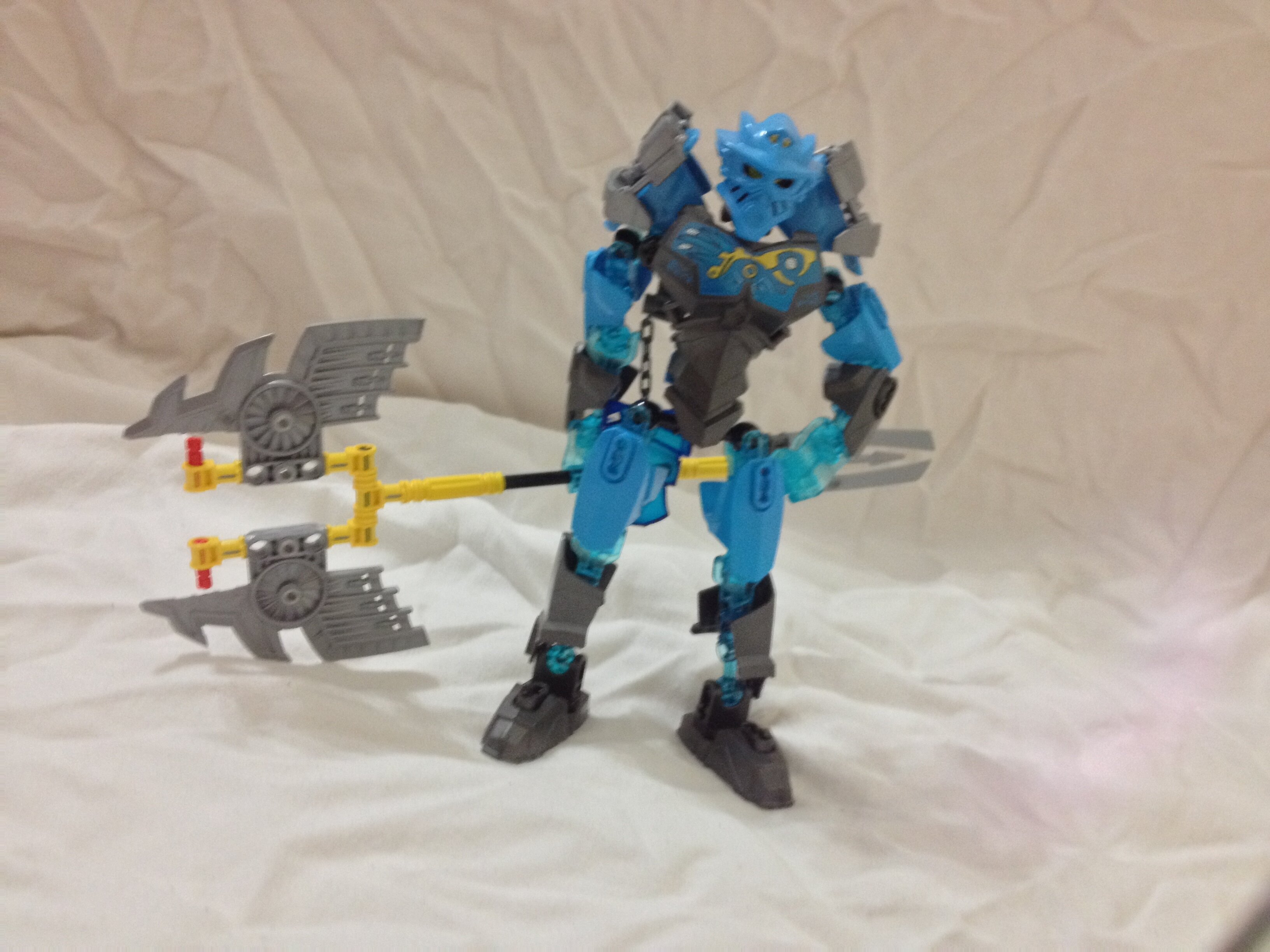
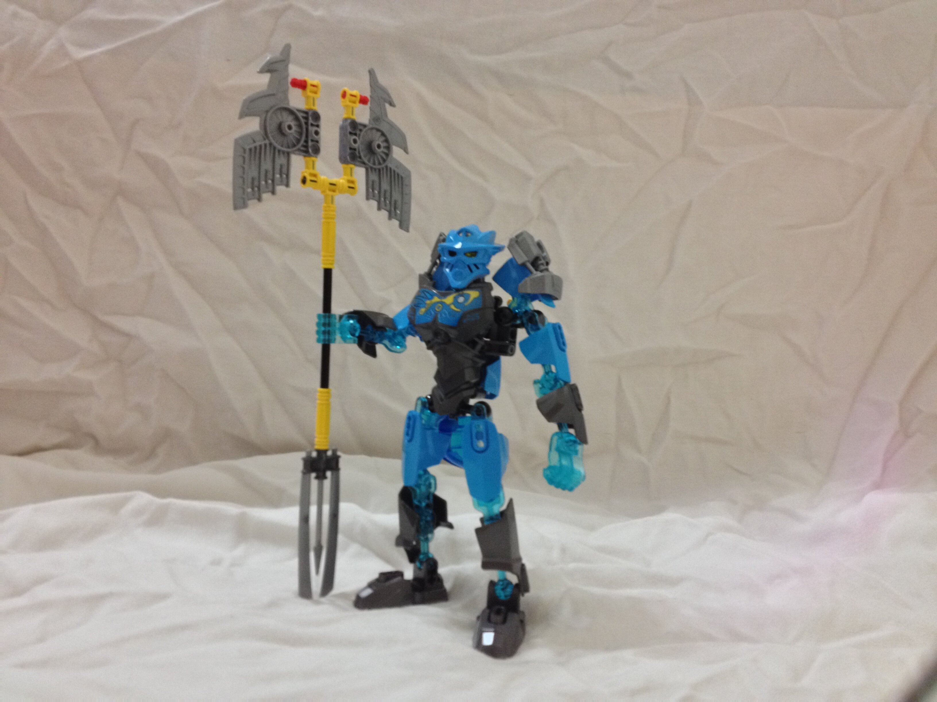
My Kopaka.
http://i.imgur.com/mSO0i09.jpg
http://i.imgur.com/beZ8cpi.jpg
http://i.imgur.com/mPZfUTp.jpg
http://i.imgur.com/buAGIGu.jpg
Edited for Double Post - Waj
7 Likes
The green feet on Lewa works extremely well 
My Gali
http://i.imgur.com/NGeZl16.jpg
http://i.imgur.com/7ZcGE9K.jpg
http://i.imgur.com/Yk0ktG8.jpg
And Pohatu
http://i.imgur.com/L067vYC.jpg
http://i.imgur.com/anucKnC.jpg
http://i.imgur.com/3DD3zGt.jpg
4 Likes
It looks great, but it must have caused you…
quite the LoSS of time!
1 Like
A general remake of the Gen 2 Toa, with the first set of mocs being Tahu, Kopaka and Onua.
They’re designed to fit into my own version of the Bionicle stories, which pretty much has them decked out in pieces only from CCBS Bionicle and Superhero Ultrabuild lines. The challenge here was to only use those pieces shown in these lines and their available colors.
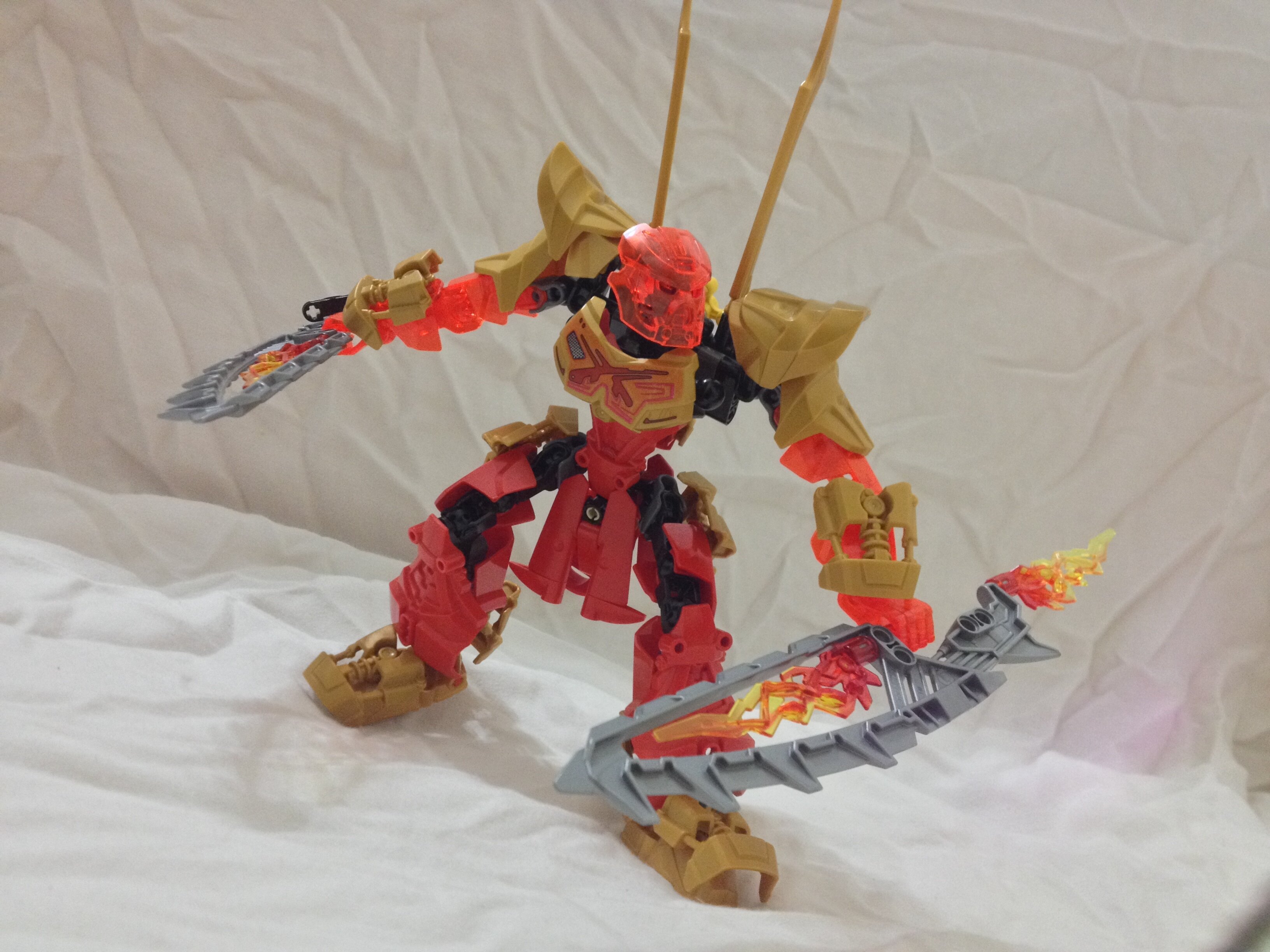
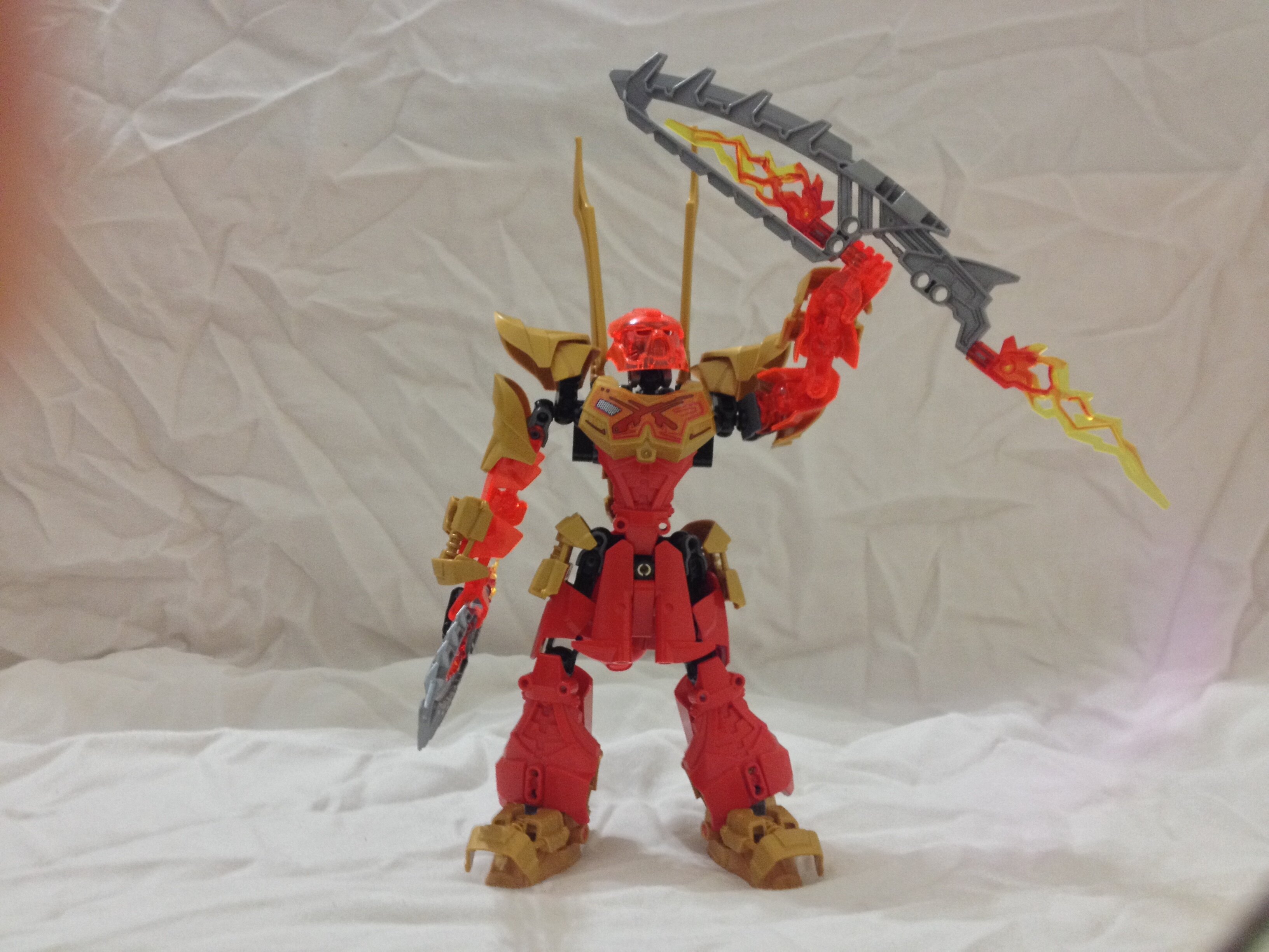
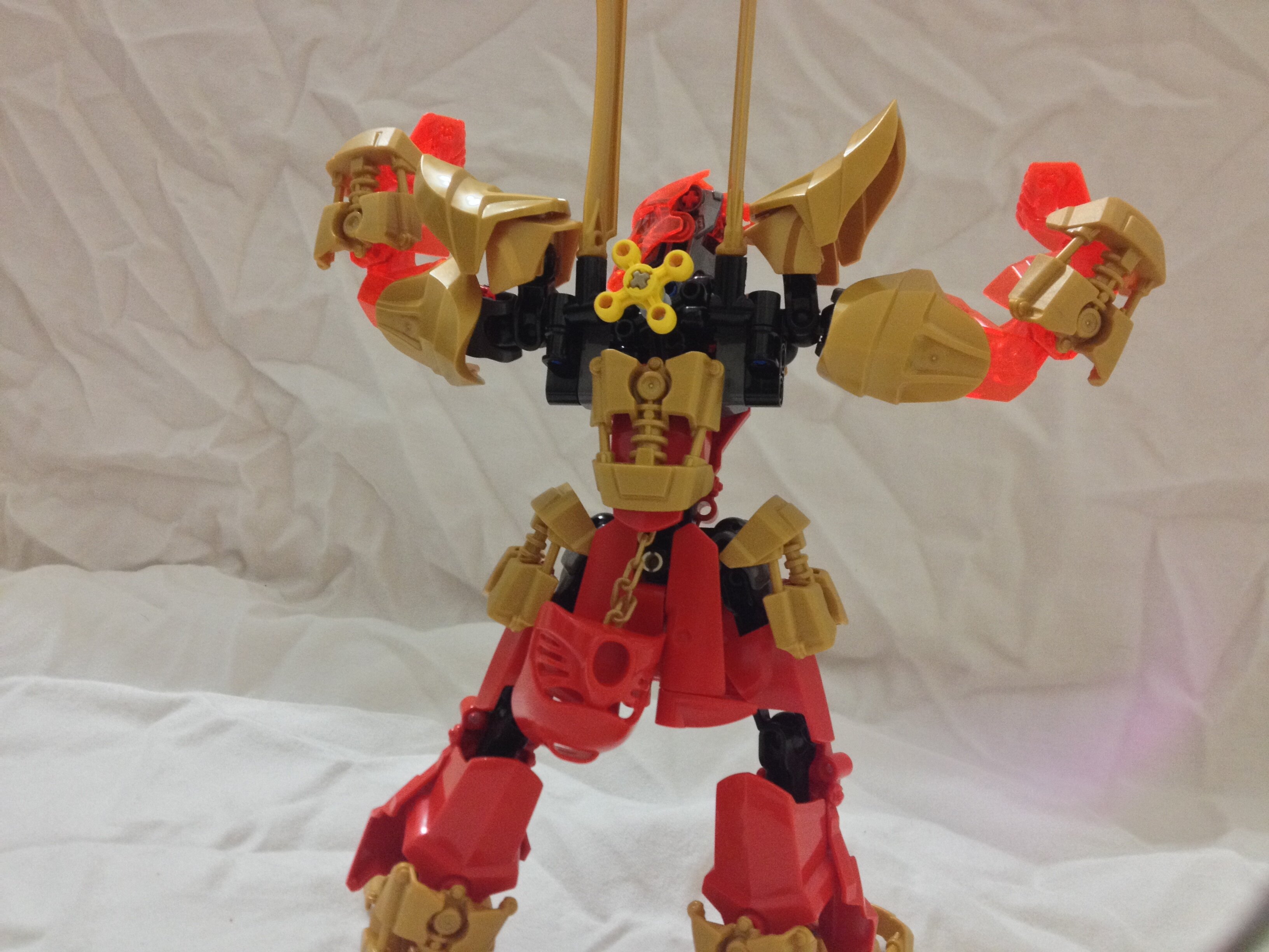
TAHU MY BOY
Here is the poster boy of bonkles. The design here was based off of his official build, only exaggerated. His shoulders are samurai armor pads and the bell bottoms are carried over from the original. His arms are completely trans-neon orange to express constant glowing fire in them.
Excuse my thumb. This is a clear homage to THAT poster.
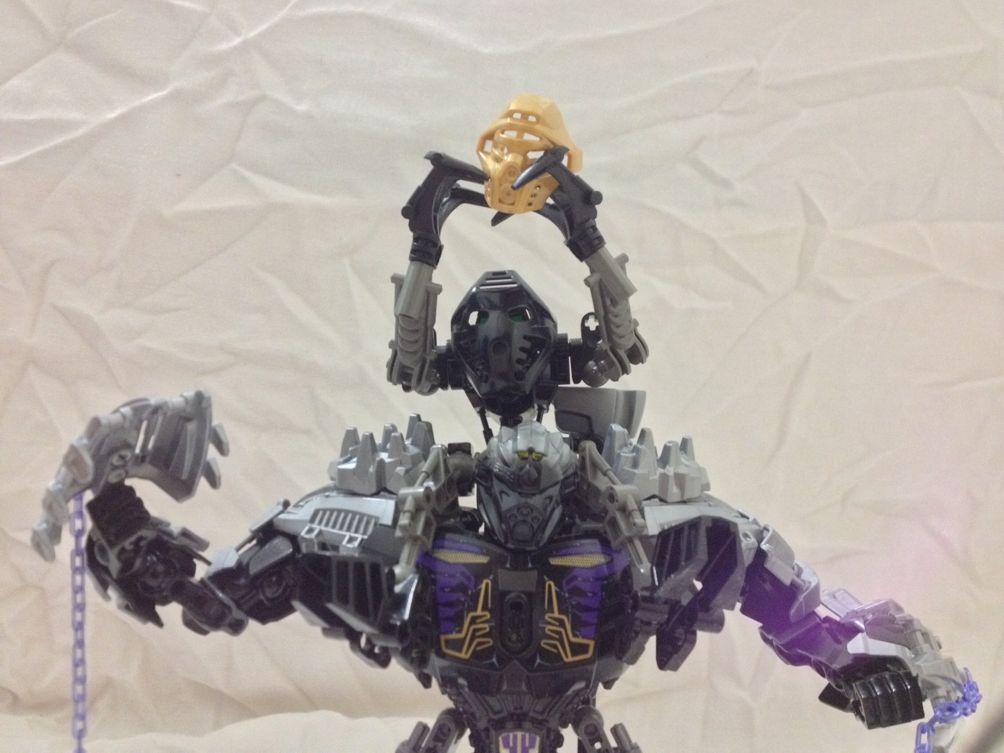
Him flexing. I added the original Hau as a cheeky (no pun intended) callback to Gen 1, part of my version of the Bionicle story.
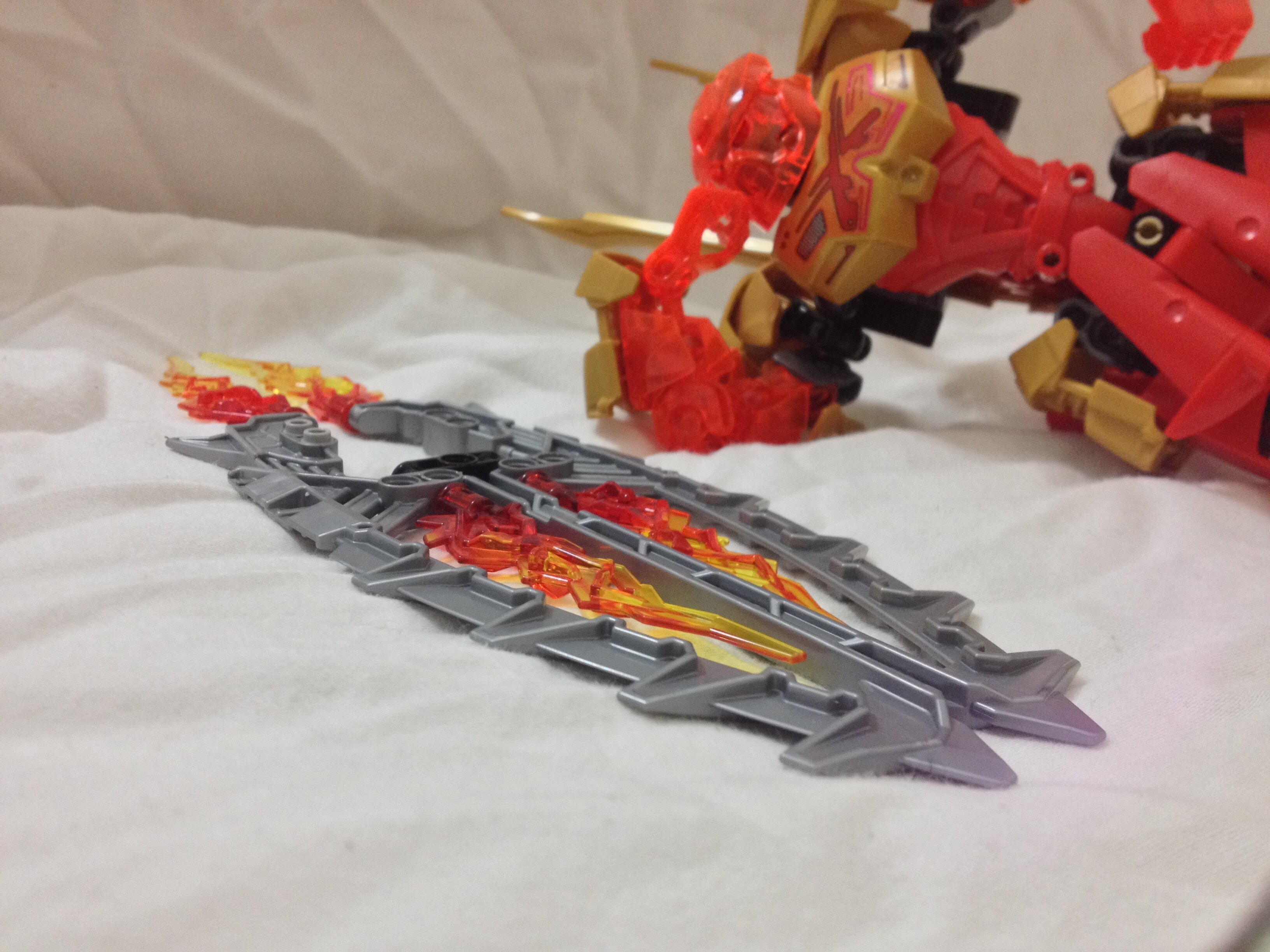
His Lava Surfboard is equipped with fiery thrusters of burning powaahhh!
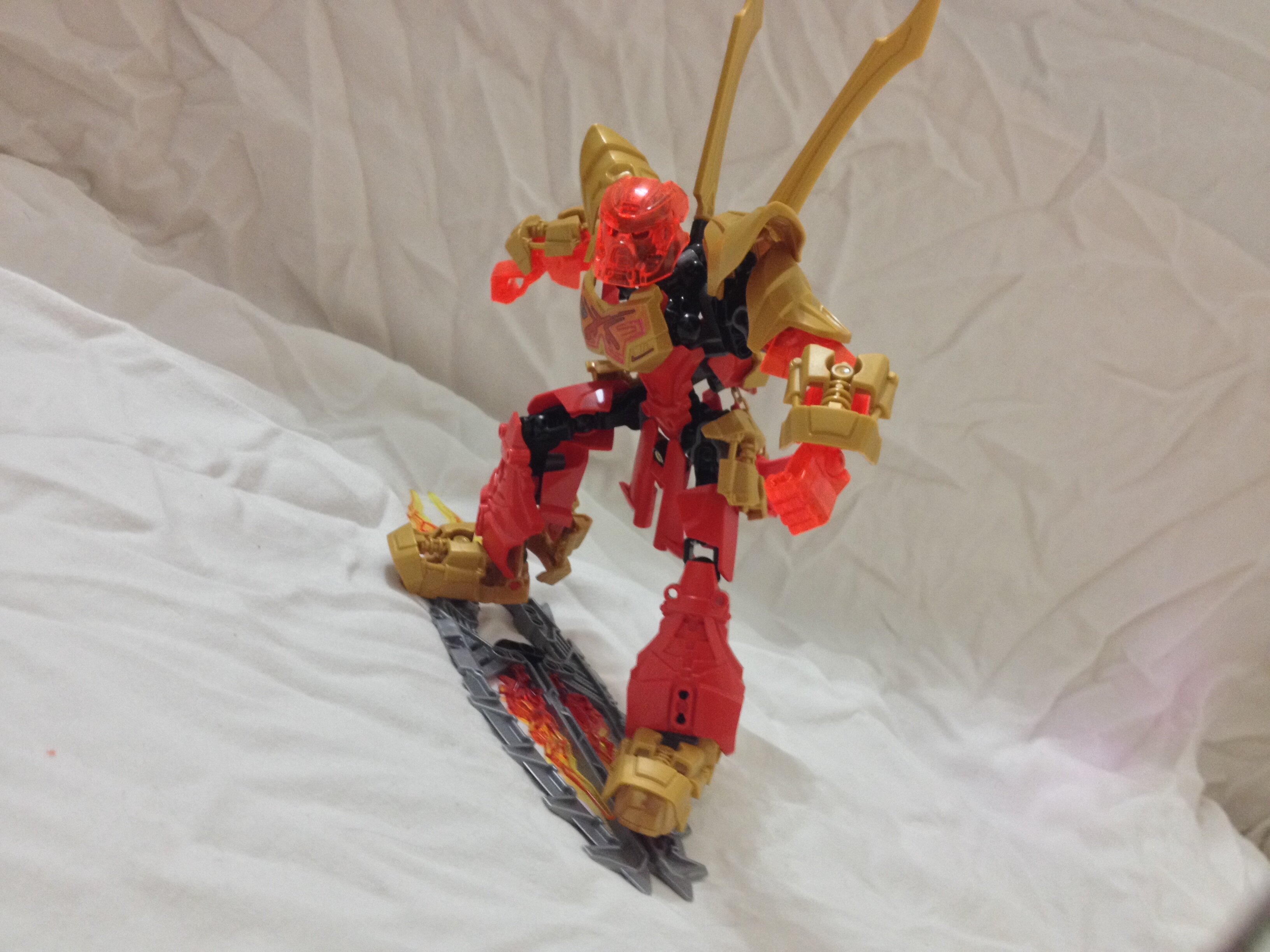
The surfboard is equipped with half-pins because the stress on the full pins put me on edge. Fire in the back of the board because he is the MASTER OF FIRAHHHH
Kopaka was not photogenic in that earlier picture.
The competitor to Tahu here was made to be an inverse of Tahu, having a skinny and knightly theme. His hockey knee pads are accentuated to ridiculous levels here, and white was spread about to suggest ice. I went overboard with white CCBS.
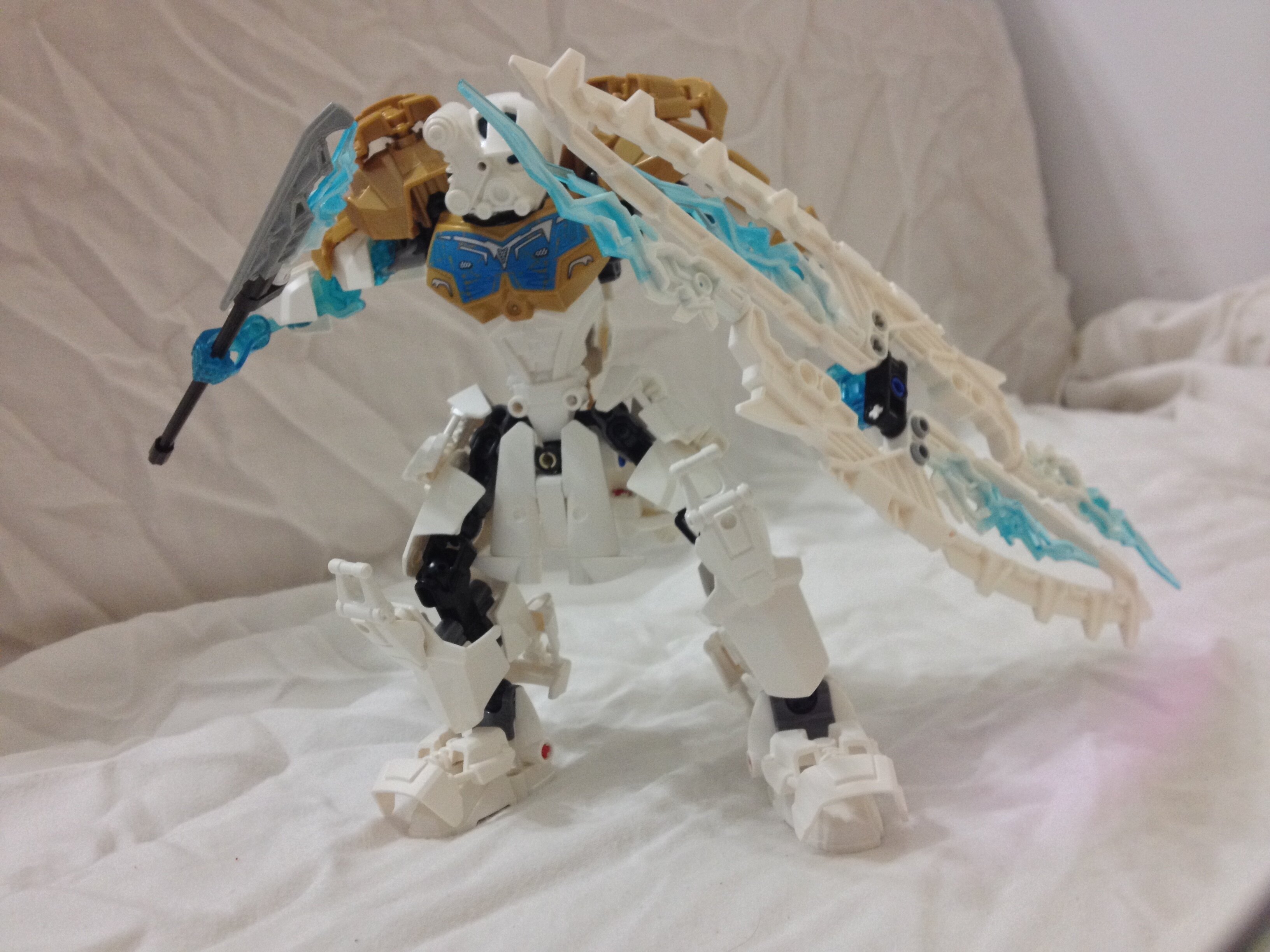
Another mask, another backside. This Akaku does not like what it sees.
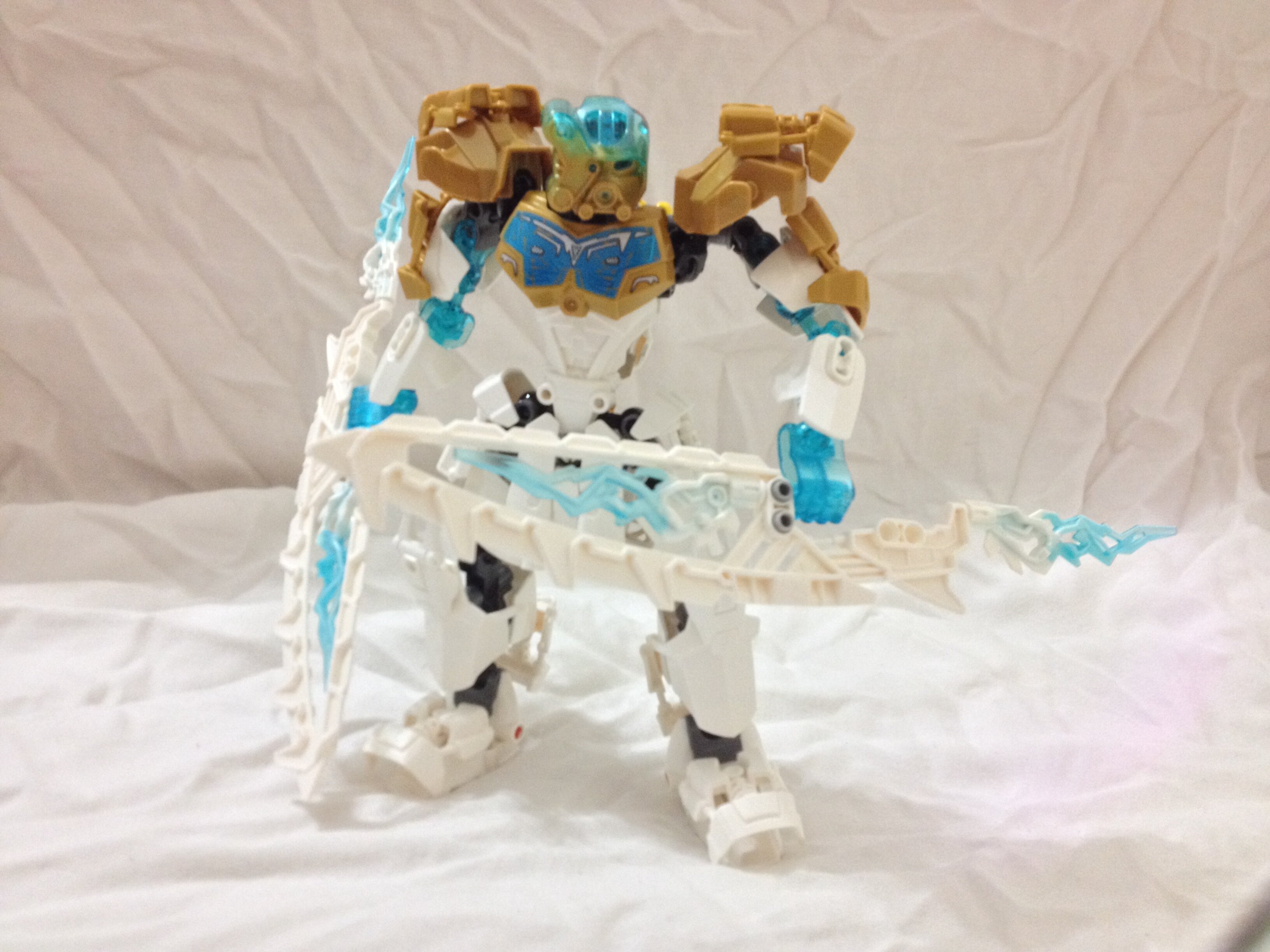
Here he is showcasing his weapon. No major changes besides the lengthening of his spear and some shards to even out his shield.
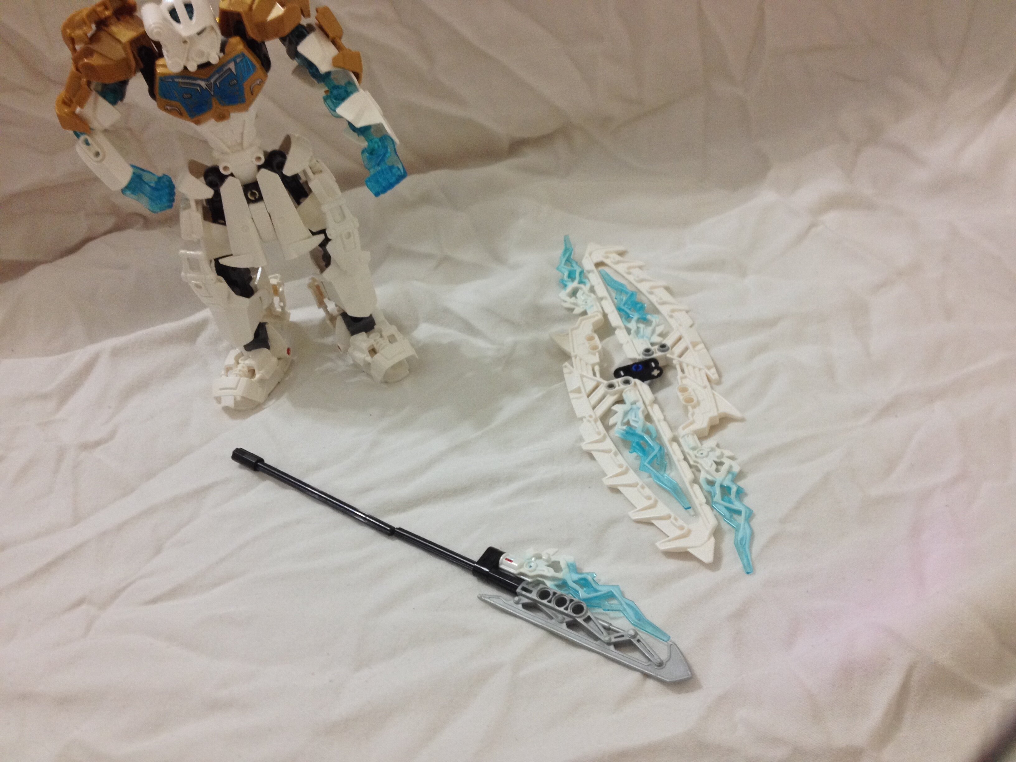
But wait! His shield DOUBLEs as weapons! He’s like a POLAR opposite of Tahu! weak, dry laugh
He can put his hefty shield on his back.
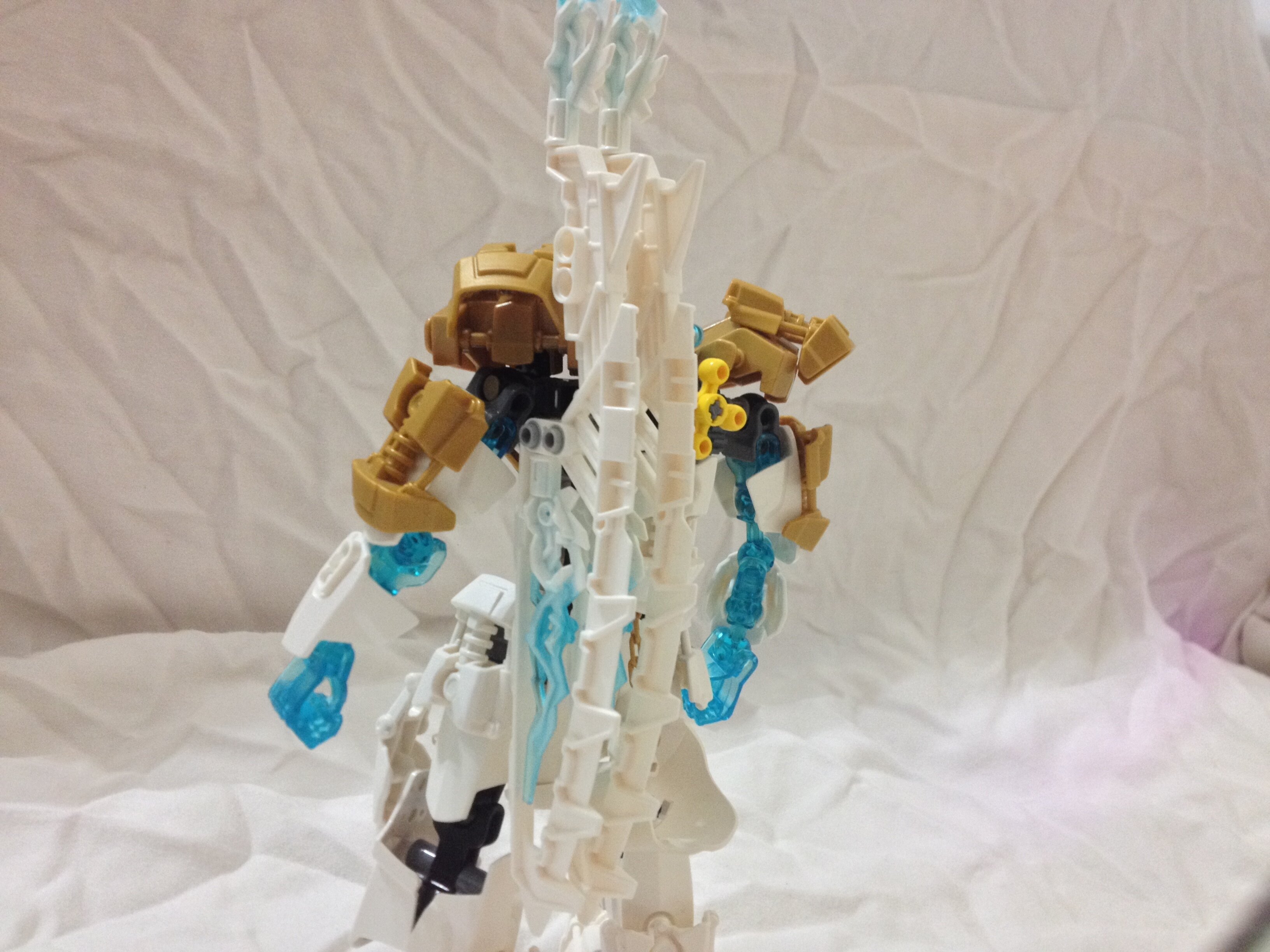
On his dual snowboards?
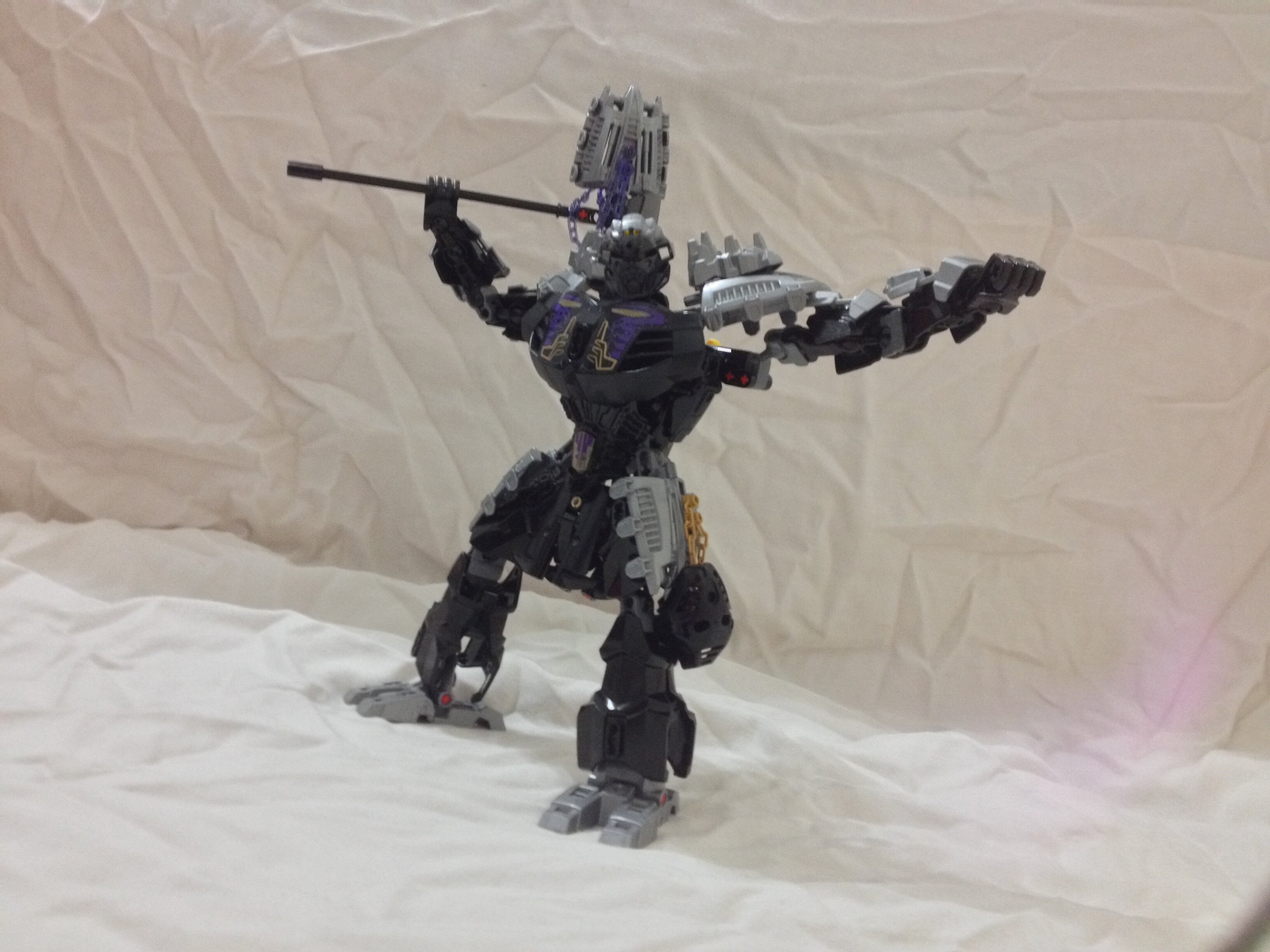
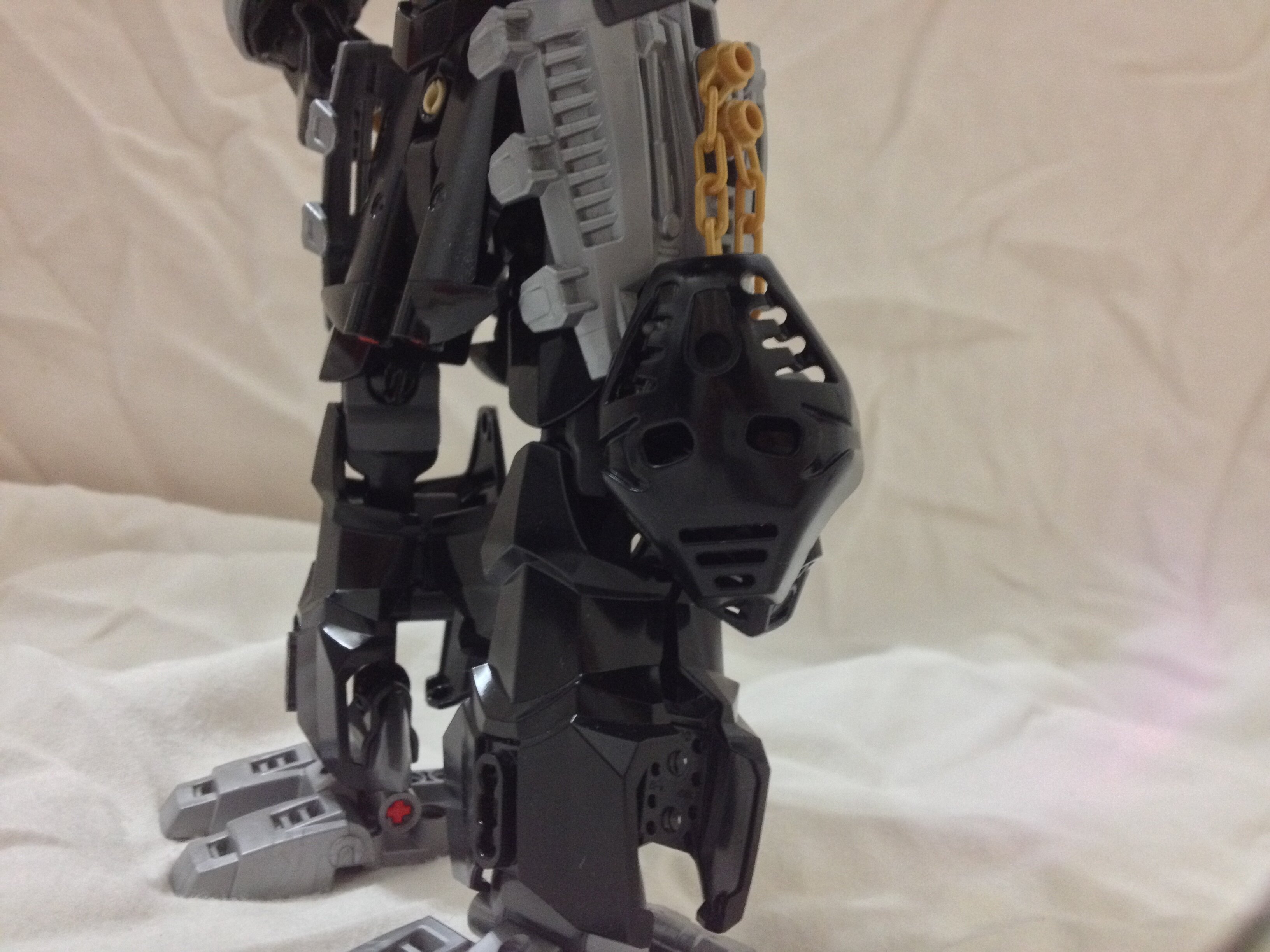
Onua, whose calorie intake exceeds the amount of Gen 1 names.
I got this idea off of a similar MOC I saw of Onua that melded 2015 and 2016 forms together. My version is much leaner and taller. However, he does not sport the gold that he originally had, since I unfortunately ran out of gold armor.
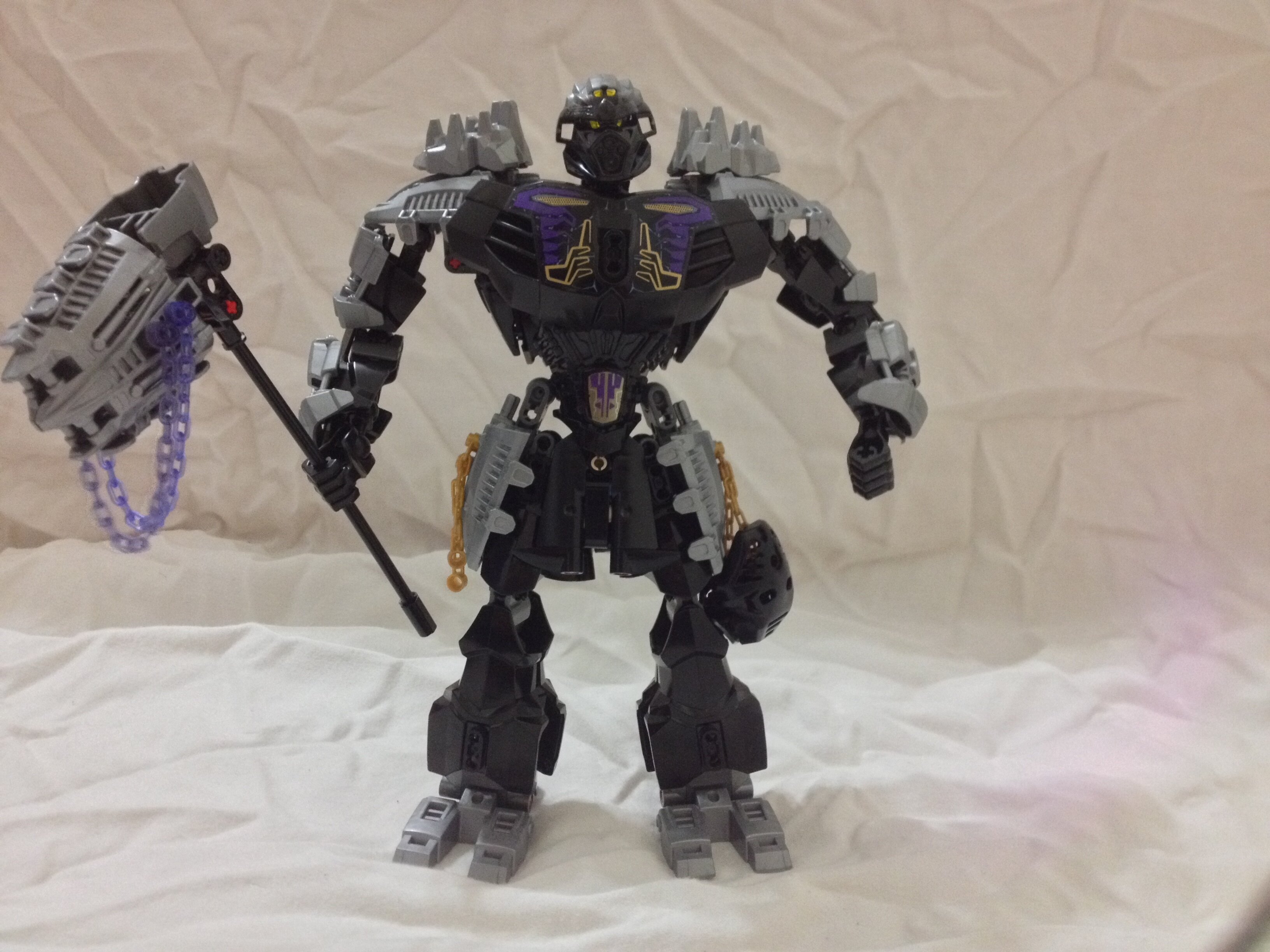
He has two Pakari kanohis on his leg. His thigh is insanely buff now.
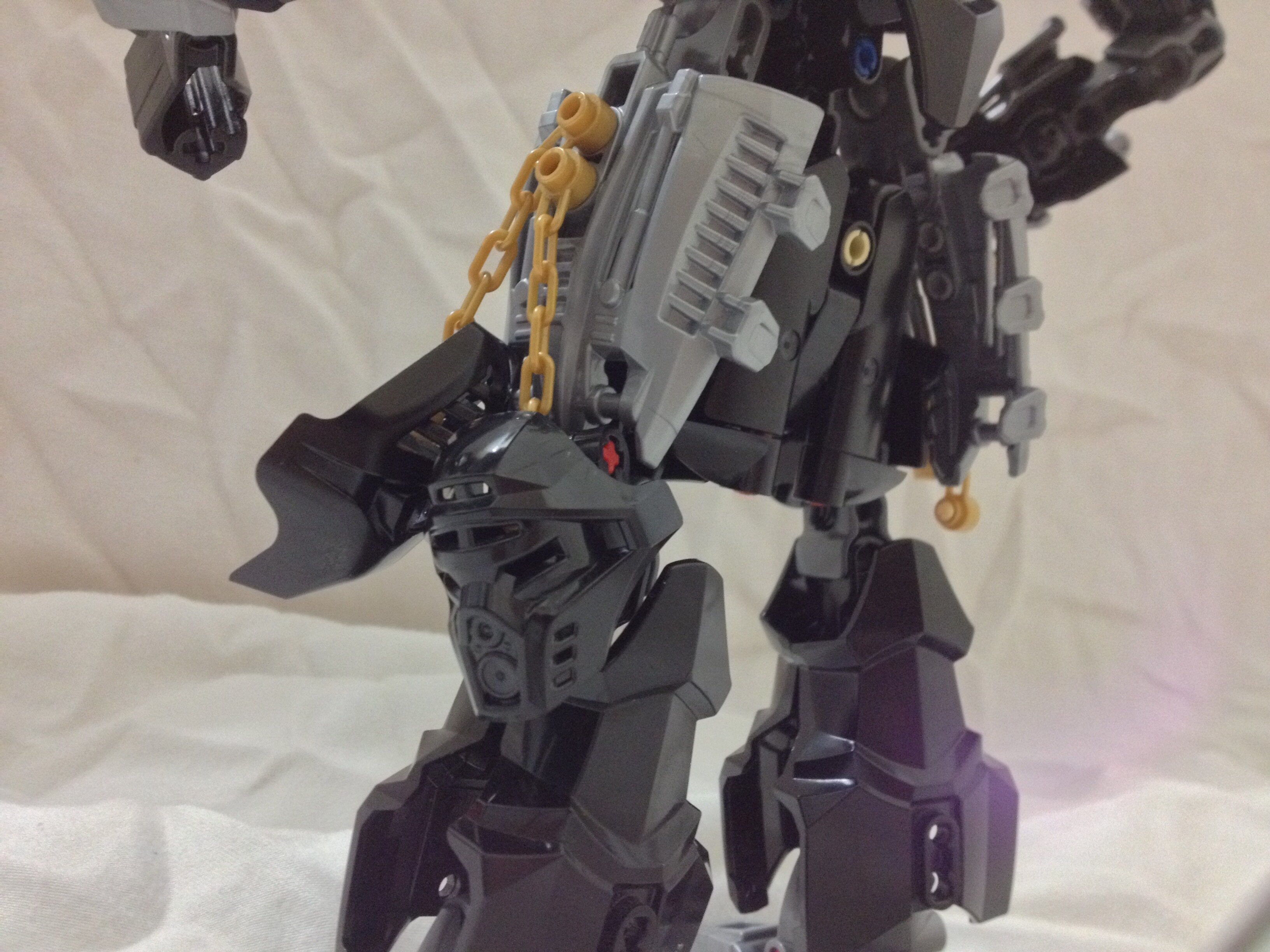
His weapon is extended and a major thing I wanted to do with all my Toa’s weapons was to give them an elemental color.
Back storage! That poor piece lifting up that hammer. It’s actually flexing I think.
He’s got claws and delicious trans-purple chains.
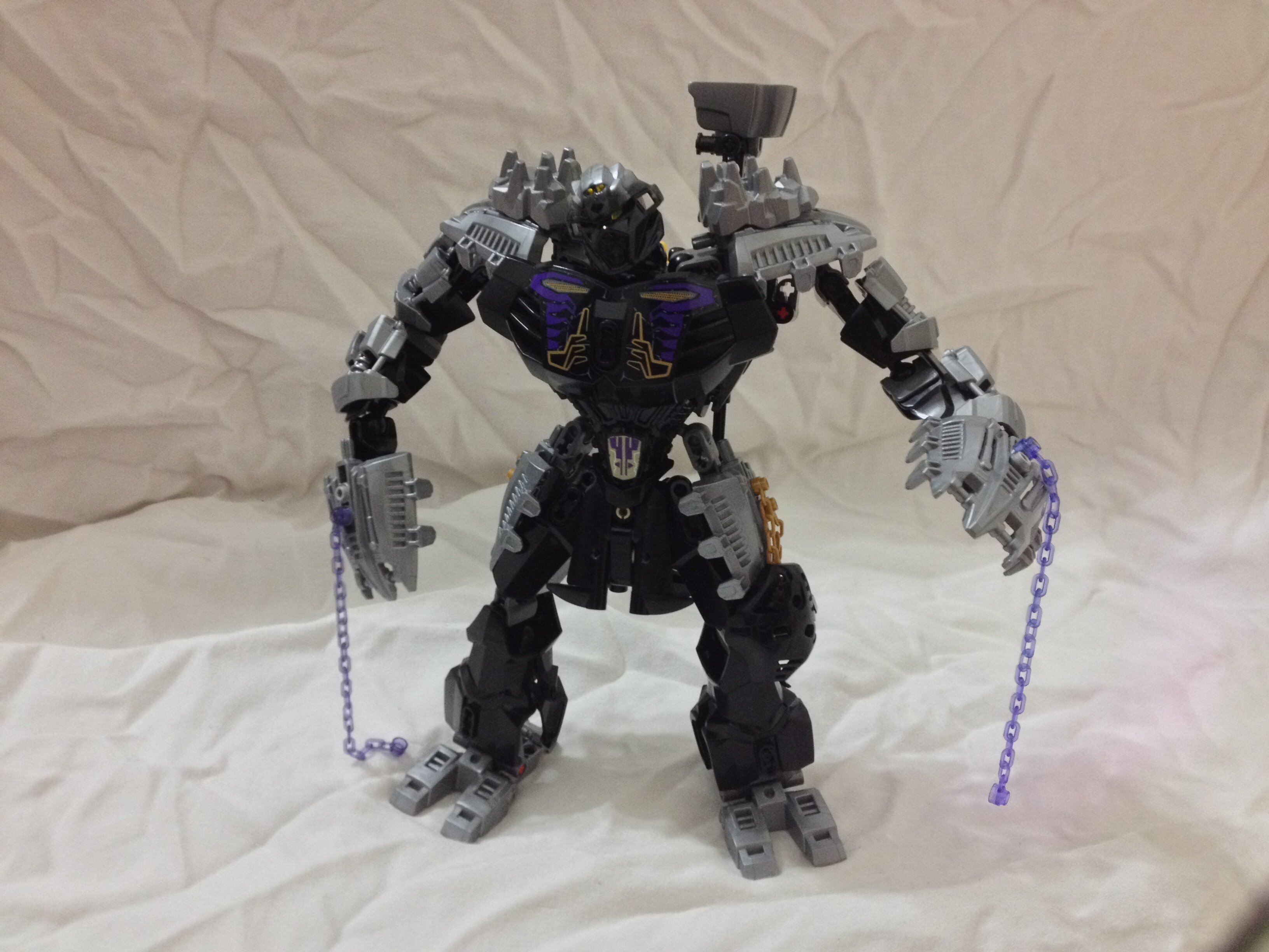
I always like this display of Onua resting on Onua’s massive trapezius muscles.
Stay tuned for Part 2! Thanks
8 Likes
These look flipping amazing!
nice skirts
I heard they are part of a ballet trio
I like the mocs but I’m not a fan of the obi-wan crotch cloak
Wow, these look great, I love the bulky look Onua has which he didn’t really have in the first place and Kopaka looks n-ice.
Same thing with Tahu.
admittedly it does hinder leg articulation
These are super cool. I love the skirt armor. Gives them a sort of Gundam look that I really dig. I think the only bit of feedback I have is that Kopaka and Tahu don’t have any trans-blue/red on the lower halves of their bodies. I think I would have tried to at least add some of those colors as an accent to their legs or feet, just to balance out the color scheme. I guess it would also help to add some more purple to Onua, because he’s almost entirely black here.
But those are very minor nitpicks. These look great as-is.
Pretty cool, I like the samurai esq look the skirt gives Tahu.
I think you had good ideas on most of them but went a little too overboard with said ideas.
The armor add-on looks really unappealing on their feet.
I’ll go one by one for clarities sake.
##tahu
The mask and arms really clash with the rest of his body, badly.
His arms are completely trans neon orange which ends up looking really ugly compared to the rest of him.
I’d recommend making at least one bone and one shell transparent instead of the whole arm.
And I’m really not feeling the double armor pieces for his shoulders they just end up looking like they would hit each other making him moving difficult.
I do like what you did with the different HF chest plate, but I don’t entirely like the way the back of the legs look, especially with the armor add-on floating off of it.
I think he’s the only one that wears the skirt thing well because of his samurai like appearance.
I don’t like the fire parts on the end of the swords cause they look impractical and seem ike something a kid would do to make the weapon “more powerful” like adding another blade to make a sword thicker or something.
I’d say make Tahu more samurai like and fix up his arms a lot and you got a pretty good revamp.
##kopaka
Kopaka feels really bulky but in some of the wrong ways to me.
I don’t like the skirt cause I think it really should be something to make Tahu look unique.
I don’t like the add-ons on his shoulders either, think for a moment that these are pistons to help them move, those are literally floating there, and his legs lack ANY gold pieces which is critical to balancing a colorscheme.
And his arms while the bones are all trans light blue the legs lack any of that color as well, which confuses me cause the set comes with the lower leg bones in trans light blue.
I think the upper legs should have been left with that shell piece they had before instead of just copping tahu. and theres a much more compact way to make legs using those shells.
Use one of these and then attach a five long axel with a stopper on it, one balljoint at the stopper, then a bushing, then 2 more balljoints then connect it to the piece above, you put the bigger shell on the higher joint and the smaller shell on the lower joint.
Ends up looking like this.
Now unlike tahu I actually like the extra parts to the shield, cause it makes the thing a tad bigger and doesn’t look too bad.
And the spear is a nice touch being Kopaka nuva’s sword and all.
Those are skis
##onua
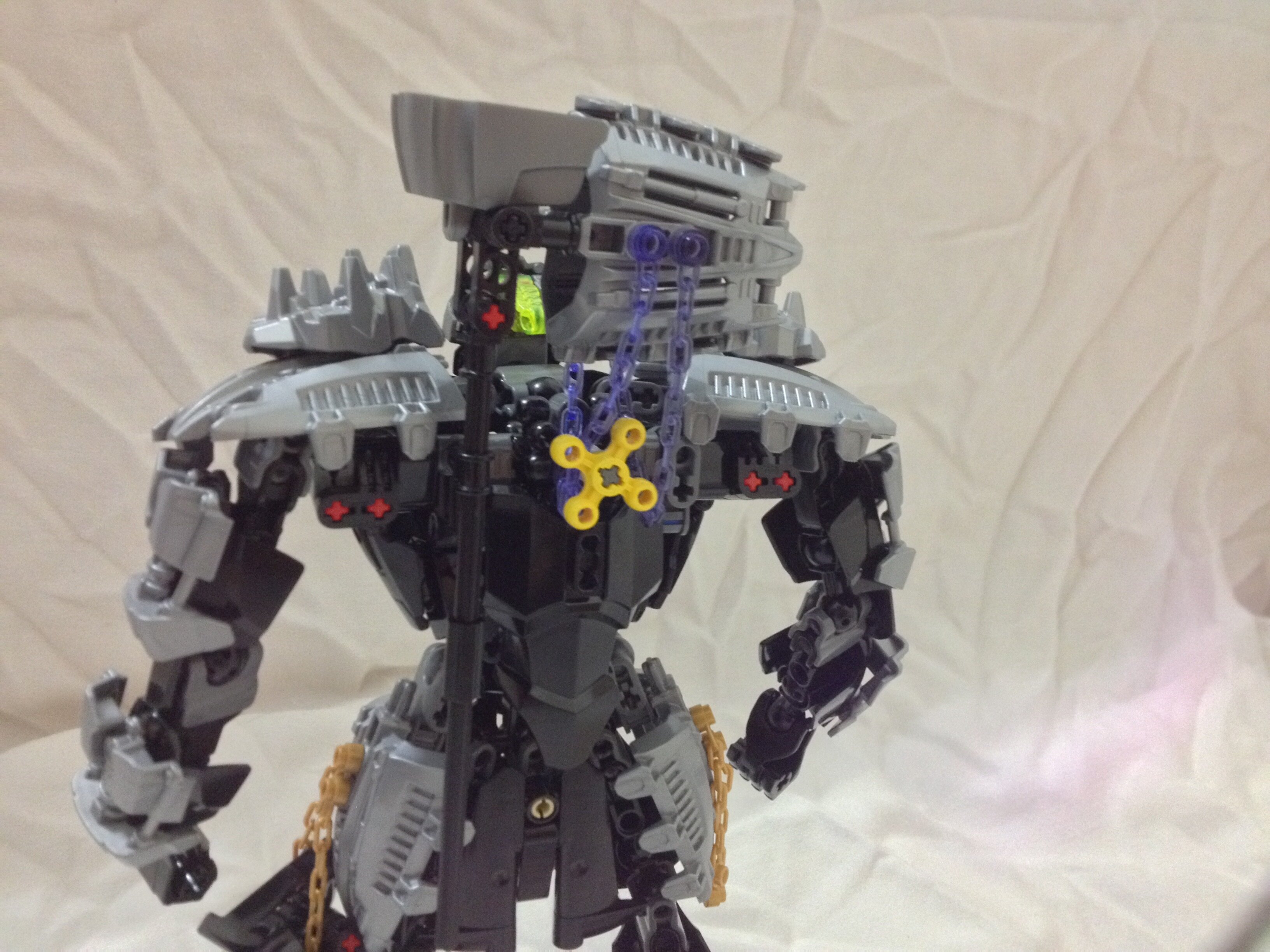
Why the 2016 mask by the way?
As you said it looks a lot like LoganMcOwen’s version, though I wish there was gold due to it being on his chest print.
The same thing goes with Kopaka about the skirt.
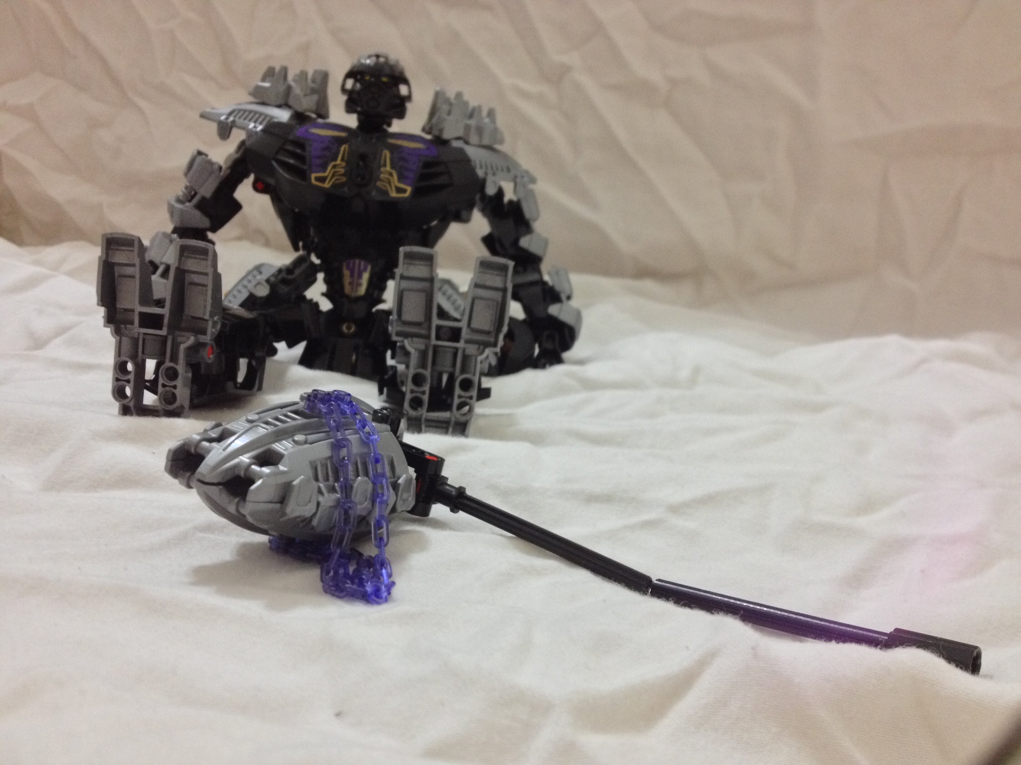
Not a fan of the chains hanging off the hammer, it seems pointless, kinda like the ball thing on Pohatu 2016’s spear.
Despite them being on his combo model with PoE i don’t like the rocks on the shoulders, it ruins the sleek look the shoulders had.
He could also use a lot more purple, as he is now he’s basically his 01 colors but with the chest ruining everything.
You are taking some of the best aspects of these sets and trying to improve them, but I think at the same time you’re adding problems of your own.
So I hope you continue working on these and make them better.
@BlackboltJohnson Haha yes. Unfortunately I’m strapped for cash so I can’t hit Bricklink for pieces. Rest assured, I am planning on giving them so more trans-pieces
@AwesomeJoel27 These revamps are subject to change as I am gleaning some opinions on how the Toa should be like.
Tahu’s head and arms are supposed to be on fire hence the trans-orange. I don’t think that was communicated too well in this design from what I can see. The shoulders are the closest I could get to having a samurai-esque piece, and yeah they clip with each other a lot when I use his gearbox. His board has fire on the back on it as in my own story the board can now fly, but that kinda detracts from the lavaboard aspect of it.
Kopaka
He is not a pretty sight. I purposely designed him to be opposite/similar to Tahu i.e. Scorpion and Subzero from MK (the elemental arms are a nod to them). However, his trans-arms ended up looking bad. The knee pads are based off of the wonky proportions you’d find in mech anime (think Evangelion and Gundam), but these are really gappy. I am not too experienced in using classic Technic pieces, and I wish to keep it limited to CCBS-era Technic.
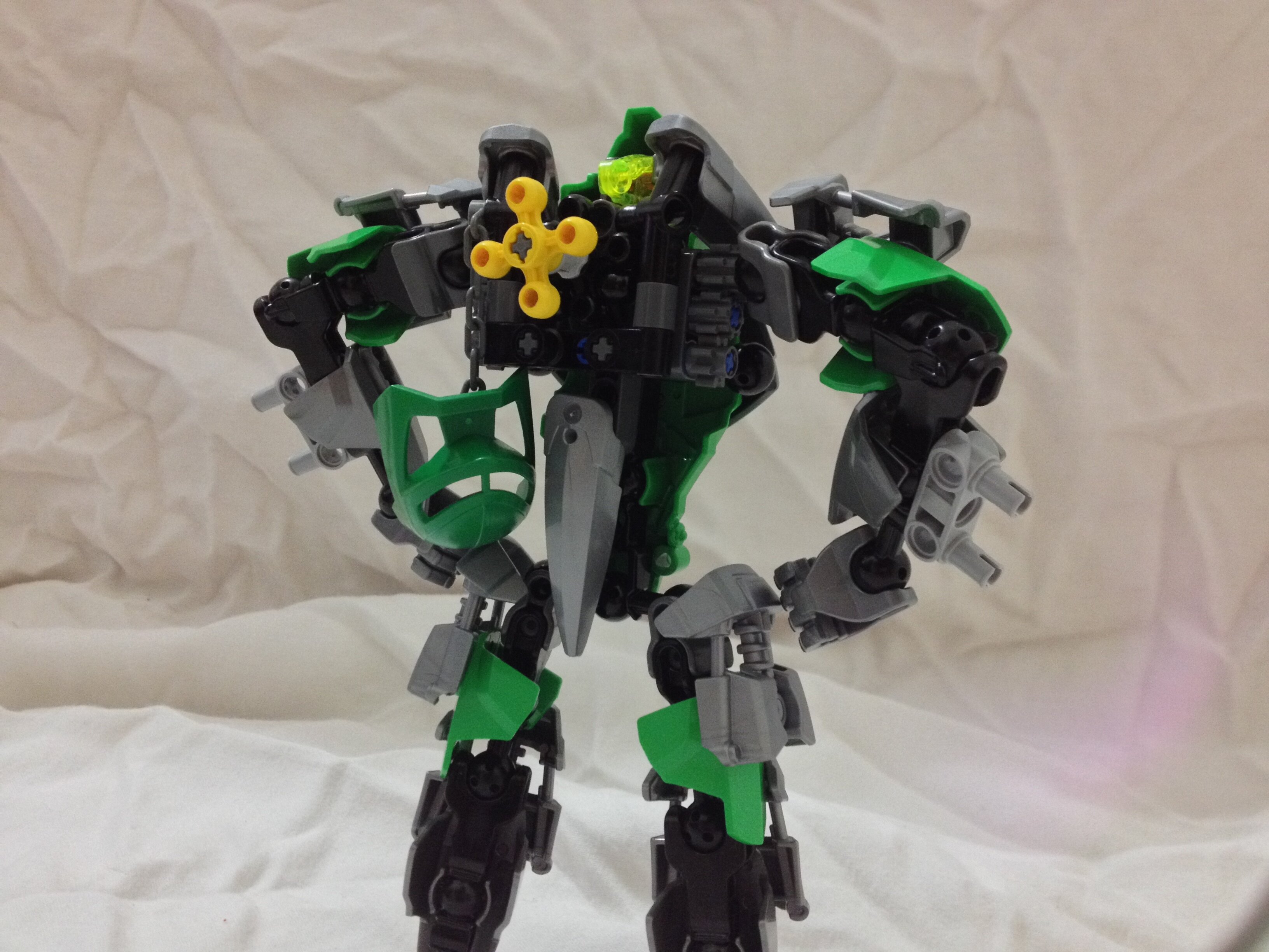
Onua
The 2016 mask looked proportionate compared to the 2015 one, and had the silver dual-mold to match with the rocks on his shoulders. The skirt was to fill out his crotch. I lack the new trans-purple and golden armor pieces, so I made him entirely silver. The chains are meant to add more color on him, sort of as a placeholder for the actual pieces I need to get soon.
I admit I opened a new can of worms with the revamps, and these will fixed accordingly.
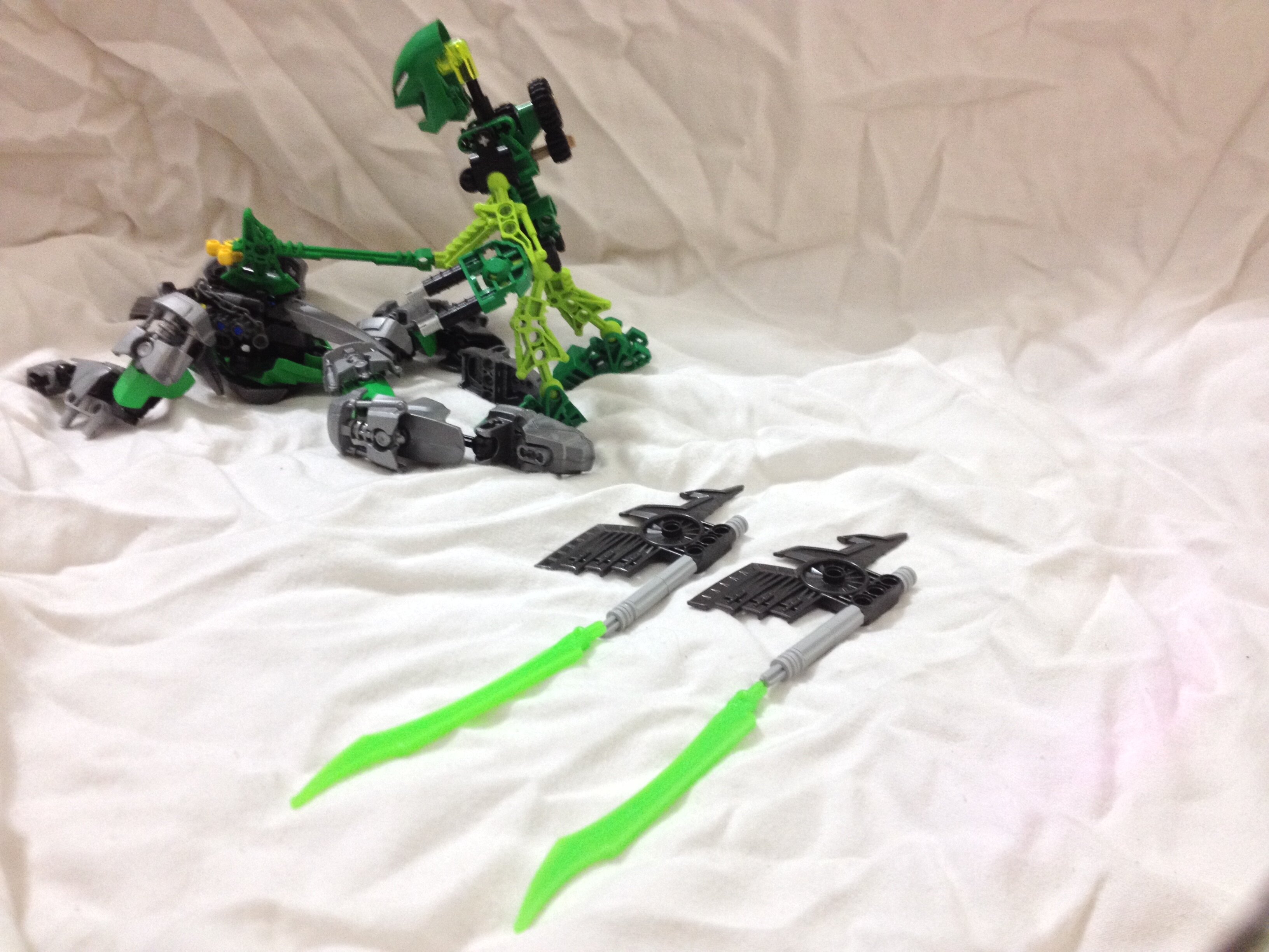
Just part 2 of my revamp thread thingy.
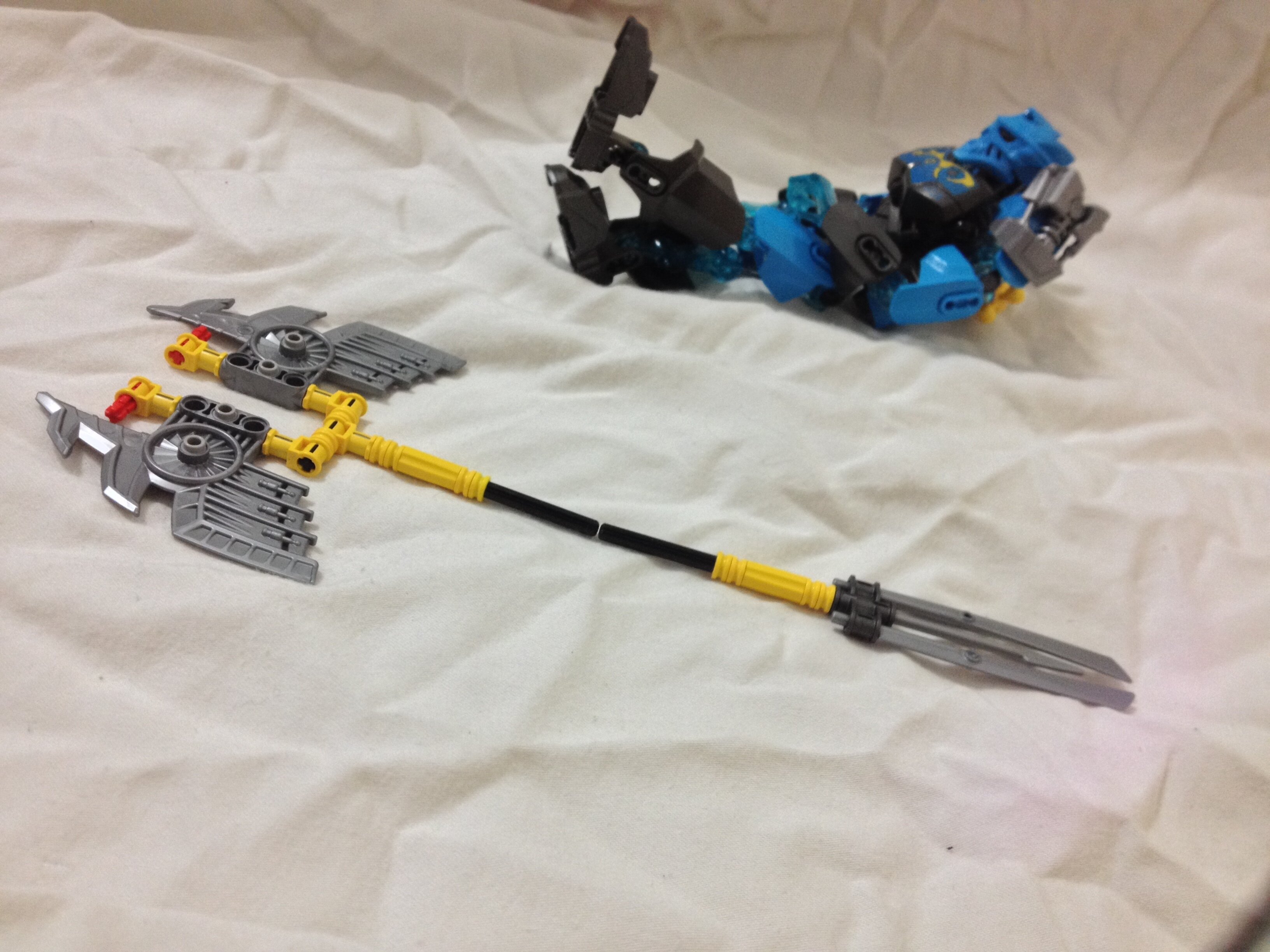
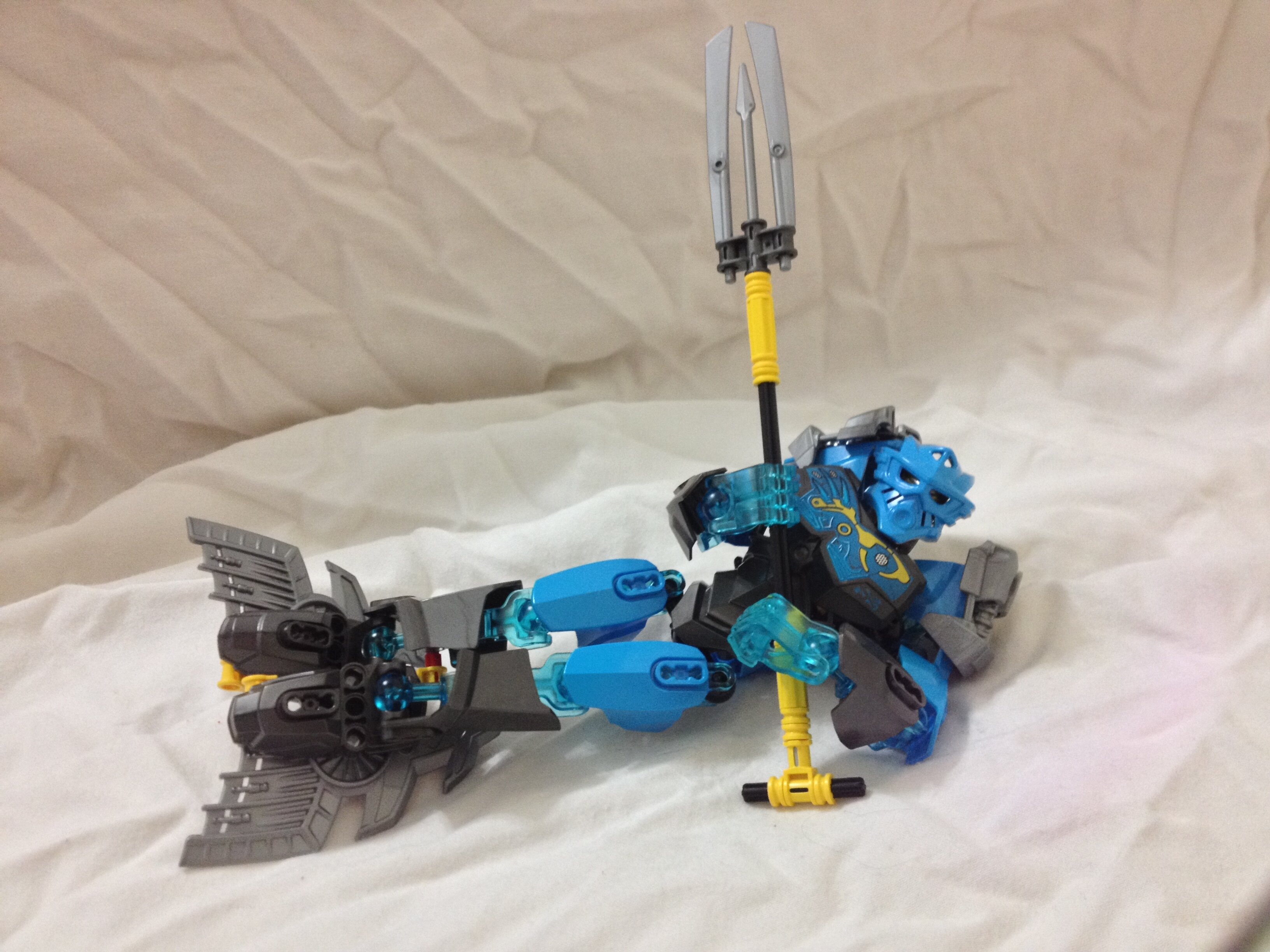
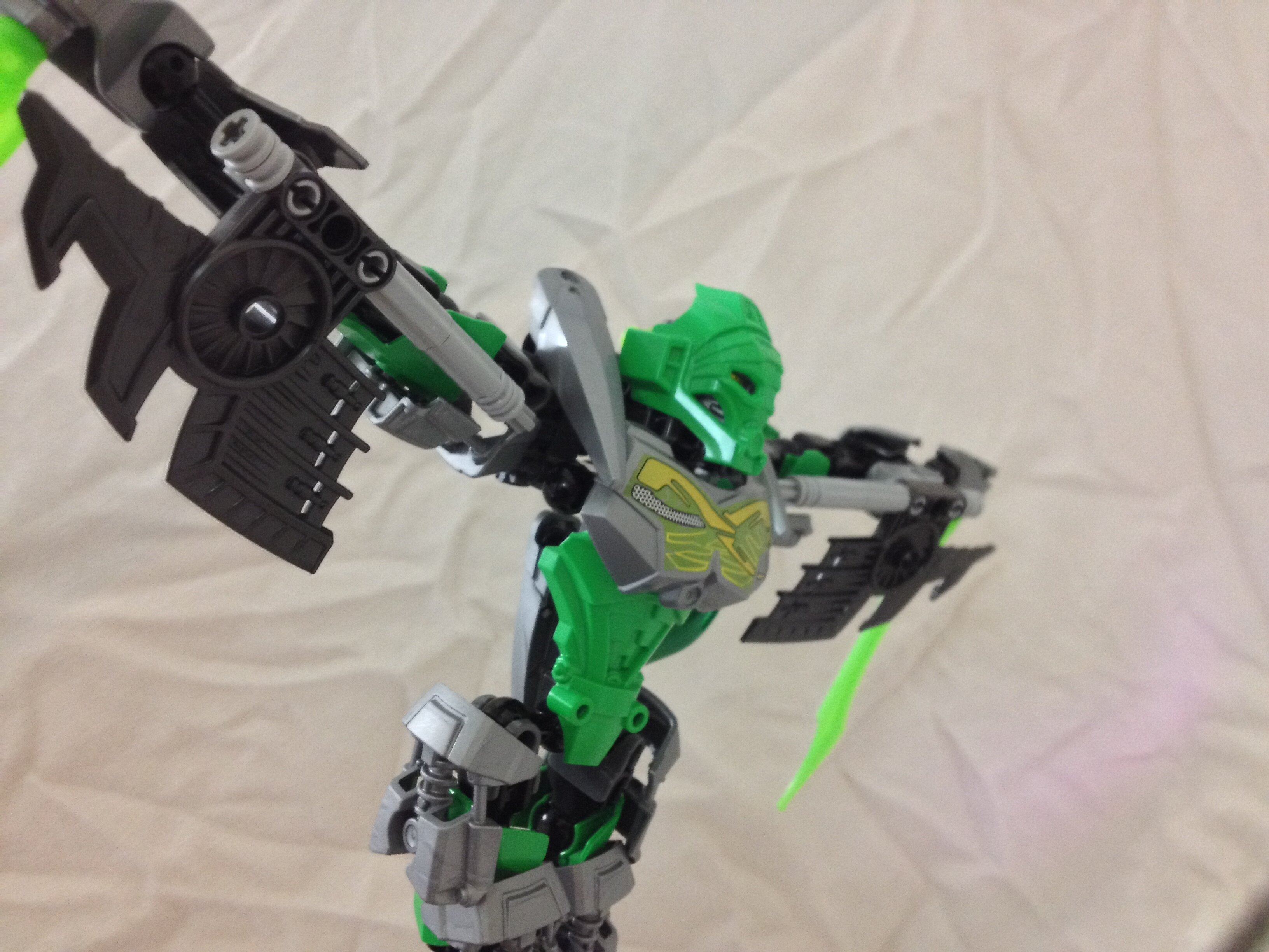
GALI, 500m BUTTERFLY STROKE CHAMPION
Not much of massive revamp of Gali, just removed unnecessary silver. Her original design is extremely solid. The only thing I wanted to really change was her arm bones to complete trans-blue to make her look like her arms were pulsating water.
Like all of the Toa, she carries her original Kanohi on her person. The Kaukau unfortunately does not share the light blue that Gen 2 has.

Her original trident had yellow on one side, which looked out of place in her secondary form.
Under the sea, this form you will see~
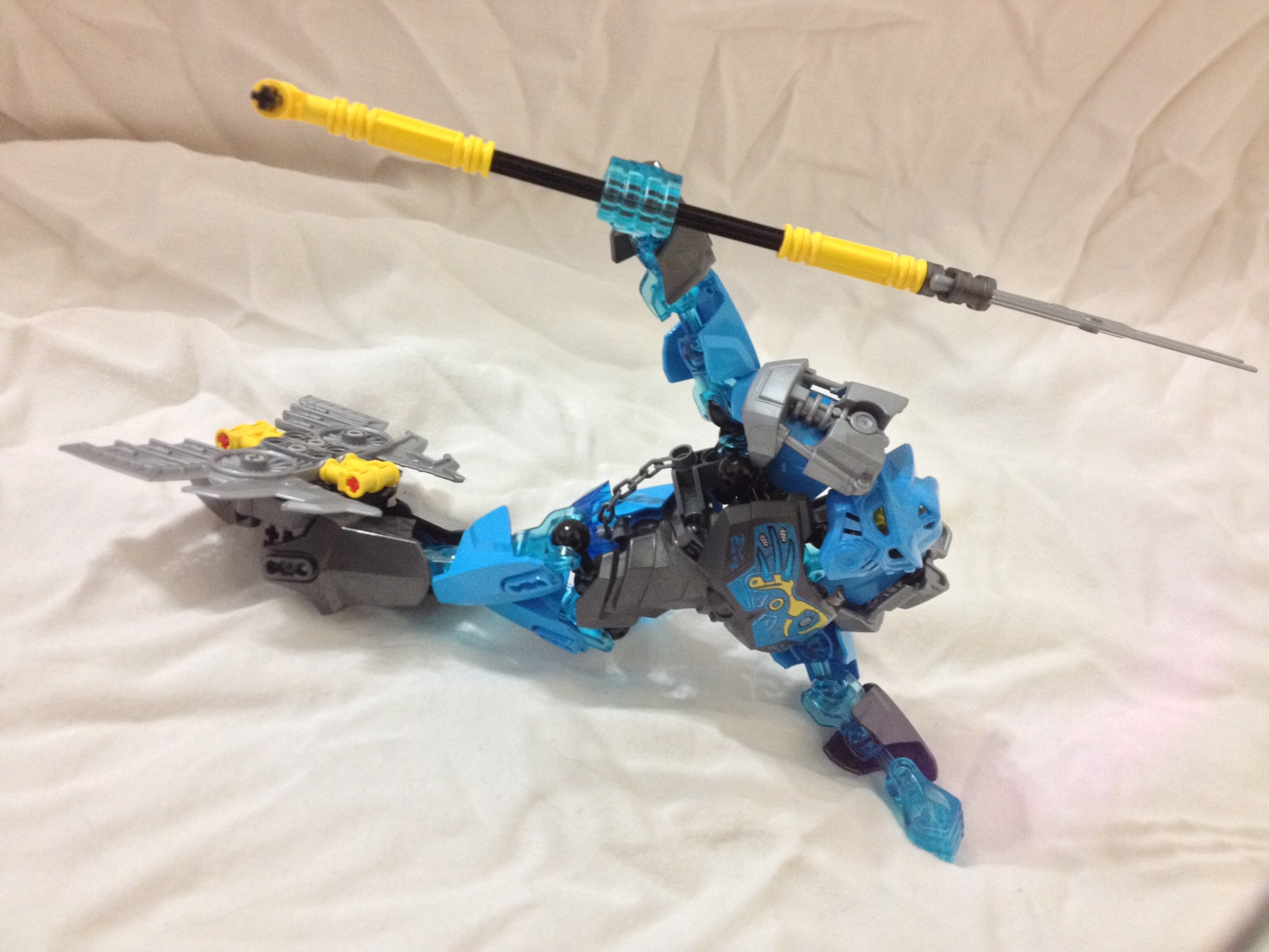
She realized that she is swimming on land.
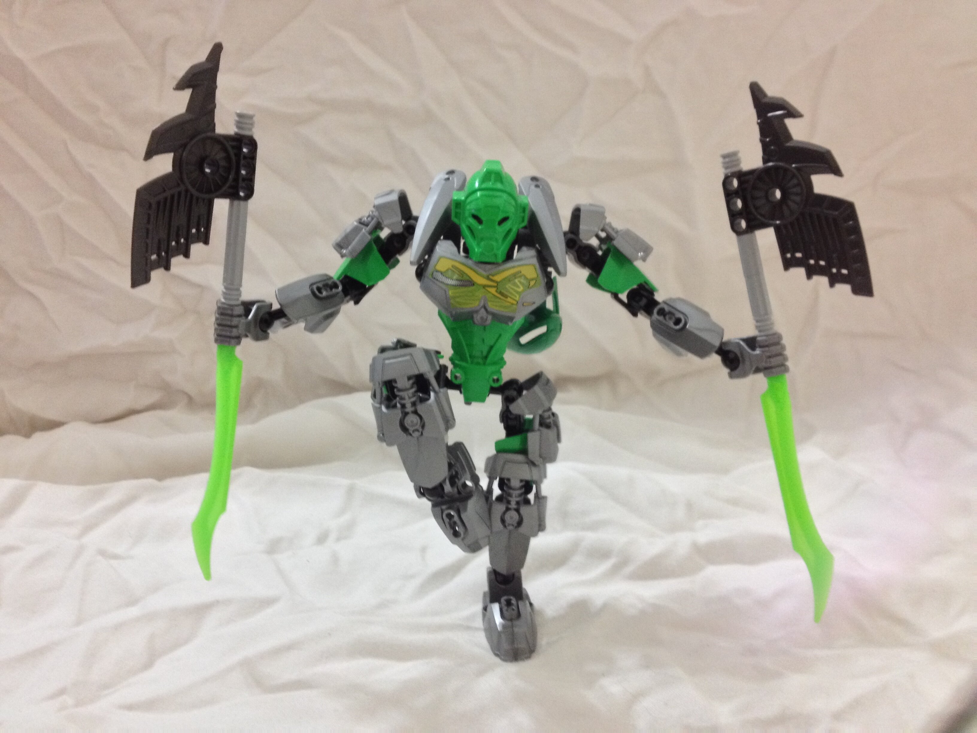
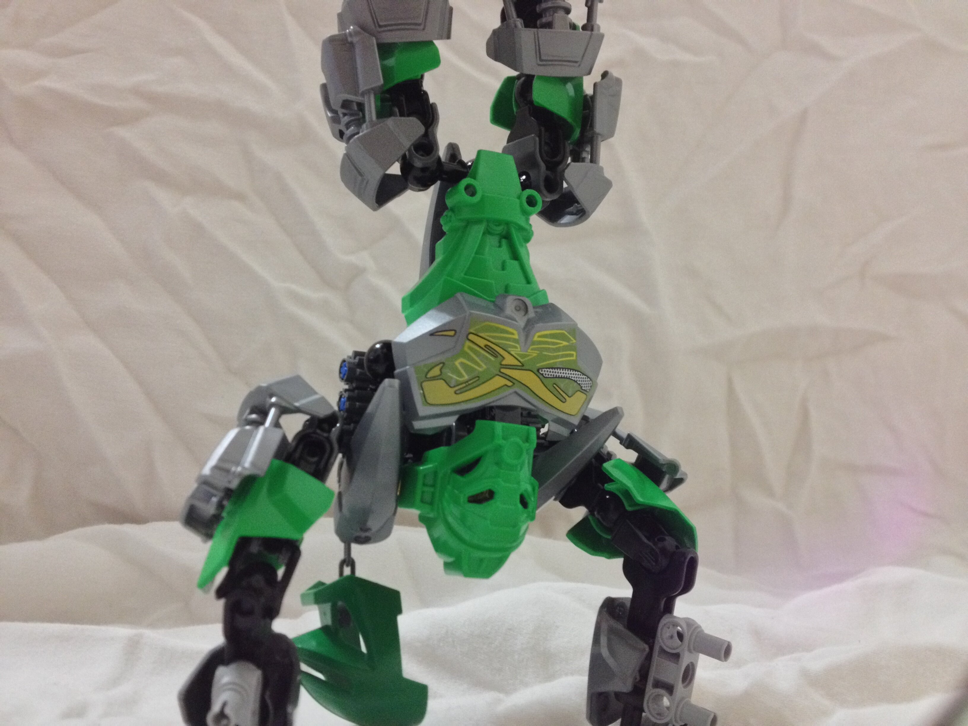
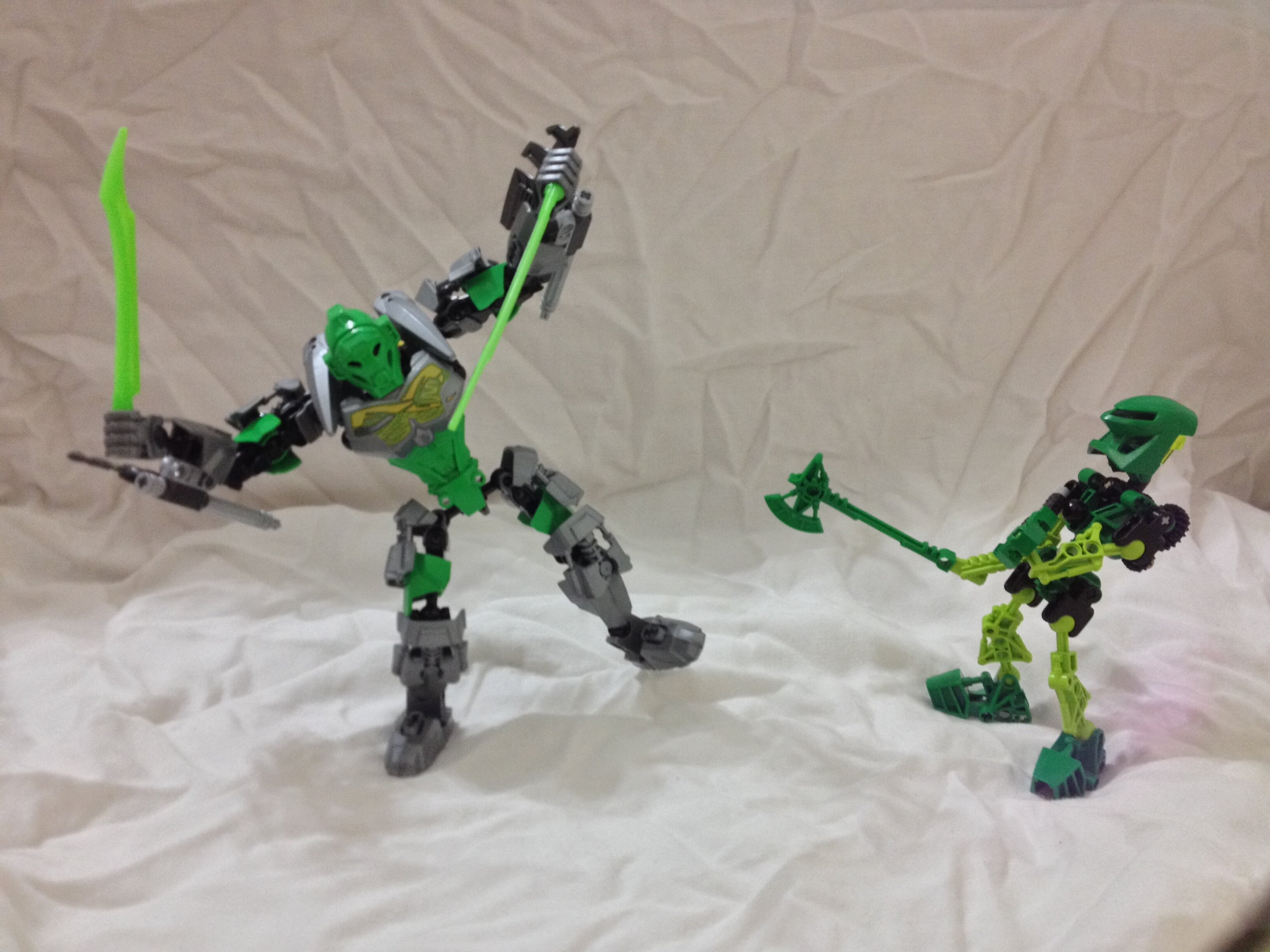
Lewa, Lean Not-So-Green Air-is-now-Jungle Machine
He is not the best I could come up with. His problem is the same as the Mistika, which had too much silver. However, I made the axe tops longer so he could actually swing it, which is a plus.
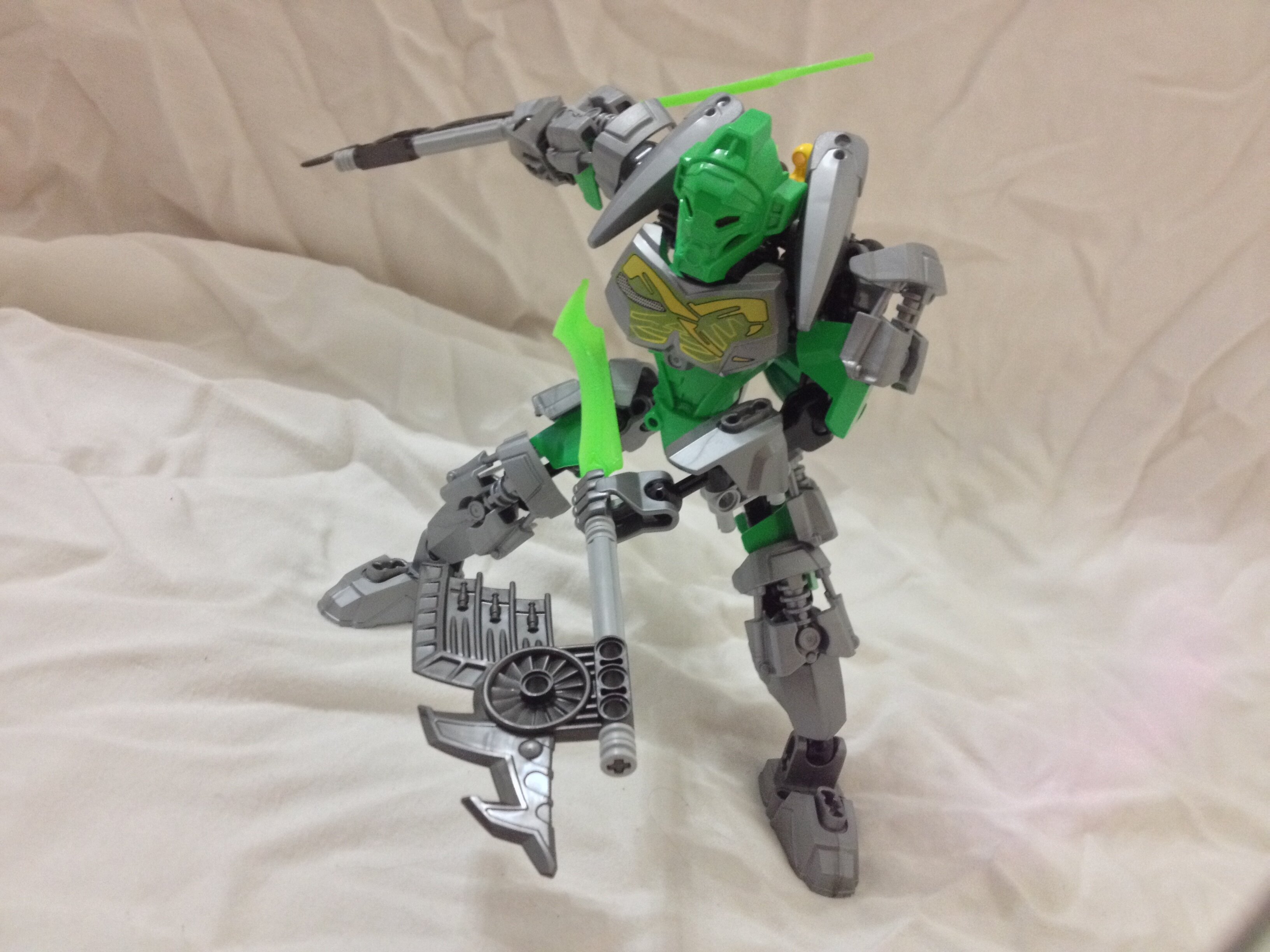
If the Hau didn’t exist, this Miru would probably be the main Kanohi.
His axes need a bit more flair after I removed the yellow, so trans-bright green seemed appropriate.
Wind-fly!
Handstand!
Two generations having a laugh.
Edited for unintentional triple-post -legomaster
5 Likes
I actually preferred the yellow on Lewa to all that silver.
The rest are really good though I can’t see much difference with Gali.
3 Likes