Alright.
First off, I’m going to be the fifth person to insist we get proof of your interactions with the LEGO designer you mention. If you cannot give evidence, I simply find myself obliged to disregard the notion entirely.
Either way, I doubt it’s anywhere in LEGO’s business plan to say they dislike somebody’s creation. That’s just outright bad for their image, and it wouldn’t hold up to LEGO’s standards.
Second…here we go.
Neruhi
He’s uh…well, EXACTLY the same as he was fourth months ago. So basically, in that four months, nothing was improved upon where it desperately needed to be.
The torso, first off, is a complete and total block. I seem to recall there is supposedly a swinging arm function, of which I can almost see some sort of workings, but without more than one picture (which was taken over four months ago, I’ll remind everybody), I can’t fully tell how functional it is or if it even exists.
The singular wing is a consistent flaw between all of the little guys. If this was a “parts limitation,” then I don’t understand how it got its way into a MOC you were trying to make as close to a real set as possible.
The open balljoints on the torso aren’t the worst on this guy, since they’re next to gunmetal which slightly masks them, but unfortunately looking at the rest of the roster, I doubt I’ll get to say that more than once.
On the bright side, his weapon looks rather cool for using just parts from the sets.
Hutea
Honestly, probably the best out of the little fellows. Still holds the same flaws inherent to the build, but I think that because this guy uses a big heavy weapon and has those boot-like legs, he works best with the torso build.
Unfortunately, of course, the torso remains a complete and total block, he still only has one wing, and the mask stands out…so…very…very painfully.
Ilaso
Copy and paste from the first two. He’s got a block for a torso, is missing a wing, and the mask stands out like…well, the ONLY spot of gold on a black, trans-light-blue, and silver character. Additionally, he’s got orange eyes…for, some reason or another. Which completely stand out and mess with his coloring even more. Still, I think the weapon worked out pretty well, although I’d rather have seen the transparent saw get used in some creative way rather than just the regular silver.
Salma
Yeah…I’ll be blunt, I think this is the worst of the six. The arms are painfully bare, he’s got the ever present box torso and half wing, the claws are way too big for his scale, and the weapon (a redeeming factor on the previous three) is just outright boring and uninspired. Even the legs feel awkward since the transparent armor does little to cover up the CCBS beneath it. The mask, of course, also stands out as usual here.
Muaka
Because uh…apparently he’s a cow. Or something. Names are hard.
I kinda like this guy a little bit for the same reason as the Earth one. He’s got the big weapon to match the brutish look, and his colors are pretty dynamic.
On the other hand, I can basically read the list of cons off without looking:
Blocky torso.
Only one wing.
Spindly arms.
Exposed balljoints.
Off-color mask.
And really, that’s all there is to this guy. He gets a couple bonus points because I see Entropy’s 2015 foot design in there and that makes me happy though.
Reatu
Copy paste here. The weapon could use a bit more bulk, and the mixed metallics are a bit weird. There’s no reason to explain the list all over again.
Alright…so, we see here that it’s a parts limitation…but here’s the better question: You refer to the creator as “the builder.” Are you simply referring to yourself in the third person, or did somebody else make them who you have not credited? Because I’m pretty sure the second one is way, way worse.
Moving on to the Toa.
Tahu
The best thing I’ve seen thus far, and yet what baffles me is how you used gold on all the masks for the little guys, and yet used silver on the masks for the Toa. It makes absolutely no sense from a color scheme standpoint.
On the bright side, aside from the transblue on the sword and the aforementioned silver mask, the color scheme is consistent enough and the design - although a basic CCBS build - is done pretty well. I actually quite like the thighs, since the layered armor part is simply so good at making stuff look fancier.
…however, the knees don’t help. They really mess with the aesthetic you had going. Just saying.
Kopaka
It’s a bit hard to tell much about this guy…but from what I can tell, the legs are one dimensional, there’s not really any consistency in the armoring, and the wings just kinda…sit there. They don’t look big enough for him to fly, but they’re not small enough for me to pass them off as just fancy armor spikes. To add…that’s not a flail. That’s a few links of chain and a flimsy claw impersonating something somewhat resembling a flail.
Also, the theme of shared cons continues as we see with the silver on his mask. It really stands out.
Onua
He’s…uh, lanky. Which is weird for Onua. But he’s super lanky.
Honestly I think that’s basically a death sentence here. He looks like a bizarre melding of Onua’s 2015/16 form, but like he’s been stretched out and flattened. Really hurts the Onua look.
Lewa
Just…swap the two gunmetal kneepads out and clean up the thighs, and I think this one could be legitimately pretty cool. The best one so far by a good margin - the silver on the head doesn’t even bother me since he’s actually got silver as a primary color. The only thing that really stands out here are those gunmetal bits, which are obviously an easy fix.
Pohatu
The best…followed by…what is this? I can kinda see where you were going with it, but the transblue has no place on a Toa of Stone, the cloth element just ends up looking awkward, and his colors remain painfully inconsistent. Even the armoring just isn’t up to part for CCBS styling - look at the knees, for example. What made you decide to leave the knees completely open, when there were at least three different ways of effectively covering it up and having it look way better?
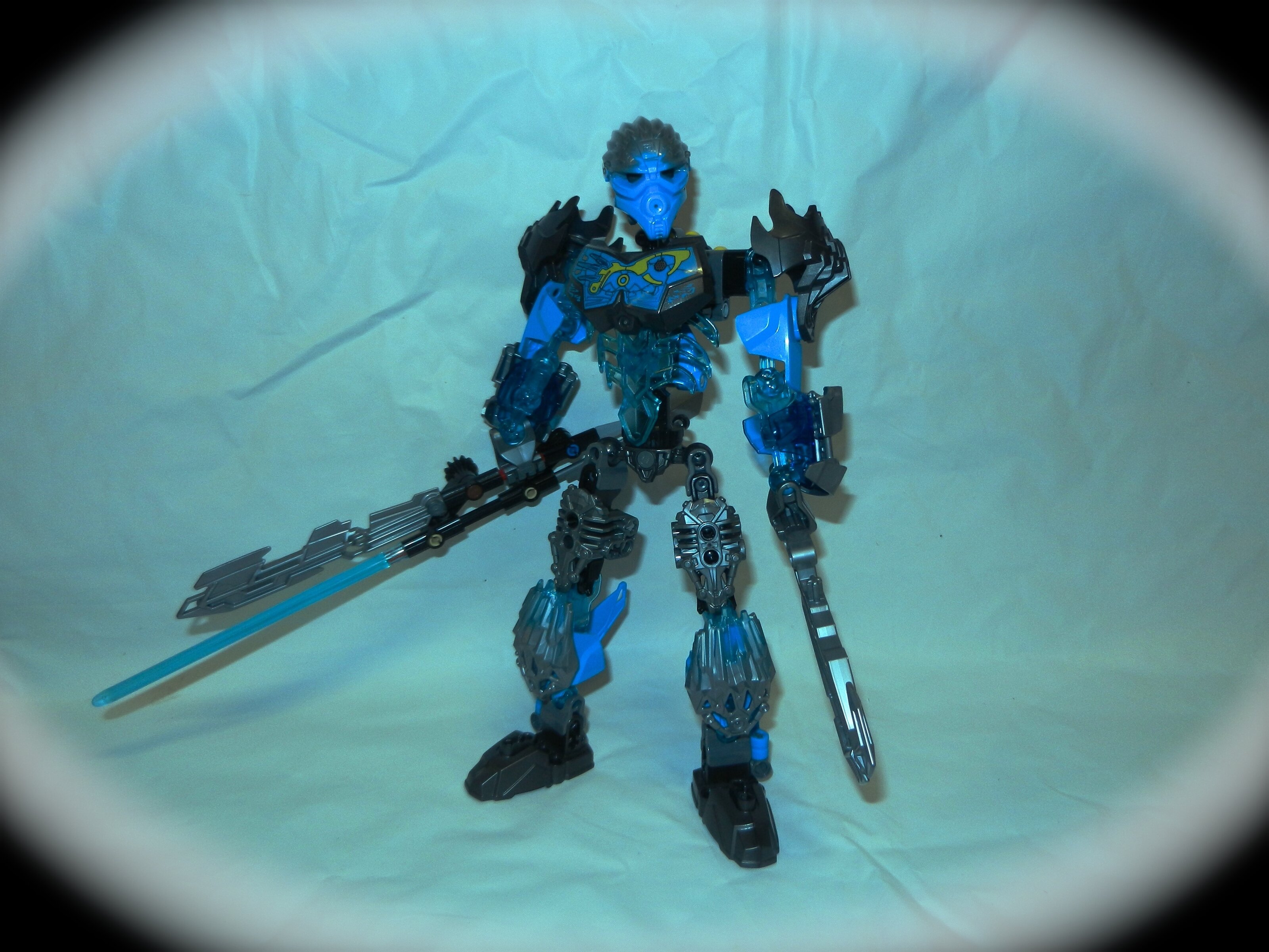
Gali
I believe it’s already been mentioned, but Gali is pretty generic. Fortunately for Gali, it works out…mostly.
Her coverage is pretty decent. Her weapons although boring, aren’t obnoxiously in the way, and the mask doesn’t stand out again due to the silver armoring elsewhere.
Unfortunately she’s got rock texturing, ribbing textures, whatever you wanna call the textures on the Skull armor pieces, and the piston armoring, as well as the comicbook textures on the chestpiece…which is about four primary textures too many. That conflict really messes up the end result of the character.
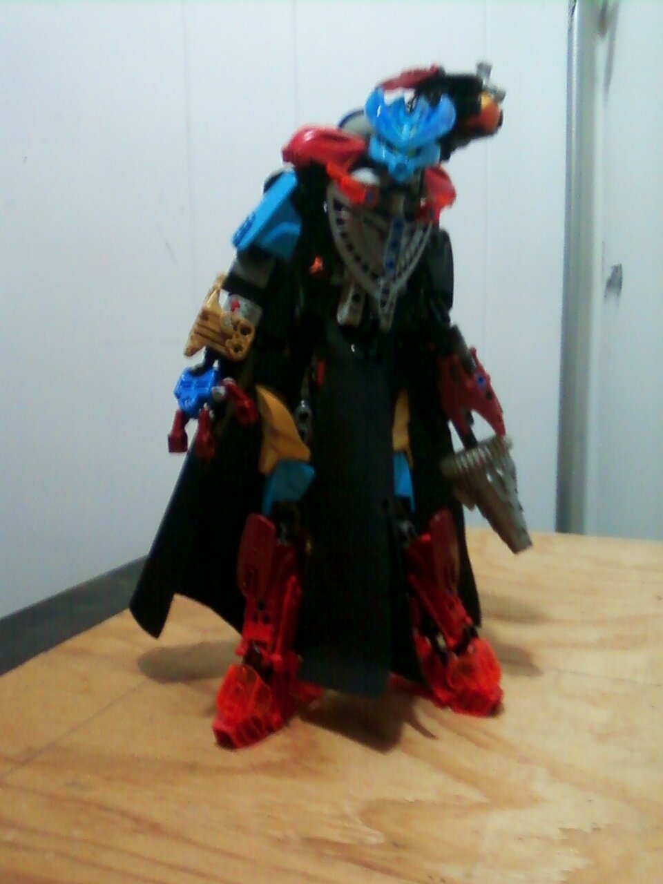
Karnarohk
Oh.
It’s Umarak the Destroyer.
That set I absolutely hated.
Y’know, I’d be providing way more critique on this, but it’s Umarak the Destroyer. And If I try to critique Umarak the Destroyer then I’ll be here for the next four hours and I’m uninterested in that.
The color scheme is eye catching, at the very least.
Ekimu
I hope we’re missing some part in the bio about how Ekimy shattered his knee and hobbled to the final battle with a backwards leg.
It’s tall. Spindly. Awkward. And gives little to no evocation of this hybrid element you’ve got him listed as. Otherwise, he’s basically just another Toa build…or in other words, just another CCBS build. Moving on.
Takanak
I can’t tell what I’m looking at.
The colors are all over the place. The armoring is all over the place. And most of it is just copy-pasted from real sets to begin with.
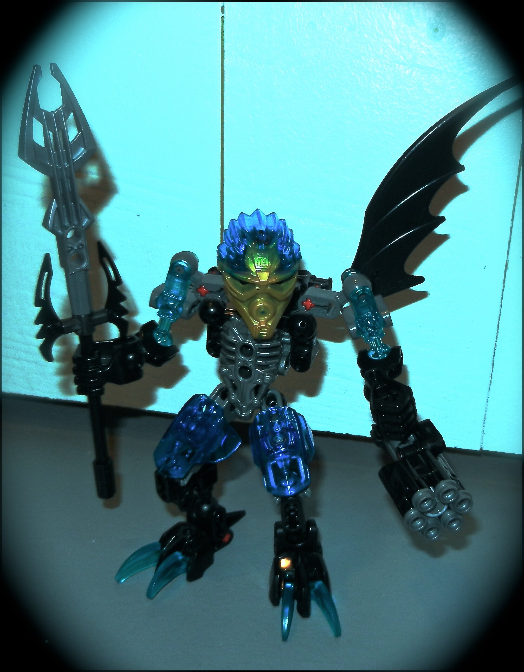
Grelnoc
He’s probably got one of the most eyecatching color schemes yet. But on the other hand, it’s Quake Beast with limb modifications and some horns.The base purple on the head also stands out a lot.
I quite like the heavy weapon he’s got going there, though. It really feels like what we’d have seen for a G2 Rahkshi staff. Probably the most accurate thing we’ve had to a continuation of G2 in the whole topic thus far.
Sliglak
First off that chain…needs to be dark grey. He’s already got multiple translucent colors, and the trans-orange chain is really messing with that.
Other than that, I spot Umarak the Hunter legs, generic CCBS thighs and arms, and a basic torso build with overall decent covering. Probably the best of the three Rahkshi, barring that harshly distracting trans-orange chain.
Makuta
Now this is the most accurate thing to a continuation of G2. Because it’s the regular JtO Makuta…with a few mods…in a slightly different color scheme Without trying to fix the glaring flaws or major issues that the original combiner.
I quite like the wings you’ve got going there, though. They’re not all that special, but at least in this light they almost look trans-purple which would have been so cool to see as an actual part.
Other than that…I got nothing. Not a basic CCBS build, but nothing I haven’t seen a dozen times over before already.
Lastly.
If you’re referring to negative feedback as insults, degrading commentary, or simply rude translation of critique, then I see what you mean.
But keep in mind that some people might understand “negative” feedback as also including constructive criticism. Which, trust me, ignoring critique hasn’t really ended well for anybody so far that I can recall - it’s just the nature of the beast when it comes to posting your content on an online medium where people are allowed free reign of their responses.
PREPOST EDIT:
Darnit @Sammythekat, now we have TWO massive posts stacked on top of one another.
