Stop using a G1 iPod to use the site
2 Likes
Wat. ![]()
Were you expecting this to say something?
2 Likes
jk, we fixed it
Hot Topics consists of weekly hot topics across the boards now.
4 Likes
Correction, just discovered a way to display all categories! Any topic can now be featured on the front page providing it gets a large amount of likes/posts.
Sigh Kahi.
5 Likes
360 no scope clutch snipe
ps: love the new style. It’s so awesome. Thumbs up for us taking one afternoon to figure out Hot Topics as opposed to like four years.
4 Likes
I’m not a fan of the new look, though the new topic button in the lower right corner is cool.
The site is looking pretty legit. 
I don’t like the line at the side as it makes it more difficult to see profile pics. The hot topic bar doesn’t show up for me- is that because I am doing this on my tablet?
EDIT: reloaded site- it’s there now
Could I suggest making the user icons a bit more bigger ?
There’s a lot of unused space on that side.
So looked around and found the main things people are having issues with in the new layout - these might be things to improve on or fix;
Topic Suggestions;
http://i.imgur.com/MCofBeK.png
Topic suggestions are not really needed at the top of the main page. given we have suggested topics at the bottom of each topic. I’ve had little-to-no interactions with the suggested topics either, so not sure why some are being suggested. Other ‘Hot topics’ feel like they shouldn’t really be focused because of their nature as troll topics, fun to mess-around with, but not really something that should be thrown in a member’s face when they log in ![]()
They are also incorrectly labelled saying they were updated years ago. It also appears to be scrolling, yet there is no option to scroll back. So if you notice a topic you are interested in, chances are you’ll miss it as it’ll scroll before you click it.
There is also the idea that it may reveal spoilers for people who don’t want to see them when suggesting topics about varying things - such as Ninjago or other TV shows/films which sometimes have a spoiler-filled image inserted in the opening post on the topic. (Seen this happen with the Ninjago realms topic)
A a similar ‘text-based’ suggested topic, to what is currently shown at the bottom of pages would fix this issue and take-up less space.
Making the ‘hot topics’ shown be the starred topics which have been starred by staff would fix most the issues with them - user topics would still be suggested at the bottom of topics.
Profile pic sizes;
http://i.imgur.com/yaB60SX.png
Sizes of the profile pics have changed again, resulting in the issue mentioned by ‘The_Owl’ where its difficult to see the profile pictures. I think its also trimmed a few images resulting in the above image of ‘Kah’ and the unreadable ‘Cast & Crew’
Pictures and videos posted compared to text;
http://i.imgur.com/UwX7Sqn.png
As shown and probably demonstrated here, pictures and videos posted come out as massive taking up the entire space of the comment while text fills barely a corner of a massively long comment box and seems squished sometimes in the previews and when posting.
Pictures not posting;
Sometimes imgur links will not post the image despite it working in the previews.
=====
Personally, could get used to the layout other than the annoying, scrolling ‘hot topic’ bar that will forever be known as ‘Steve’
4 Likes
oh thank god I’m not the only one
3 Likes
GET YO HANDS OFF MY BUG >:U
I named it bugger and it’s mine >:L
THE BUGGER IS MIIINE
3 Likes
would you say he’s your
https://amandasnoseinabook.files.wordpress.com/2014/09/myprecious.gif
2 Likes
the comments, why have them pop out of the background?
actually, that probably wouldn’t bother me as much if the outline went around the users avatar as well.
also, if I may ask, why the random grey line on the left? it obscures the time-stamp of the posts.
and the new topic button doesn’t need to be that big.
honestly, the whole site feels more like something designed for tablet now.
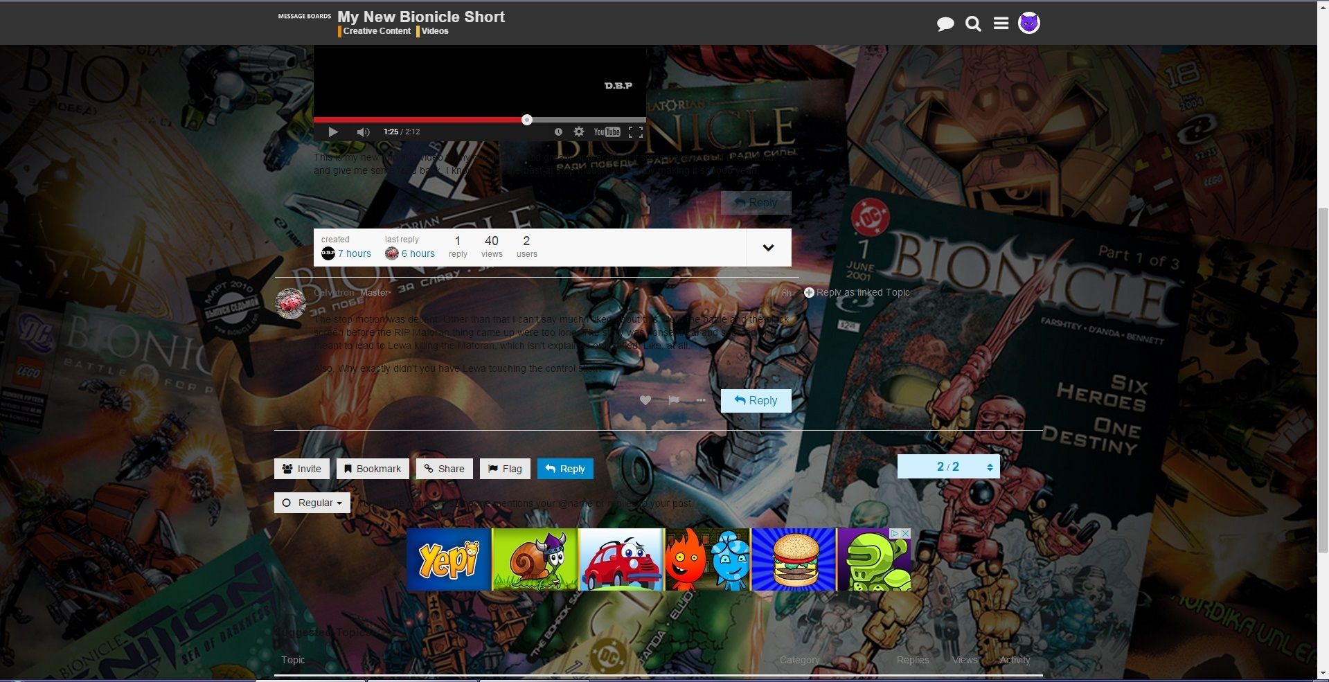
The replies now have boxes which makes it even easier to distinguish posts from one another and not blend into the background. This is a great update.
Steve is, as Scar mentioned, pretty pointless. I don’t see the point having him around when there’s the box down below doing its job.
The big Youtube videos scare me and take up space. They were already embedded well enough as you were able to switch the video to fullscreen on the spot. Have the videos be as wide as images.
The location is also a weird decision. The previous button was in a good and easy spot and didn’t clash with the style of the site. The new one sticks out like a sore thumb.
On another note, I found one bug: the ad on top moves to the side as I move to the board’s main page from the ‘Message Boards’ link next to the topic title.
http://puu.sh/jhhQ5/dc9d2da7e5.jpg
Not a big deal, but it’s an odd one nonetheless as it hasn’t appeared in any other instance.
3 Likes
At first it was a bit confusing,but it actually looks pretty great.
Also since the time the post was posted isn’t there anymore,necroposting isn’t against the rules,now?
/s
Personally I’m not a fan of how the boards look.
2 Likes