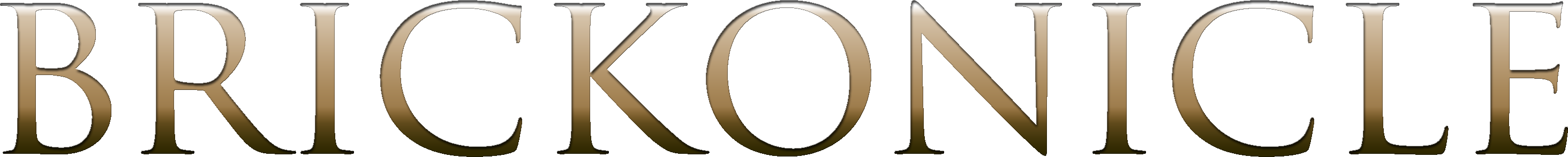
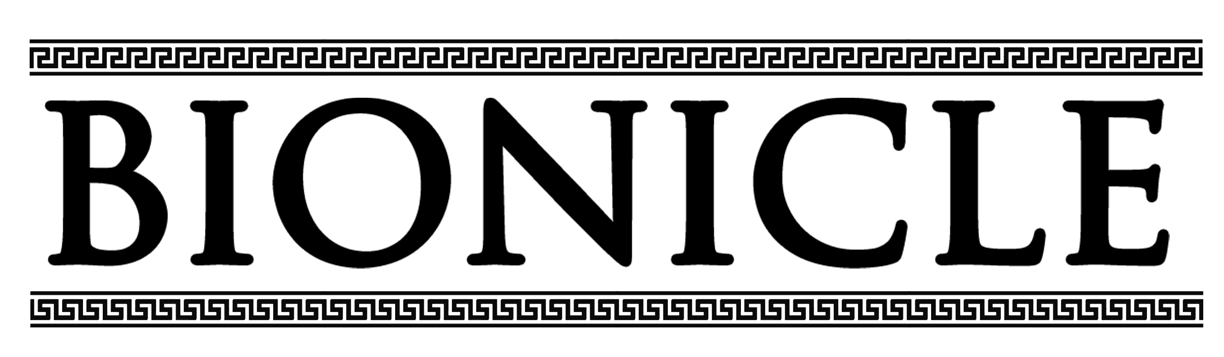
Brickonicle Logo [Not Official]


just checking this new font I just got, I made this because someone said on @joshuad17 's poster “it only needs a logo”
so here we are


as I said, poster was made by joshuad17, go check his topic, he made a fantastic job

I made the logo in under 5 minutes DONT JUDGE ME!

24 Likes

Looks good

I like it! Maybe needs a background, but honestly it holds up well on its own either way!

I like it. The logo really does make it look less like fan art and more like a poster.

“Well, that was easy”

Wouldn’t it just be called bionicle

1 Like

then we should just take the g2 logo and use it,

1 Like

I think that if this thing would ever be cannon it will be named Bionicle…

1 Like

but the thing is; it’s not canon

1 Like

G1 and g2 use different logo’s, why wouldn’t g3?

1 Like

how would you it?
G1 - Skinny font
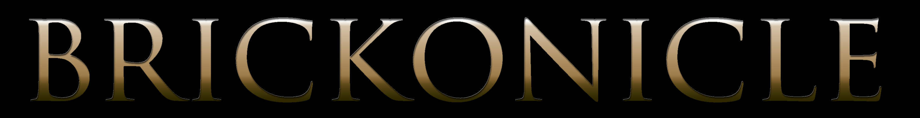
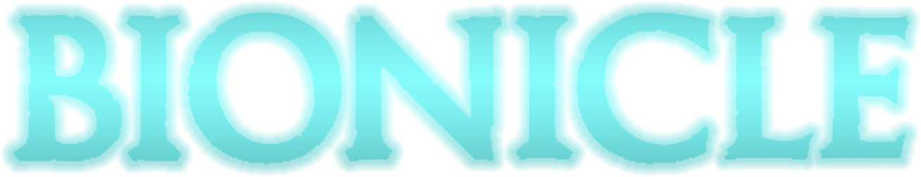
G2 - Thicc font, energy leaks, some written things
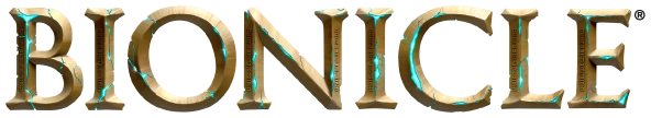
G3 - Thiccest, full of energy, some written things in new language (?)


1 Like

I’d go in a different direction, modify the font, change things up a little.

The g2 logo reflected the central America inspiration for the line, g3 takes inspiration from Greek and Norse mythologies among other things, I’d take inspiration from there.

alright, I’ll try a new font, but would you go for the golden look like g1, the corrupted look of g2, or what

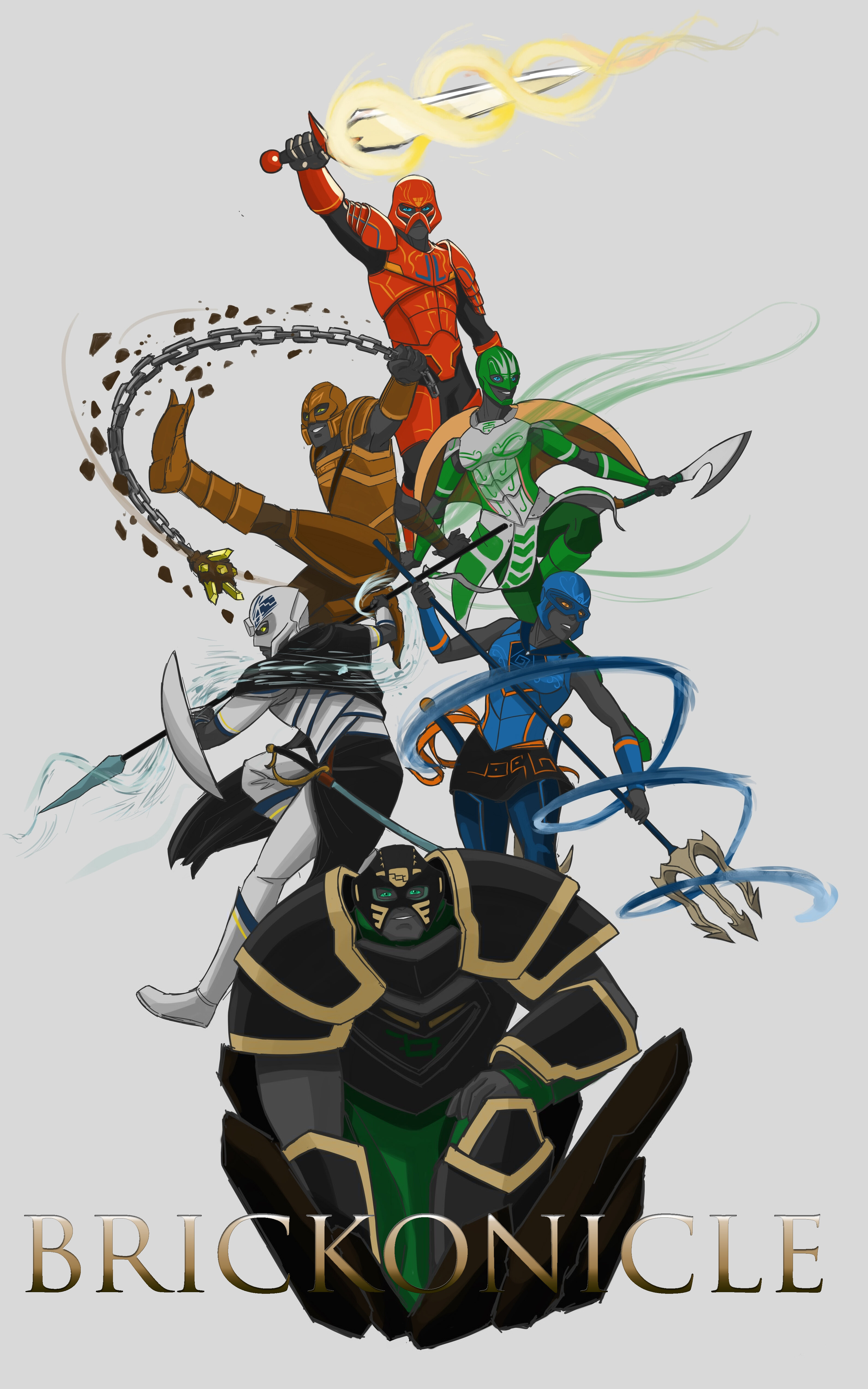
Neither, perhaps it being an engraving would work, like I said, Greek and Norse. Perhaps it being an engraved tablet with Norse patterns in the lettering and a more Greek border across the top and bottom?
Honestly I’m not sure modifying the font is entirely necessary now that I think it through.

2 Likes

how about…

WIP!

1 Like

Perfect.

or maybe the top line could be facing the other way

1 Like

This but with greek chiseling

THIs but make it shiny and metallic