Lord knows I wish I had a few dozen of these
6 Likes
Here’s a new hips/pelvis part I’ve made recently in BL-part designer:

I’m still not 100% sure about using it on the “canister” (Toa) sets because it is a bit harder than expected to connect it to the upper body section, but it probably would get used as a body frame on the Villager/Matoran-sized sets.
What do you guys think about this one?
6 Likes
Here is a first look at the latest design of my Technic armor-shell part:
It’s a bit simpler than what I’ve had in mind for the og design, but I think, this way, it will be more versatile.
I hope you like it, though!

7 Likes
During the week, I made two variations of the first almost complete prototype model, using BL-Part Designer and Blender, respectively.
The limbs are still missing the additional covering/decoration parts, but I plan to place them on the legs and arms in the next two or three days.
The two builds are mostly identical, but the 2nd one uses a modified version of the 2015 G2 gearbox piece, while the first uses a modular custom-built one. (The second also utilizes the well-known knob gears.)
I originally wanted to make the chest armor from existing curved Technic panels, but unfortunately, I couldn’t find a way to manage that.
I’m still struggling to make a good-looking solution for covering the chest area, but until then, it will remain like that.
Hopefully, this prototype will serve as a good enough foundation/basis for better-looking set ideas in the future, but as of now, it’s just a demonstration of what I’d like a Gen3 to look like.


6 Likes
I actually love it…
Crazy how this predated the GWP set by years.
5 Likes
I favor your custom torso, the fine tooth gears carry the nostalgia of G1 for me
3 Likes
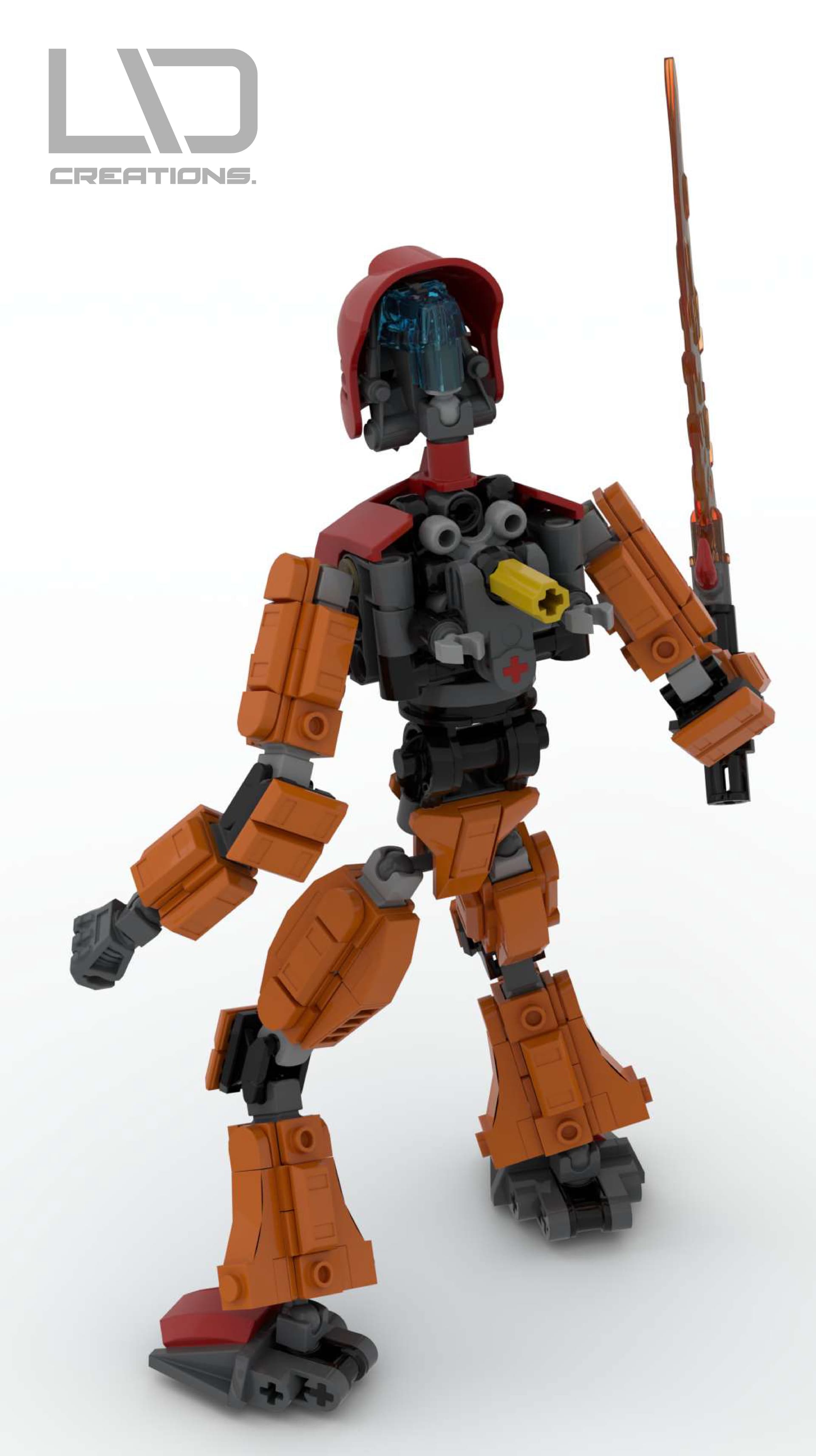
Today, I’ve finally finished up my Tahu prototype in Part-Designer.
It’s far from perfect, but as an early attempt at fusing System with Technic and showcasing how an ideal G3 would look like, I think it looks neat!
I hope you like it as well! 


9 Likes
I recently had an idea that might give my story a new and exciting setting.
In the early years of G1 and throughout G2, the setting for the plot was a tropical island divided into six distinct areas (Mata Nui & Okoto)
I started wondering, what if an official G3 had a departure from this type of location?
Many ideas came and went, but none of which felt like something I could say, “This is it! That’s the one!”
Then, the weekend before last week, I was hiking a nature trail in a karst spring-fed wetland.
After the trip, my brain cogs started working, and one thought followed another.
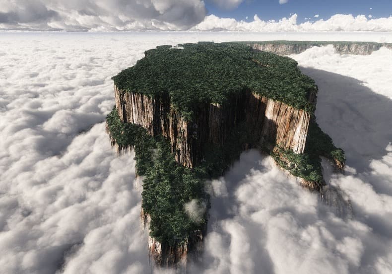
Suddenly, I remembered the so-called Tepui, the table-top mountains of South America, which from above look like floating islands rising from the clouds.
So, I envisioned a place similar to the Tepui’s but much larger and more expansive, and like the island of Mata Nui, or Okoto, would have the usual six regions.
A “floating” island that looks and feels like a regular continent.
How do you like this idea?
How well do you think it would work in an official theme story?
(P.S. The picture below is only for reference:)
5 Likes
Intriguing
3 Likes
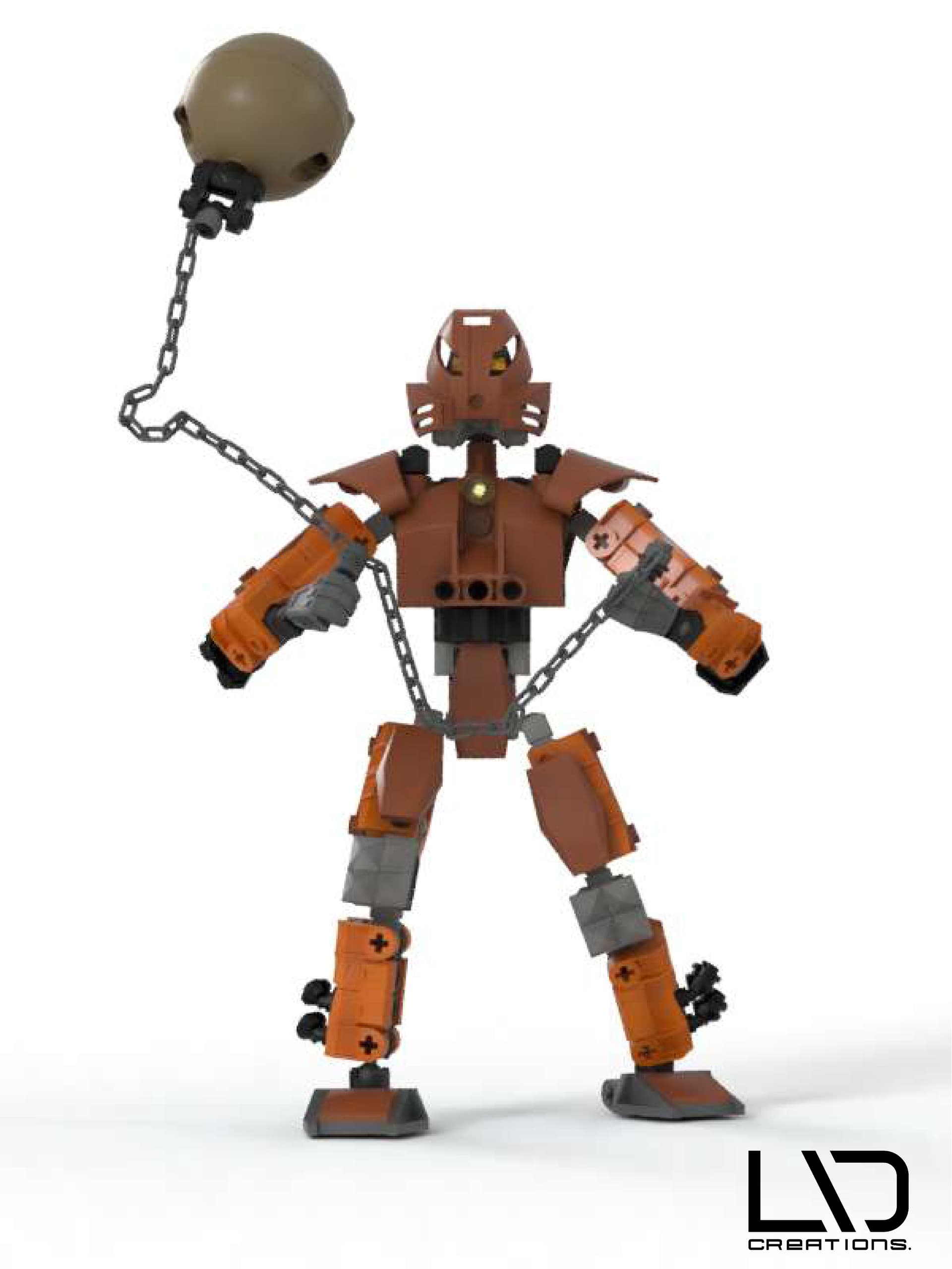
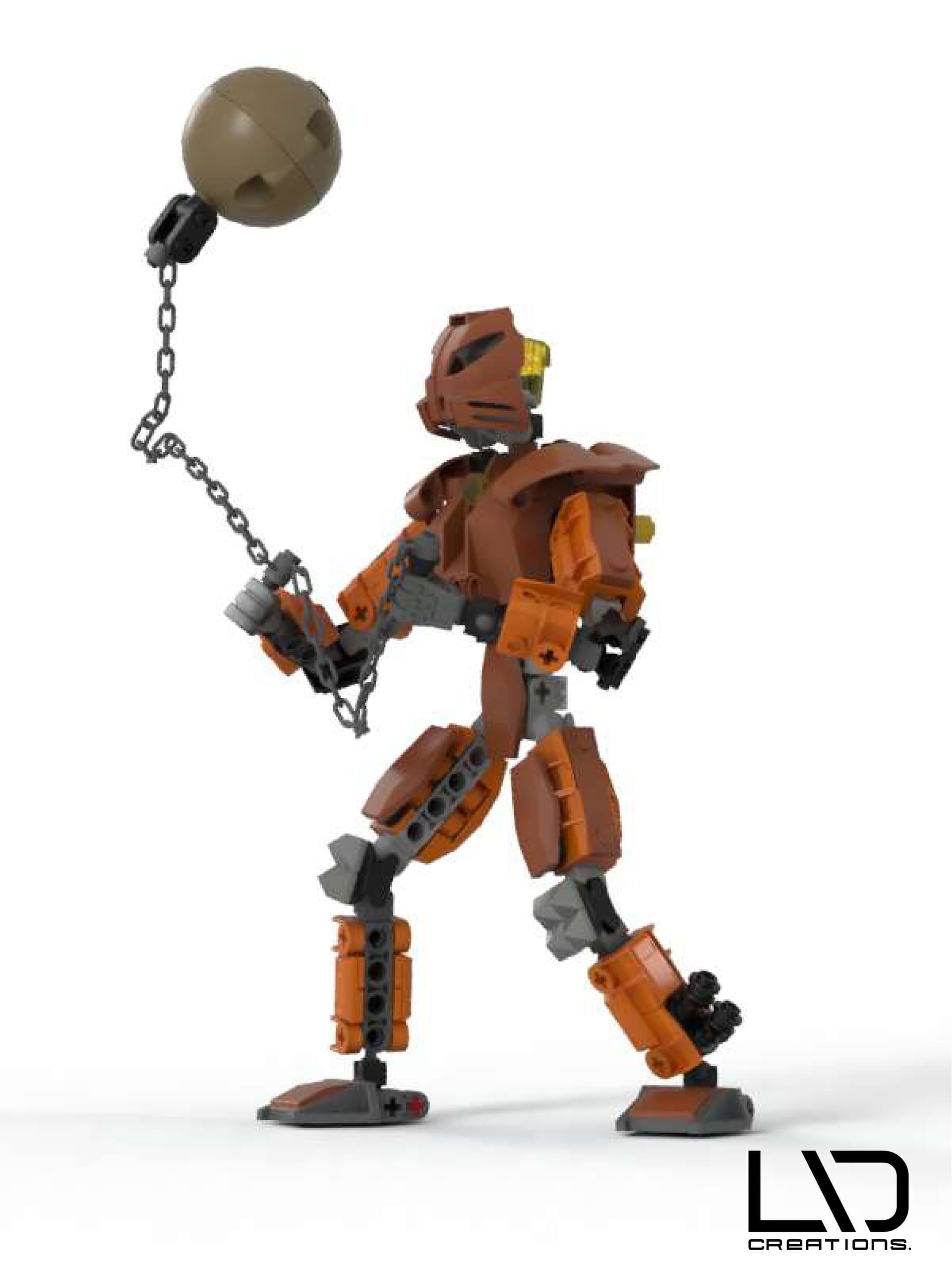
A few hours ago, I managed to finish my latest attempt at visualizing the concept of my Gen-3 sets, this time by creating this early version of Pohatu in my vision:

It took me a while to figure out what kind of “Tool” He should use as a character.
I had several ideas, but none felt or looked good enough inside my head.
Then, out of nowhere, the realization hit me that in his Mata form, He had a boulder to kick around.
Then, I remembered that his Uniter set also featured that specific Boulder with a chain that connected it to the end of his crystal spear as a callback/reference to his 2001 self.
So, I’ve decided to reunite him with his “Old, trusty Boulder” but with more up-to-date parts.
I originally intended to make his wrecking ball on that chain a bit smaller, but BL-Studio’s part catalog didn’t have the ones I needed, which forced me to use these recently introduced new half-dome parts.
Looking at it now, It seems pretty cool, but the set probably couldn’t swing its arms in real life due to the ball’s weight.
How do you like it?
What should I improve on this model? 
9 Likes
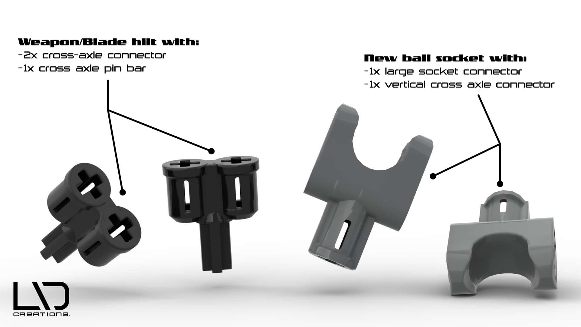
Today’s creations:
I’m trying to widen the collection of my custom part designs while also upgrading/improving some of them to look more professional in language.
These two had been in my head for a long time, but I didn’t know how to make them properly due to BL’s Part-designer being such a frustratingly limited in-use program. (right now, that’s the only 3D software I can use without struggling too much.)
The “hand”-ball socket joint, with the vertical cross axle connector, was something I always felt Lego should have brought back, as it was an ultra-versatile piece proven by all the Mocs made with it over the years.
I wanted to update it for today’s design standards while parallelly improving it by using the more up-to-date Cross axle connector on top.
It’s part of my creative philosophy in general:
To successfully reinterpret an old creation with a new take or spin, you must first analyze what still works and what doesn’t.
In short, fix what’s broken and add only some supplements to what is not.
Anyway.
The “hilt” part, as I like to call it, is a design I’ve intended for swords to have an option for two blade elements placed side by side (either two identical or two divergent sides.) but to have less space between them.
I was inspired by the piece featured in HF’s Brain Attack, which had a similar function but had a center section with 2x vertical axis connectors.
I wanted something with a similar function but without that middle section leaving a gap.
That’s about for today, I hope you like them!
6 Likes
Today, I made a small but significant adjustment to the version of my take on the hand connector with the vertical axle connector, I posted yesterday.
Here, I’ve made a little comparison between the new and the old variant, to demonstrate the changes:

5 Likes
That weapon hilt piece would be a fantastic new part, I’ve always wanted more grid-offset connector blocks
5 Likes
Ok, this will probably make me sound like a broken record at this point, but it is a very important aspect of my Gen3 that determines the further development of my project.
As I’ve expressed and shown previously, I tried to make my set designs at least 70-80% Technic-system based.
However, I recently realized that it’s pretty unrealistic to pitch something like this to Lego and even more unrealistic to expect them to approve it.
The TLG we know today is a very different company from what it once was around in the early to even mid-2000s.
Long story short:
In this day and age, when lines like Technic are primarily focused on selling medium and large-scale licensed models of IRL cars and vehicles instead of creating strange-looking, abstract, bio-mechanical creatures & beings with some action-centric functions, approving a project like mine is out of the question.
Not to mention that the amount of new & specialized molds a true “return to the roots” style gen3 would require to satisfy its core audience makes it even less viable than it already is.
Trust me, a Technic-based G3 would be spectacular or even incredible, but, as the example above shows, it cannot be made today.
So, from now on, I will design my sets within the regular brick System with Technic-compatible functions, maybe adding a handful of Technic panels onto them for decoration purposes.
That’s all for now. 
4 Likes
The project is a wonderful idea you have. Also the artwork of the Toa you made is really top-notch. Love the take on the three virtues symbol. Please make more.
4 Likes
Thank you for these kind words!
Do not worry!
The project will continue, but I’ve decided to wait to post the next creation until I have finished it properly.
There will be more on the way during the month!

6 Likes
Unfortunately, I still can’t show you anything new because my next works are still in progress, but here is an older drawing that I found a few days ago in one of my folders, which gave me a new dose of inspiration:
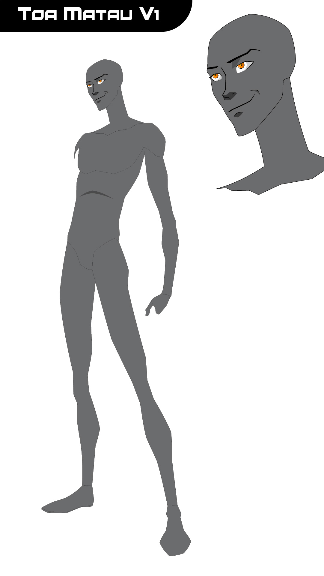
This was made around late 2021 when I was in a phase where I wanted the Toa Metru to be the main characters in my story.
Around that time, I was really into DC’s animated universe films, like Son of Batman, Justice League: War, and the hit series Young Justice.
All of them had one thing in common, they were animated by one of my favorite animators: Phil Bourassa
For me, Phil’s art style feels both intriguing and fresh compared to other animation styles, because it gives the impression of mixing anime-ish Eastern aesthetics with the more stylized and abstract Western art styles.
His character designs also feel very dynamic yet very expressive.
It is an in-book example of the phrase “the best of both worlds” in animation and drawing.
So I made this vector drawing in Illustrator back that year, drawing Toa Matau in Bourassa’s art style. (Or, at least, tried to depict him in his style.)
As you can see, it’s far from finished, for various reasons, but looking back on it, I think I captured Bourassa’s style with Matau’s face a bit. (I did use some references while I made it.)
However, when I found this abandoned illustration, I realized that this art style could suit a hypothetical Bionicle show quite well.
(If it’s made in 2D, but if it’s 3D/CGI well, that would be a whole other story then…)
So, I’ve decided to return to make my characters in Bourassa’s art style from now on.
I will try to post something relatively new next week, but until then, this is it for now.
Stay tuned! 
4 Likes
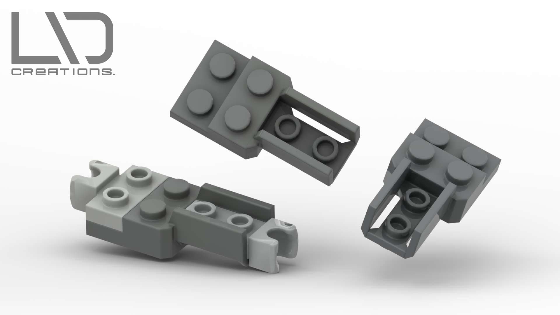
I recently made these renders about my newest design, which is still in development but looks promising.
This part is a “limb-base plate” (As I like to call it) heavily inspired by those similar-looking elements that mostly appear in lines like City or Speed Champions as chassis for cars.
I wanted to make it as structurally stable as possible while giving it a design that is somewhat reminiscent of the proportions of a human limb and has a good range of versatility for customization.
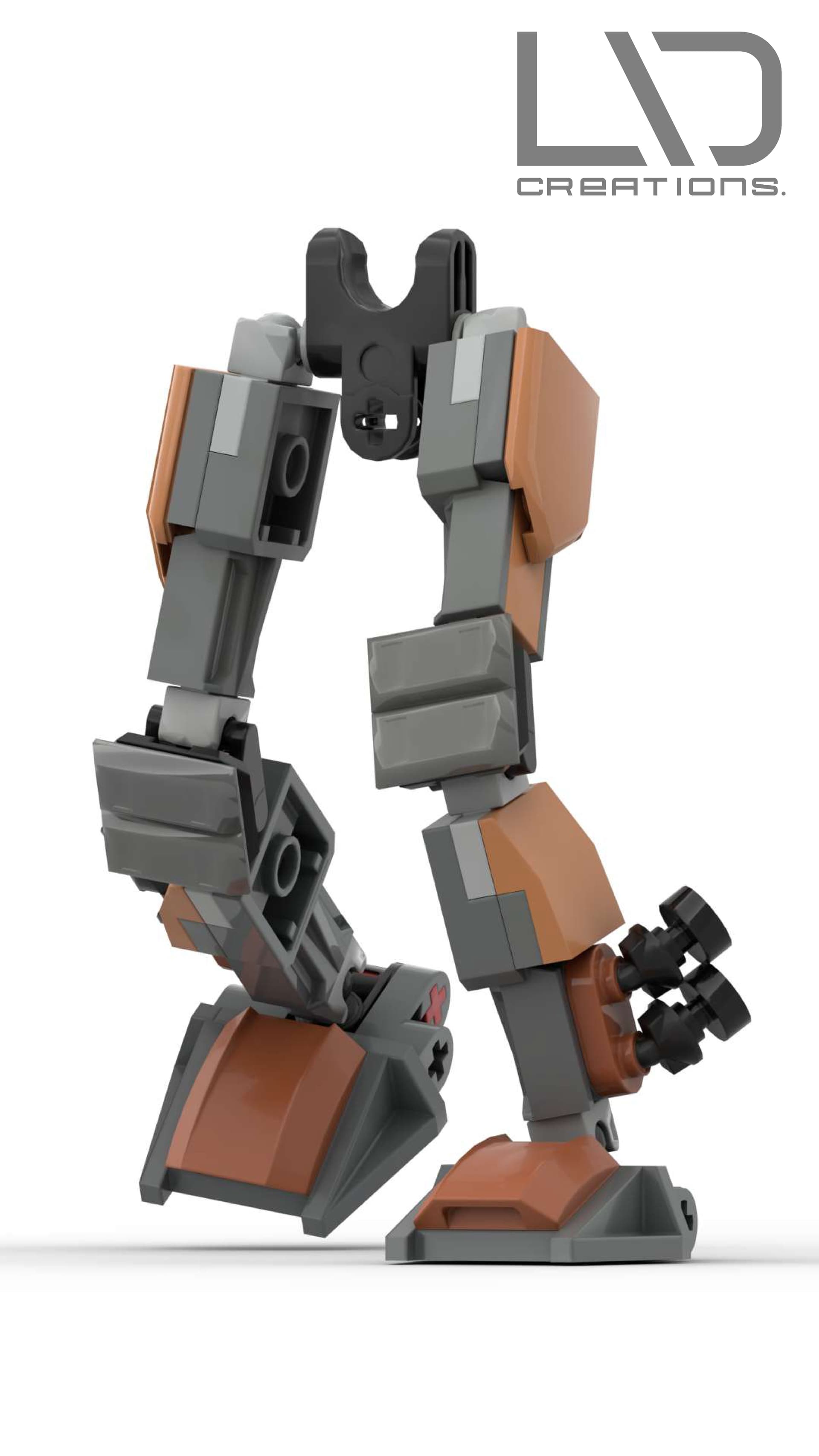
I’ve also made this little test to see how it would function and look in an actual build.
So far, it looks decent, but I will try to refine it even more later on.
Anyway, that’s it for today!
More will come next month!
8 Likes
The second logo is better than the first.
1 Like
Thanks for the feedback!
Yeah, I also prefer the second version over the first, although I consider both to be outdated at this point.
3 Likes