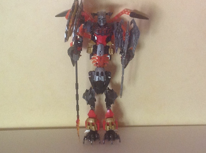
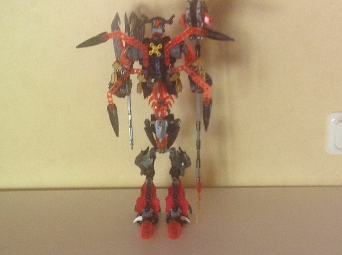
By any chance, could you post a back shot?
is this matt damon as a devil?
Ok, I’m going to give this my honest opinion. Warning: this will be blunt.
In my opinion, this is awful.
Pros:
consistent color scheme
cons:
The torso is awful. From what I can see, you took Skull Grinder, switched around a few things, and then tried to fix the gaps. Unfortunately, you also made him look goofy. Those bulfes on the sides are just awful. Plus, it doesn’t help that the chest is farther in than the stomach, making him look almost pregnant.
The legs. Those thighs interrupt the flow of the legs, making the already spindly build look even more frail. And the feet are just a mash up of different parts and shapes.
The arms are way too skinny in comparison to the body. they’re like twigs.
Those weapons aren’t practical in any way, The mace pieces are basically like and umbrella the way you have them, and the swords on the bottom weigh the whole thing down
As for the double bladed sword, it’s okay, I guess. It doesn’t look great, but I can see your reasoning there.
Finally, the horns. I have no words for them. they’re hilarious, honestly.
0/10
it looks a bit like kulta and tahu did the fusion dance,
but mistakes were made.
I’m gonna have to agree with cal, though I give it a 1.2/10 for effort.
The sword pieces are their to hold upp the arm as it isn’t strong enhoff to support the mace and he is supost to be skelletal and he is a demon he is supost to lock unnatural
I’m not going to give you a rating, as giving you barely a point out of ten doesn’t really help. At all.
You can do better. I’ve seen you’re previous mocs, you have much more potential than what you’ve shown. You look like you threw Kulta and Tahu together and called it a day, to be honest.
That does not mean that you can’t improve it
Think about what you want; do you want a wide, bulky build, or a more spindly one? What weapons do you want to use?
I would start again from square one, if I were you, chances are, you might have put a lot of thought into this moc; all it needs is some more. Try to have longer arms even, maybe differently shaped legs, like chicken walkers from Star Wars.
Overall, start again, and keep an image in your mind of what you want it to be, if you don’t think something works, take it out
Good luck!
To be fair, a concept doesn’t make a MOC better. Now, I’m not saying it is as bad as Cal believes it is, but I do think he has some valid criticism.
Thank’s you have no idea how mutch you just helpt me.
No problem, man-keep at it. Only other thing is to take people’s critiques into account, though it’s fair enough to not take some critiques seriously, but don’t be too defensive with your creation.
Might help looking at it with fresh eyes tomorrow, but after a year on these boards, on and off, I have gotten a lot better, all due to critique on these boards.
Again, keep at it, this does have potential to be a really cool daemon! 
First off, I’ve said this before on other MOCs. The concept does not excuse the flaws. Just look at the Barraki for what you’re looking for. They manage to look unnatural, while still looking really, really, good.
Next, I’d like to defend the #/10 review system. Many times on the boards, I’ve seen people leave reviews that go over all the pros and cons, only to have the score defy expectations. That rating is how you know whether it’s good or not. the pros and cons are things you did right or wrong, but that score should tell you what to do with that review.
This leads me to my third and final point. My review. I gave your MOC a 0/10. Several people have claimed this to be too harsh, and frankly, I agree. Your color scheme is extremely consistent, and that earns it at least a point. Add to that the fact that, as Yink said, you did try, I have to bump up my score to a 2/10.
So, I was browsing through my MANY unread topics when I found this guy. I figured I would post a “review” of sorts. Like Yink and Calvatron however, I will be very blunt.
Now, in order to make this streamlined and as relatively clean as possible, I will split it up into segments.
Legs
This guy’s legs make him out like he has Elephantiasis. The feet are SUPER hindered by the armor around them, and it breaks the look and just looks cluttered and flimsy. Then, you have the upper legs, which look too skinny compared to the lower legs. If you’re going for Mega Man proportions, this is not how you do it. There are many other ways. This is not one of the best. Overall, not a fan of the legs.
Arms
Relatively simple, just standard CCBS arms from what I can tell. Nothing to mention or nitpick about here.
Head
Not a fan of the horns. They look awkward and unappealing. Furthermore, they look flimsy because of their connection points. Otherwise not much going on here.
Torso
This is… honestly one of the lumpiest, most thrown-together torsos I’ve ever seen, and I’ve been “in the Bionicle Community” for 7 years now. There is no streamlined look, no organization. He looks incredibly awkward. Furthermore it looks like it could come collapsing at any moment with just a bit of wind. This, as a result, only further makes the MOC look fragile and unappealing. At least to me.
Weapons
…The one on the right hand looks like a chandelier. Not a fan. It makes no sense, and it is literally Kula’s weapon turned upside down. The other weapon looks like some awkward double-bladed sword that makes no sense. I don’t know what else to say, they’re weird weapons, I guess.
Overall
Normally I would suggest fixes on how to improve the MOC, as is customary by critique, but my honest suggestion is to just start over again. I don’t think anything is able to be salvaged, other than maybe the arms.
If I had to give it a rating, I would give it a 1/10. Not a fan. Hopefully the next one will be better. Thank you, and have a nice day.
Let me fix that for you.
bad joke is bad
SO
THIS MOC THOUGH
I’ll be blunt. And please don’t take offense to this.
But no.
This doesn’t work.
It looks exactly like what other people have called it.
In fact I might take it beyond and mention how the legs and torso are beefy compared to the very literally skeletal arms.
I’ll just reiterate Ventum’s overall thoughts.
Ahh… I sounds a bit cruel to say this but… It’s hideous.
A update, huh?
An improvement, but not by much. The weapon actually looks good, though.
I added the protector of fire and lord of skull spiders
That torso is… Long… The fiery aesthetic is cool, and pulled off well.

