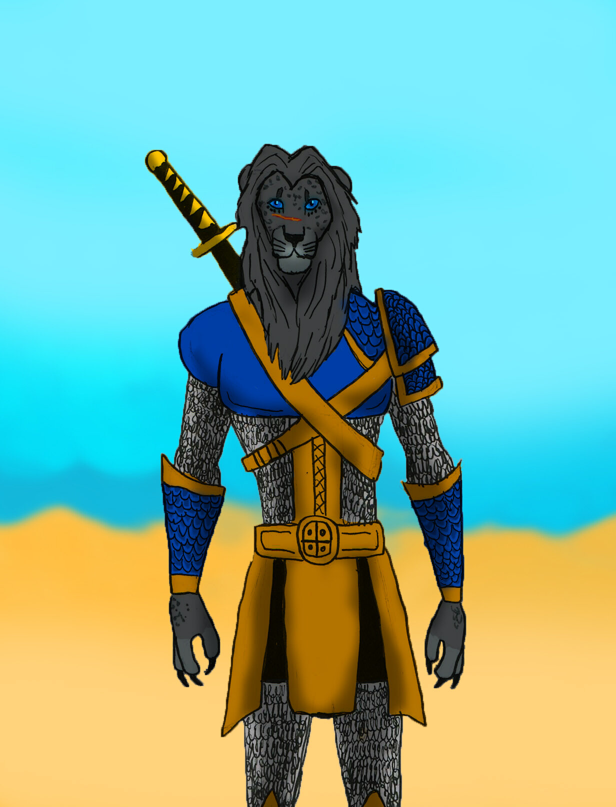
Some recent attempts at digital coloring, utilizing characters from the two ends of my story spectrum, Judah Alisdair and Mara Alisaedra. Judah Alisdair is a lion-leopard mix, and is a member of the King’s Rangers, a company of bounty hunters that keep the peace in the lawless desert frontiers.
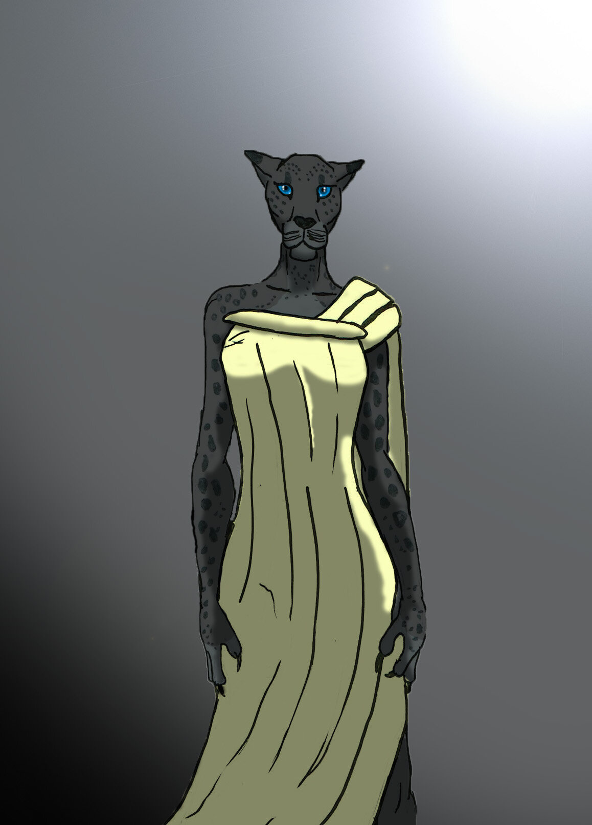
Mara Alisaedra is his ancestor from 600 years earlier in the storyline.
I’m not too happy with the shading on the Judah. Something about it just looks…off.
Really nice! If I were to make a suggestion (now take this with a grain of salt, I’m not a pro by any stretch of the imagination) it would be to make certain deeper parts of the shadows even darker, and add some higlights to the bright areas. And maybe make the shading lines a bit smoother and more defined. Keep up the good work!
I think the shading is definitely what needs worked on the most. In the first image there’s a very clear light source, which is good, but some of the light doesn’t make sense. For example, the arm on our left has heavy lighting on its left side, but the light is coming from the top right. There’s also no indications of rim light, so it doesn’t make sense to be lit on that side. Other than perhaps some more light falling on the dress, the rest of it is in line.
I think the reason the second one doesn’t look right is because the shading on this one doesn’t really have a purpose. For starters, there doesn’t seem to be a clearly defined light source or direction. Because of that, it looks like all the shading is toward the center of his body, on the edges of all the shapes. The waist armor is where this is most apparent. The center piece has shading on all its edges, and the two outside ones have light on the outside edge. If you want to fix it, it would be good to choose a direction for the light and focus on making only the edges that would face that light be illuminated.
Just some general tips and tricks for shading:
Try to use a different color other than black for shadows. Using pure black muddies the colors and makes the shadows look tacked on. Try tinting your shadows with colors related to the environment. I typically like using a dark purple or blue as my shadow color, but you can use almost any color depending on the mood or surroundings of the piece.
If you’re picking shadow colors individually, make sure you hue ■■■■■ your shadow color. That means rather than just adding more black to your color (i.e. sliding the brightness slider down), make sure you also ■■■■■ the hue very very slightly towards a cooler color (move the color towards the blue purple side). This again achieves the same affect of not muddying your colors.
When shading digitally, put all your shadows on a layer set to “Multiply” mode. This will darken the areas covered by the shadow color, giving the piece more contrast without covering up the colors underneath.
If you want to go for more realistic shading, remember to use soft and hard shadow edges effectively. Use soft edges for rounder shapes that have a more gradual falloff and hard edges for sharp corners.
I find a more effective way for me to shade is to cover the entire character in shadow first, then go back and “paint in” the light using the eraser. By doing it this way you can act as if your pen is a beam of light, and you can sort of trace your way from your light source onto the surfaces that would be hit by it, if that makes any sense.