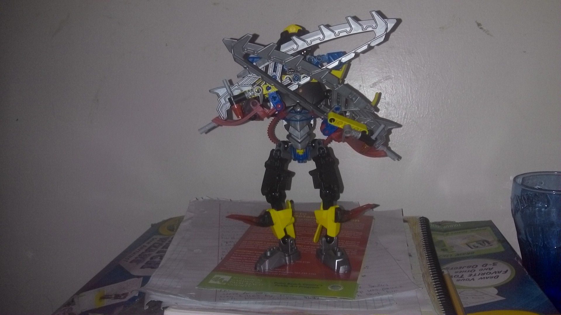
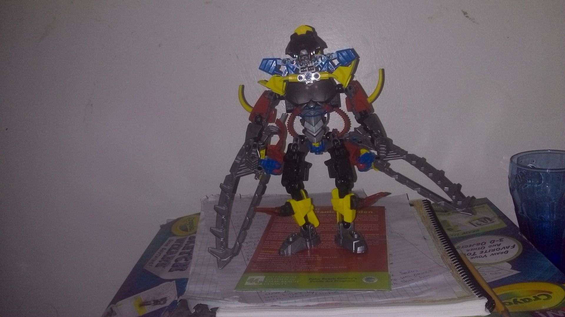
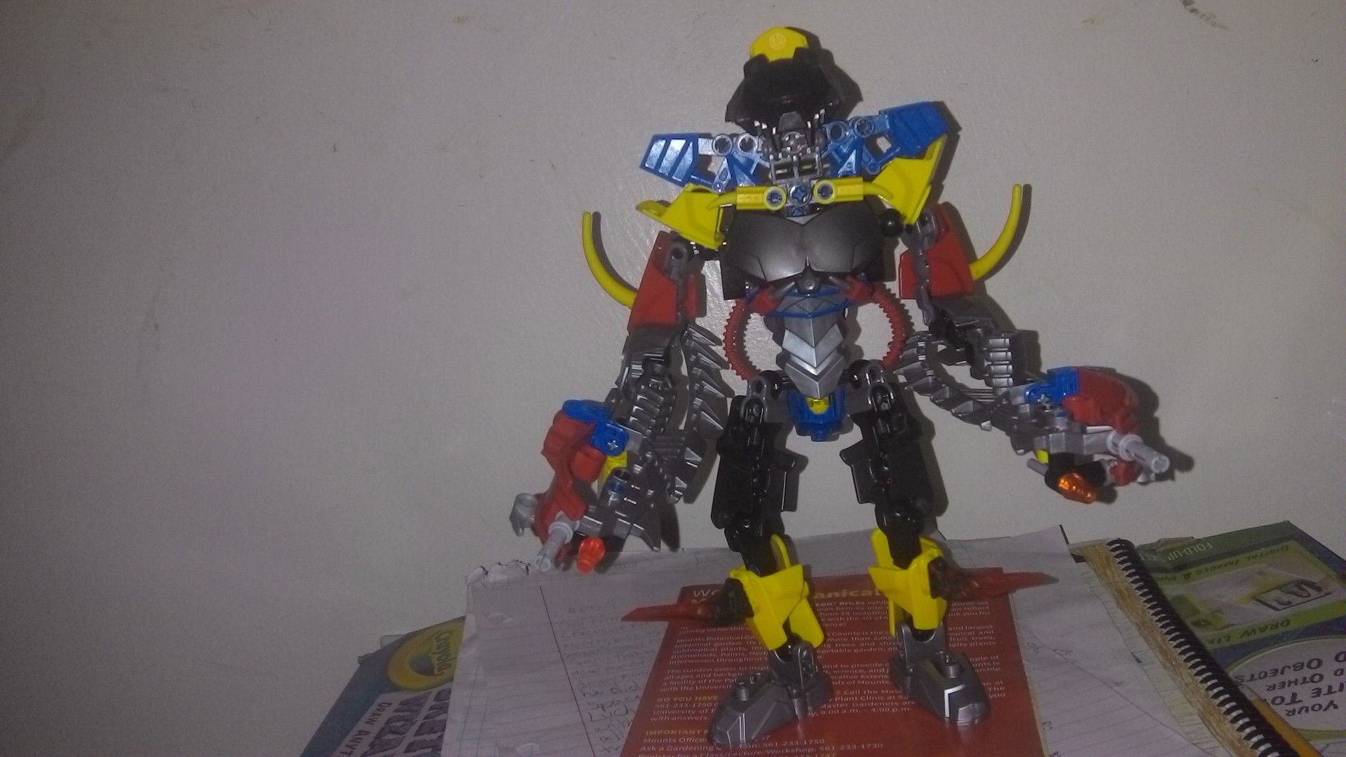
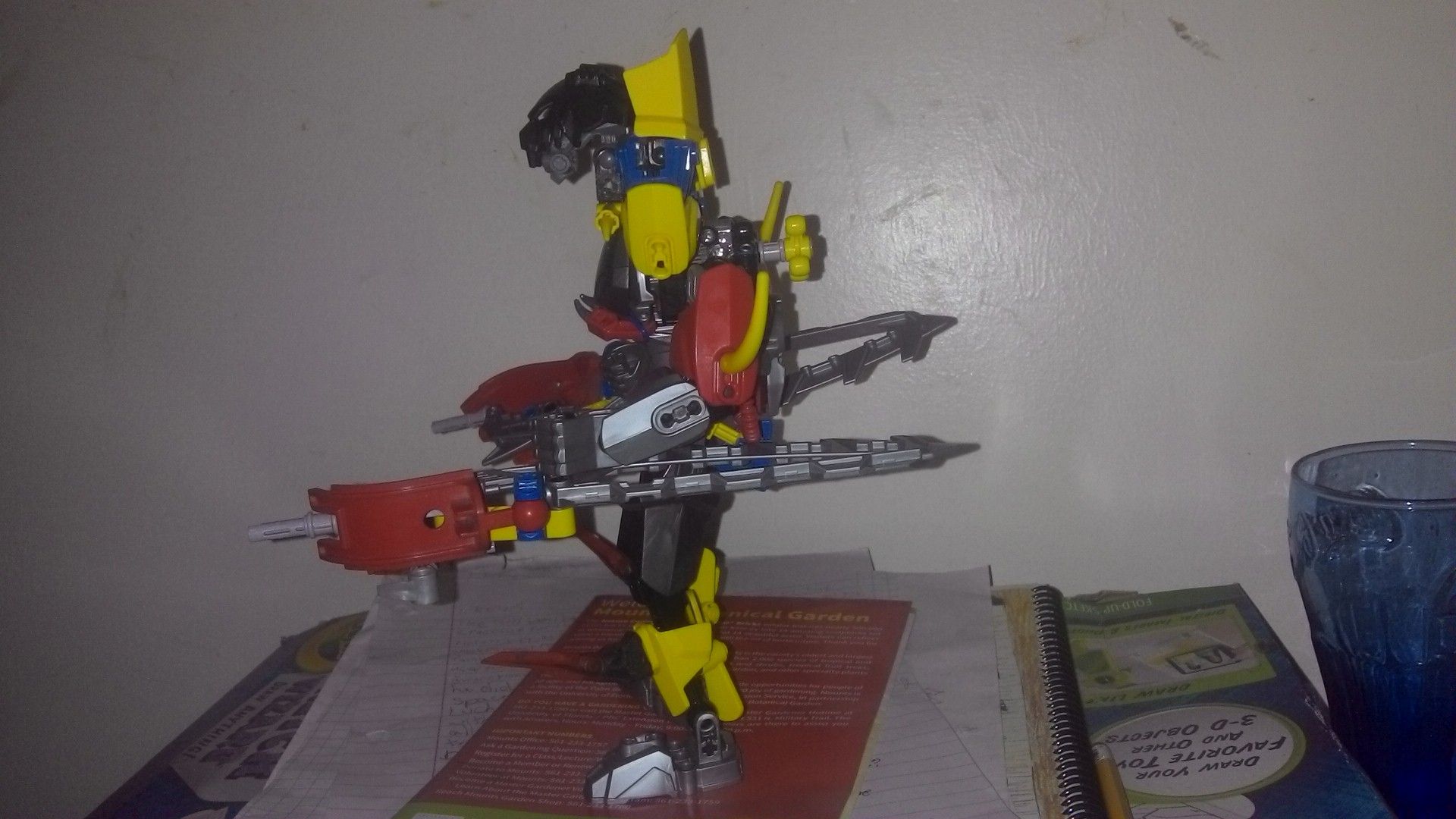
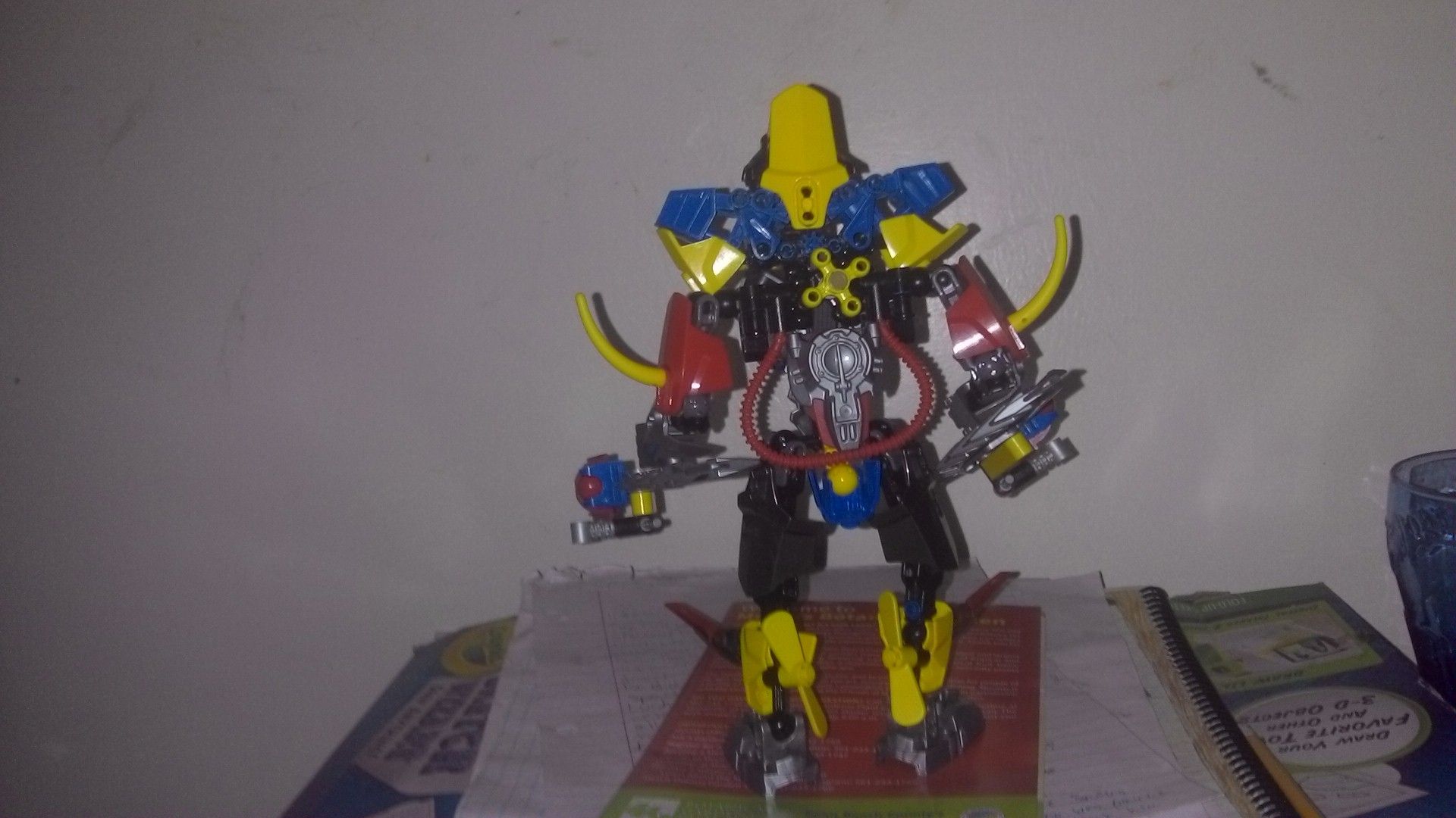
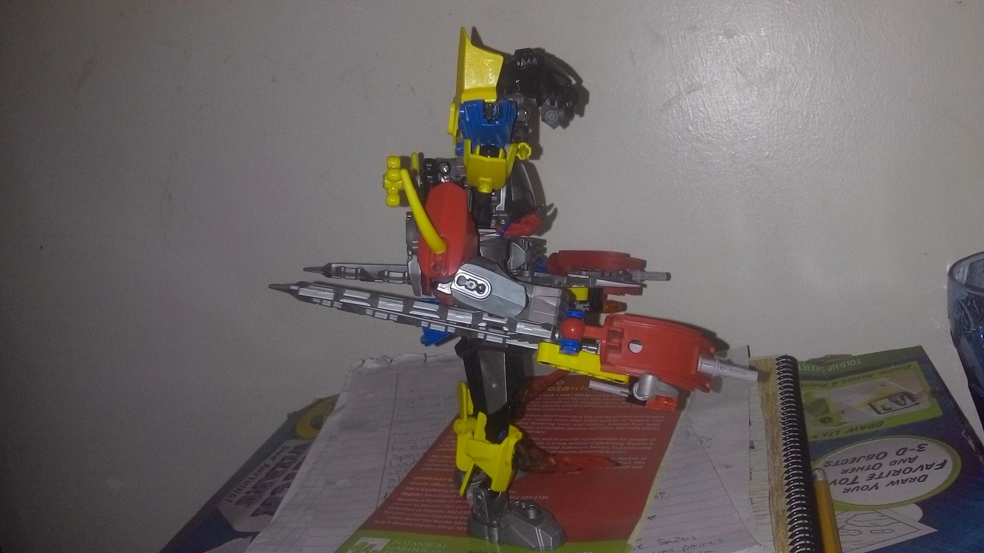
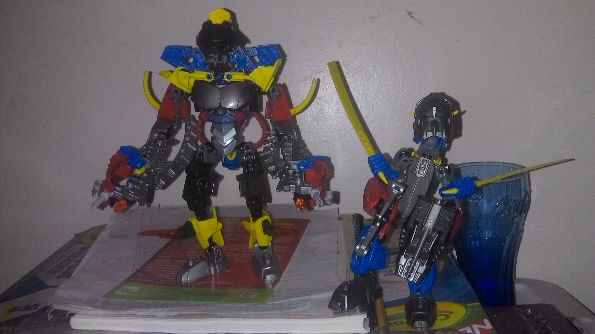
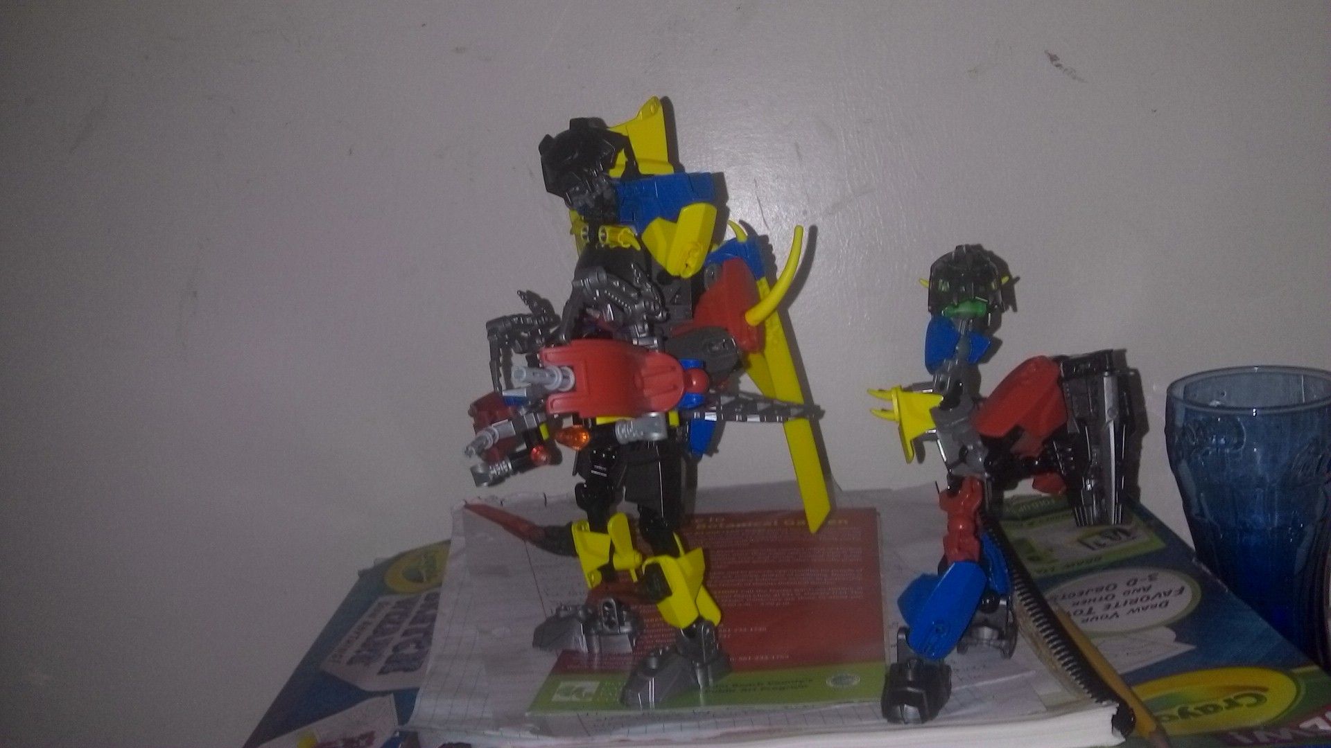
Not sure, as always the background detracts a lot of positive feedback you could get, sd for the MOC itself, I do not like either one, the builds are weird and the colors are a complete mess.
@White_Rainbow, Sory if you dispise the cluttered background, but at the moment it’s the best spot I’ve got. @GIF.Man.Ben It wasn’t supposed to look bad as much as weird. @h1vem1nd I may revamp this MOC. As for the protector, he was actually built as a hero factory guy before the fists G2 leaks. @Ninjanicktf The colors are supposed to be weird (hence the name). Thanks! @Oniwah As stated before, those were all intentional, except the proportions. I’m not sure how I would fix them, though. @CarumSarene Thanks for the advice! Also, the name is just what came out of closing my eyes and tapping the keyboard. I find it funny that just adding an accent sign makes people assume it was Scandinavian or Icelandic or something. @Maypool Yes, that’s the correct translation. @SwagMeister Yeah, I wish I could bring the neck in closer, but I cant figure out how. @Toa_Joker toa I just wanted the weapons to contain all three major colors. @Hutere_The_Toa_of_Air, Thanks! @BioKnight Oh.
I don’t like both. They both suffer from poorly executed colorschemes and large necks. The master is clearly the better version, although he’s still very gawky and awkward when looked at certain views.