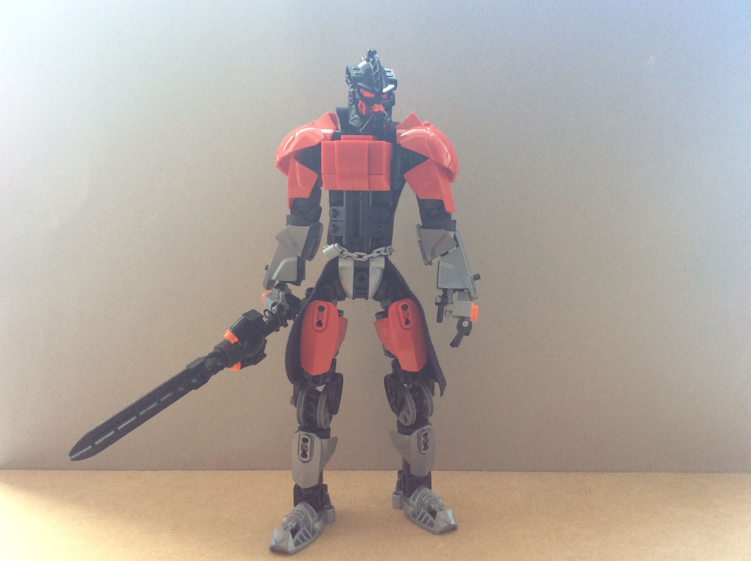
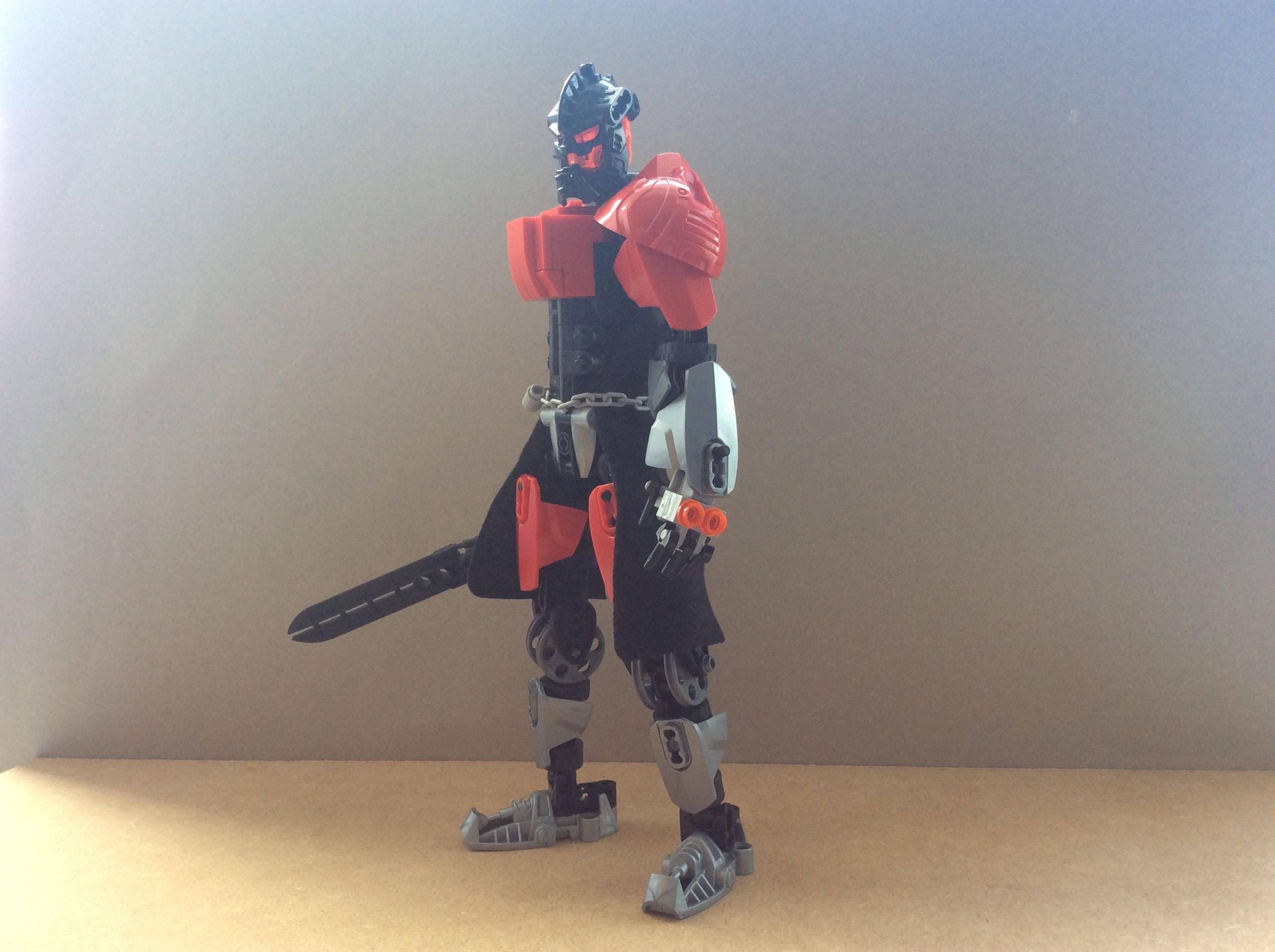
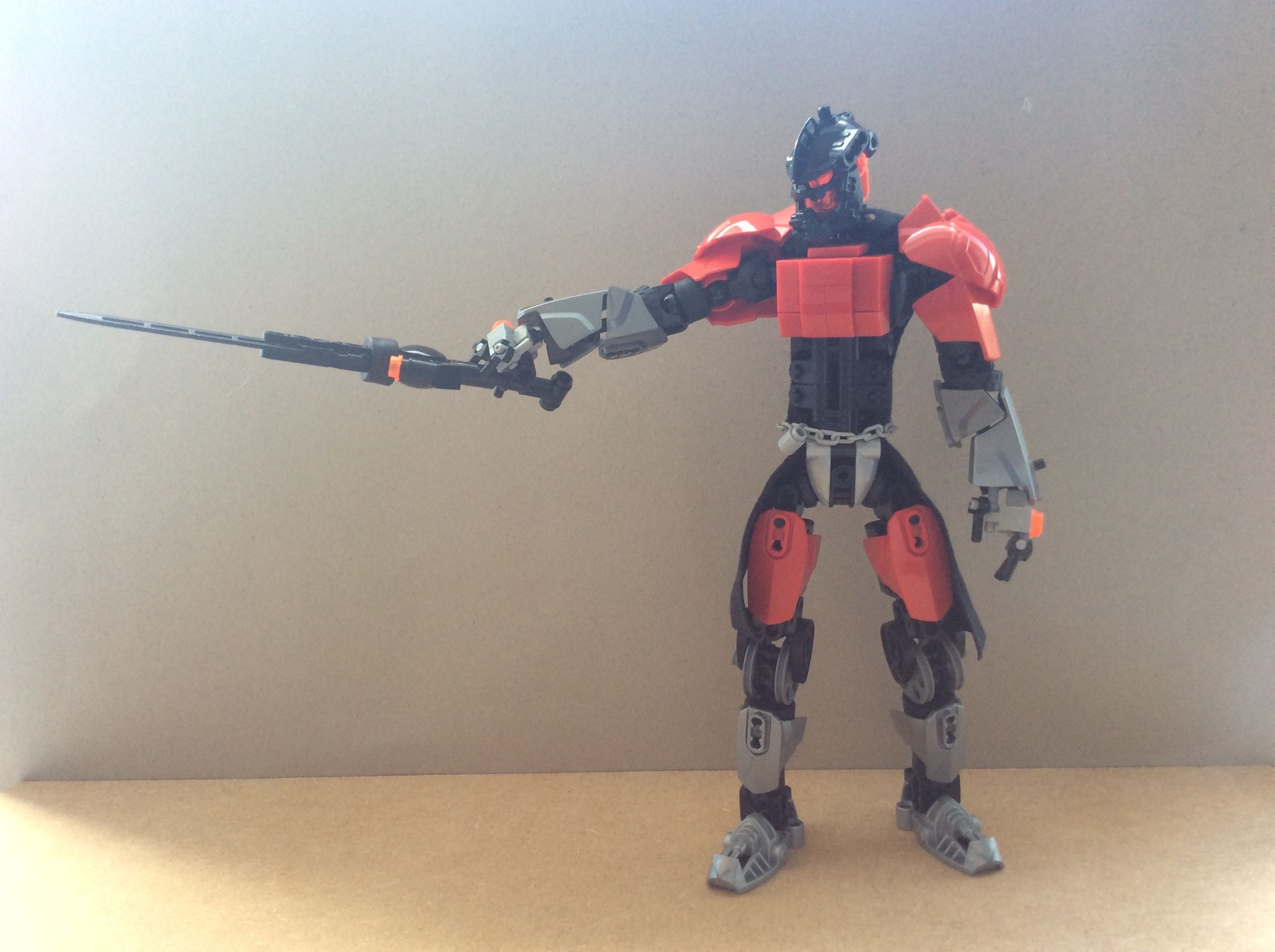
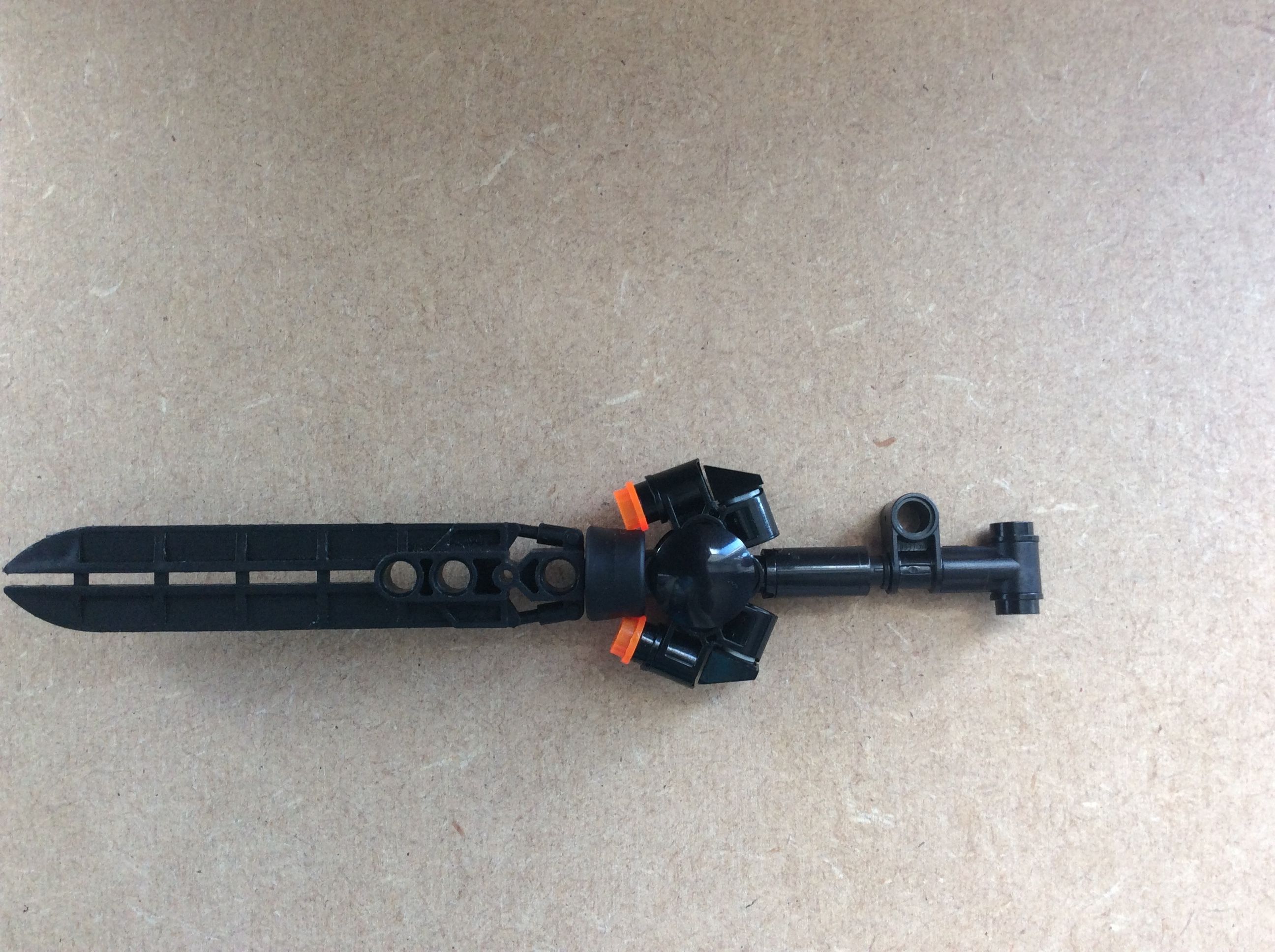
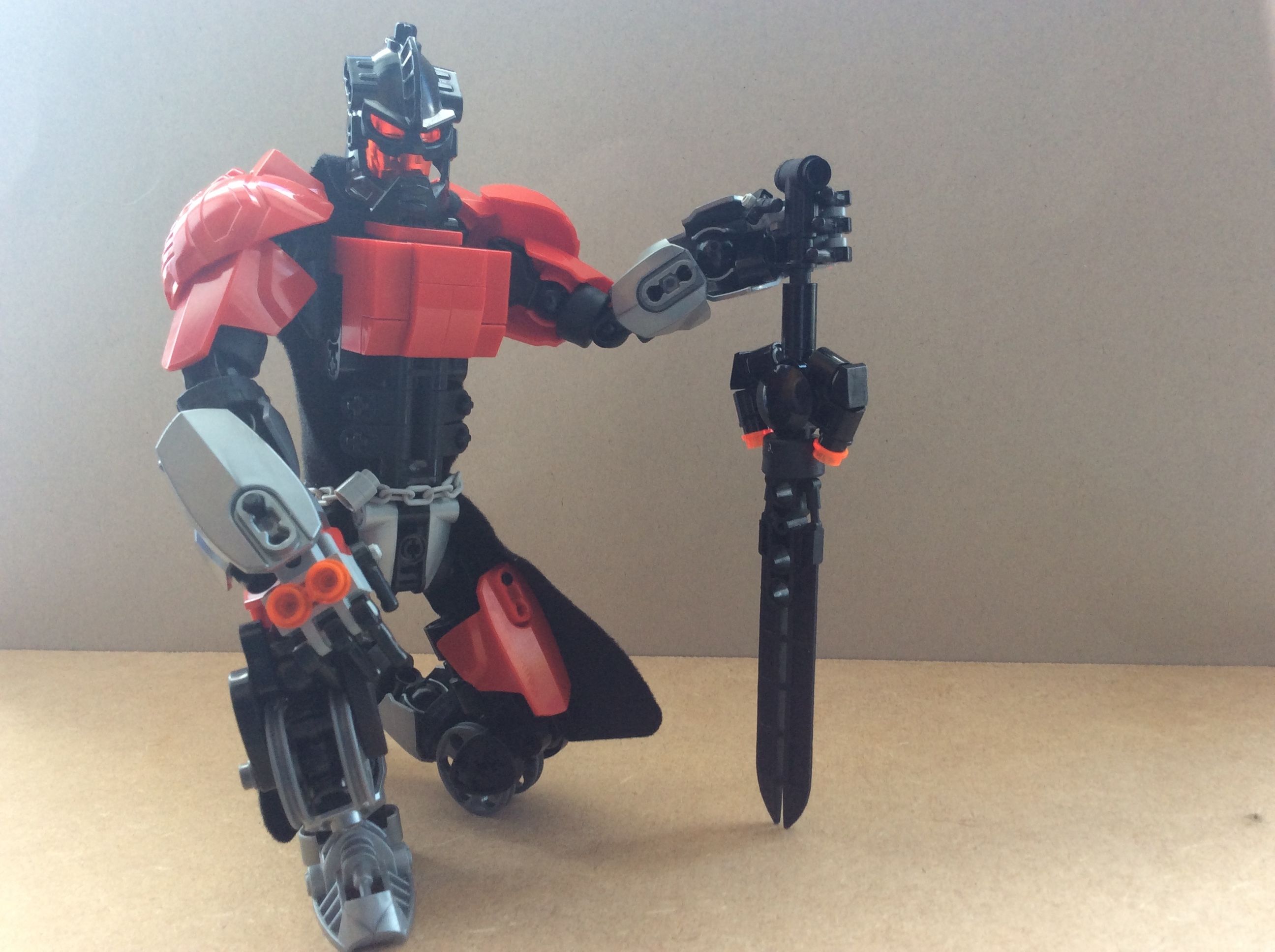
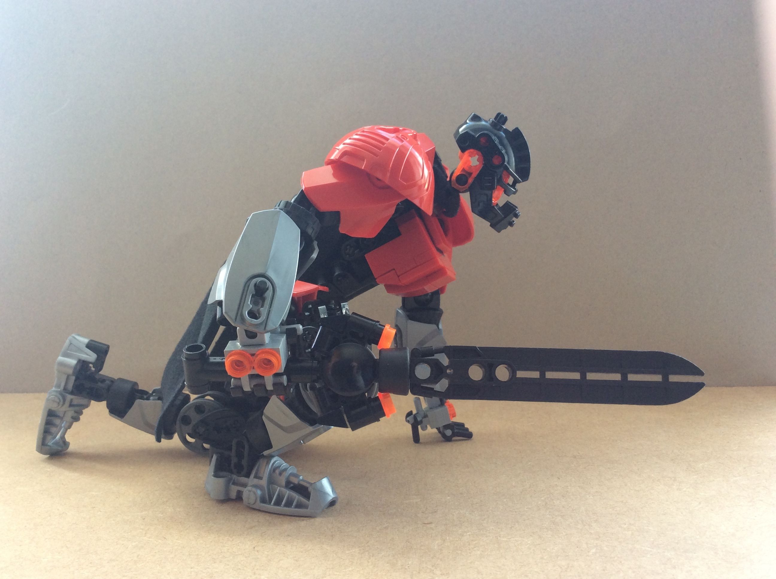
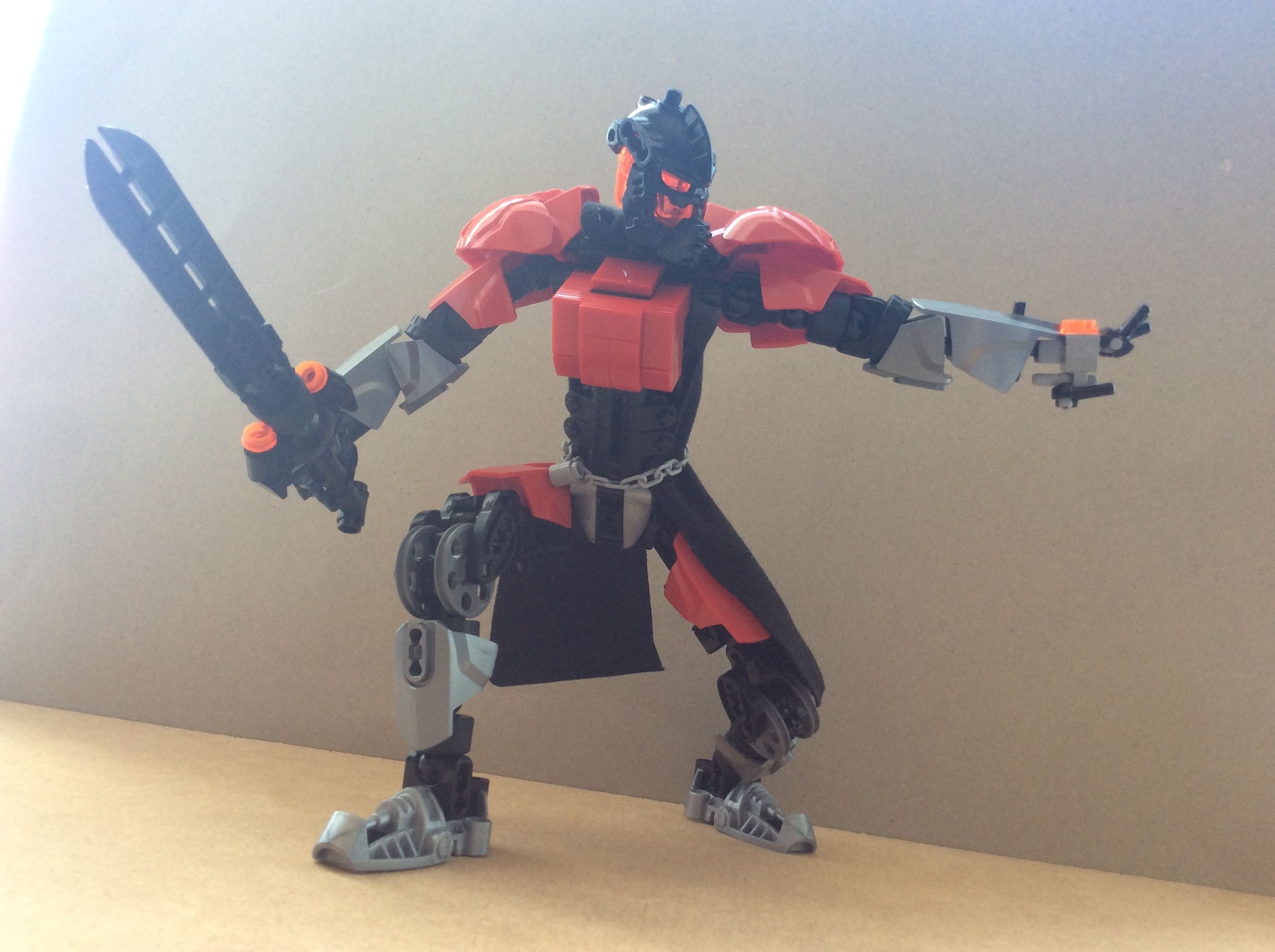
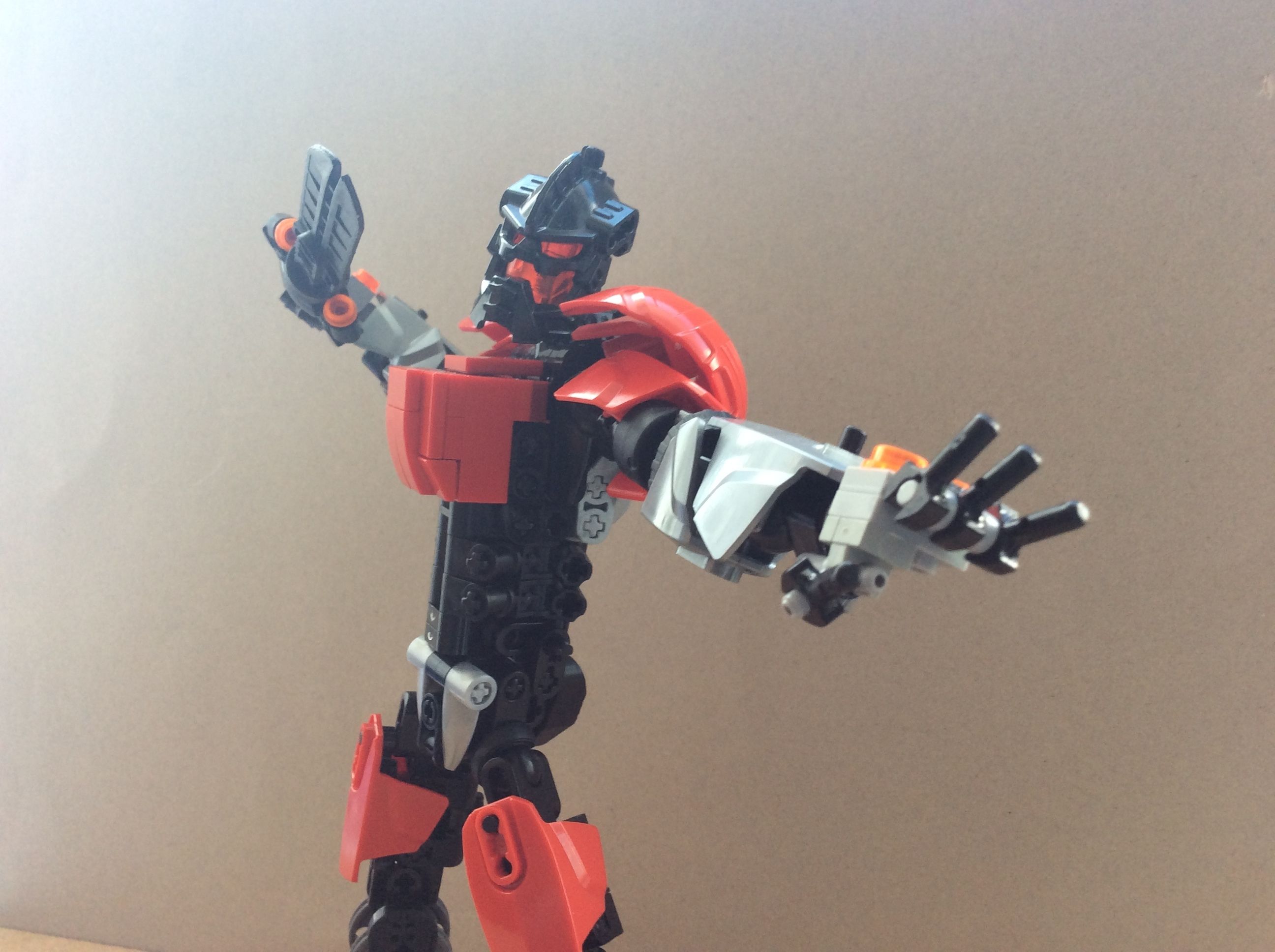
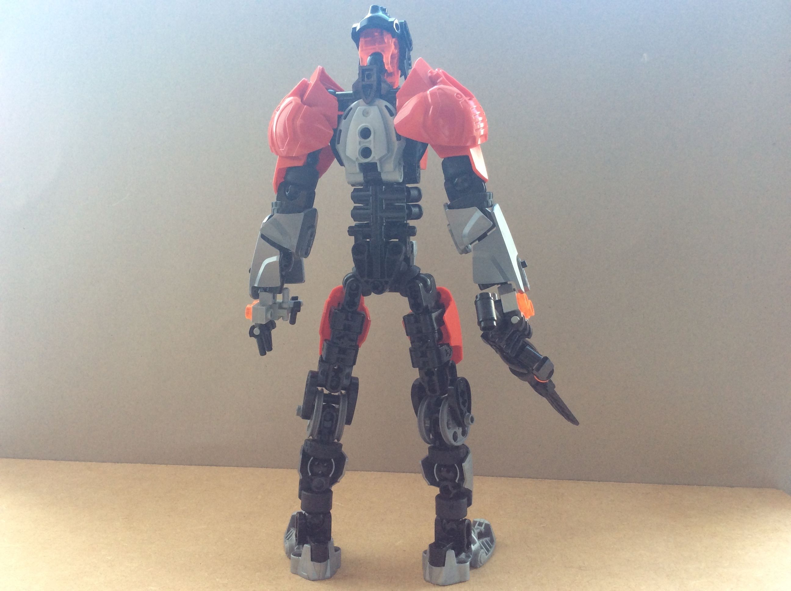
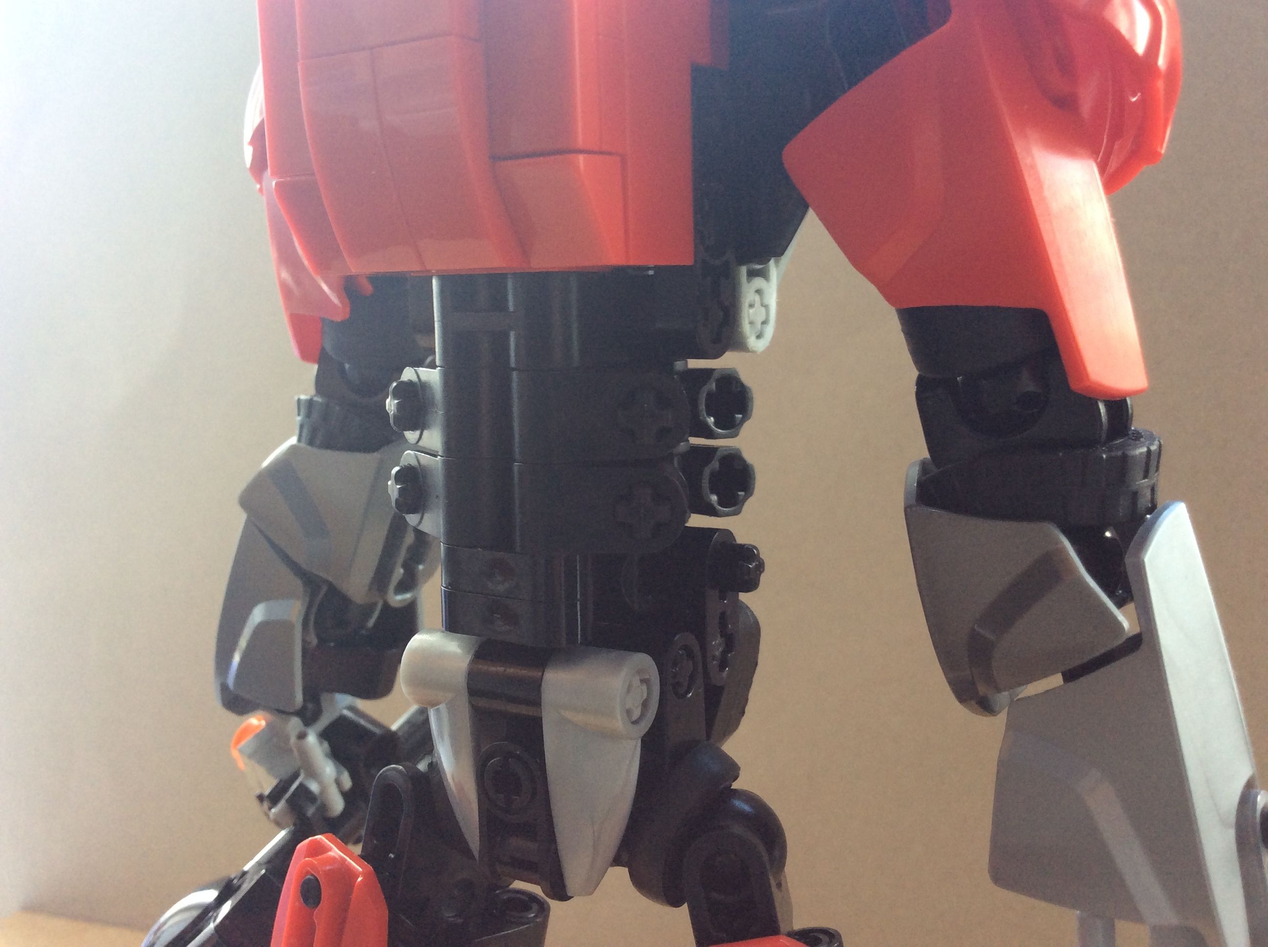
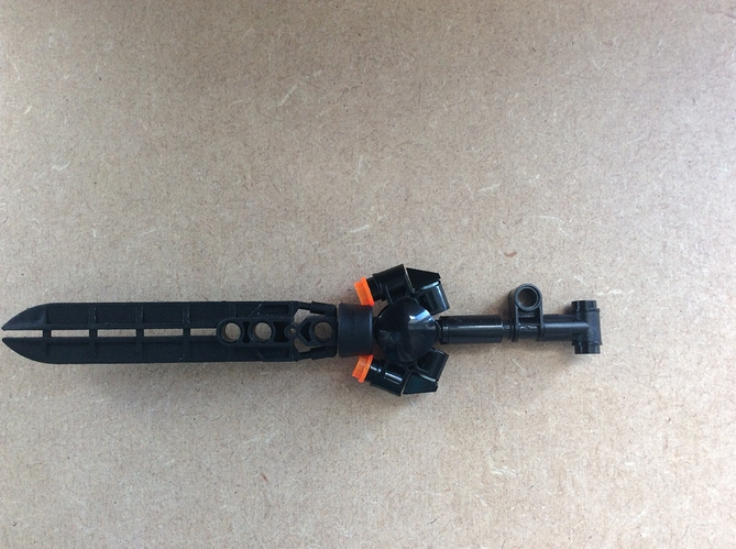
Based on the coloring, I’m guessing that red and silver represent armor, while the black is more like the skin underneath. Going by that, there’s an awful lot of his waist that’s left open… I think he’d look a little better if you extended the red chest piece down a bit (or just straight up move it down a stud). Other than that, though, he’s got a really nice design, and I particularly love the sword. The double-jointed knees are a pretty unique design choice, and one that seems to help the knees actually bend in a realistic manner without having to leave them hollow; I like that, too.
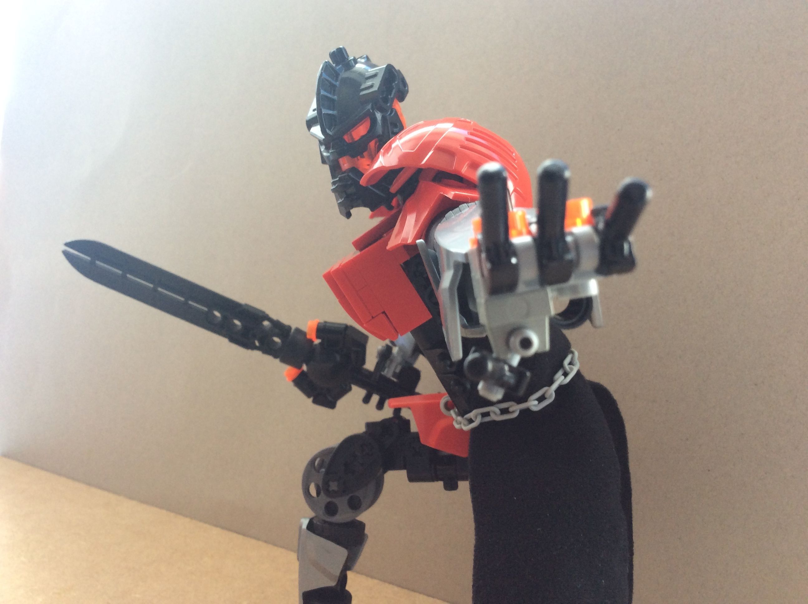
The chest armor is too blocky for my tastes. The knees do seem a bit happy, but I like the design. I think I’ll have to mess around with something similar at some point. Overall I think this is pretty good.
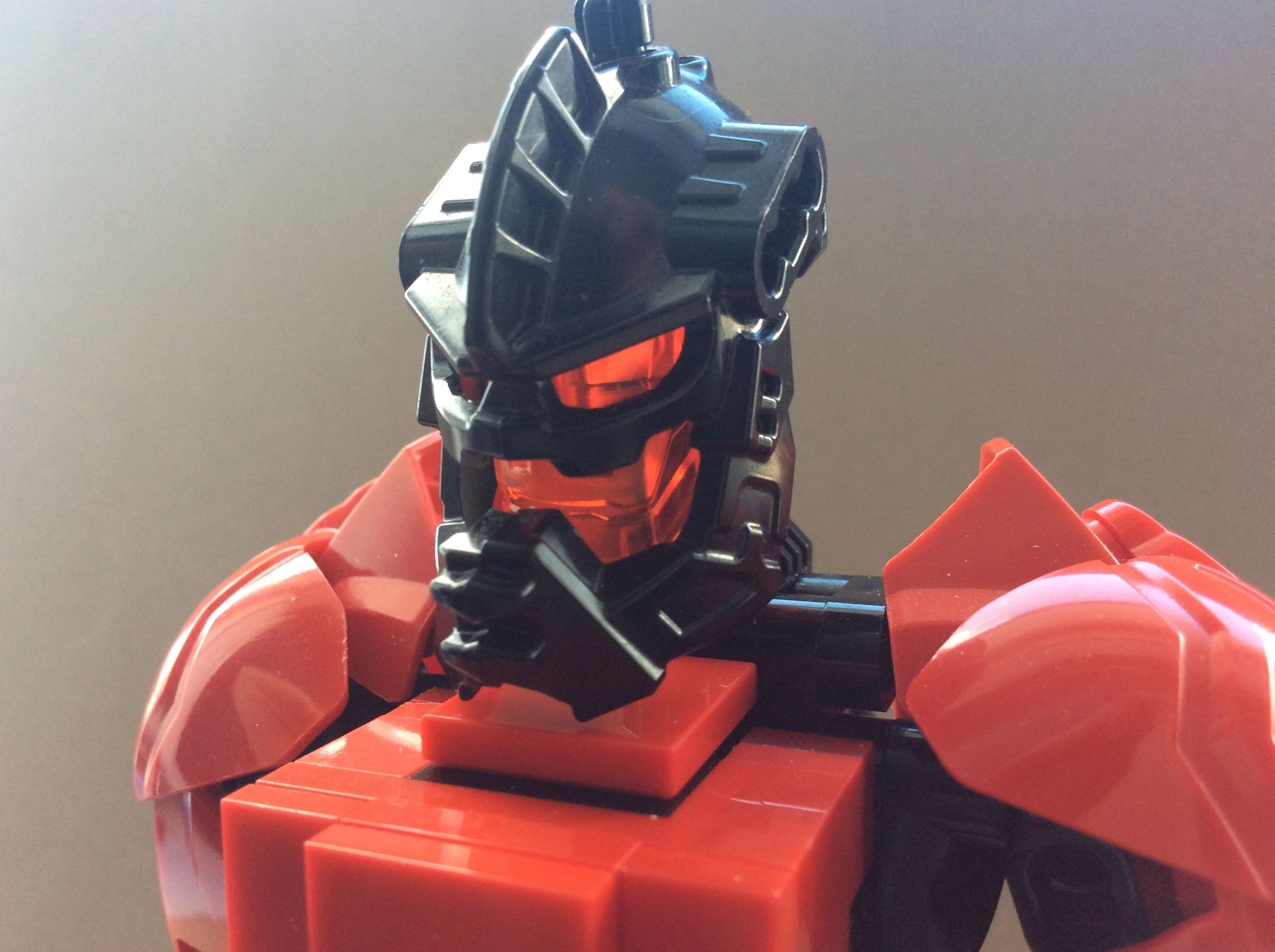
You’ve really outdone yourself this time! It’s a lot better than version one, and you can see that through the other versions. I’m really getting midevil “knight vibes” from this!