I know what you’re all thinking… “Not again”. And I know that you’ve all seen him a lot, but I like showing updates. This time however, thanks to @Lord_Tuma, I’m going to go right from the start and show the difference from V1 and how much he has improved…
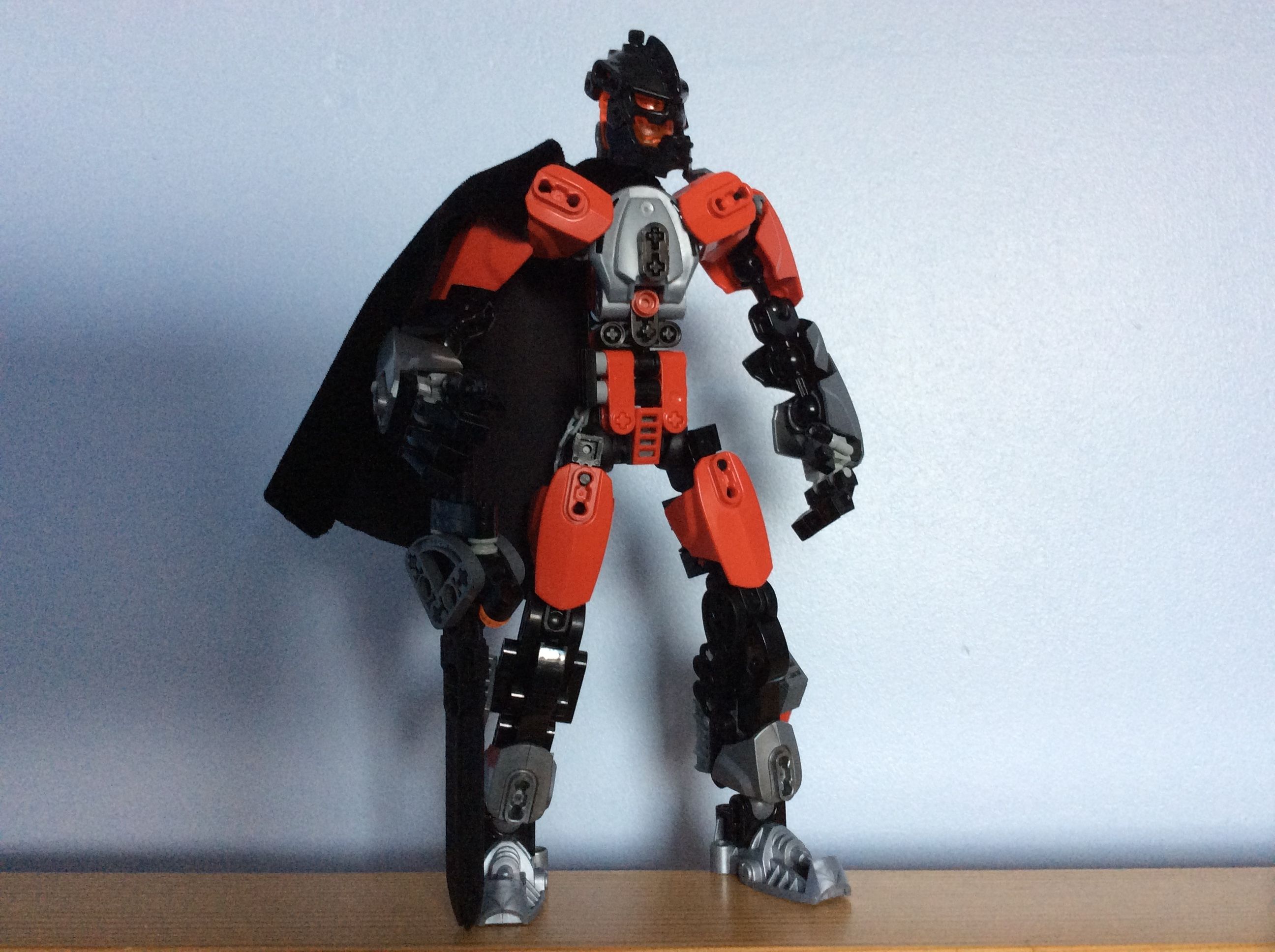
V1
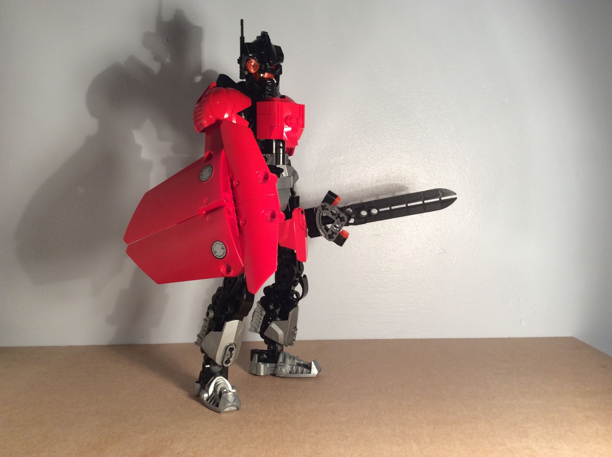
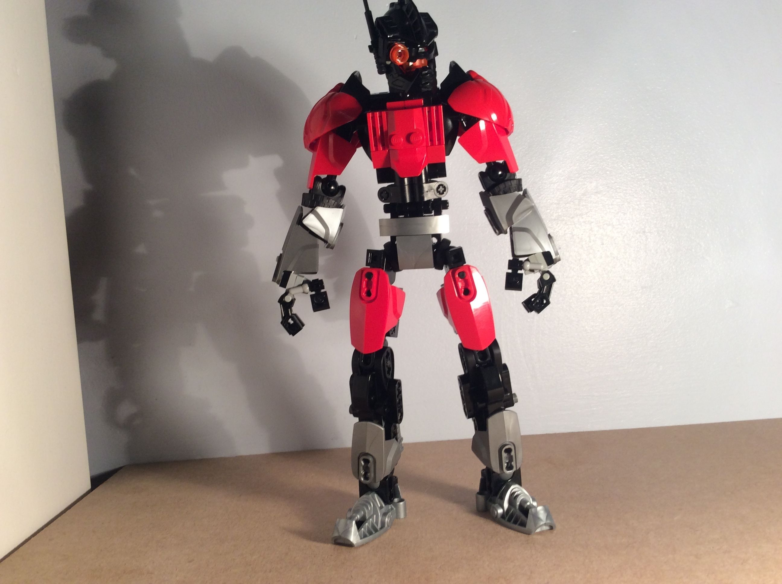
I like it. It has decent proportions, but to me the hands look a bit big… probably it’s just those system pieces used for thumbs.
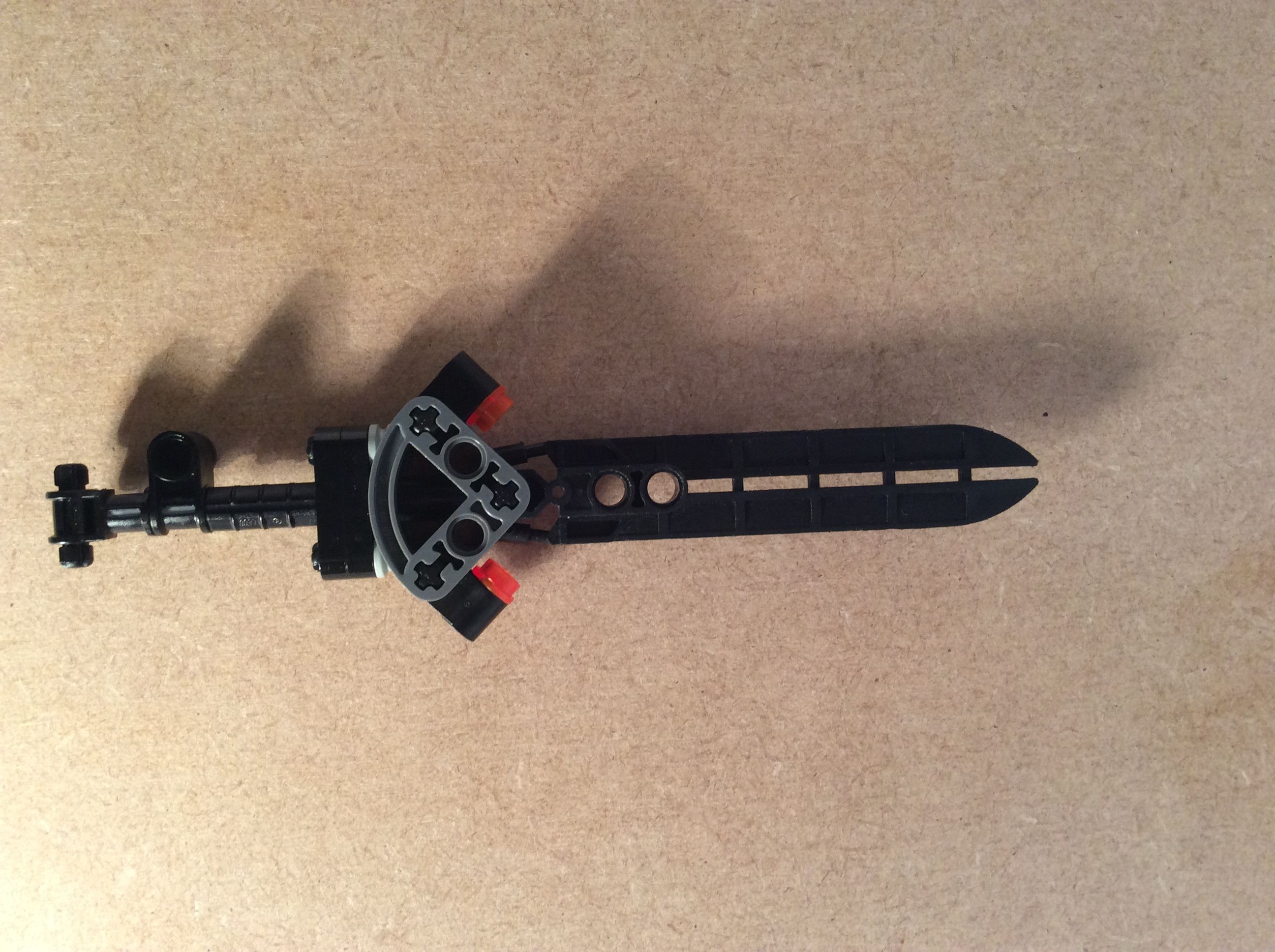
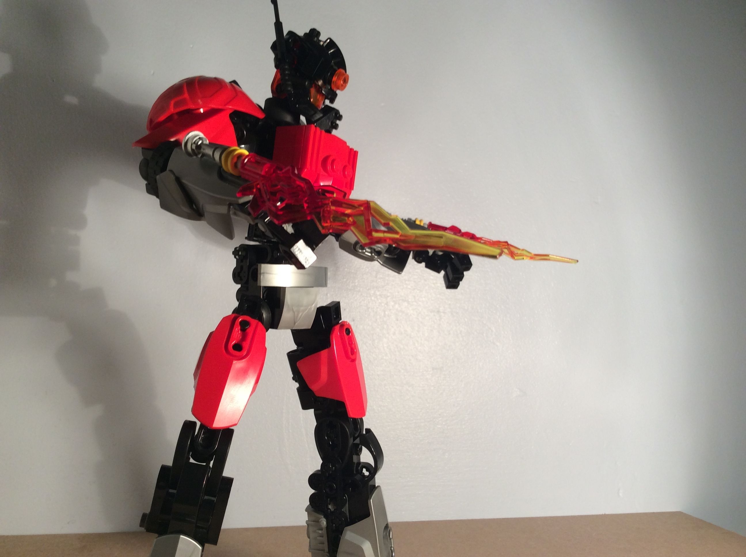
The “scope” to me feels unnecessary as Kardymis seems more of a meele fighter , but it looks definitely cool.
Edit:
This is not meant to offend you in any way. If you like it, you should keep it, He’s your Self-MOC after all.
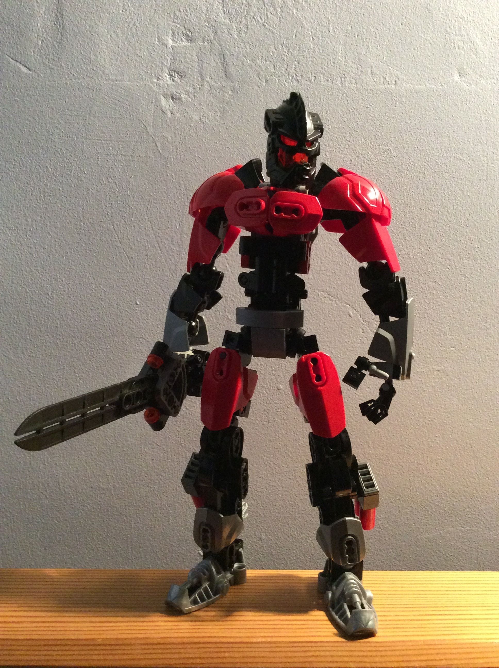
But yeah! This looks great! I think the sword might actually be getting too small, though! Looking at the older versions, there was a large jump between versions 3 and 4!
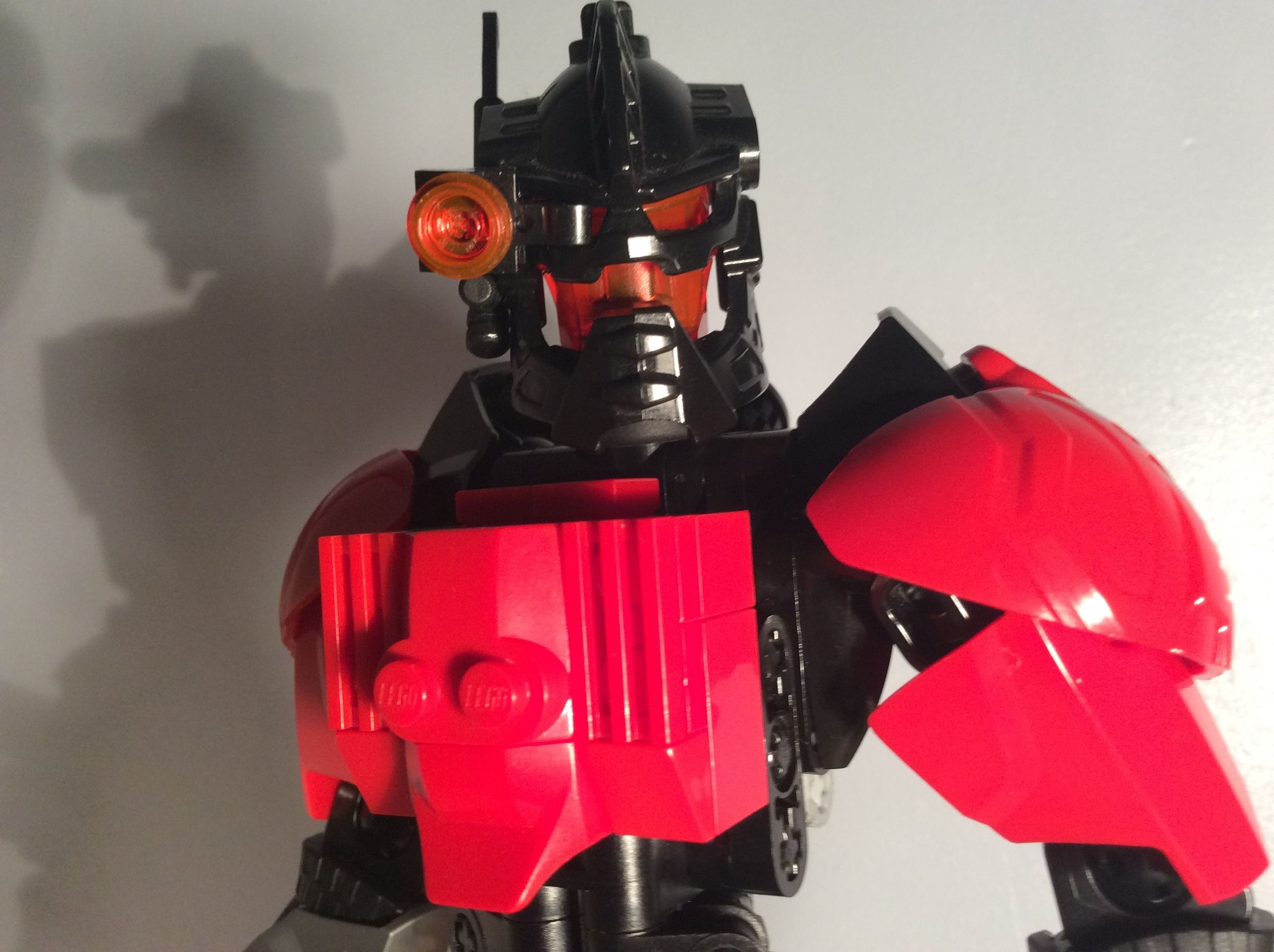
Nice. I think the pelvis section looks a bit awkward, mostly that horizontal slope and the way the legs are armored make his legs look funky and too long. I think that scope is pure epicness though, and he has some very nice armoring. Its nice and cohesive.
Imma tell you what you can improve on further though.
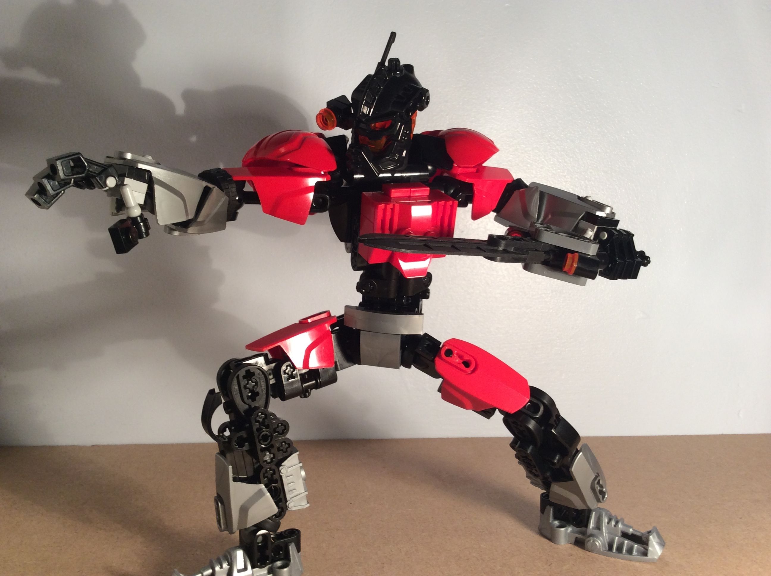
His upper legs should be longer and his lower legs shorter. It looks odd and off when looking at the other limbs. The small shells you used on the upper half of the lower arms don’t flow well and look out of place, perhaps just using tires will work.
His chest has some nice things going on for him if it weren’t for the middle. Those greebles aren’t that fitting. I think the chest would look best if you’d use some red shells as pecs, would flow well with the sleek look he already has.
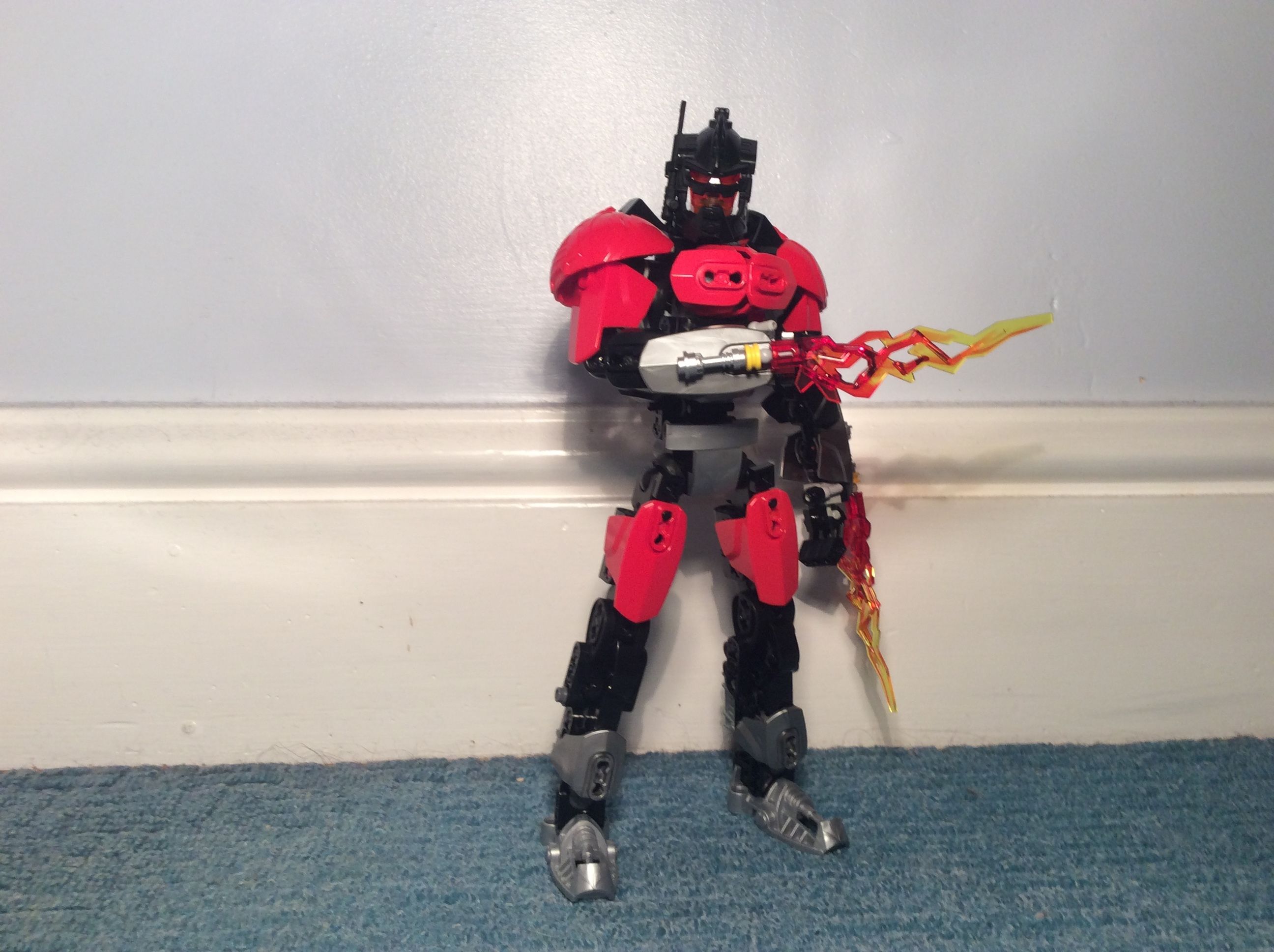
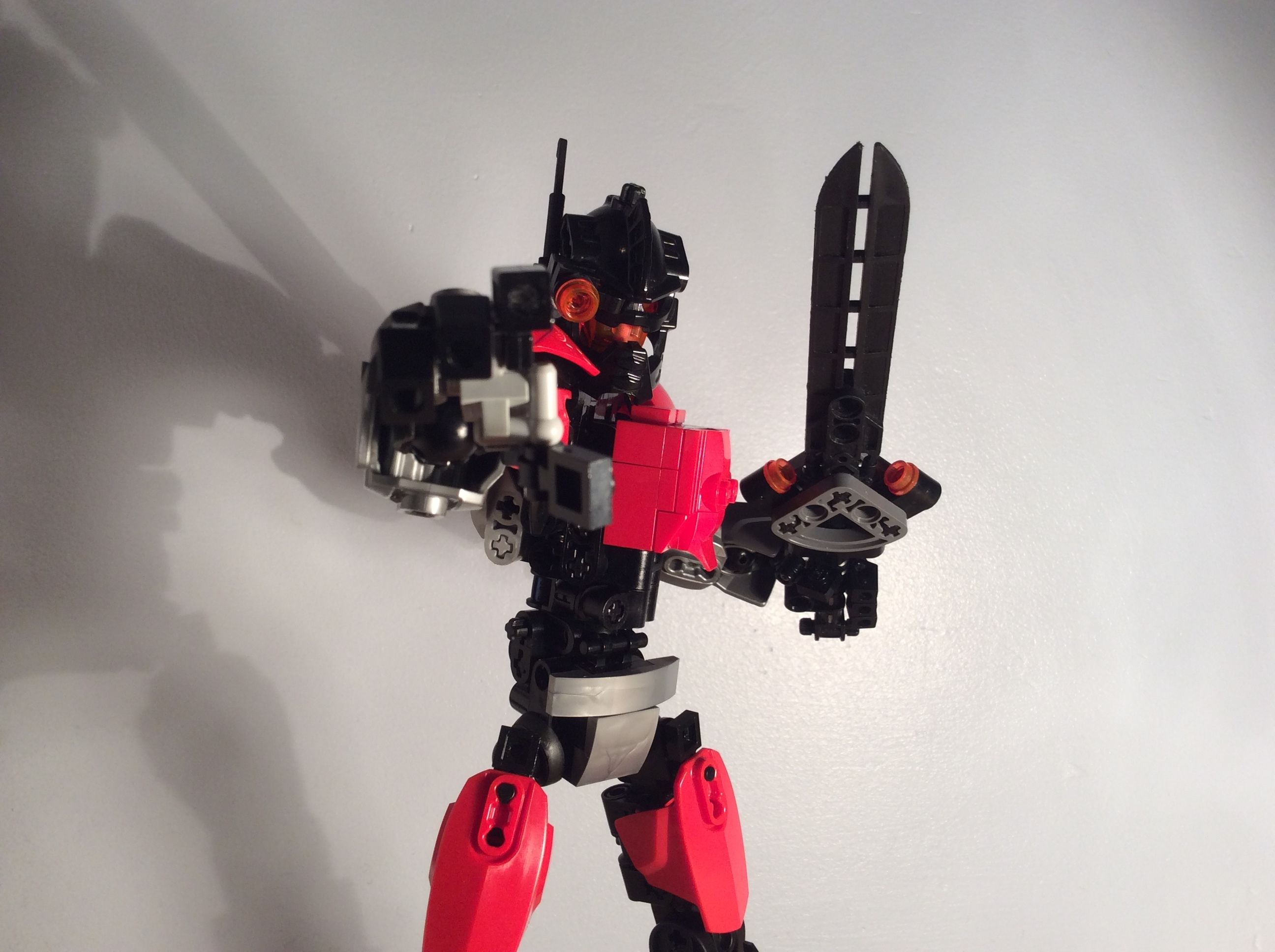
He looks clean and concise. I’d only add more black to him as to match his mask a bit more.
Good work
Oops, completely forgot the waist. It looks hella cluttered. The technic pieces are used in a weird curve and bits and pieces stick out here and there. The abdomen don’t look all that good