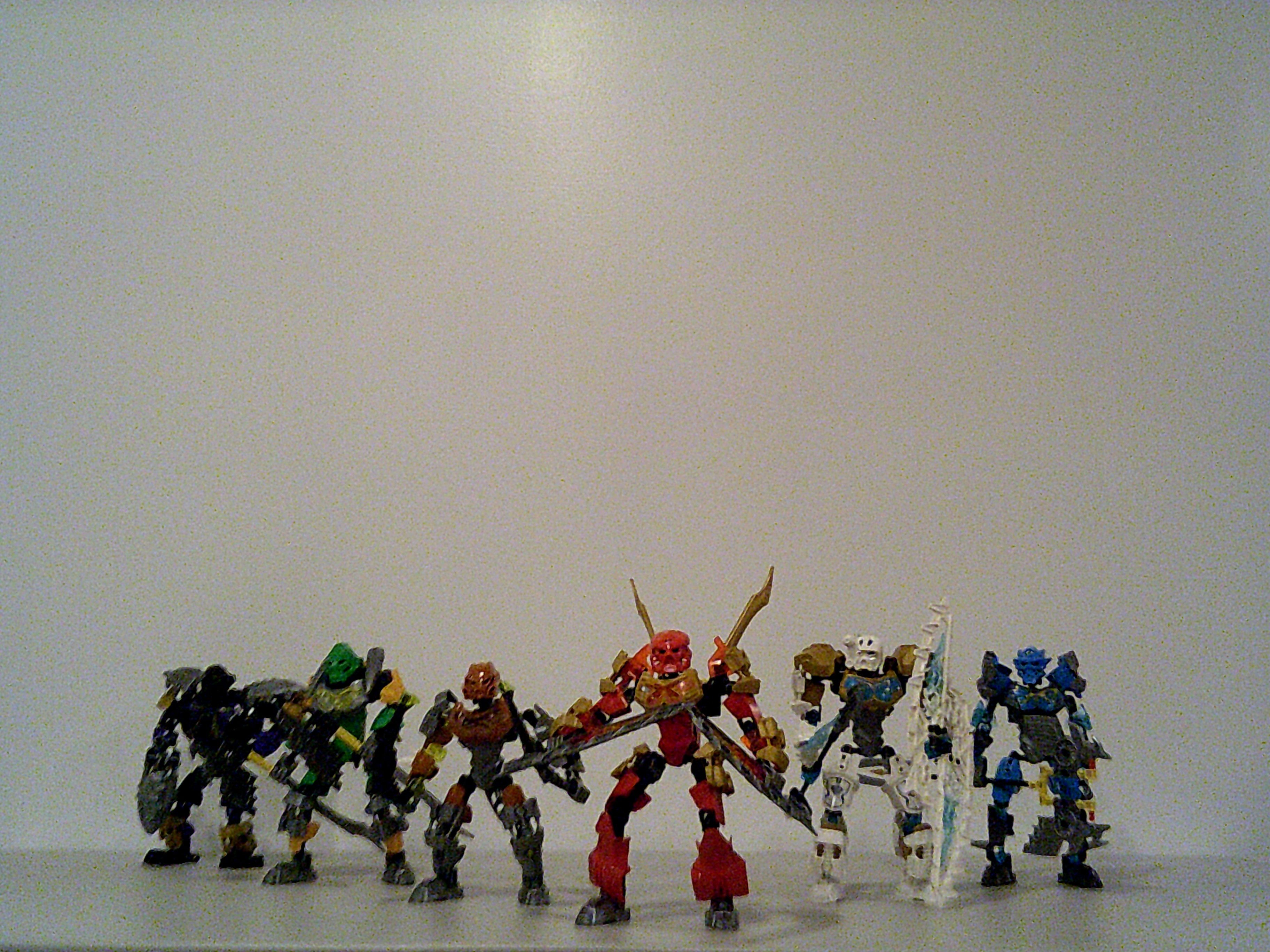
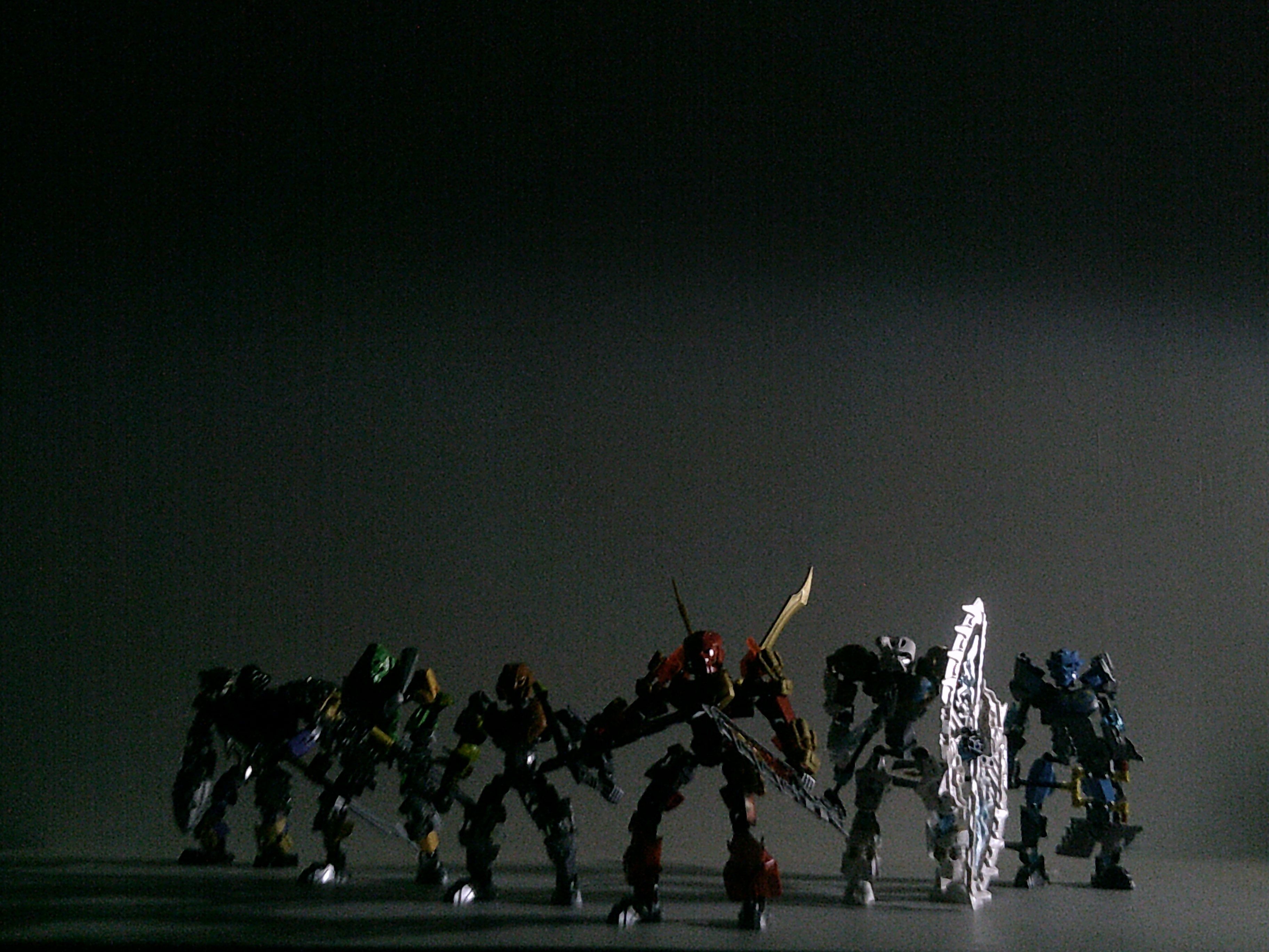
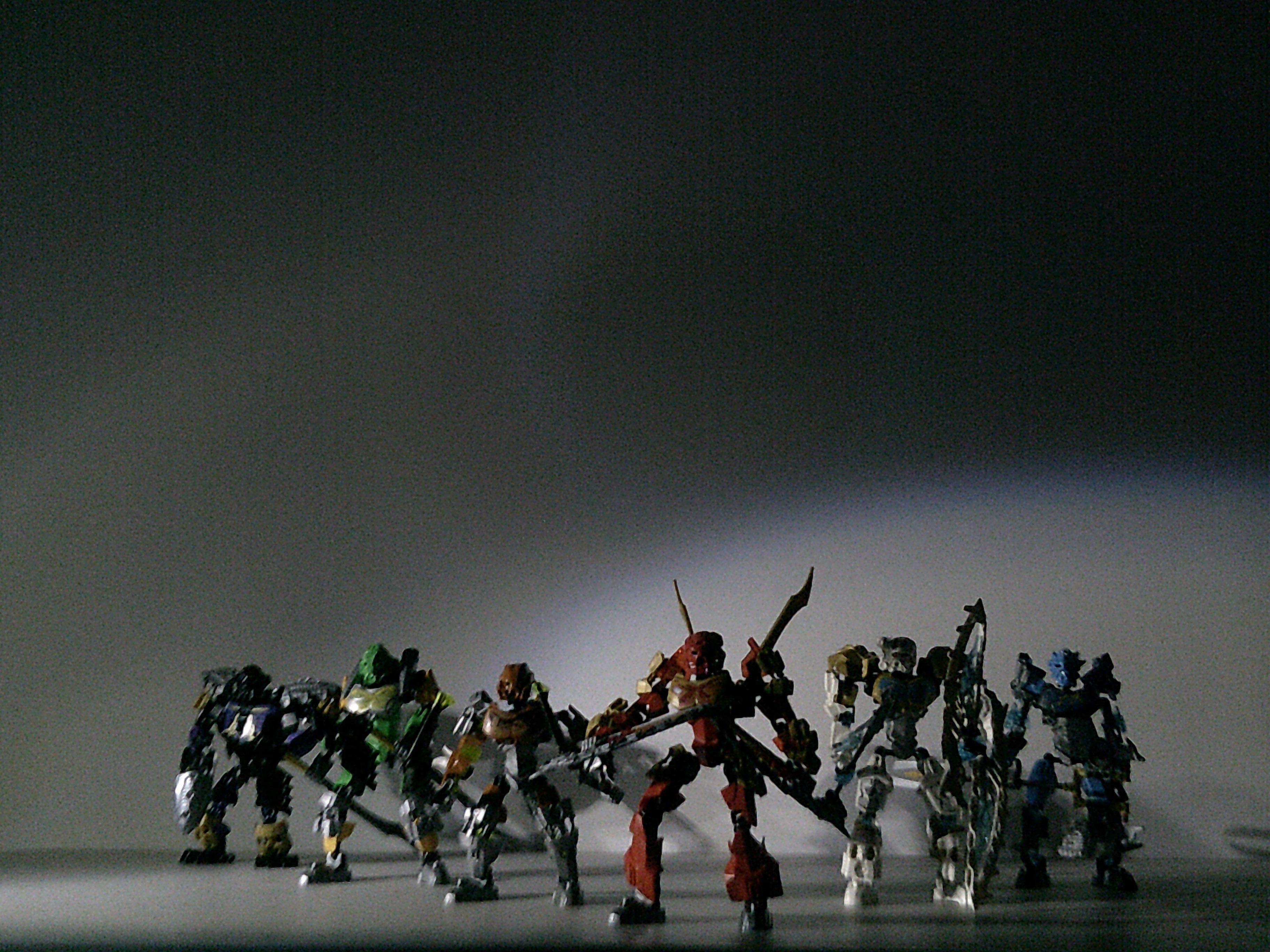
Here are some Pictures I took when I first collected all the 2015 toa; I had fun with the Lighting in the photos.
Any comments, critiques, or ideas?
11 Likes
I really like the fourth, second and sixth one. Those ones present to me as a more actiony style. However, I’ll give my thoughts on all of them.
-
Simple and straight to the point. It helps showcase our heroes.
-
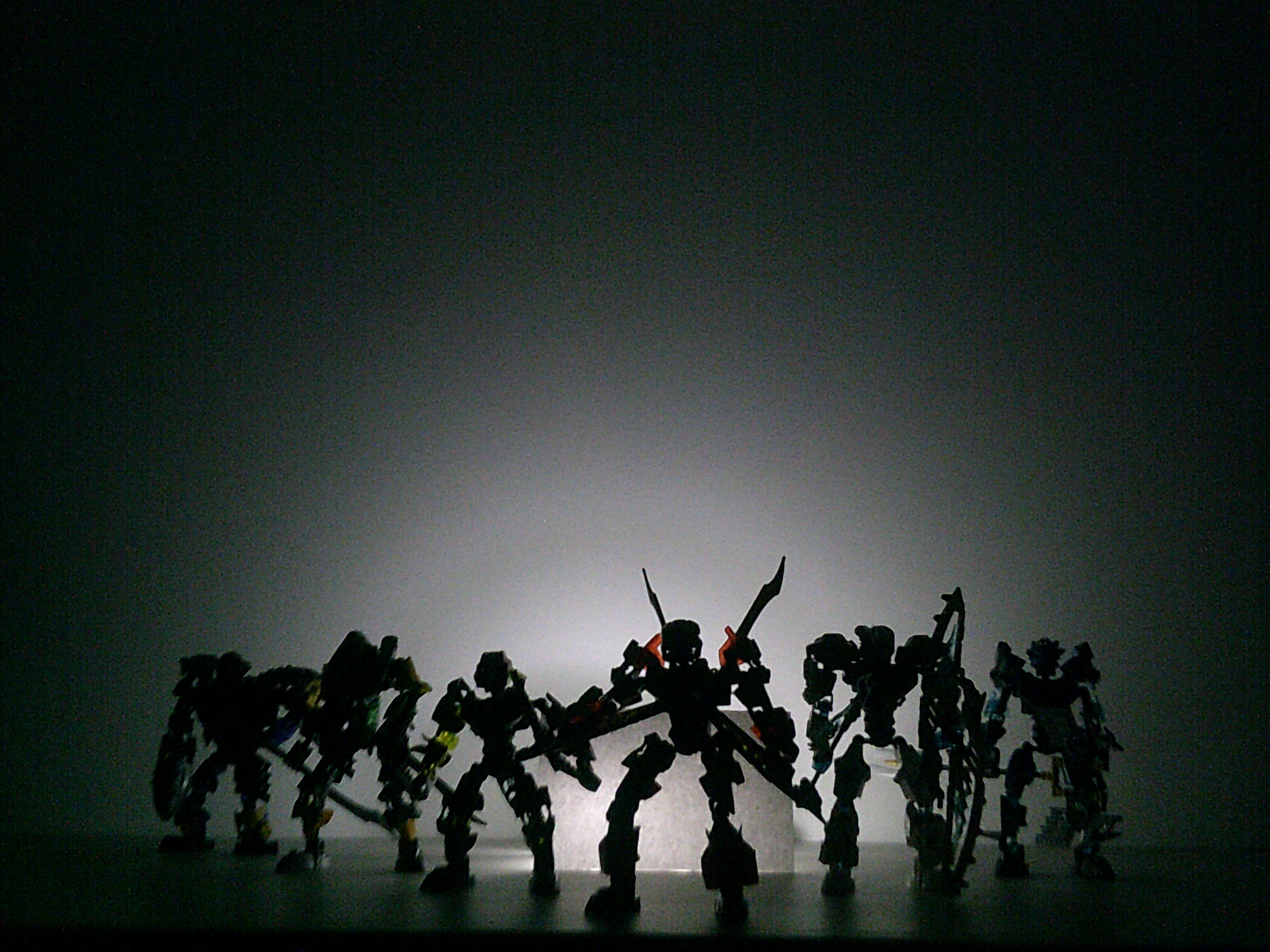
This is awesome. A silhouette really helps give the more “mysterious” yet heroic vibe, like our heroes are coming from the light to help those in the darkness.
-
This reminds me of one of those spotlight as a theater.
-
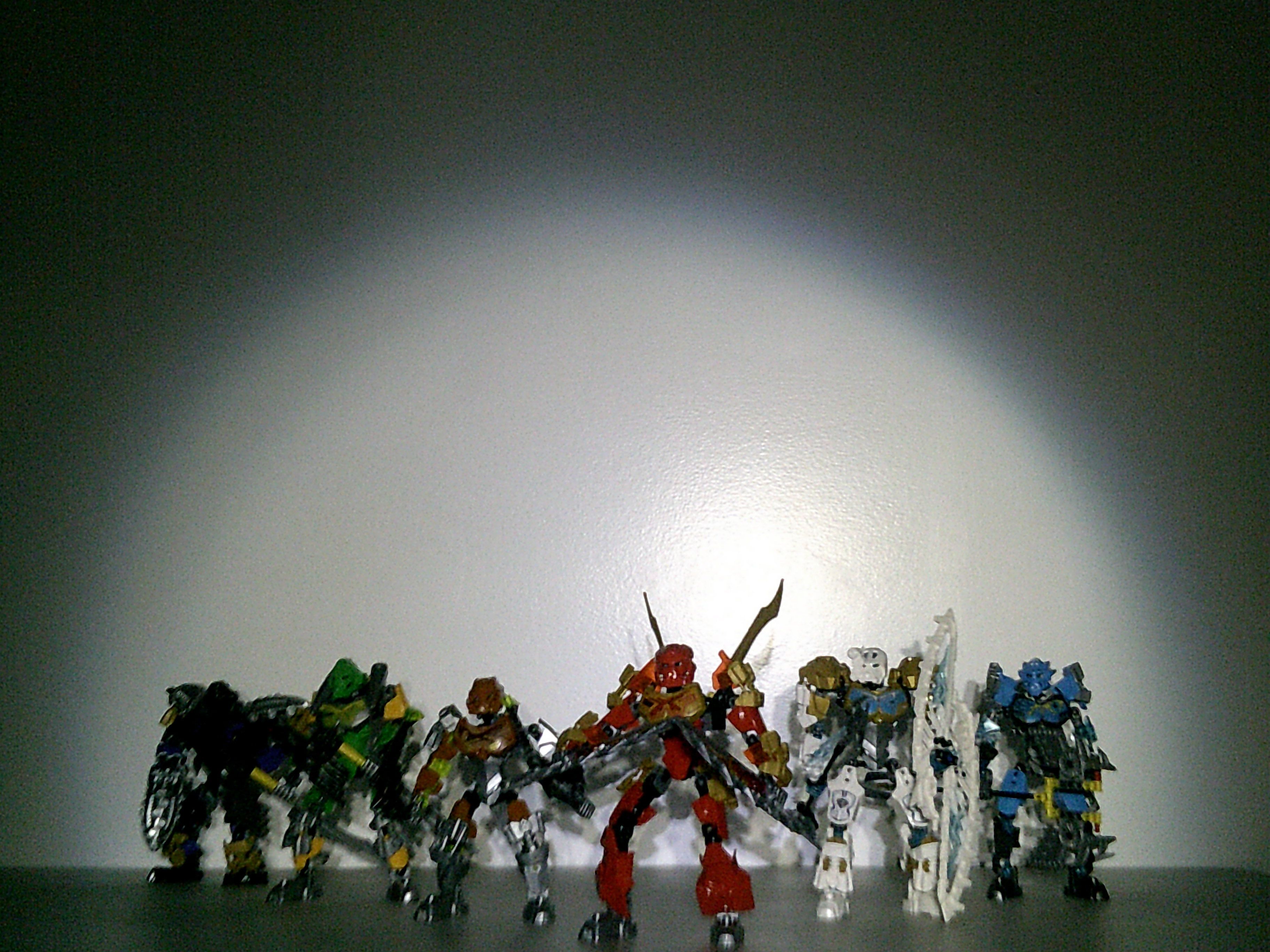
Straight to the point and slightly better than the first one. The colors stick out more and the blue background gives good contrast.
-
Again, gives me a super-hero vibe, except this time it makes them feel they’re in the streets.
-
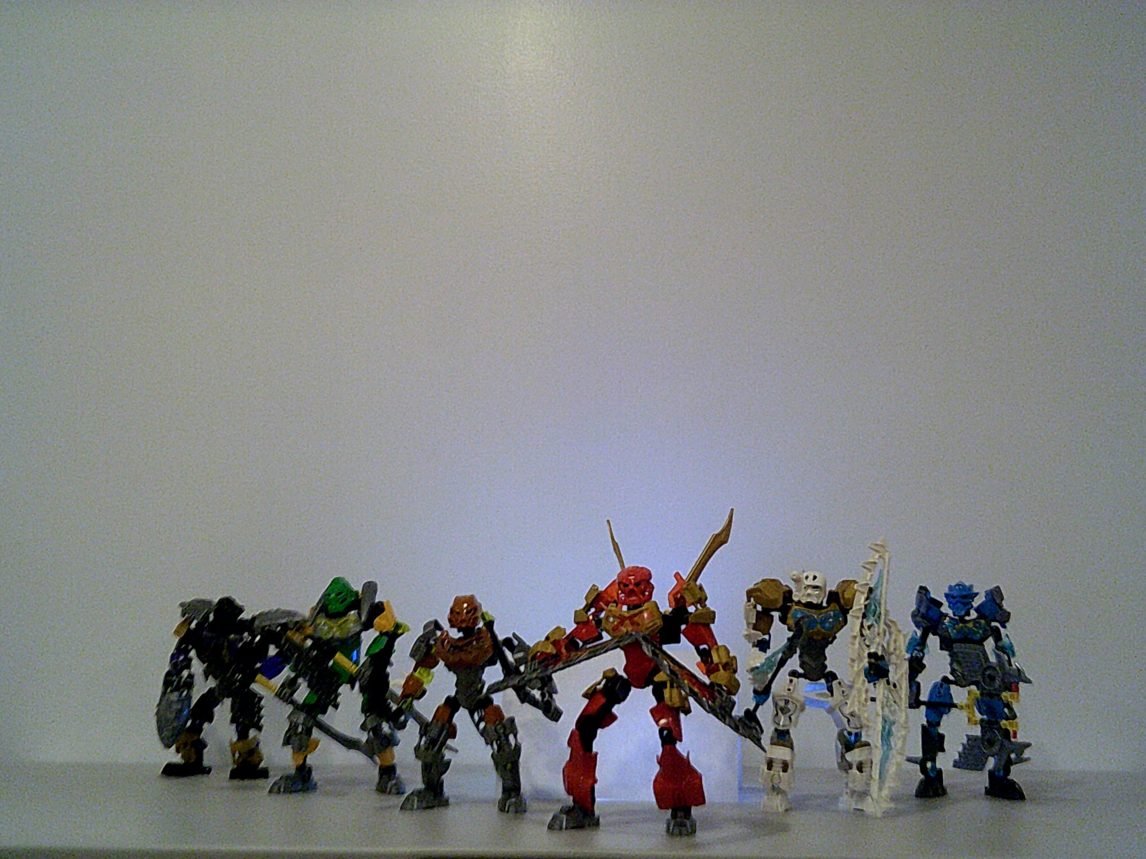
This reminds me of one of those detective films or something, where they flash a single light on a character with the rest of the background being black, but the characters are full colors. I really like this one.
2 Likes
I like the fifth photo. There’s something about it.
I really like the second and the sixth. The second has a feel like that of the Inika. The sixth looks like a dawn with renewed hope. That’s just what they remind me of.
-Emerald
1 Like