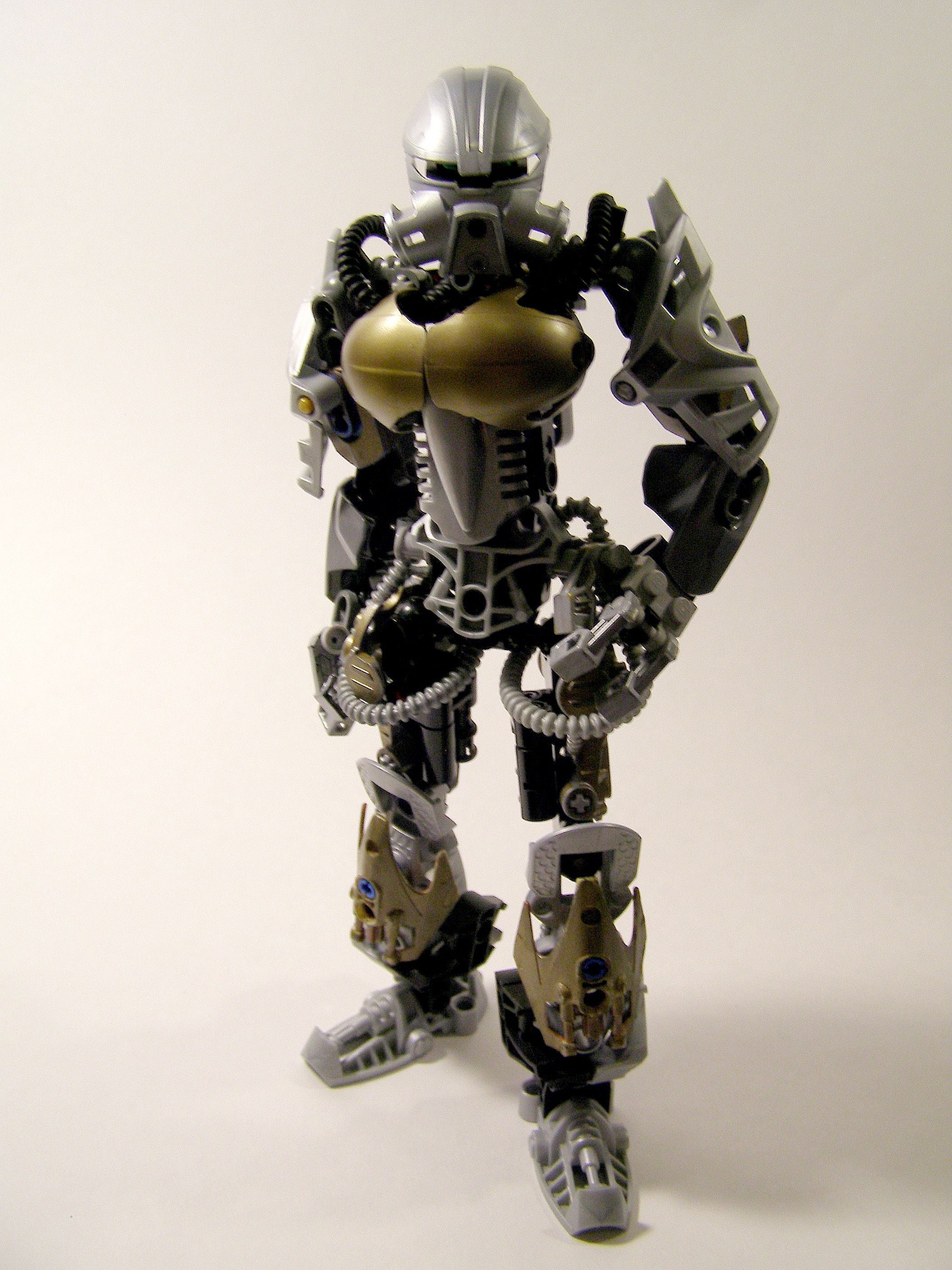
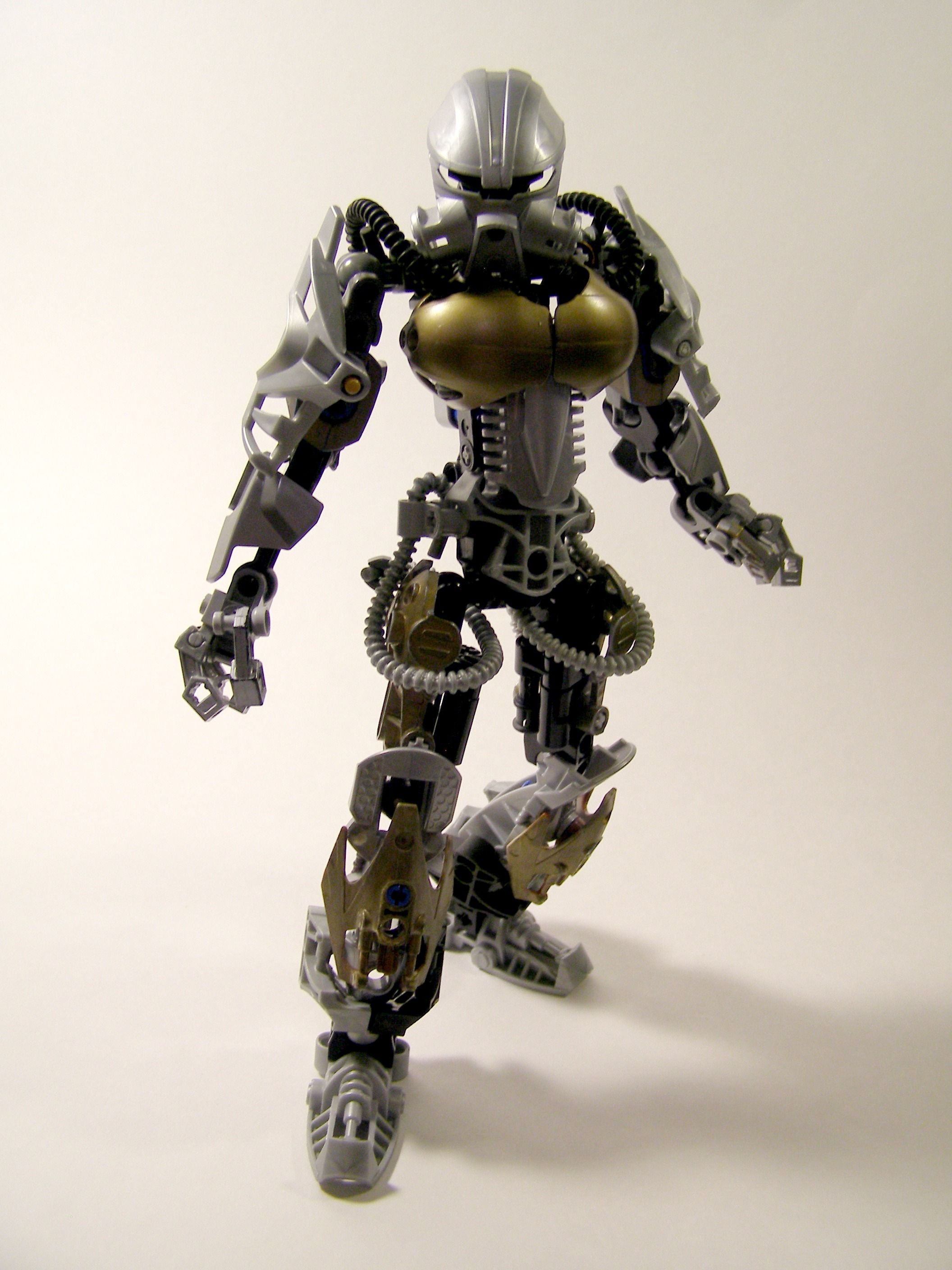
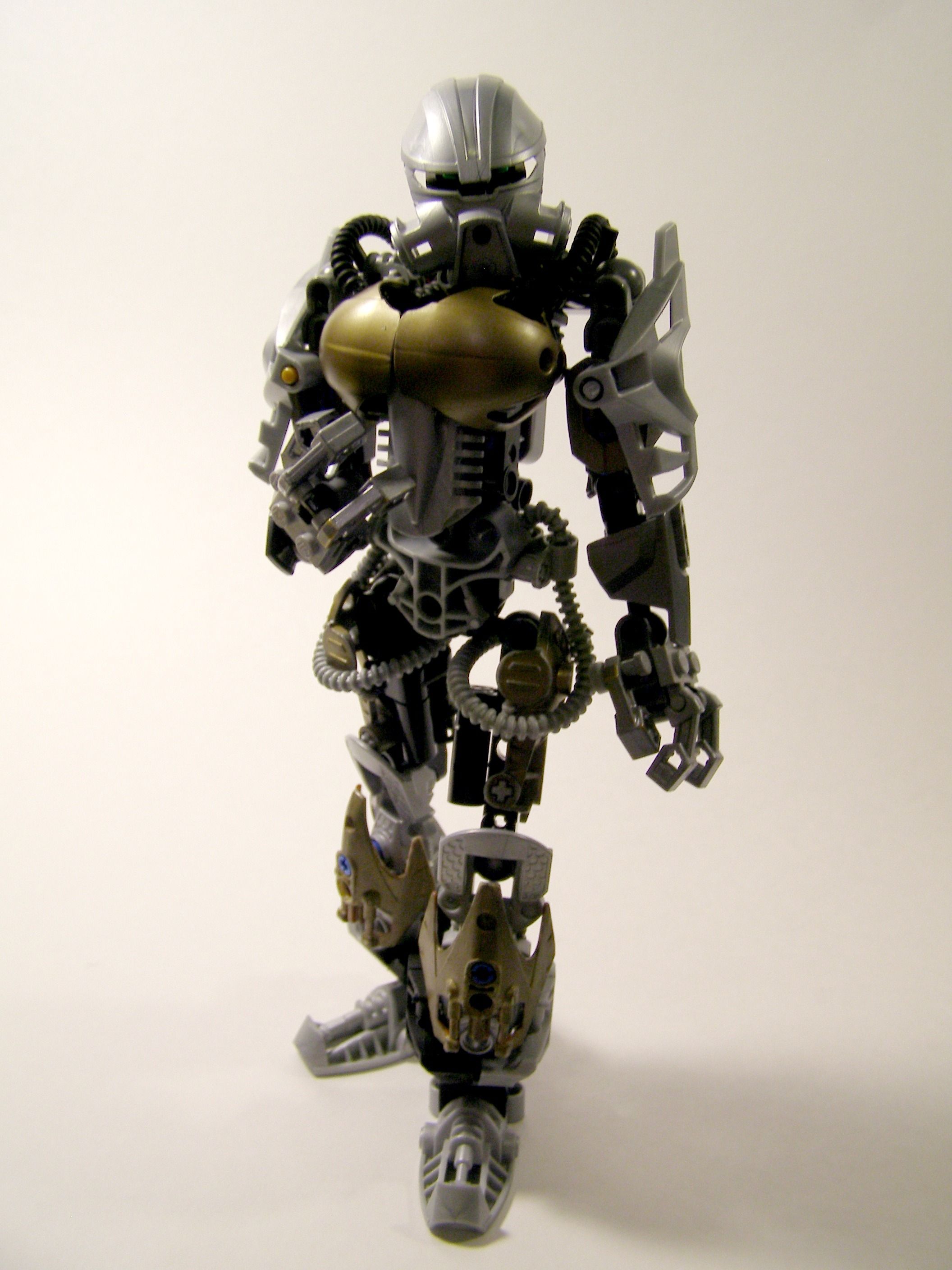
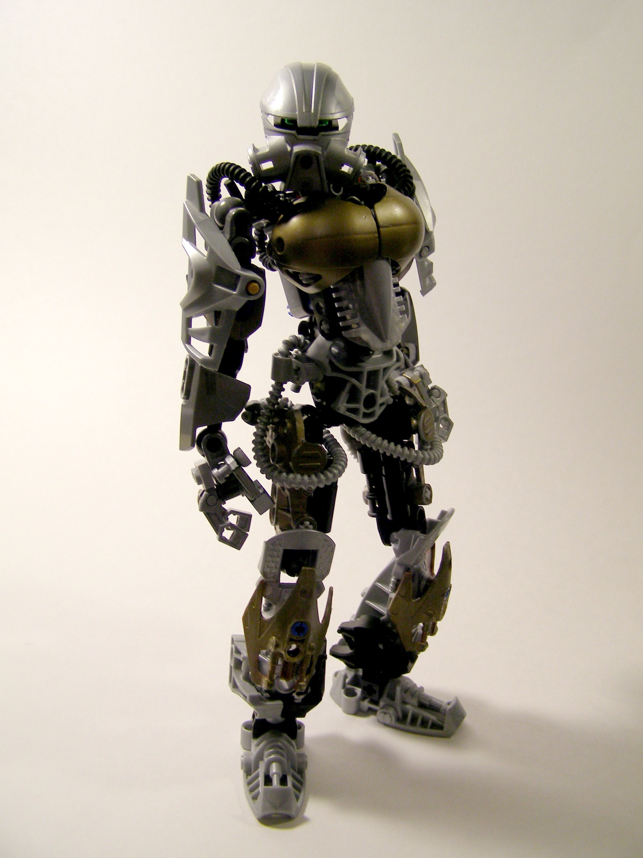
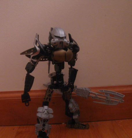
Original Moc:
33 Likes
I hate to be that one guy… but those nuvaboobs look kind bad on this MOC.
other than that, looks great 
6 Likes
Well, regardless of how they look, they are a key feature of this moc.
So thanks!
1 Like
Nice work as usual wind fall
Woah, did I start a Toa of Iron trend?
I kid, I kid. This looks pretty cool. Nice colors and solid build. Keep this up!
I guess it’s alright… the torso atleast flows…
I love the detailed look of this MOC. 
2 Likes
over all this MOC is really good, BUT THE BLUE PINS ON THE LOWER LEGS REALLY ANNOY ME!!!
1 Like
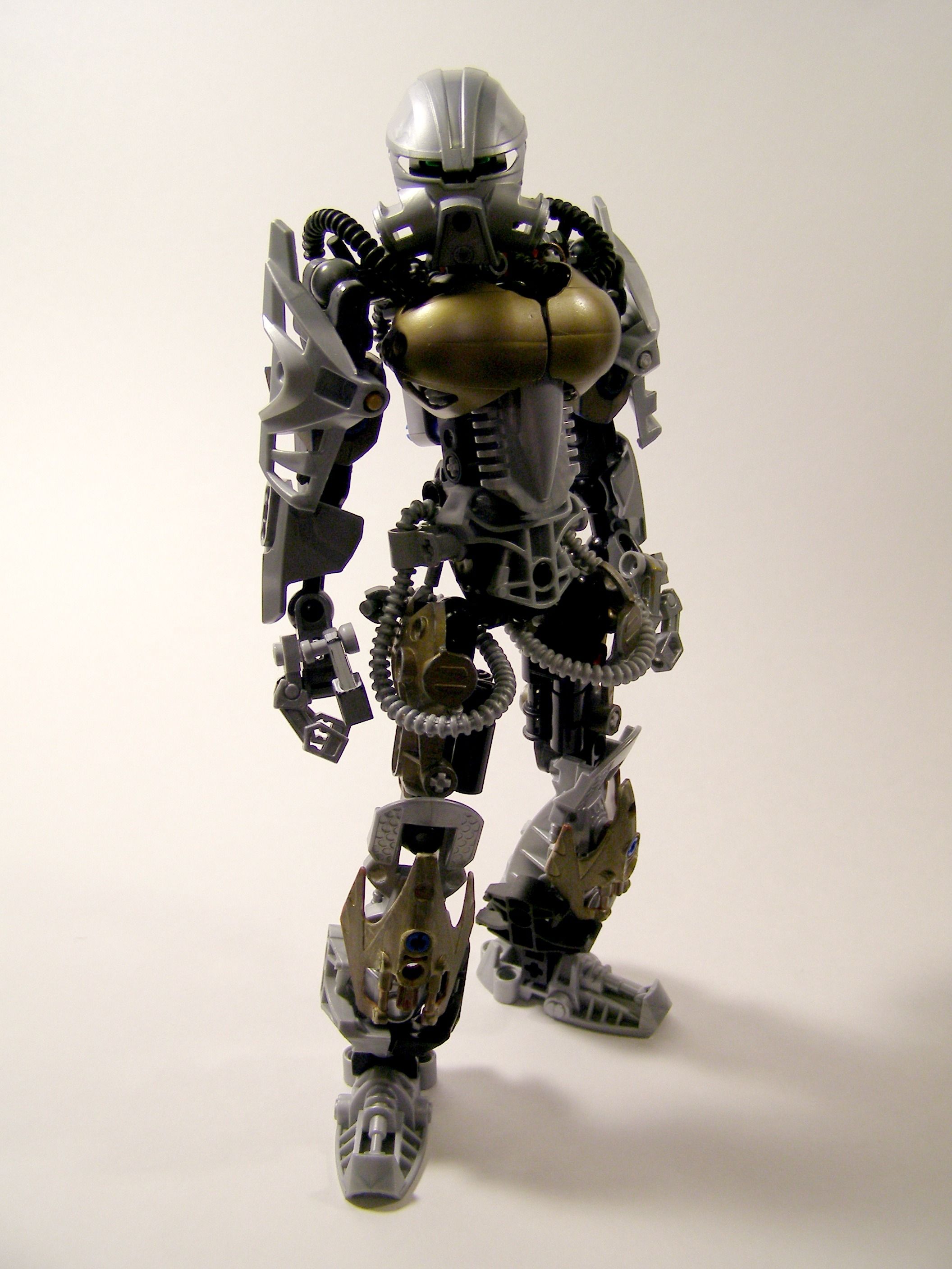
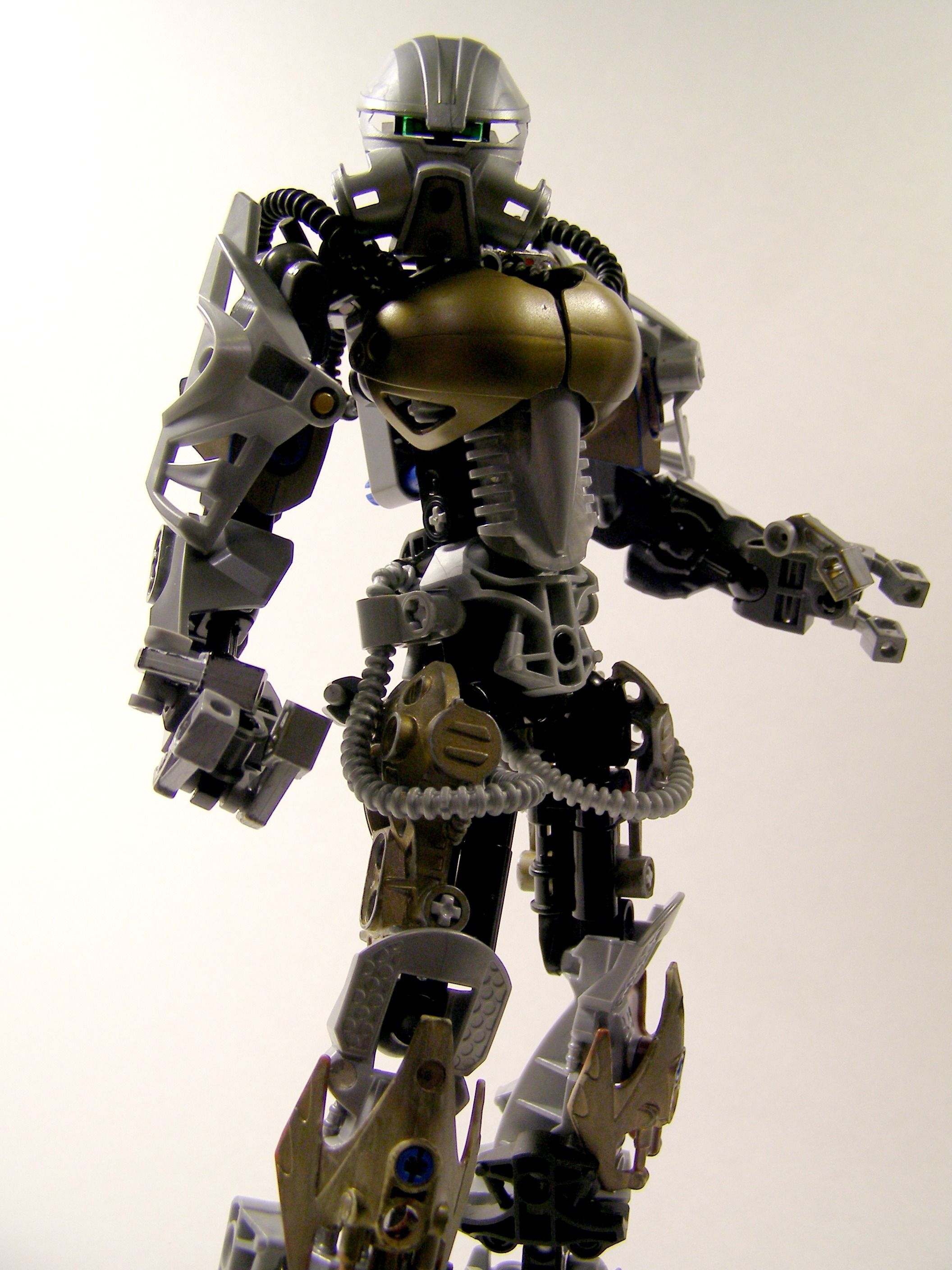
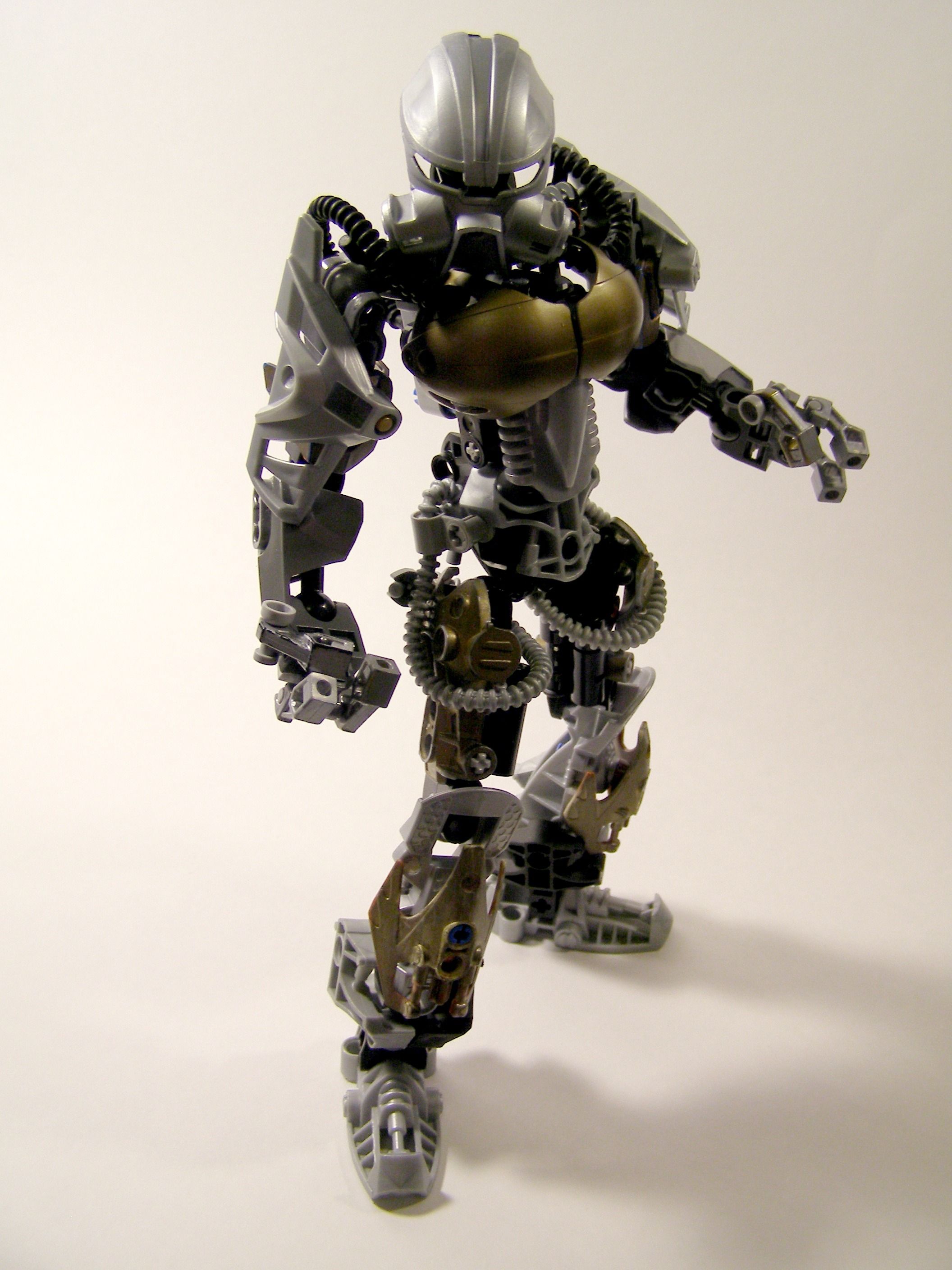
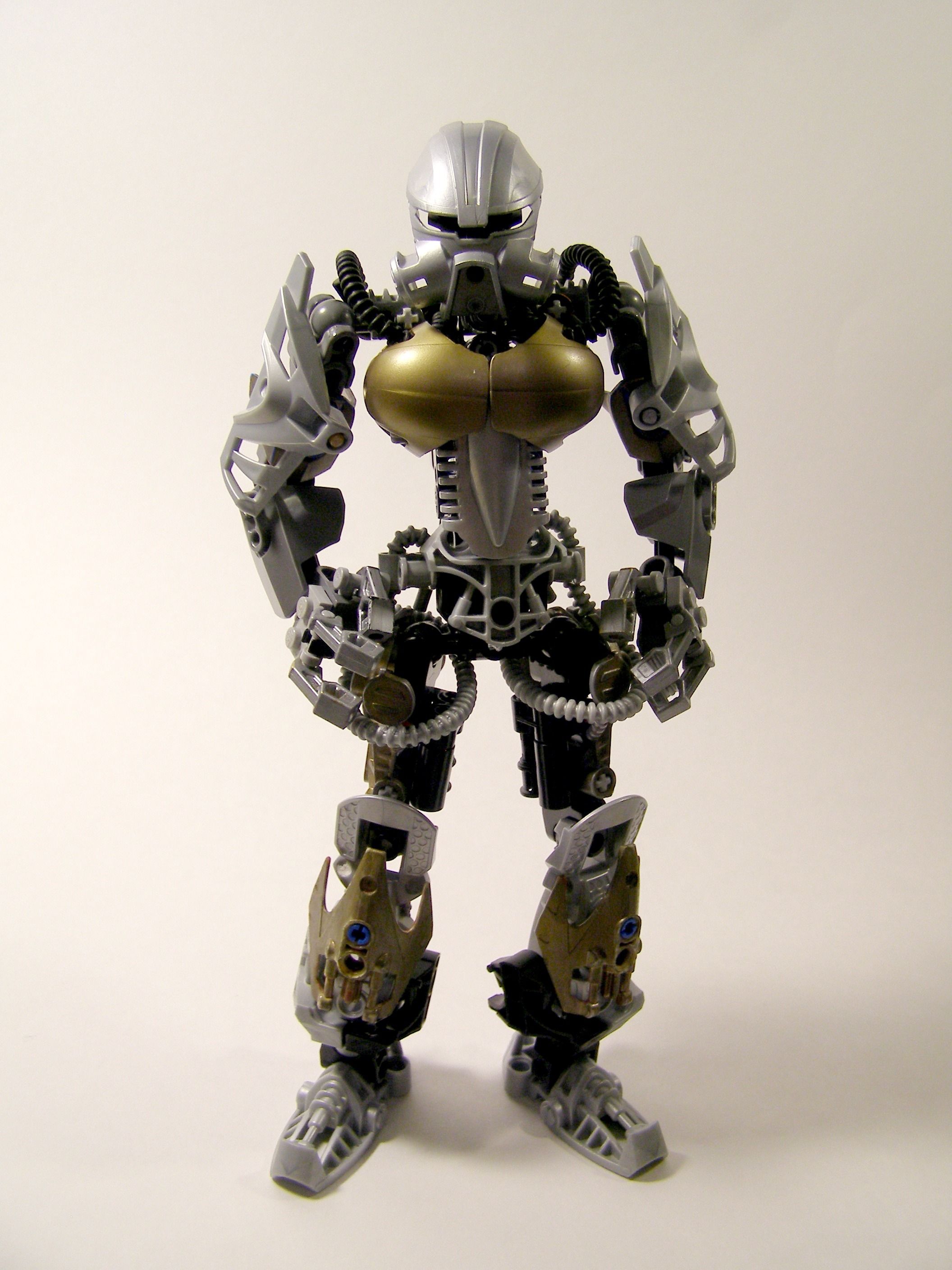
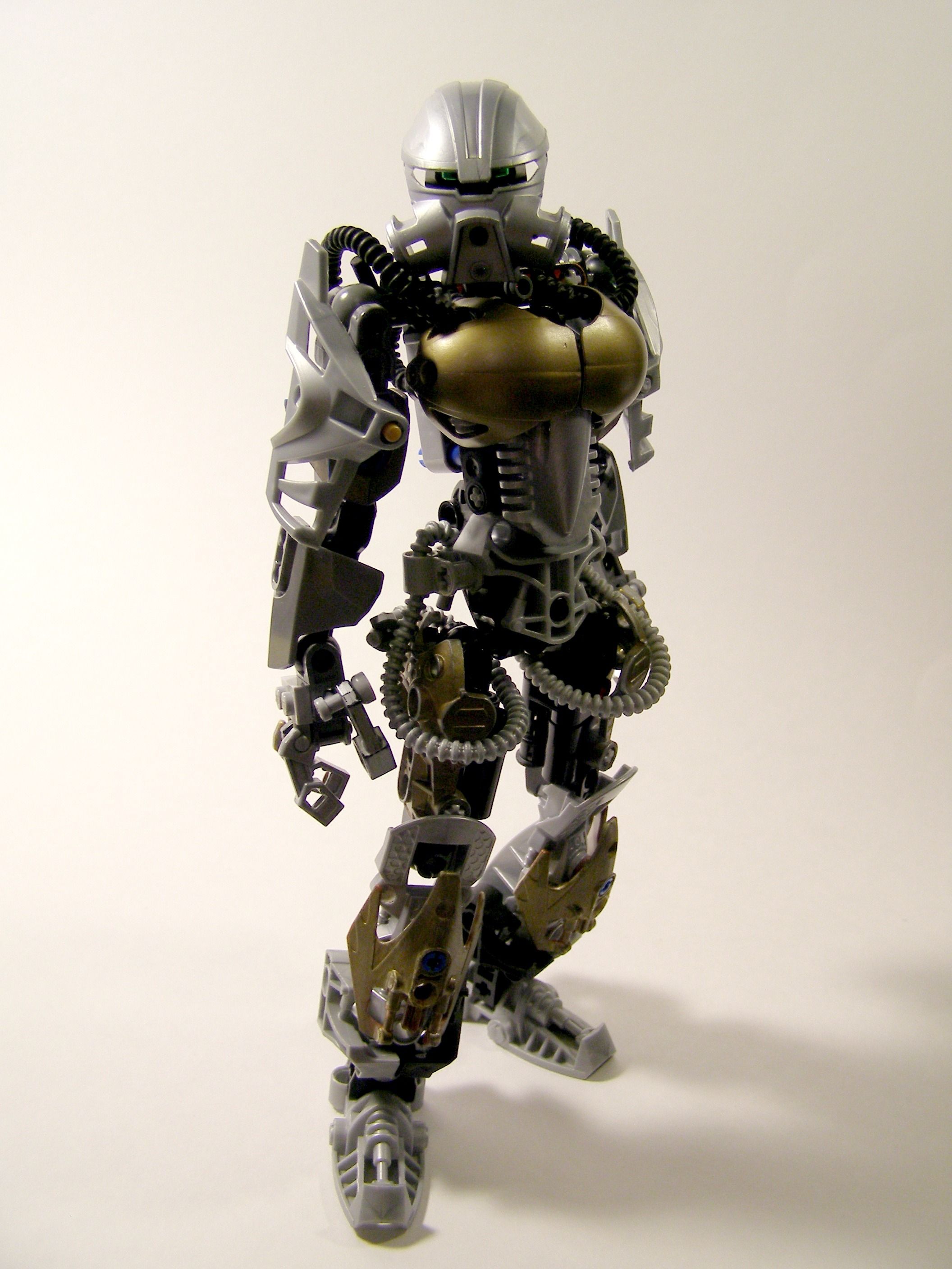
The golden Breastplate is just out of place for this moc
And
This Moc
Its the perfect Update of the original Well done
Have a cookie 
2 Likes
I generally dislike this use of the nuva shoulder piece… but I have to say that on a bulky female moc like this it looks cooler and more cohesive.
2 Likes
Well at least the breasts work better than on that last MOC
Which is not to say that they fit the styling exactly, but since the MOC is overall less texetured it could work out. The way they are attached does cause them to not line up exactly, which is a bit displeasing to the eyes.
Colors seem to work out, although the transition from old to new silver on the arms seems out of place. Using gold armor instead of old silver armor on the shoulders might negate the contrast. Also the tubes on her hips look bad.
1 Like
thats a clear upgrade from the last version
well, the hips are gappy and the tubes look awkward, but otherwise no real complaints.
[quote=“Hawkflight, post:11, topic:15590”]
that last MOC
[/quote] 
@Whaddon and @Darknova3529
Thanks! I’m glad you think so! Though it wasn’t my moc originally.
Tubes look a little odd, but apart from that good job.
Fantastic. It’s come a long way from the original version. But… the chestplate does seem out of place.
1 Like
I like how the colour scheme is the reverse (with more silver) of the protector
What do you mean? What protector?
There is a protector of iron moc
I did not know that. Indeed, I had never heard of it