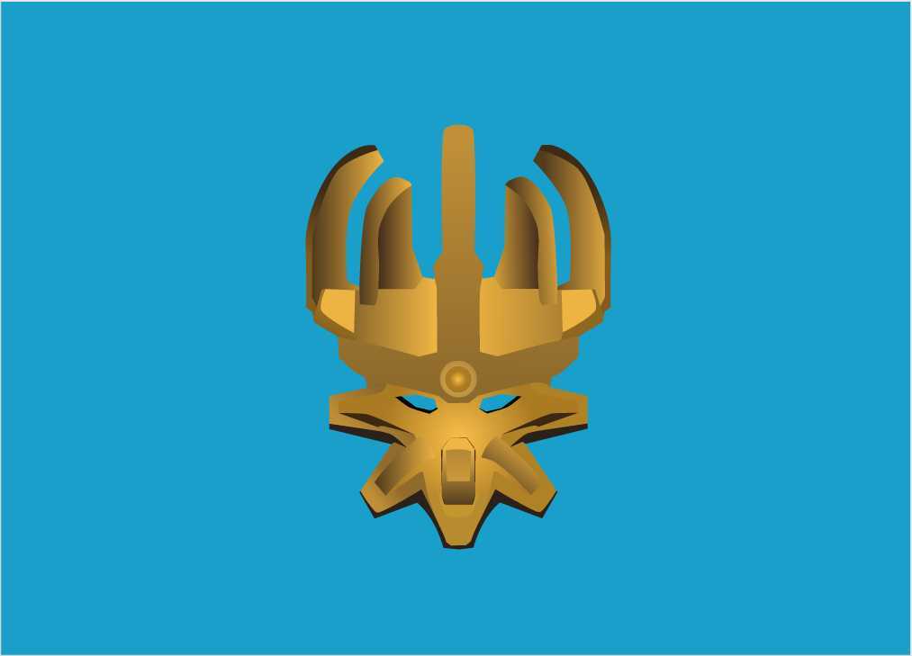
i tried making a mnog styled G2 mask
and here’s the entire thing

version 2 (Fixed Proportions)

What do you think?
i tried making a mnog styled G2 mask
and here’s the entire thing
version 2 (Fixed Proportions)
What do you think?
looks pretty cool! Now I want OOG
You should do all the G2 Toas masks. Or maybe the legendary masks?
Man someone has to a project to make mnog versions of the g2 animations and add it to a flash game
Some people on the community are making that
i am, hopefully
If only lego decided to make an official one ![]() that’d be cool
that’d be cool
Fits the style amazingly
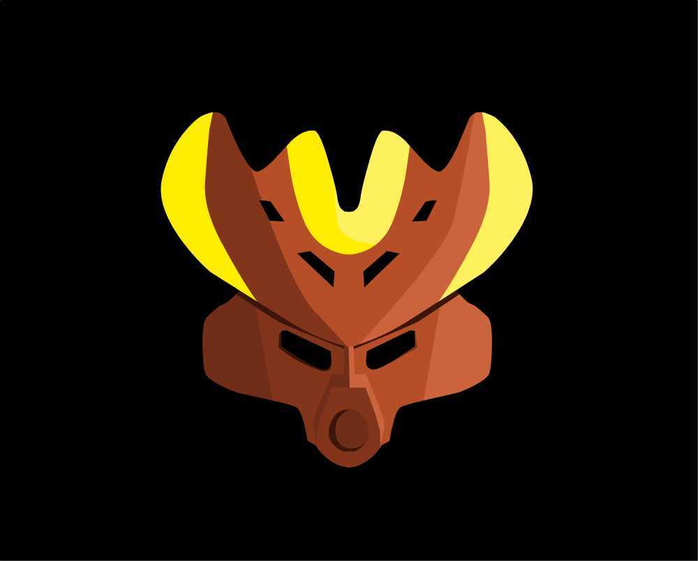
I don’t think the MoCr works in mnog style.
I disagree, I think it looks amazing in the super simplified form.
Personally, I think it looks good with all the details.
I’m not saying it doesn’t, in fact I love all the crazy details on the MoC, but I also like this simple tribal-esque version.
Well, I think we can both agree that these masks look good!
I think I should do some stuff like this, this is awesome!
The PoS mask is pretty great, though Nilkuu himself could use some work. I think the biggest issue with the MoCr is the gradients on the horns.

MNOG’s style is very iconic in that it’s very simple. On each mask, only about 2-3 shades are used. Gradients, while used in some instances, are largely ignored. I think your MoC would be a lot better if you followed that style.
Also, it’s probably a better idea to save your work as a .png rather than a .jpg ![]()
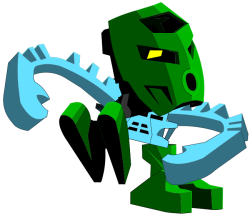
Not bad! The villager is posed a bit weirdly, though.
I’m going to echo @Political_Slime and suggest that you save your assets as .png if you have any interest in contributing them to a flash game at any point in time. There’s a lot of excitement building in me right now; I feel like the MOUP could translate incredibly well to the MNOG style, and your art is prety faithful to the original. If I were you, I would widen Nilkuu’s shoulders a bit and narrow the CCBS shells on his thighs; right now, his proportions are a little disconcerting.
The proportions for the Protector are off, not to mention the armour pieces are blocky but not in a believable way.
Thanks for the feedback guys!
i really appreciate it ![]()
i’d probably fix some of the mistakes on the MoCr but at the moment i’m focusing on the Protector
He’s not actually done yet. i just did something quick with the things i have and he will be updated somewhere in the future
again thanks for the feedback
Stunning… I really like it.
I do suppose there could be some changes done to the way your armor shells are designed.
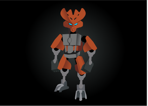
fixed the proportions
thoughts?