Certainly. Would have initially but I didn’t have the time for a full critique until now.
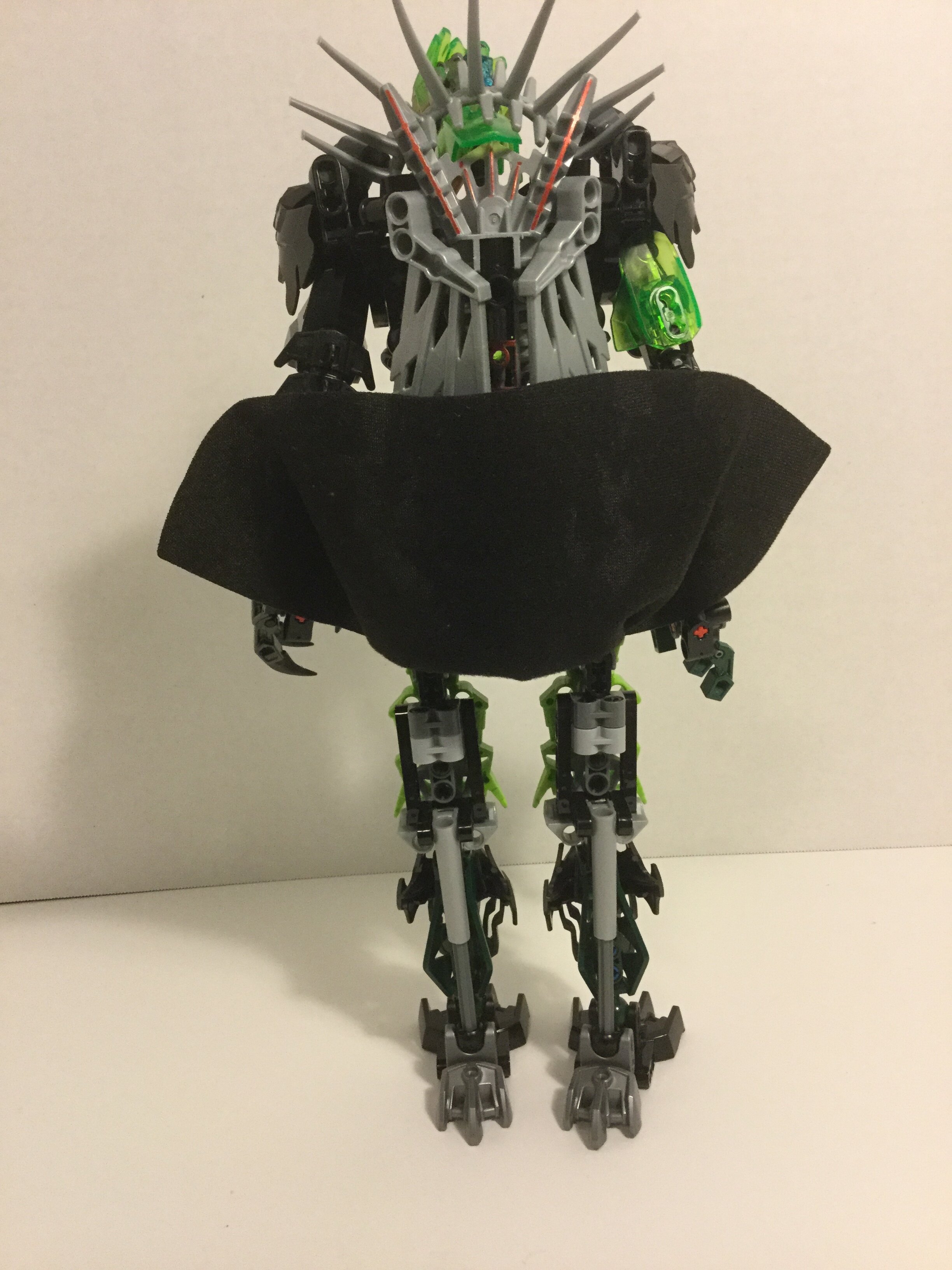
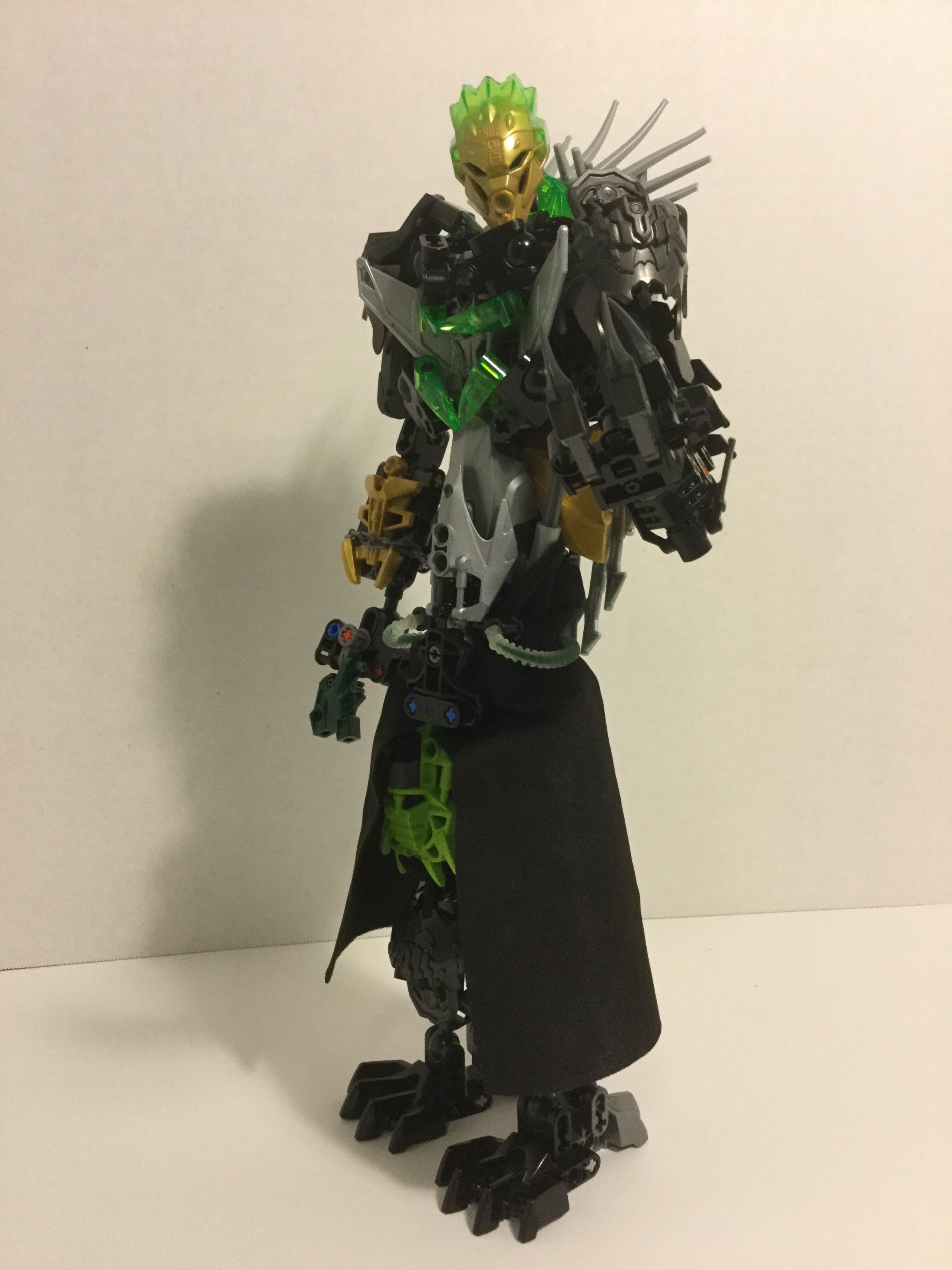
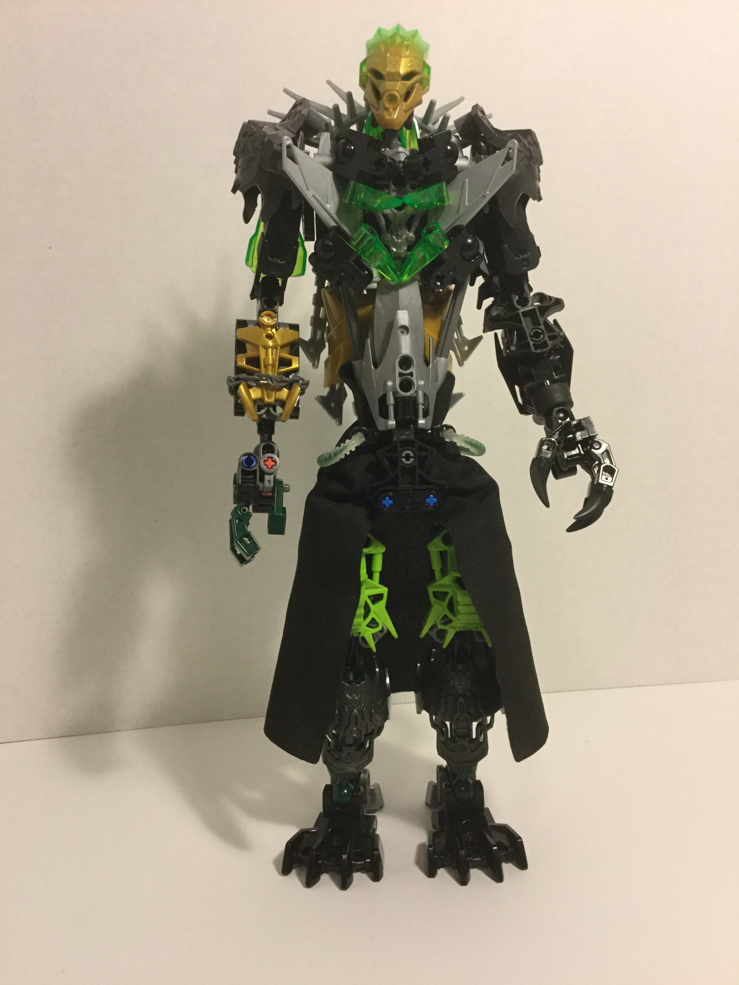
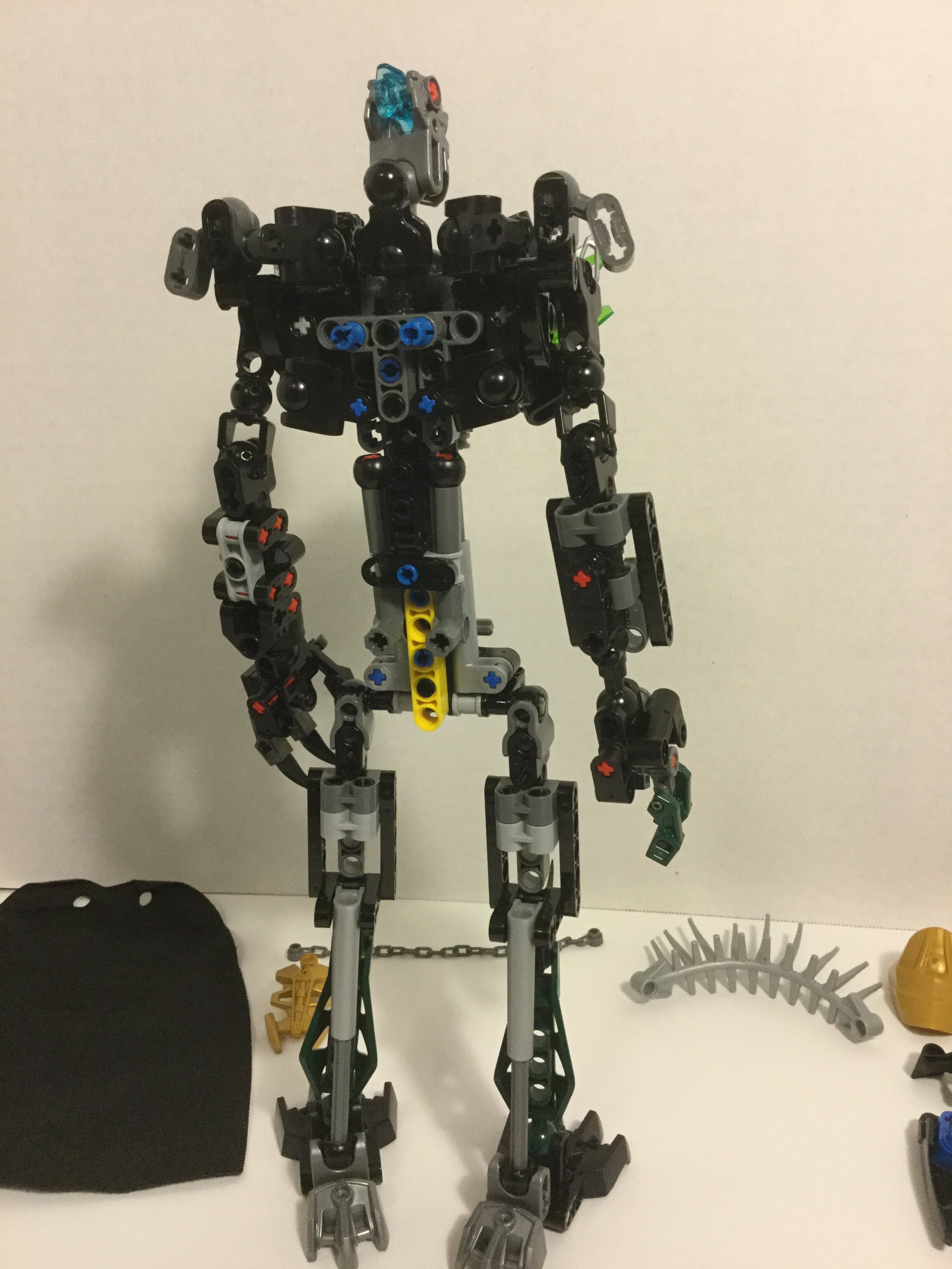
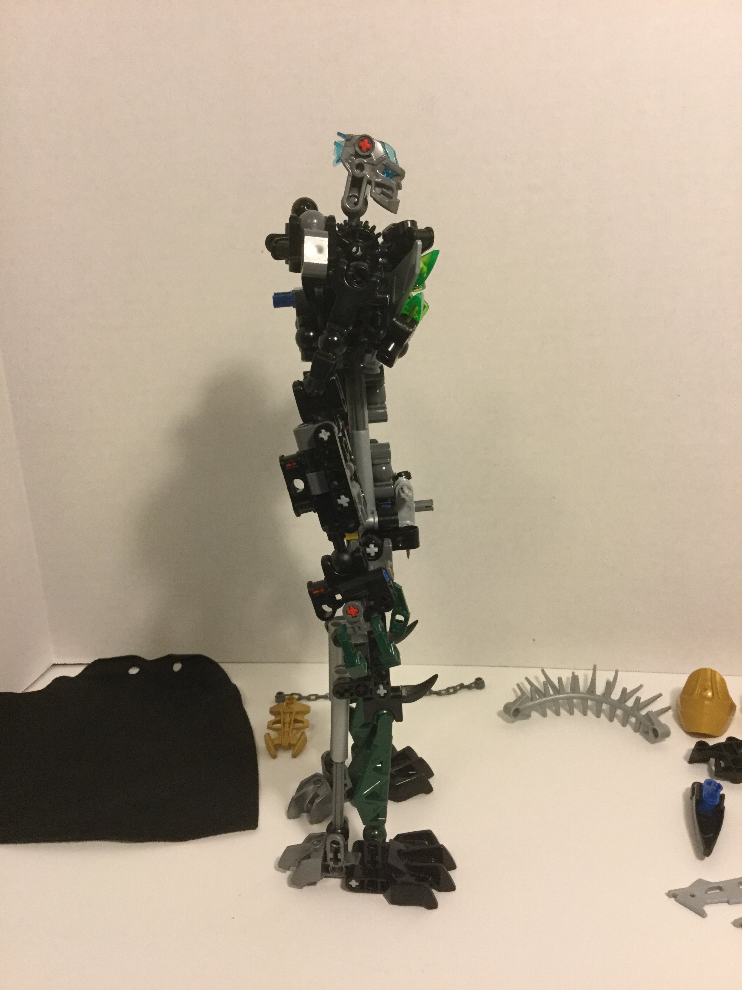
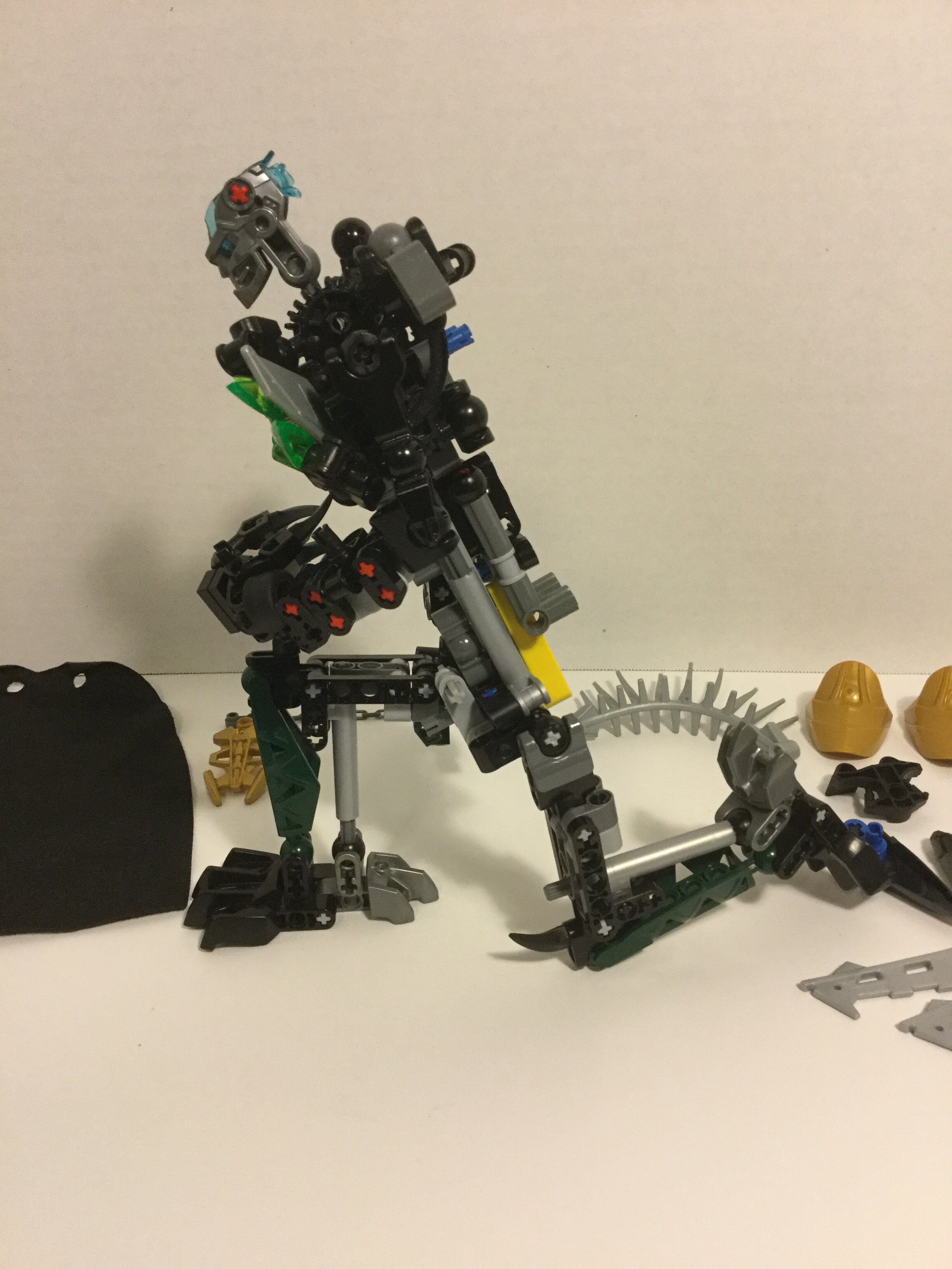
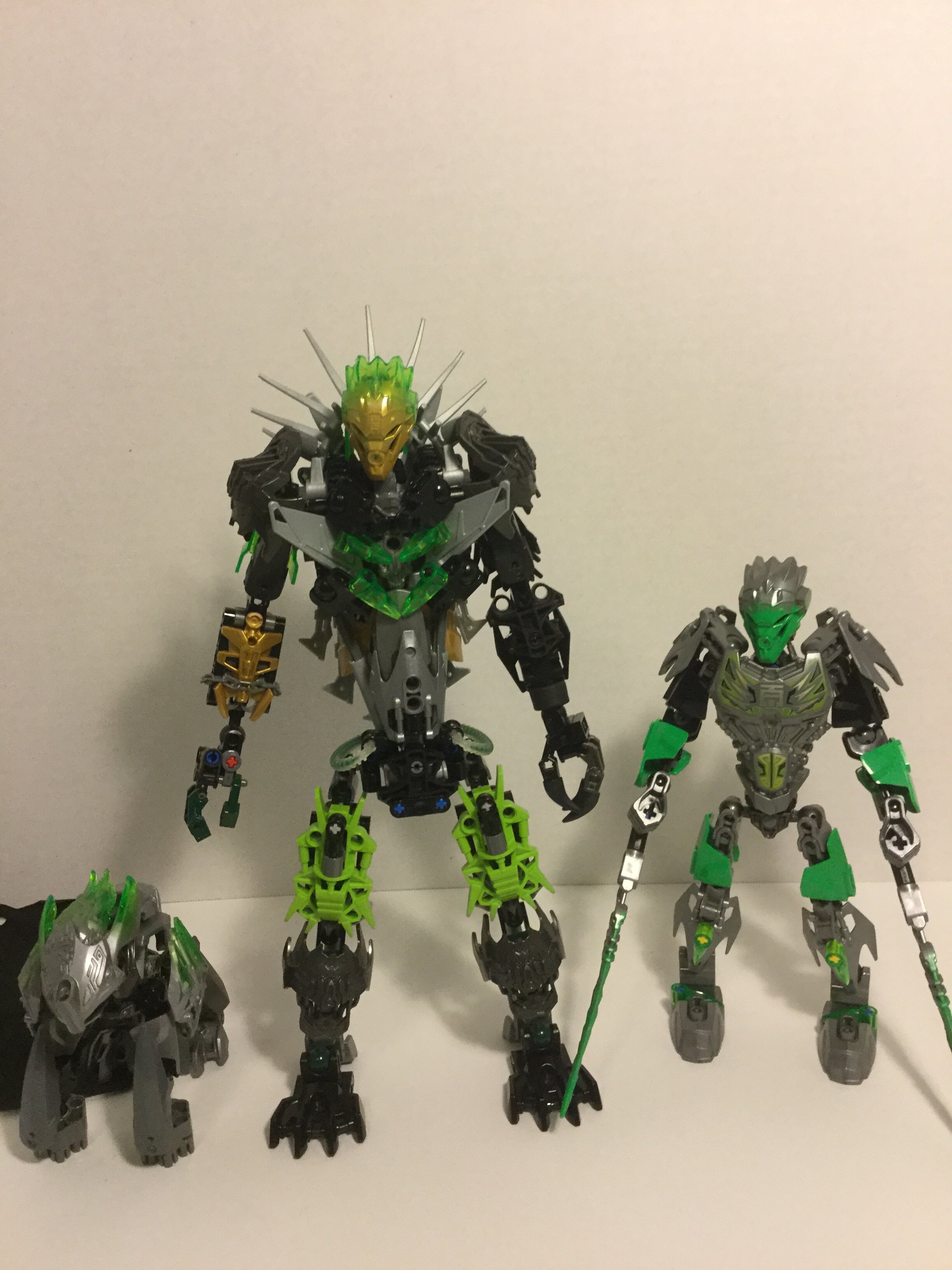
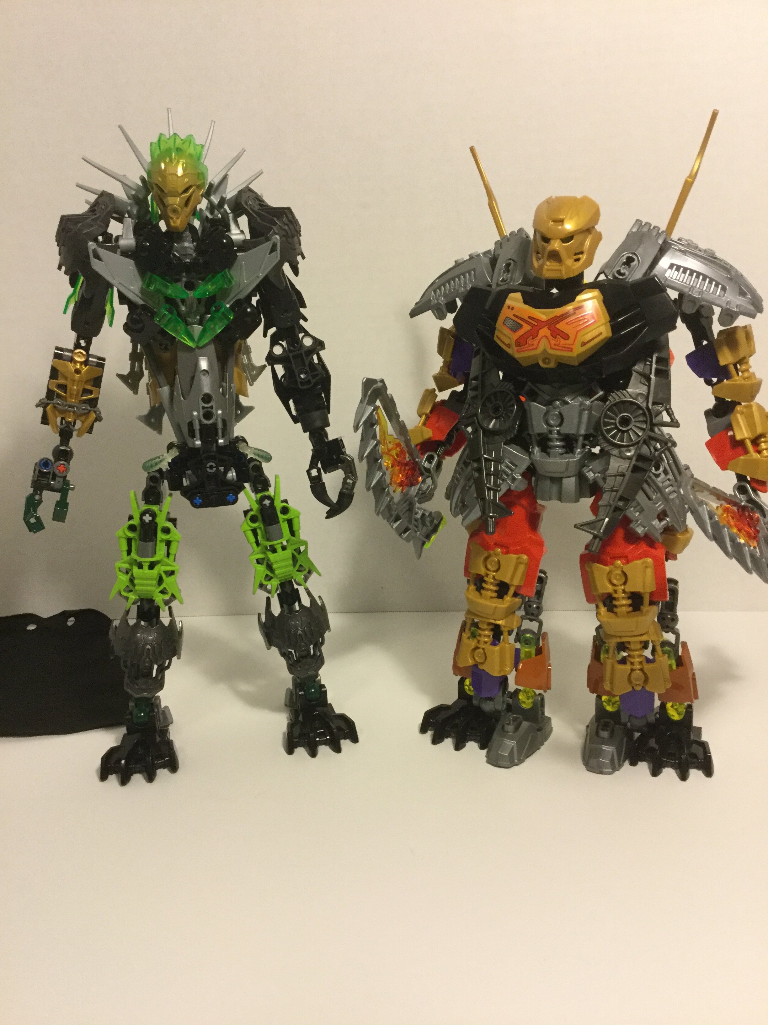
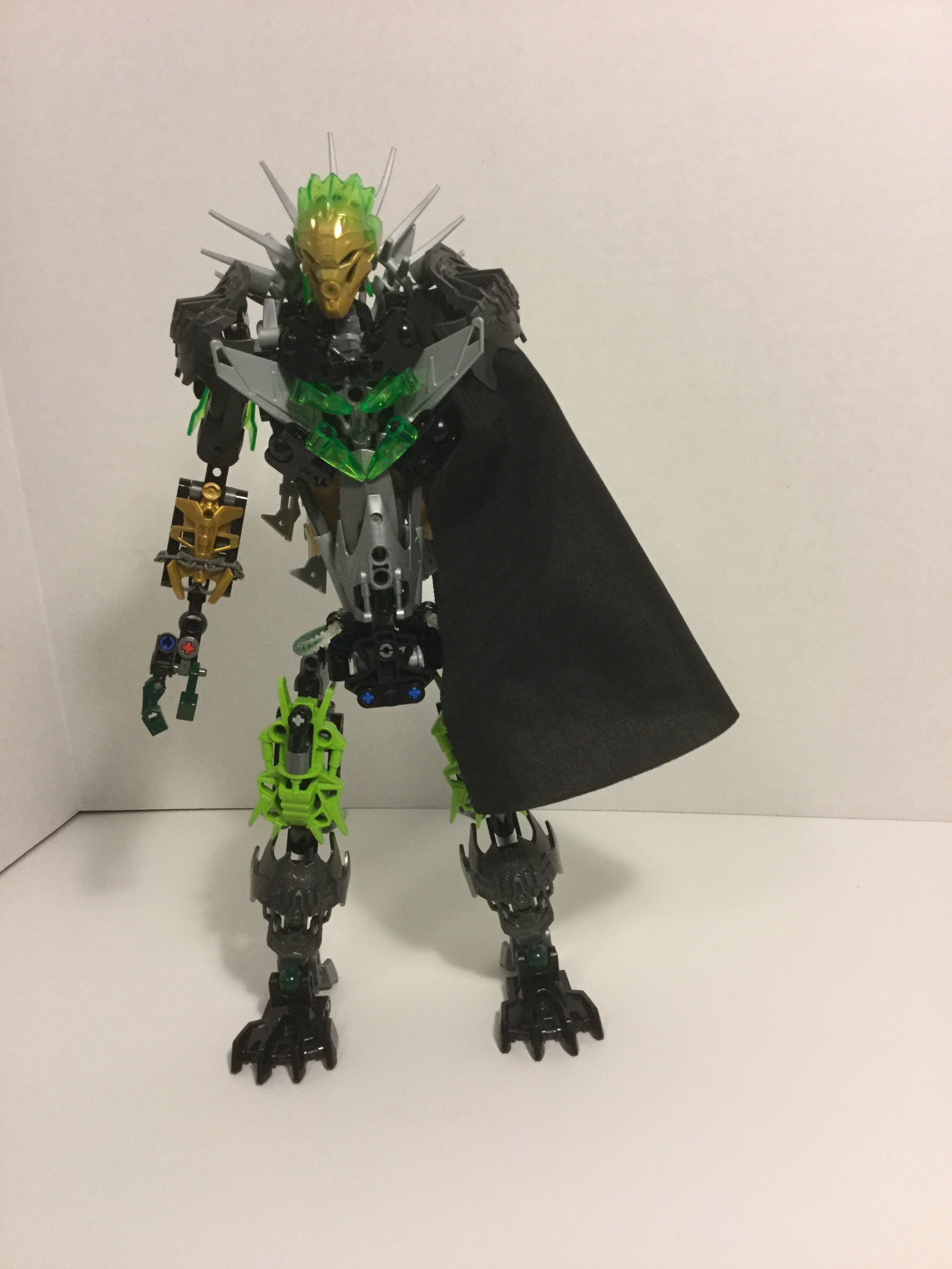
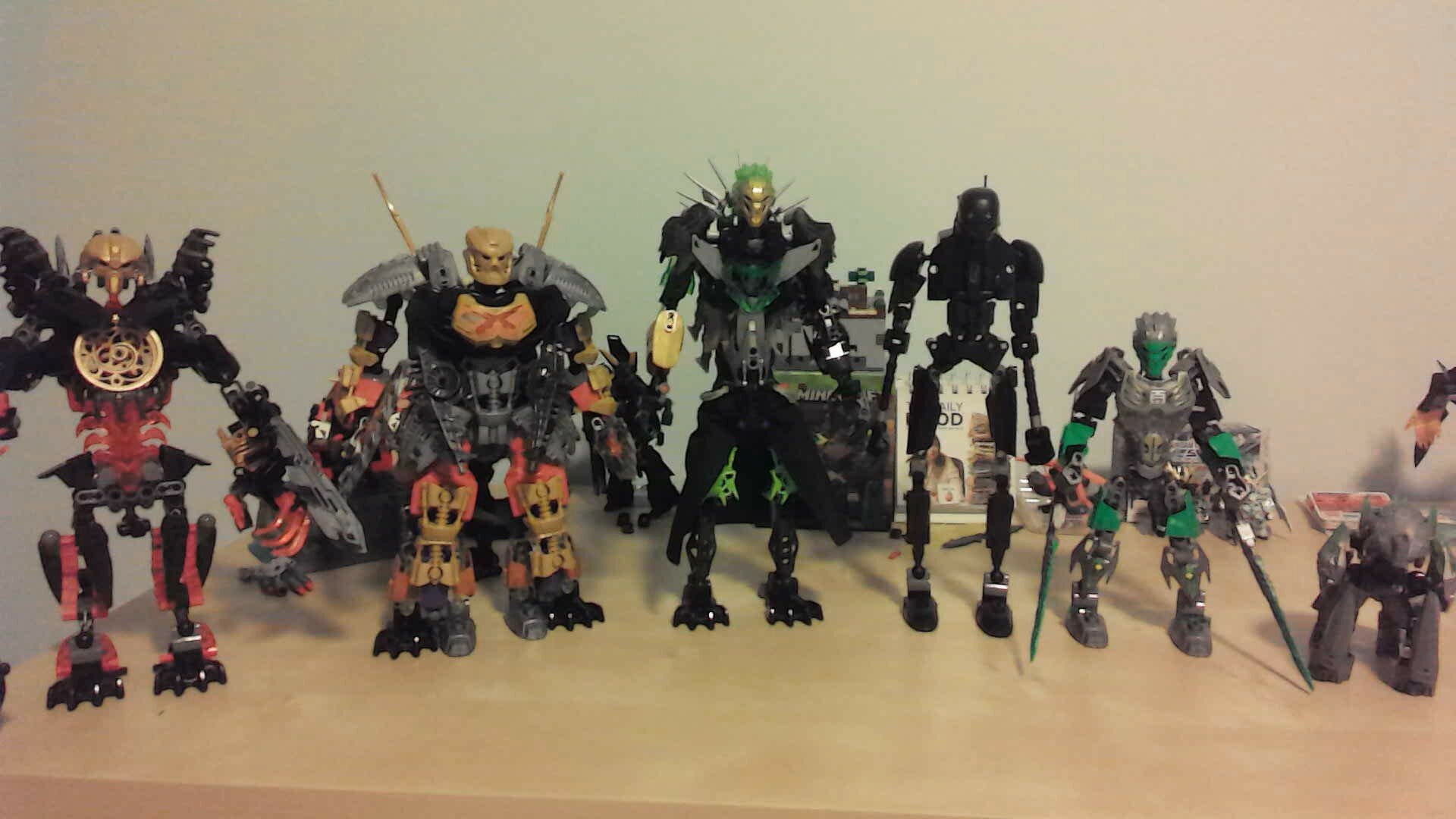
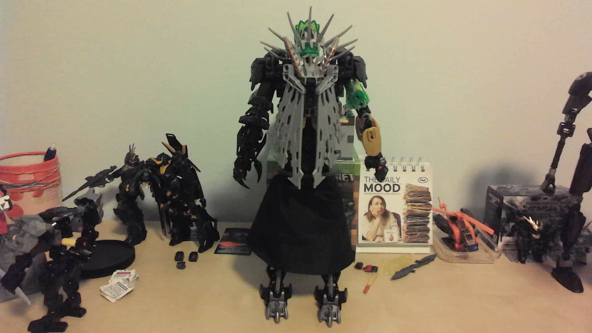
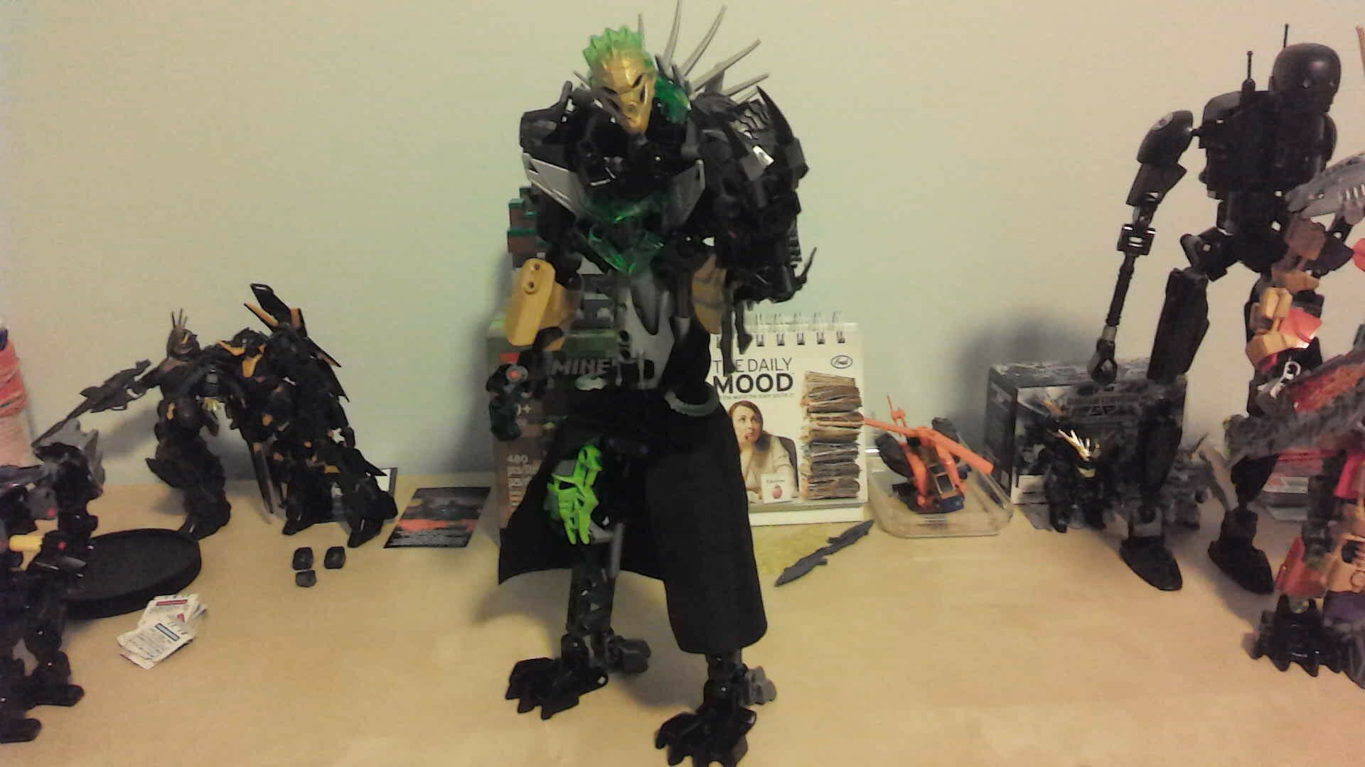
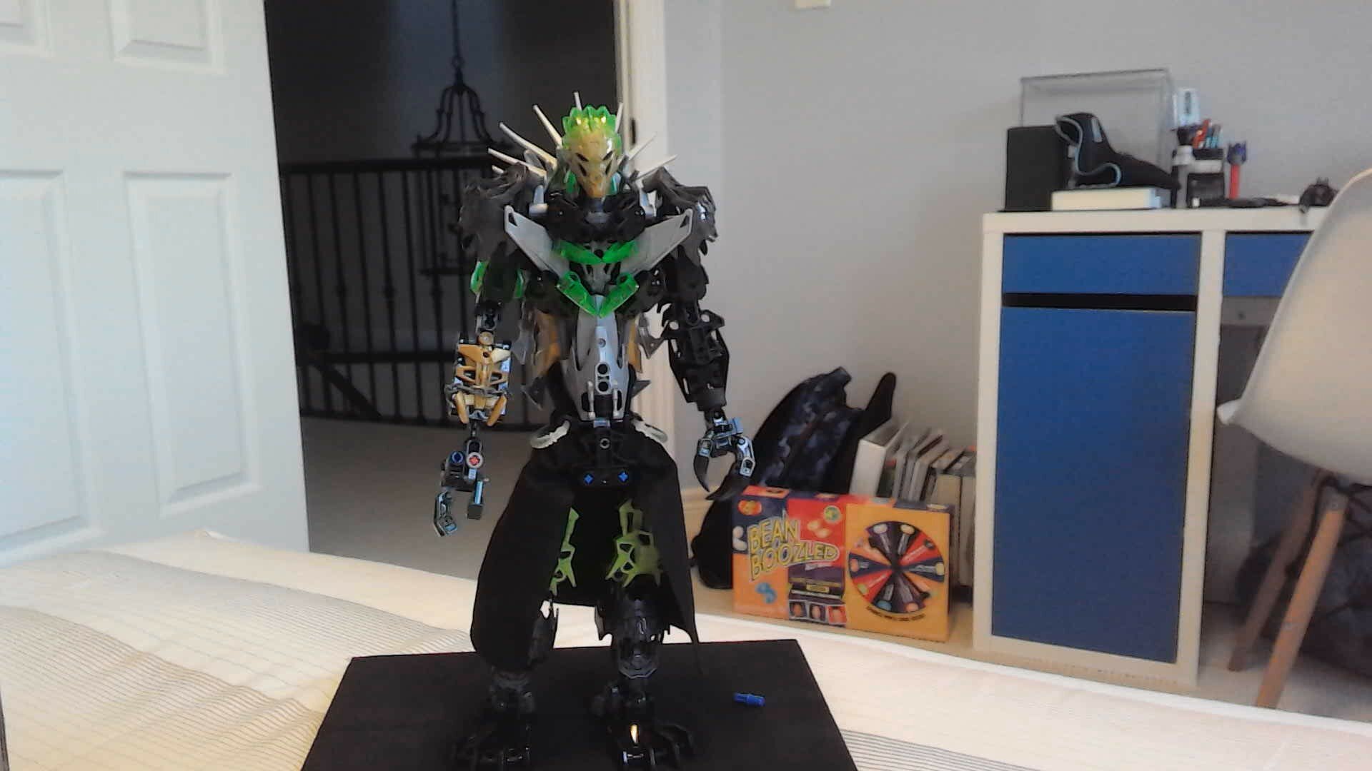
One, the legs are far too short for the torso and arms, but it’s not something you can fix by making them longer, because it will very quickly get even lankier than it already is.
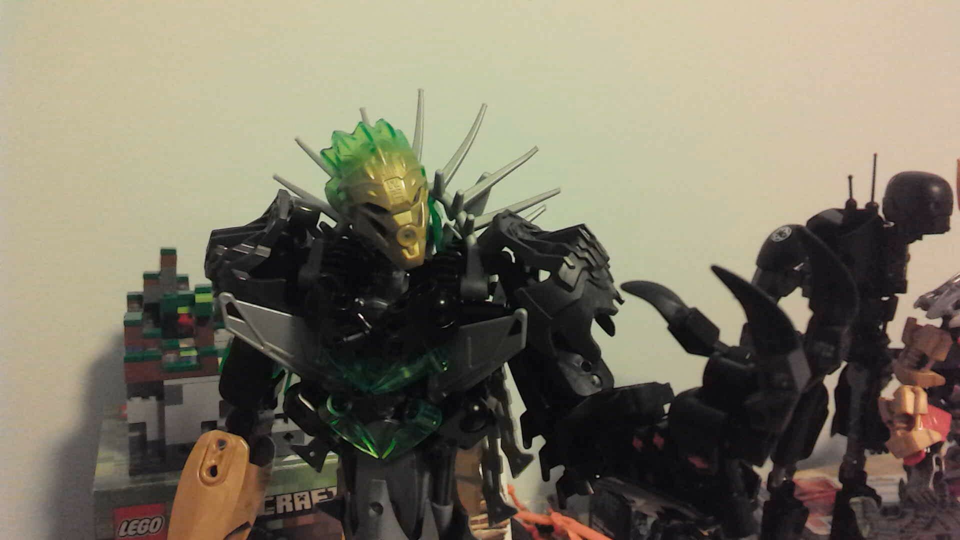
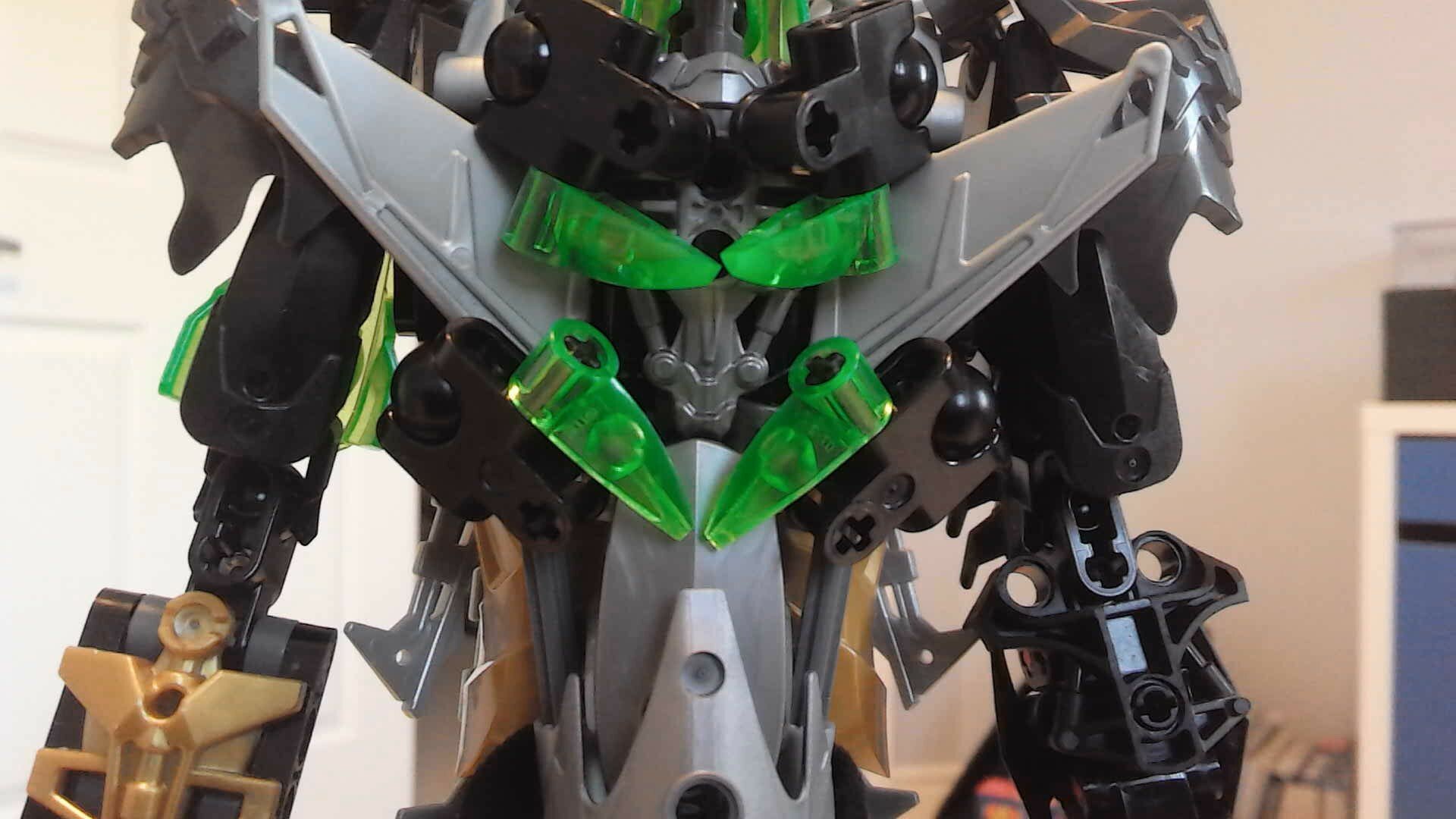
Next up would be the visual weighting, because ho boy is it a doozie. Maybe something that can be fixed by shortening the torso, but right now your visual weighting makes him look like a very, very tall pudgy guy. Taking out the majority of the midsection would probably be a huge benefit. Additionally, while the chest armor thing is really cool…it needs cleaning up, and the weighting on it is very awkward.
Also, as mentioned, the arms are too long and will only get worse if you shorten the torso, which means they need to get a bit shorter in turn. However, ONLY shortening the arms would be even worse, since the proportions are already off.
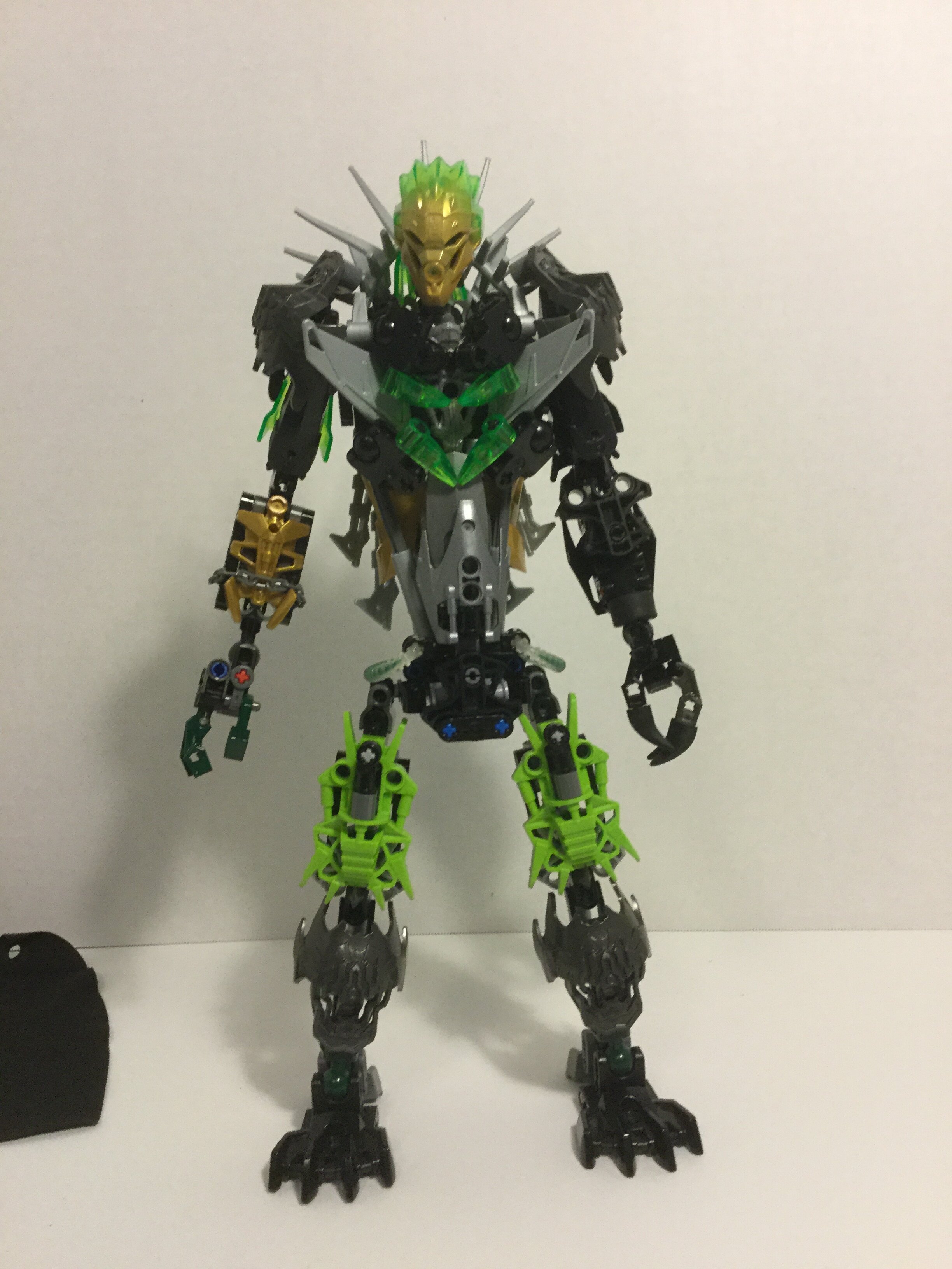
Next up, and the last primary critique I’ve got (aside from the endless game of touchup work, naturally) is the coloring.
And honestly, I’m not even sure where to start.
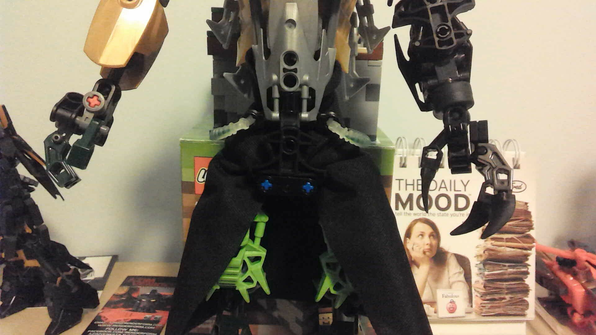
First off, the thighs. Delete them. Get rid of them. Recolor them. I don’t care, get the lime green out, or add in about three or four times the current quantity. It’s an eyesore that ruins the entire design in my honest opinion. Second, fix the metallics. You’ve got three different metallics here, and while mixing the silvers is fine, it makes the gunmetal on the legs and shoulders stand out a lot, although the legs are helped out tremendously by the shadow from the skirt.
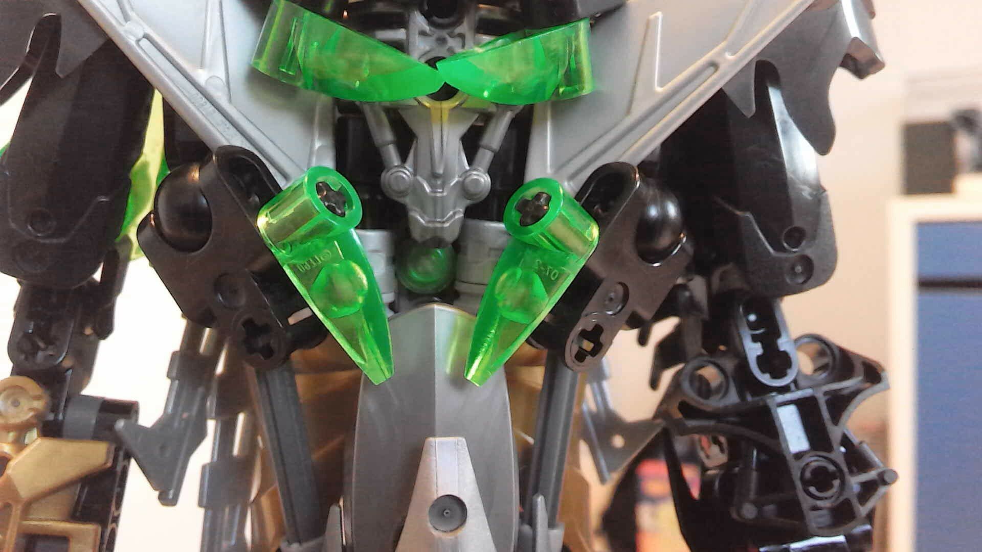
Continuing with the colors, the gold placement needs a lot of work. You’ve got three spots…the face, the right arm, and literally the midsection of the torso, but only on the sides. Very bad for visual weight, and even worse for consistency. I’d recommend either moving some gold to the upper torso, possibly leaving the gold arm and head but getting rid of the waist, or maybe getting rid of the arm and waist but leaving the head as a pop of color.
Another random thing to mention would be the forward facing armor on his arms. Some people disagree with me here, but most high-end MOCists do agree with me: Forward facing armor on arms tends to look anywhere from mediocre to just bad. Here I’d say it’s done pretty well, but not enough to save it from the stereotype.
Hope this helped!