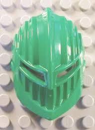
It definitely looks better when you paint the “metallic” parts.
(Also the mask name is the “Selutu” if you wanted to know.)
It definitely looks better when you paint the “metallic” parts.
(Also the mask name is the “Selutu” if you wanted to know.)
What everybody else said:
#I LOVE IT.
I’m gettin’ some real Karzahni vibes this.
Fantastic…
Same here on the Karzahni vibes…creeeeeepy.
THIS IS AWESOME!!!
######More, more, more, more, more!
Now I want to see a gold Kongu moc with this version of the suletu
Wait- has the actual mask been the gunmetal painted part this whole time? And the rest is just a weird scaly head?
wot

this is super dope!
@darkbrick999 the original mask was all in green.
This makes a mask that I never liked look amazing.
ADORE it.
Those teeth doe. Makes Kongu look really angry.
It’s like this alien warlord had parts of his war mask punched off and he’s still determined.
Looks to me like Kongu has a steampunk-cybernetic eyepiece now. Reminds me of the Borg.
this is amazing you should do something for the other 5 masks if you haven’t already so the details can be more enjoyed of the others
Is it just me or does the silver painted part look like the Knights Kingdom Rascus mask?

Now it looks like the flesh of the head is trying to breakout of the mask. 10/10
I know, but it wouldn’t be the first time a piece that should’ve had more detail was made just one color anyway.
Looks like a lizard wearing a broken mask…
Neat!
This image sums up how I feel about this mask:
(If someone wants to use this, go on right ahead. Just give credit please.)
Nice!
HOLY CRAP CAN I BUY THIS??!!
Anyway I have always been looking at my kongu mask and thinking to my self, WHY ISN’T THERE MULTIPLE PLASTICS IN HIS MOLD??!! And Then I saw this.