In 2011, when I joined the online Bionicle community, I needed an anonymous persona, hence Ranaki Pakewa. I didn’t have much moccing skill, and I frankly didn’t care too much, so G1 Ranaki was not much more than a simple Mata build.
A few years passed and my G1 collection was put into storage, without any way to access it.
Once G2 rolled around, I built a pseudo-self-moc to replace G1 Ranaki in his absence.
It was only a matter of time, once I had my old G1 collection back, before I would combine the utility of G2 with the likeness of G1…
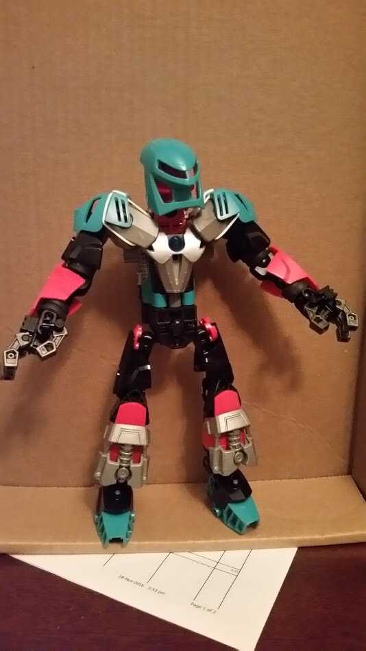
…it’s really not an improvement on either version. The 2015 add-on makes that chest look bad, the legs are weird, the feet are too far forward, and he’s got a neck to rival Oculus. The color scheme isn’t well distributed, with your neutral tones of silver and black taking primary roles instead, leaving the teal and red to get lost in the mix. Also, the fact that gunmetal is only on the hands and sword really bugs me.
Overall, I’d rate this 4/10. Still a lot of improvement to be made.
Something about the proportions is really bugging me, but I can’t figure out what. I think he needs to be stretched out or something.
Aside from the proportions I’m really not a fan of the chest, it looks awkward and makes the torso a bit too T shaped, and it looks like his ankles are broken, also the arms look weird, something about the add-ons.
Aight, I’ll try to think of something to do there instead
If I pull the feet a bit down and back, would that help?
Shorten the neck, gotcha
Would replacing the black shells with red ones be better?
I was hoping that would go unnoticed… 2am is not the time to try finding 6 of those tiny buggers, so I stole them from elsewhere. Would silver or black be better?
Maybe lengthening the upper arms, straightening the ankles a bit, and finding something different to do with the chest would help?
Honestly, I think the torso is the main issue. I’d say add more red to that. also if you could add more teal to the arms that would be great but I know that you don’t have a ton of teal
I’d say black, though I might have to see both to judge.
Better, but still lacking in color distribution. I think the red on the legs is too much, and you should probably go back to black. Is there any way you can incorporate teal onto the arms?
The T torso has become a Y, I think you need to narrow the shoulders, the masks look really nice though, if you brought the shoulders in and kept those I think it would look great.
Really like the new torso. Personally, I would ignore our box-torso loving friend Yink and keep it as-is, it really does look good. But, up to you on who to believe here
Legs are the worst part right now IMO. Arms are a bit off but I can’t place why. He’s coming together nicely though!