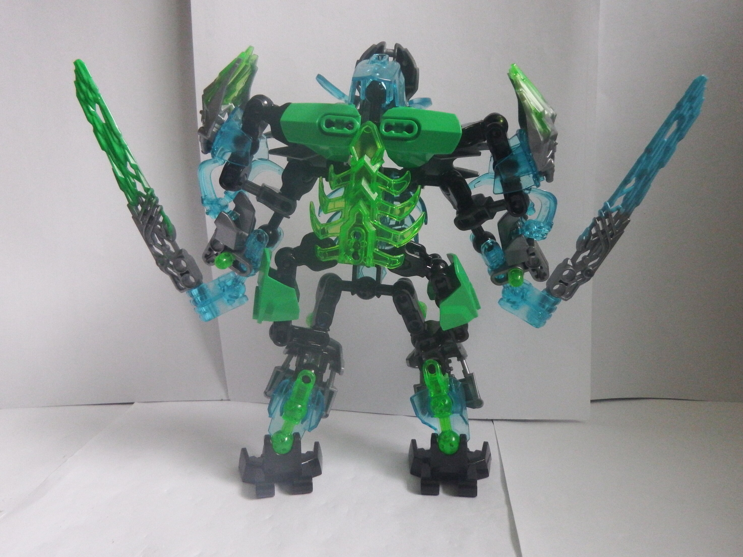
I just don`t know what i created apart from something very gapy and honestly messy so lets move on. Other than his gapyness I think he is ok at best but he is growing on me. What do you think?
6 Likes
Editted title for spelling
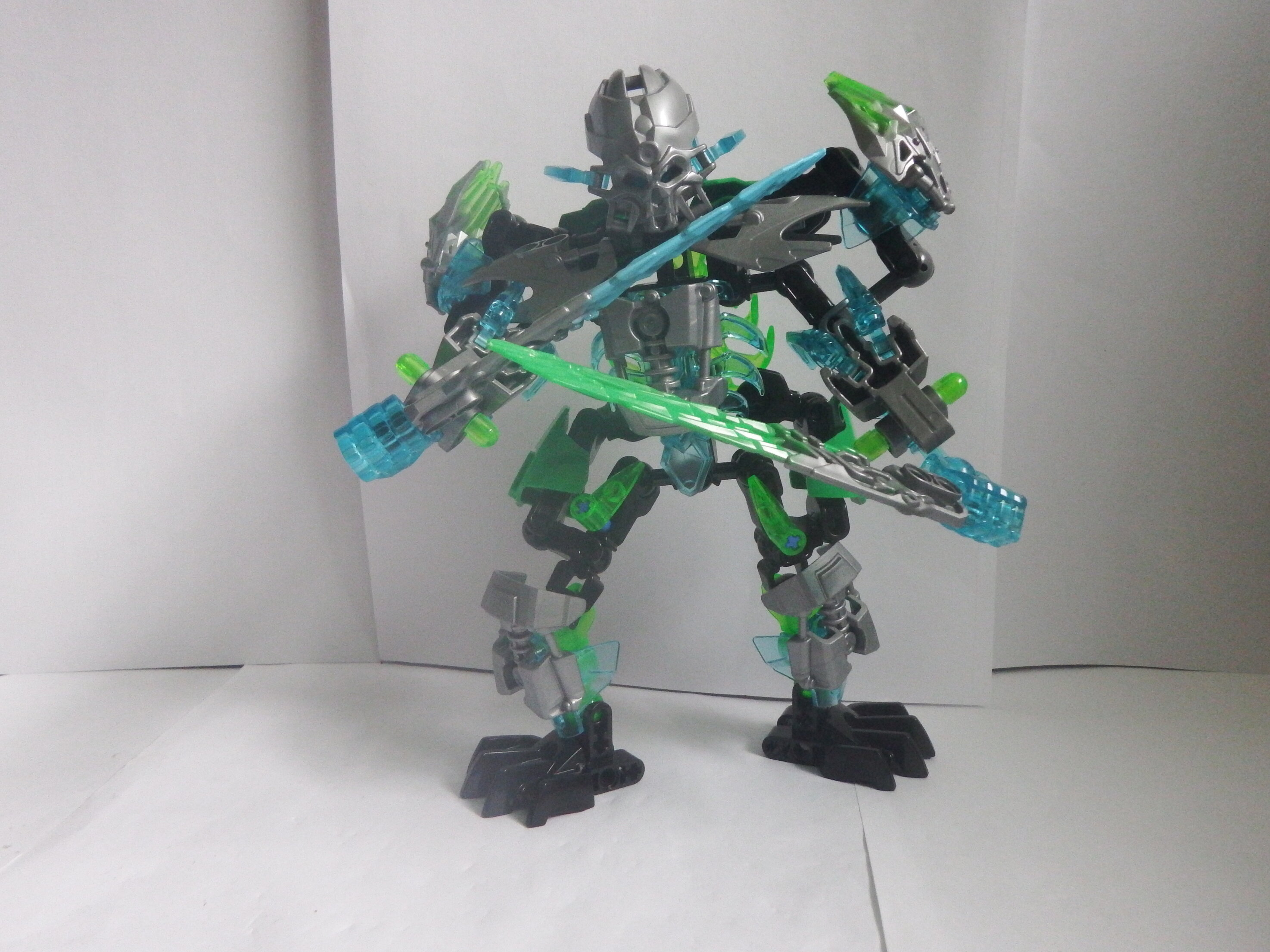
Looks decent except for gappyness ,could work on this for a better moc
2 Likes
Still less gappy than Umagap The Destroyer.
Huh. Neat. I really like the color scheme! The blue and the green mix really well!
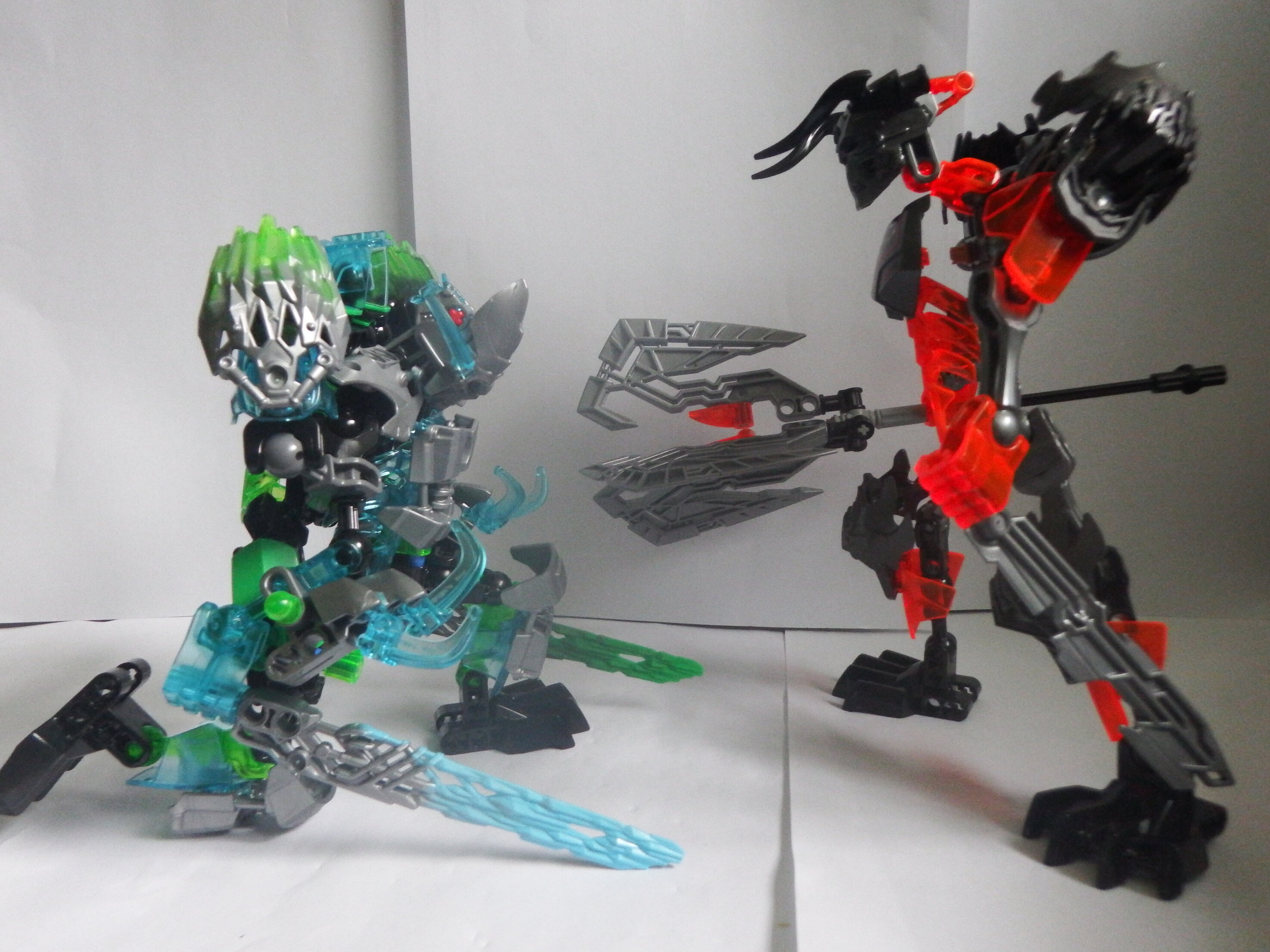
One of the images is still uploading.
That was the one i uploaded seperatly cause it just couldnt up load
1 Like
Not bad, but it could use some refining/reworking.