Y’know, ghib
you’re wrong.
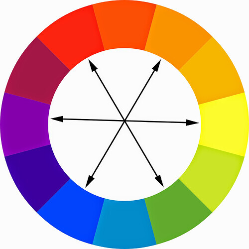
Denying that blue and orange is a good colour scheme is basically denying colour theory.
Orange and blue are opposites on a colour wheel, making them complimentary colours.
you posted that “Standard Blue” and “Standard Orange” don’t look good together. i can understand that statement, because your examples aren’t exactly opposites, but they do still work well together.
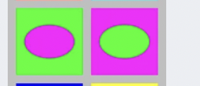
Contrary to the vernacular, two colors being complementary doesn’t mean that they look good together. Complementary colors are colors that cancel each other out. Magenta and lime are complementary colors.
I wouldn’t say they look particularly good, though.
Complementary colors are colors that have the greatest contrast, because they are on opposite sides of the color wheel - but they don’t automatically look good together.
Listen to Winger. He inherited my graphic design skills to an extent.
I work with colors on a regular basis. I’ve even worked with orange and blue in logo design. Both colors can coexist, but both colors cannot coexist in their standard appearance and be the majority of color present. It just doesn’t work.
I recently designed a vector of a 3D printer that is standard orange with a blue screen. There the primary colors are orange and black, with an excessive amount of grey highlights, and only the small screen was blue. It worked because the blue was a small detail added to a palette where the only vibrant color was orange.
One important thing you have to understand is the color wheel is a liar. Its guidelines may appear to be taken as they are, but if you don’t know what you’re doing with them, you will end up with a repulsive mess, like what Winger demonstrated. And yet any color combination can work depending on the setting and the design. One color combination that gives me more of a migraine than the one above is base red and base blue, especially if they overlap, but watch as they become based red and based blue in this design:
Slightly more on topic: you know what design isn’t bad? the boards! I really love the UI and the instant messaging format they’ve got going here, it’s fantastic. Makes it feel less and less like a forum every time I use it.