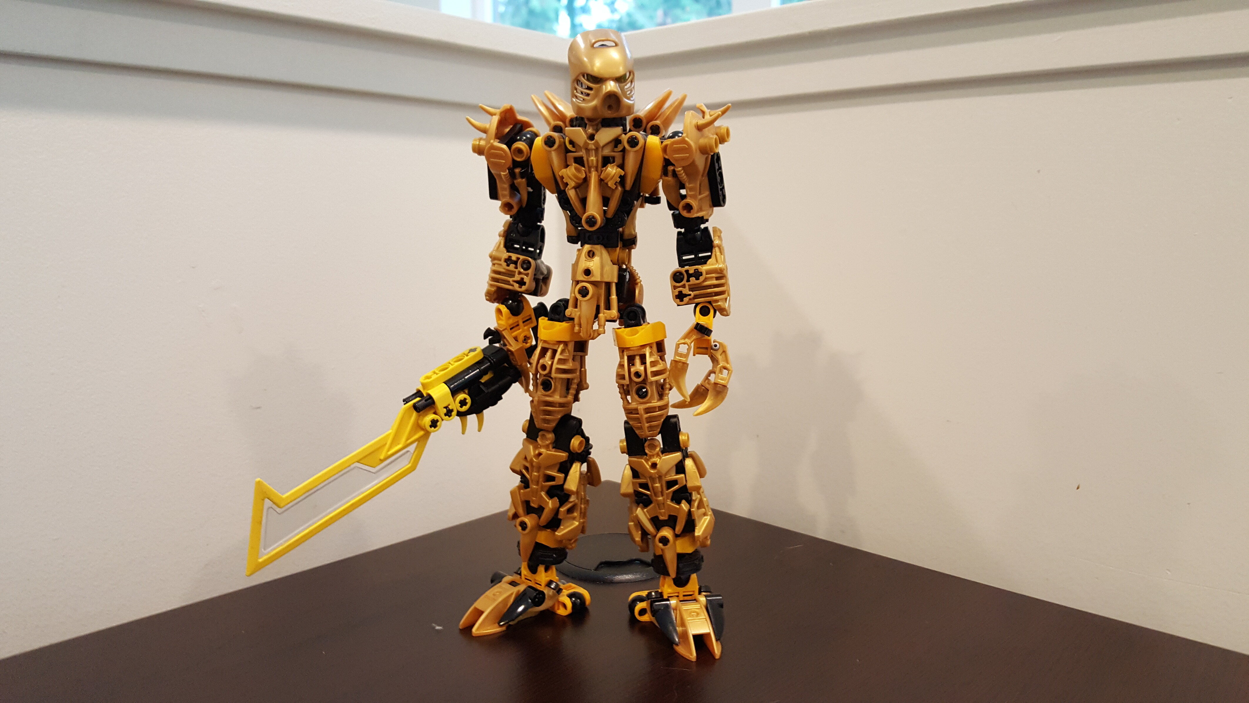
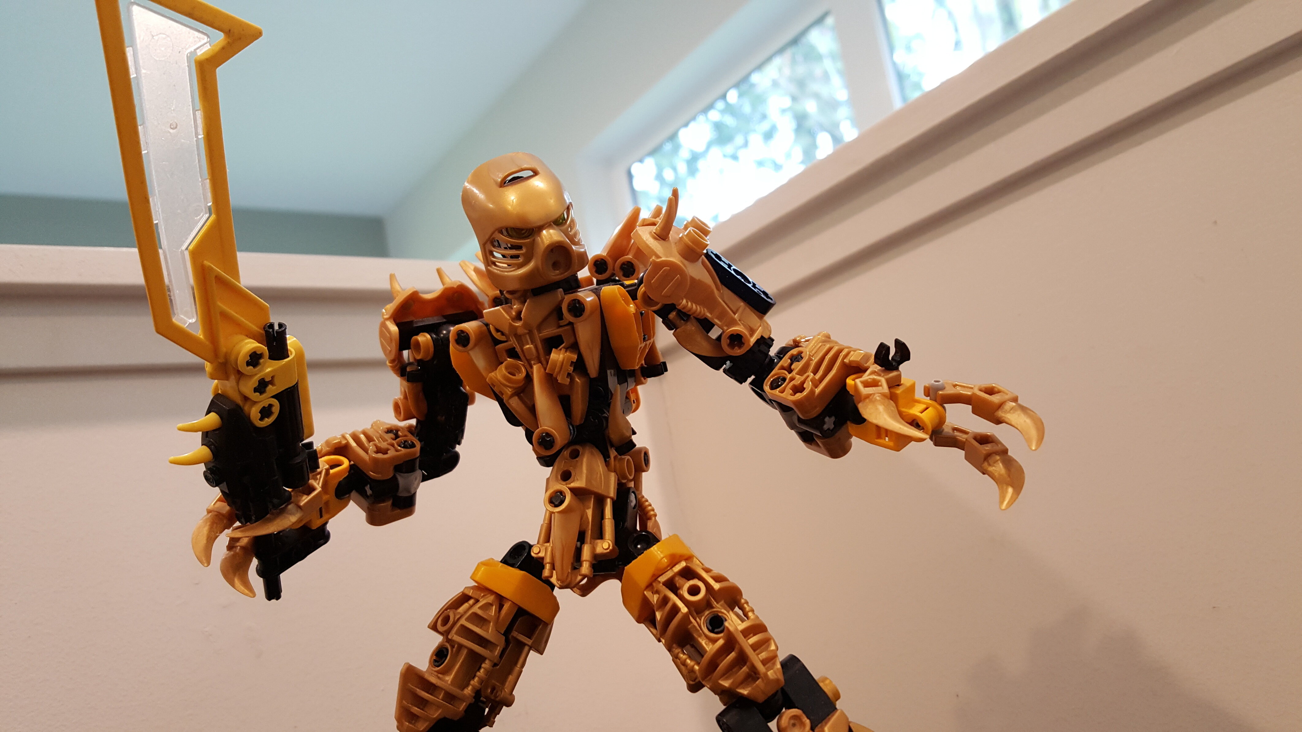
The fifth version of my Self-MOC; Serjic, Toa of Lightning.


74 Likes
Much improved! Nice work!
I’m always astounded by MoCs like this.
1 Like
Really awesome work here.
My greebly instincts approve :^)
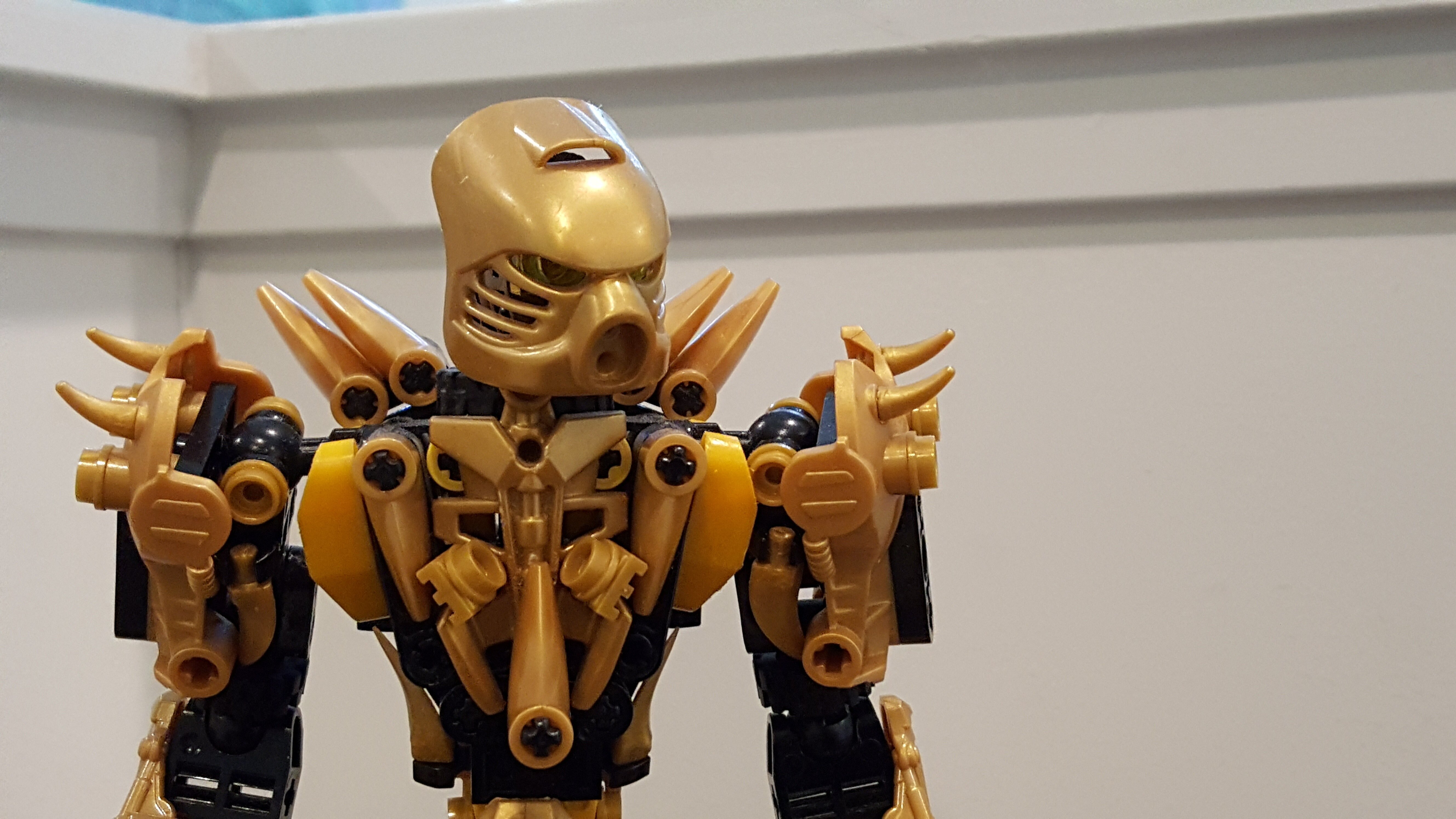
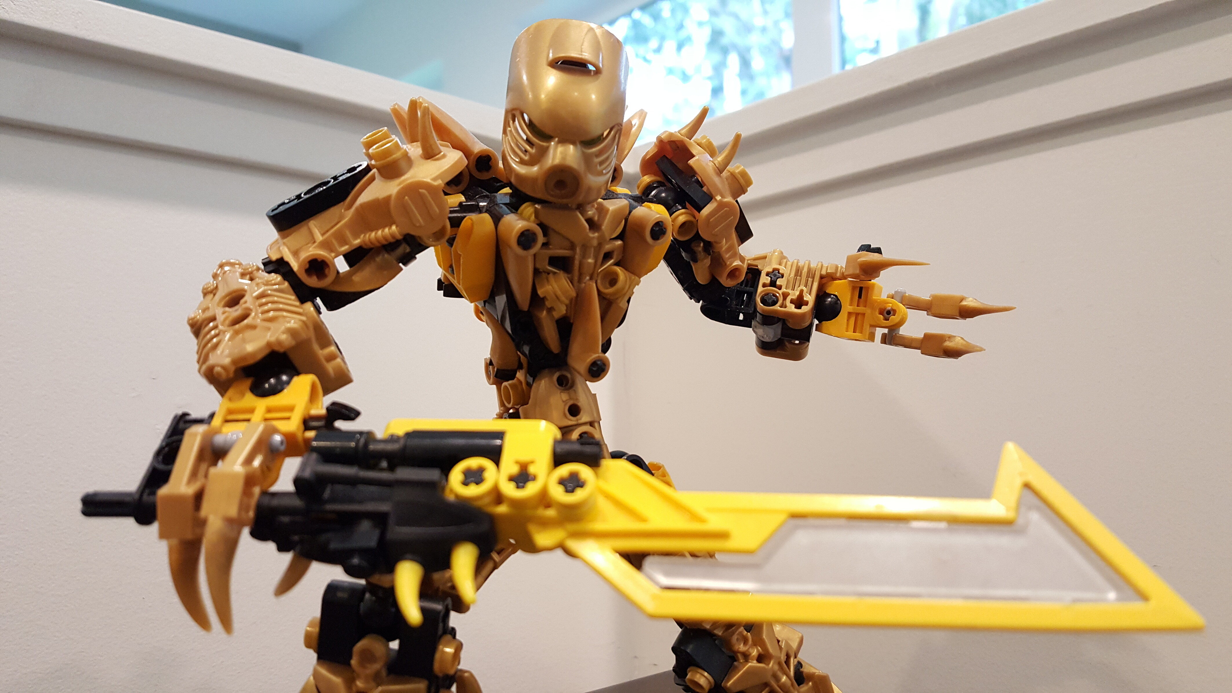
The torso is really good. However I do have a few nitpicks, like the keetorange accents. Maybe change them to black and then some of the greebles to an accent? I dunno. Also I’m not really a fan of the thumb connection too much, but overall this is great. Solid 8/10 for me.
1 Like
Thus looks pretty cool. I was wondering where you got the blade for the sword as I don’t think I’ve ever seen that piece before
@BioKnight It’s an old Exo-Force piece: BrickLink - Buy and sell LEGO Parts, Sets and Minifigures
@Ekorak What do mean by “really MOCpages” and what parts of it do you think need cleaning up.
@Ekorak 90% of it isn’t from MOCpages, they’re my original designs. I wouldn’t go around declaring plagiarism if I were you unless you have evidence.
Also I was actually aiming for the “cluttered” aesthetic as you call because I feel as though it effectively emulates the Gen One feel.
@Windfall What is disappointing about the concept?
@Payinku From my experience most Mocists don’t care for the canon and just build whatever. I do try to abide by canon, but the two things I will always throw out the window are the gender specific elements and canon colour schemes
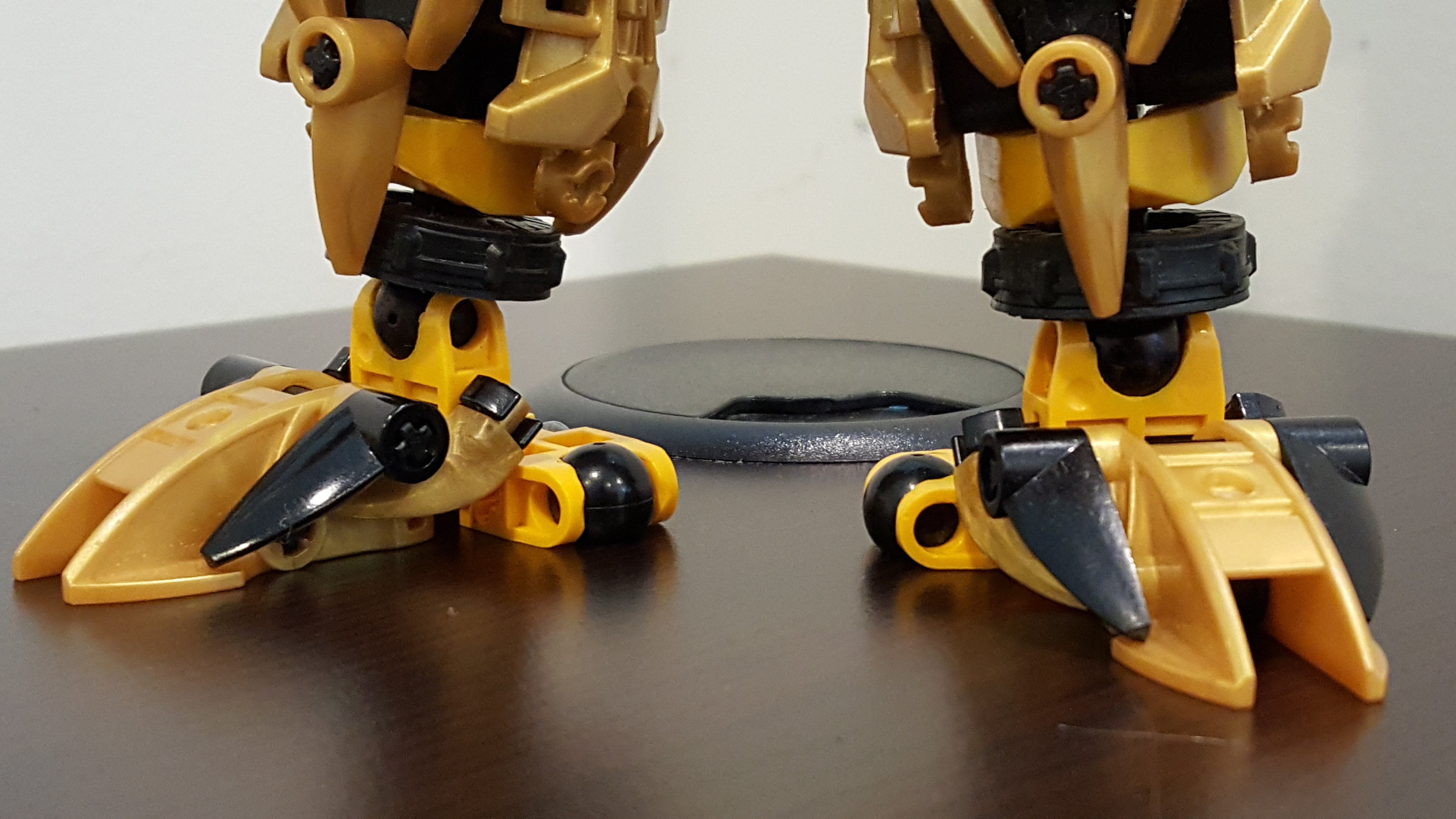
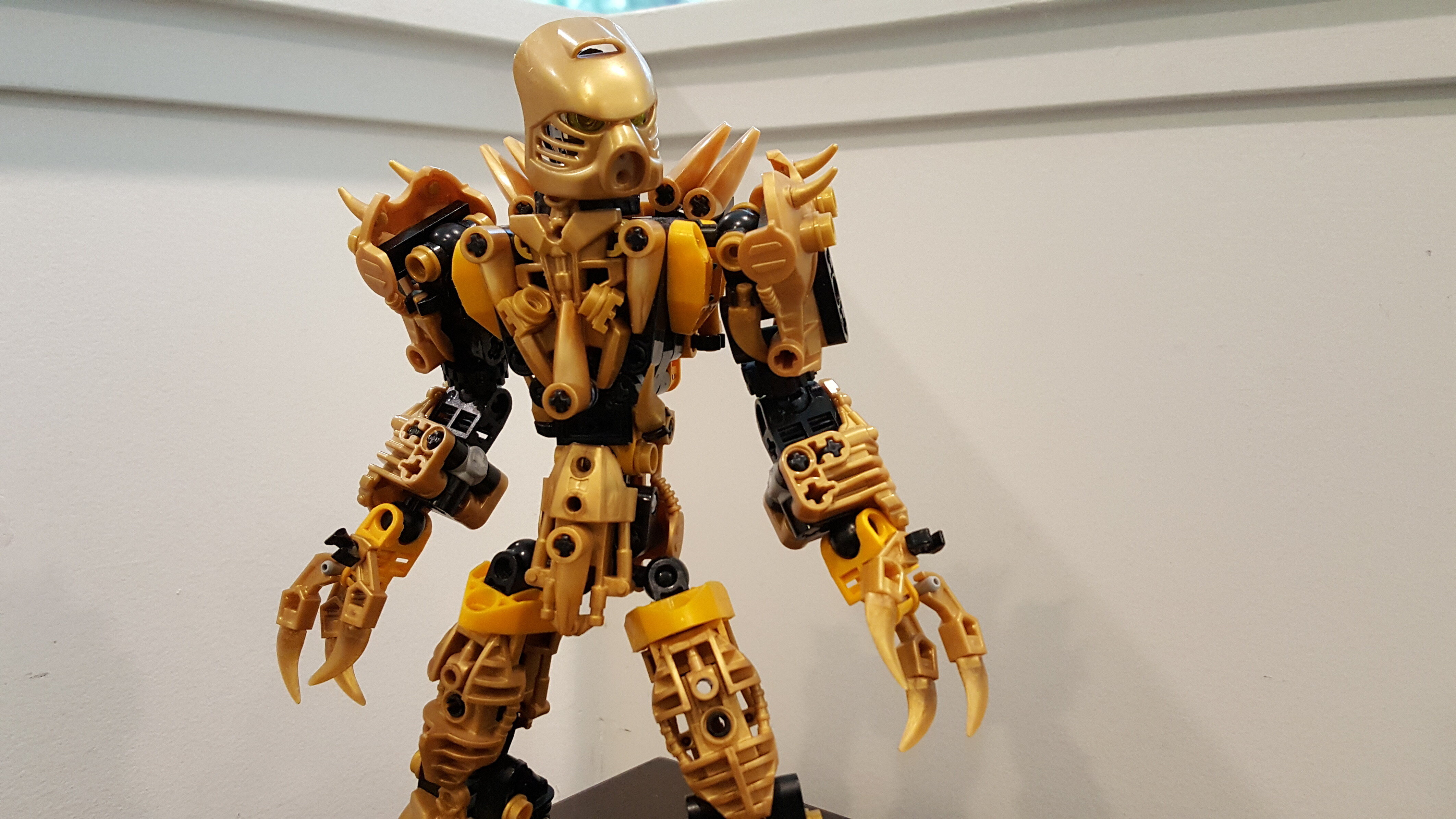
Not really my style of moccing, but I love the legs and the torso build, it flows so well with the Moc, I feel the back of the feet are a bit wide, still cool though!
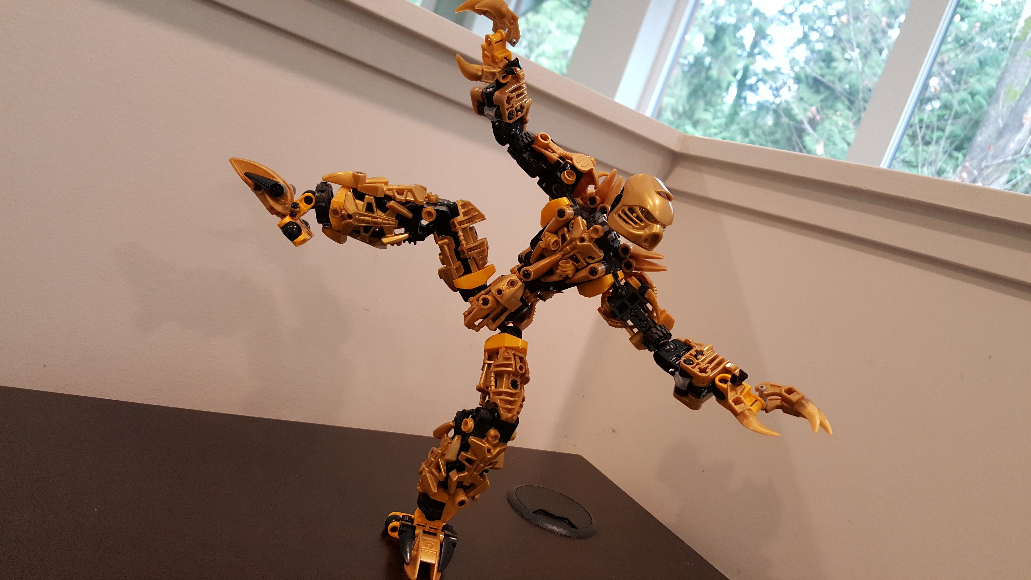
Maybe a shot of the back?
I really like this MOC, and I envy your amount of gold bohrok eyes.
A tad cluttered and really MOCpages, but he’s got a lot of potential. I’ll spare ya the nine-mile critique but I will say that the Keetorange and gold mixing like this really doesn’t work out so well, in my opinion. The rest works out pretty alright, just needs some cleaning up.
It looks like it came straight out of 90% of MOCpages designs. Some people love MOCpages aesthetics, others hate em…I’m somewhere in the middle. [Chro] is an excellent example of MOCpages done right, if you’re curious.
What parts need cleaning up though? Yes. All of them. The designs are good, but visually he is very cluttered, especially his torso.
I’m not saying “start over” by any means, just suggesting a bit of touch up work so you can get a strong cohesive product. ![]()
1 Like
I did get a bit of a flashback to older MOCpages designs once I saw this. It does seem more refined then those old MOCs, and this is certainly great! My only gripes would be the keetorange and the thumbs. but they are both rather minor all in all.
Great work!
1 Like
Nice! Excellent design, love the weapon.
OK, now this is sweet. It already has a great build but that Hau, man I love the Hau so for me it makes the MOC even better.
DIG IT!
I love the build, but I personally do not like keetorange and gold as a color scheme.
love it! don’t change the orange. its a good and original accent 
It needs more yellow, and the sword is simplistic.
Well, the concept is disappointing, but the Moc itself is Absolutely Stellar.
It doesnt really have the canon colorscheme, but other than that, looks great!
Doesn’t have the canon gender either. The moment you step into the realm of MOCs, story rules go out the window.