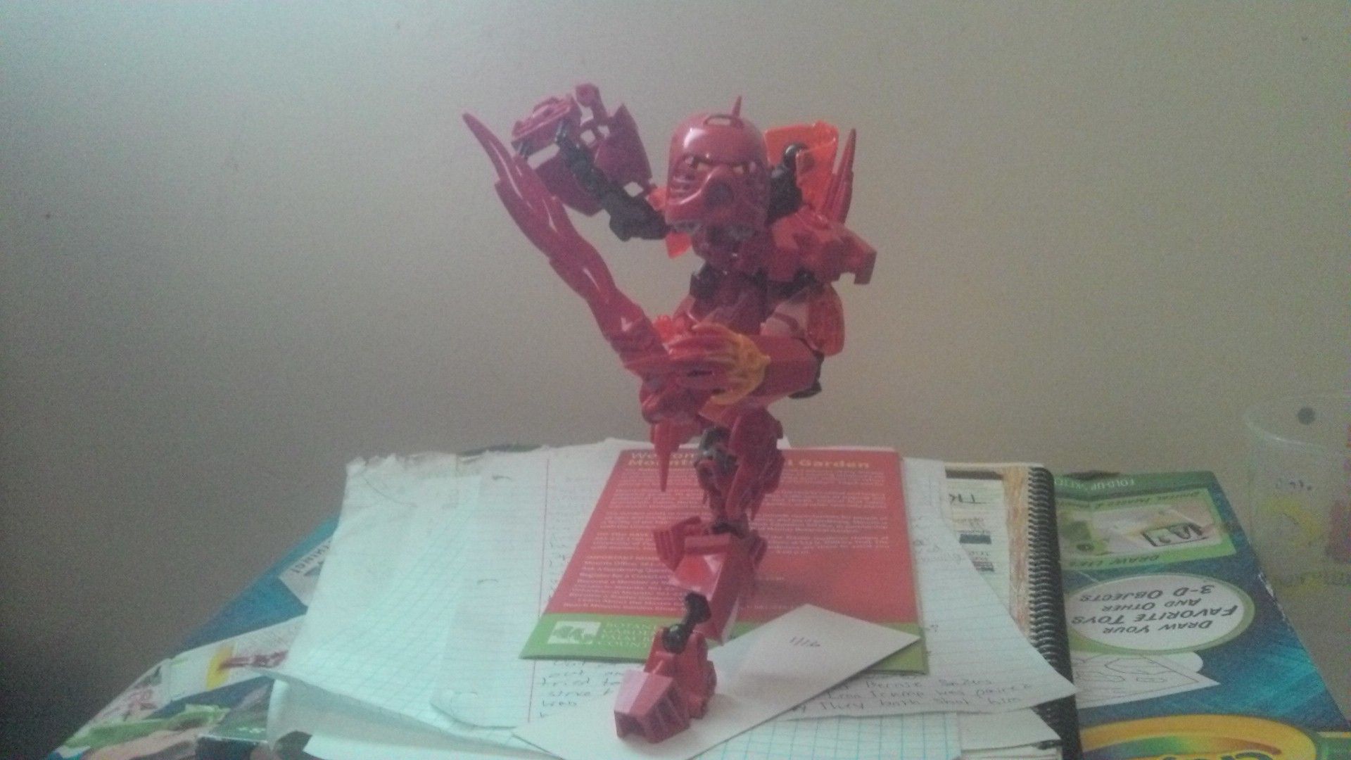
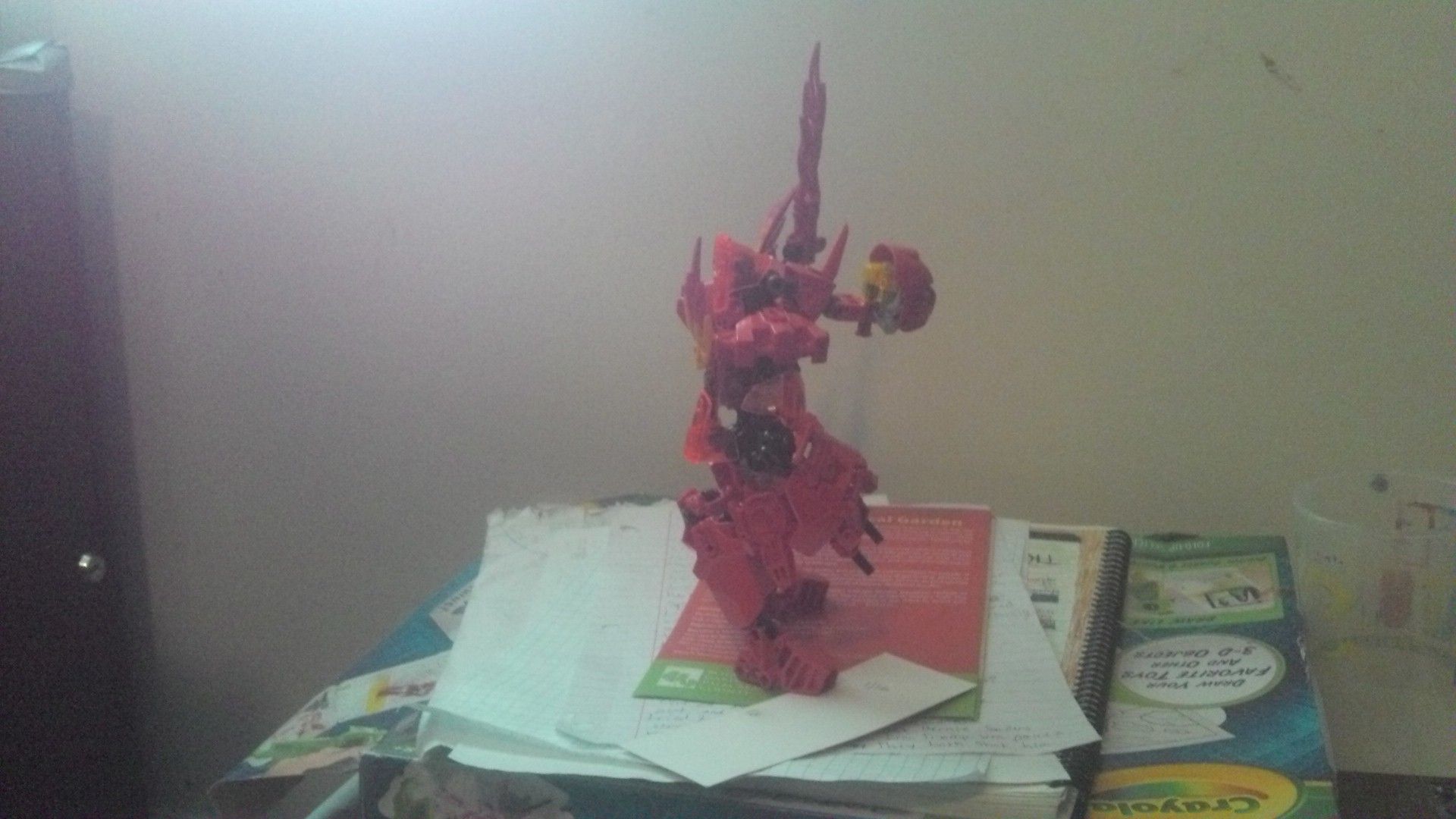
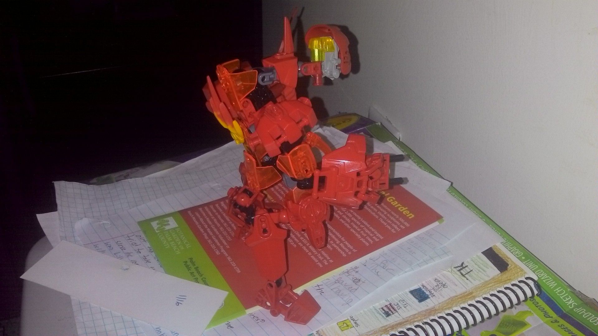
This is what I think Tahu would look like as a vilainous goat-man thing.
I tried to keep the recognizable features of '01 Tahu, while up dating him a bit. I think the part that turned out best was the torso.
In the clasic “Six Heroes, One Destiny” poes.
I think he came out alright, but looking at him now, he could’ve stood a bit more customization.
I think tat he has one of the best looking backs of any of my creations, though.
So what do all of you think?
5 Likes
The three-prong claw piece (the one in the torso) doesn’t really look good. The neck is a bit janky, too. Try making the plates a bit more focused inwards instead of jutting outwards.
1 Like
i would recommend cropping the photos a bit so it’s easier to see the moc. and the head sticks out a bit
1 Like
I’m not really digging the hunch-back look. And I know I’m not really one to talk, but a better camera is recommended. I know they cost a lot, but I’m not saying you should go out of your way to get one.
yeah you don’t need a camera, just a place with better lighting and a solid background. all of my moc’s photo’s were taken with my iphone.
1 Like
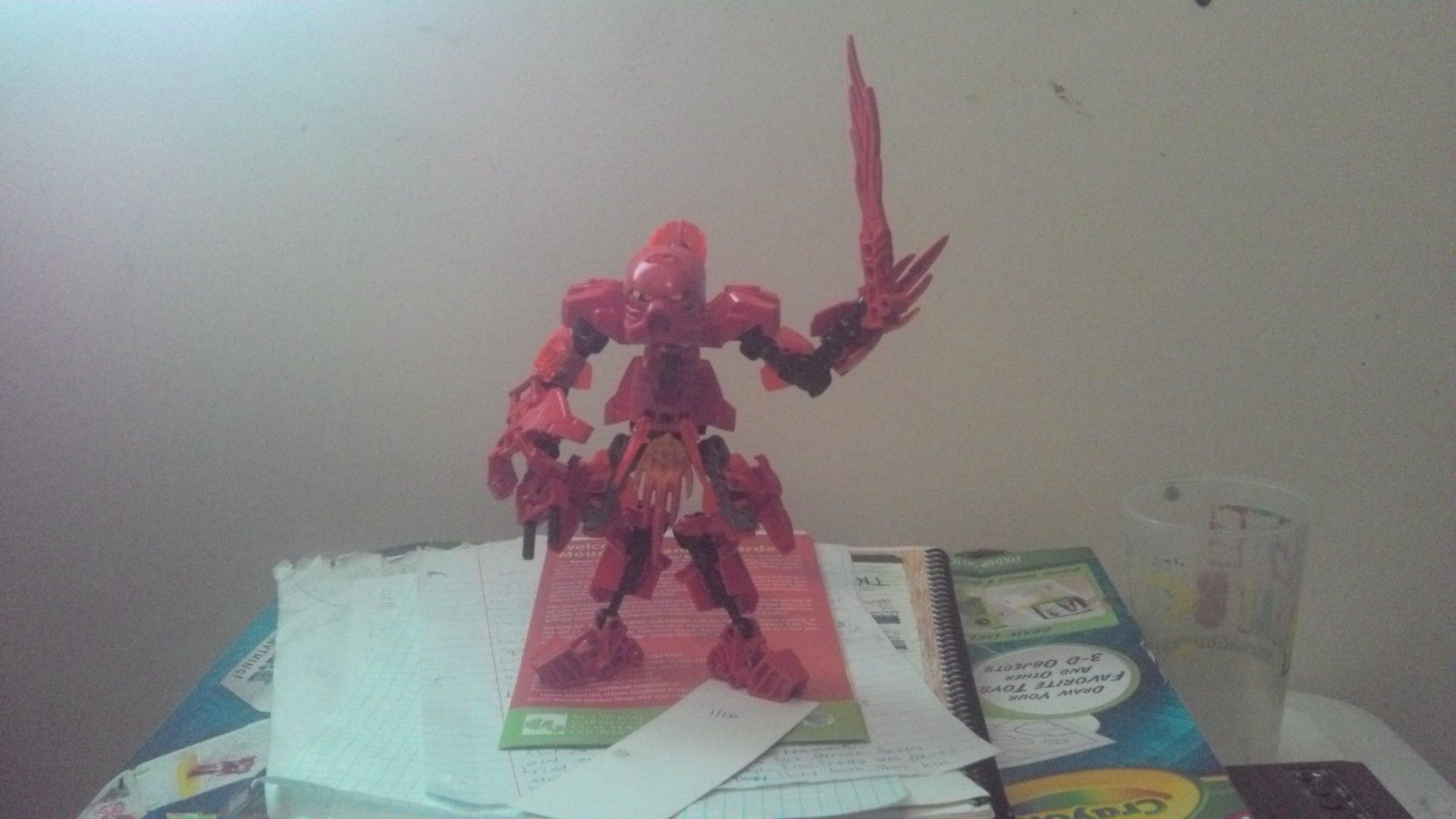
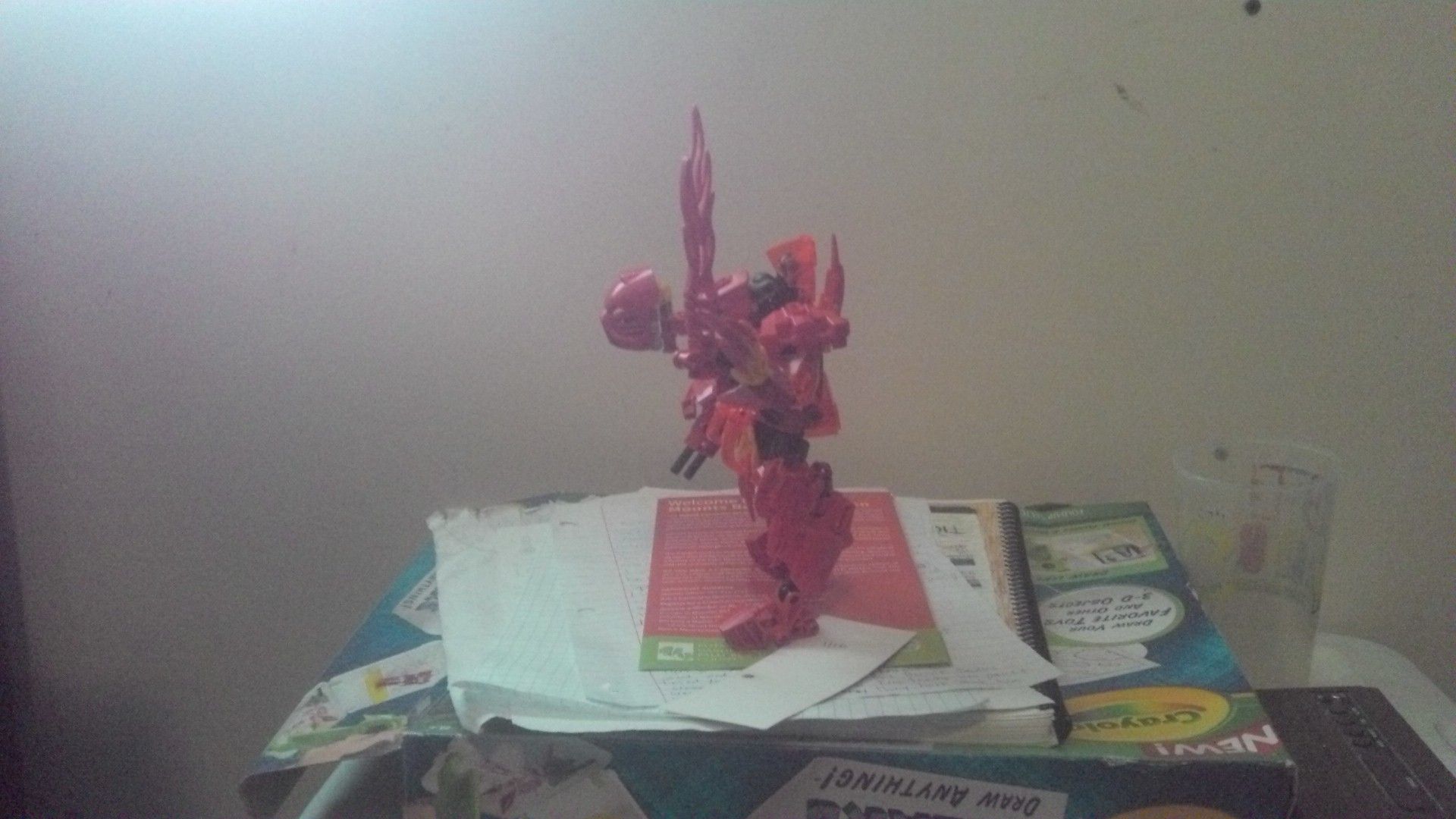
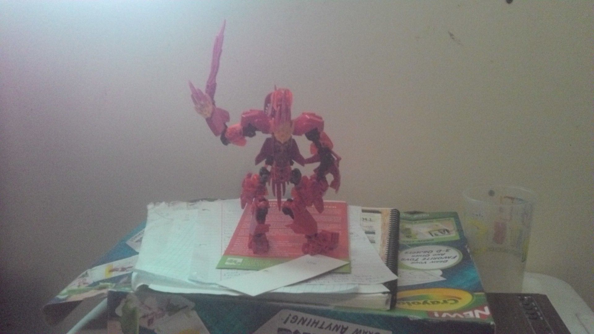
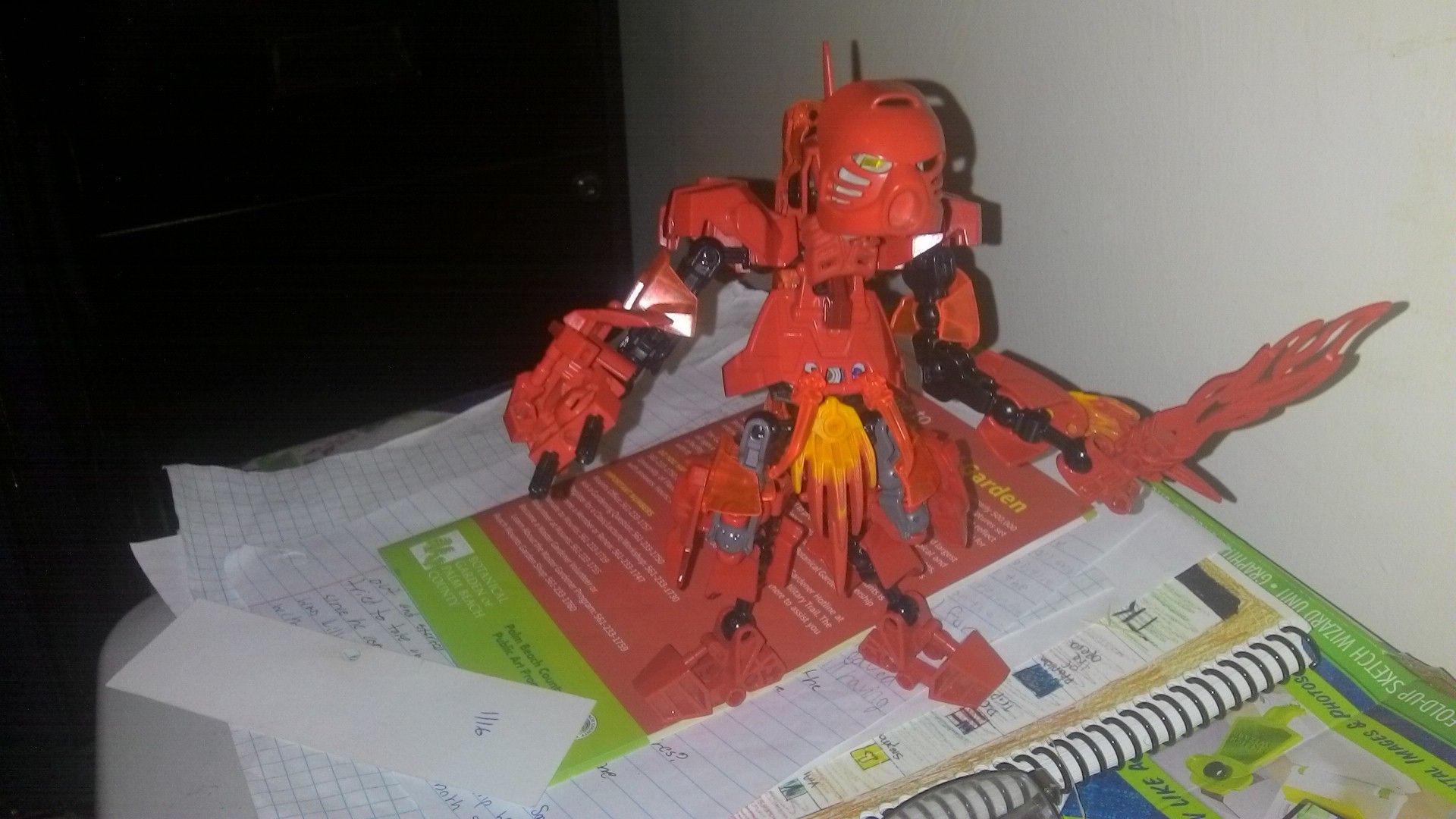
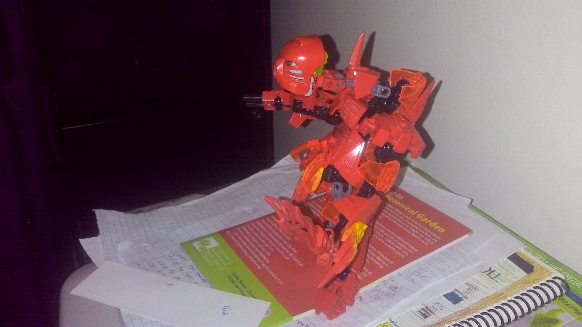
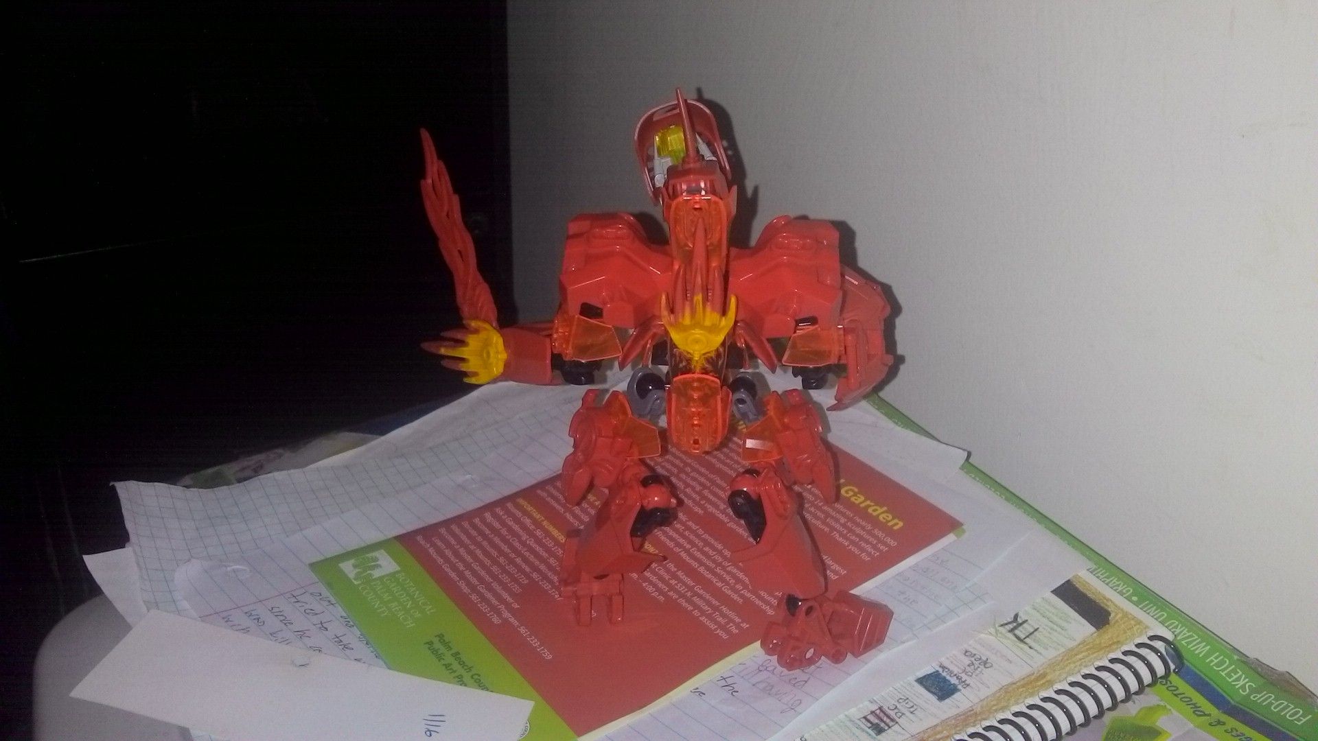
@Brunamal, @Omega_Tahu, @Radiation-7901, Here’s some better photos.
And yes, the neck is supposed to look that way.
2 Likes
Eh, even with the better pics he still looks like a mess
1 Like
Interesting concept. Keep working at that demon look. I would make him be less red. He’s also a bit cluttered.
I really do not like the design of that neck. It needs to change
1 Like
The fire on the front of him at his waist looks a little bit akward in that placing. I’m not gonna go into any more detail on that cuz i don’t want my acount to be flagged as innapropriate. If you’re old enough, you’ll know what i’m referring to. The arms also seem a little too long to me.
I don’t like puns 
Yeah, I know what you mean. I kind of intended it to look like a skirt/kilt looking thing, but I guess it kind of back fired. Pun intended.