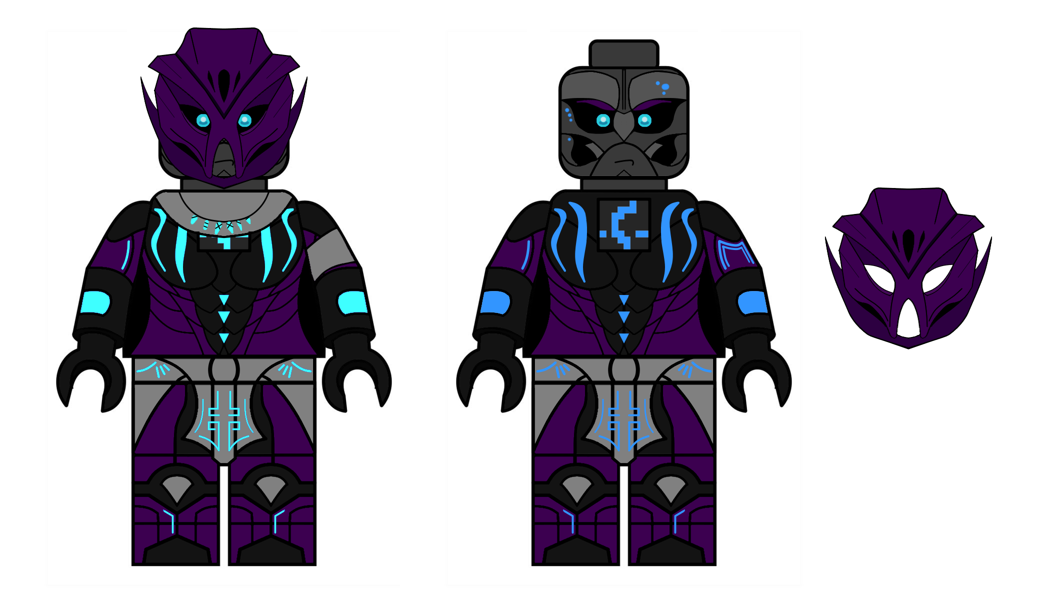
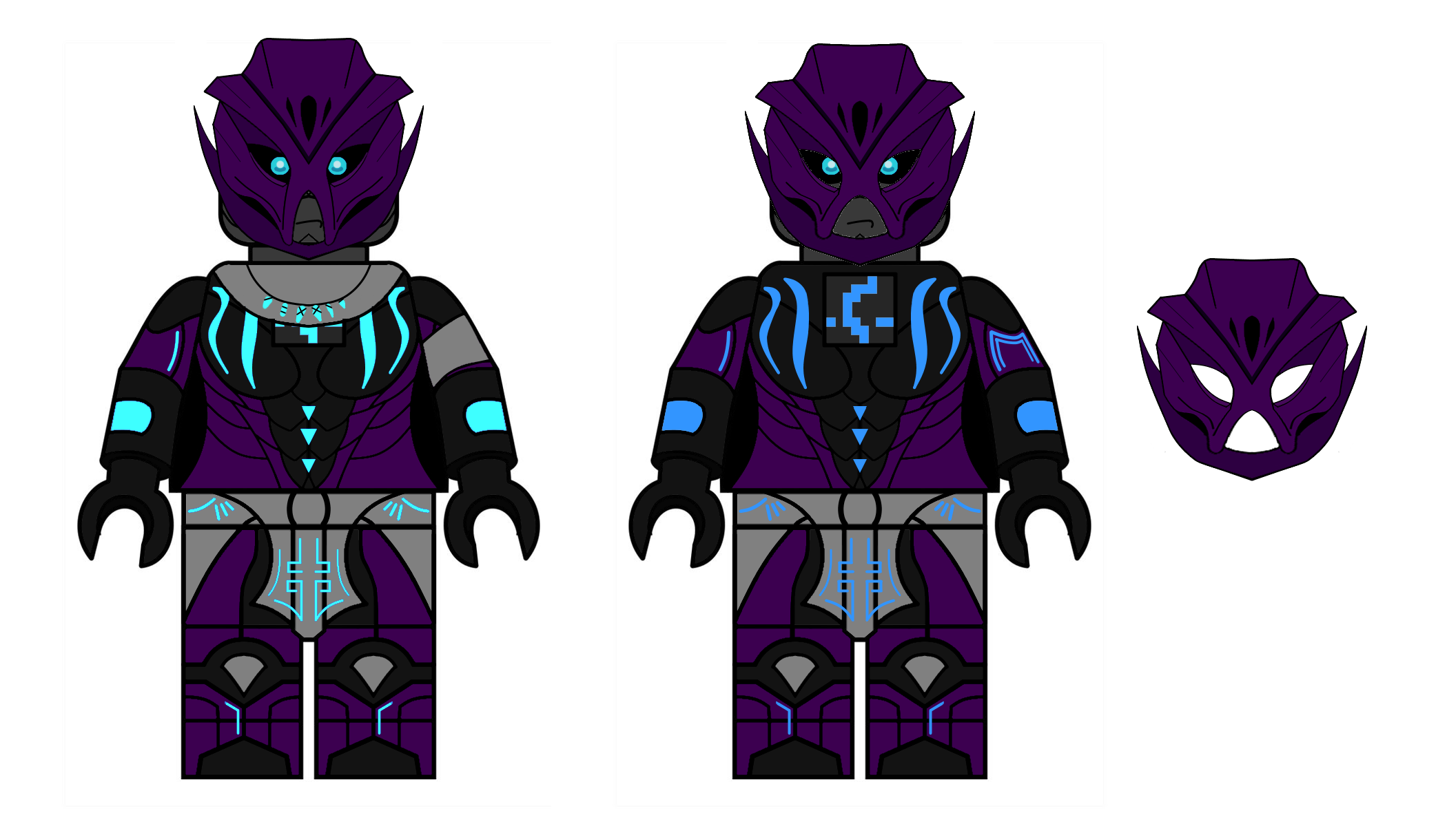
So… feeling inspired by @Darknova3529, @ZceeNook and @Oomatu in particular, I decided to replicate the minifigure design for Voriki; once again, thanks to Varderan for the final Toa minifigure design.
This is pretty much based on Oomatu’s drawings, with some differences on the secondary minifigure (the one without the mask and with a less vibrant cyan color):
It doesn’t feature Voriki’s cape, revealing her Nuva symbol (by Llortor).
It also doesn’t feature the armband at her left arm, revealing the M of Makuta (if the pitch in which Makuta gives Voriki the Toa Powers results to be canon).
Plus some tribal birth marks on Voriki’s face c:
But, I’m not quite convinced with my take on the design. I’m talking about the Mask of Emulation, which turned out a little weird IMO (I blame it on being a new mask design that isn’t familiar enough to me…); along with that the skirt, which seems a little too short…
I will try to fix these mistakes once I do another take on the minifigure; until then, feel free to comment and send some feedback!
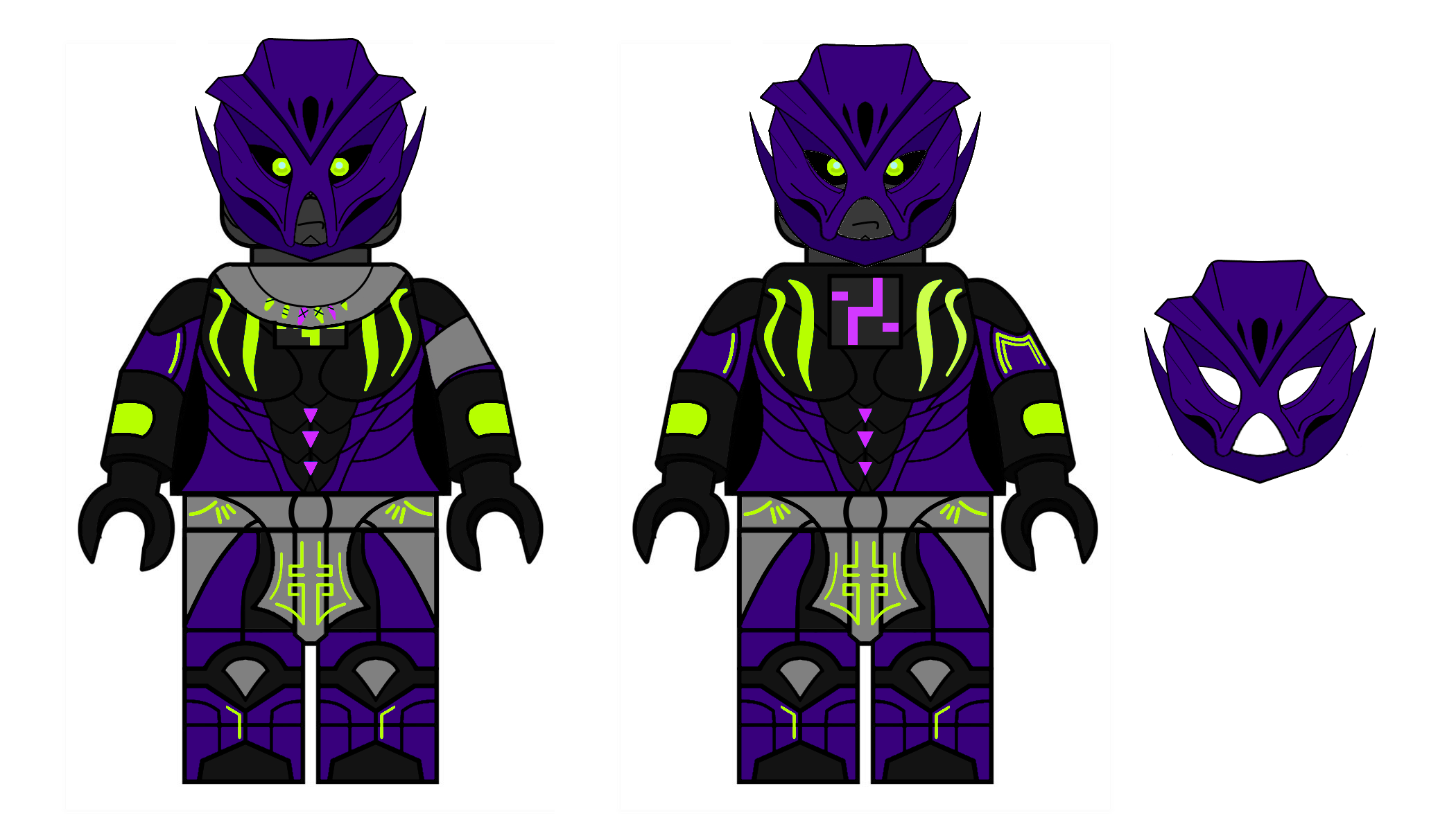
I was also considering making a new minifigure mold for Voriki with the extra briccness as a tribute to you, but at that point I wasn’t that inspired… shrugs
I think the more vibrant color looks better, and as @Darknova3529 said, I think the mouth would look better wider. Also with the Toa Nui, fantastic work, keep it up!
I think the mask just needs to be a little bigger to theoretically fit over a minifigure head and as Bokarda and UltimateMustacheX said, the wings probably need to be thicker. I think instead of blue, maybe pink or purple would be better as two other Toa already use blue in different hues. That said, I think this looks amazing especially the mask, this is now my head cannon for what the character looks like. Incredible work, I look forward to seeing any future pieces.
I have edited your image with the changes suggested but will not post it in a comment without your permission as not to offend.
The print looks great, although I’m not sure about the mask. It looks too… Organic? It kinda has the same issue that a lot of the Nuva masks suffer from.
Also, the mouth is better thin- Looks like her face is a giant X with the wider mouth.
To be fair, G3 Toa and Matoran are purely biological, not biomechanical.
I can get why it might seem a bit too organic, but I wouldn’t go so far as to compare it to the Nuva masks. That would require throbbing veins on the forehead and excessive creases. This seems pretty tame.
I’m stuck between the two designs. Can’t really say much aside from that.
So arguably not the most fleshy nuva mask, but I think the similarities are still fairly apparent.
Disclaimer: Voriki’s mask isn’t as bad as Pohatu Nuva’s, I’m just making the analogy to draw attention to what I’m not terribly fond of in its design(and as stated, it was the first thing to come to mind)
So the masks are squishy? I’m not caught up with the podcast so maybe it makes more sense in context, but that seems pretty odd.
Reading this, it doesn’t make sense for the mask to look so similar to the Nuva masks. Although, an in-world explanation for the shape could be that masks can be made from more than one material (not just metal). Maybe some masks are carved from wood, and Matoran who become Toa have their masks become living?
Also, it is likely that Makuta made Voriki’s toa mask. This detail could allow for a variation from the other toa masks which were made through the power of the Elemental Gods.
They are not Bio-mechanical? I really don’t like that idea. When was that made cannon?
Back on topic
I don’t really see the mask as looking organic, it actually kind of reminds me of the Mask of Shadows (I forget its technical name) from g1 to be honest.