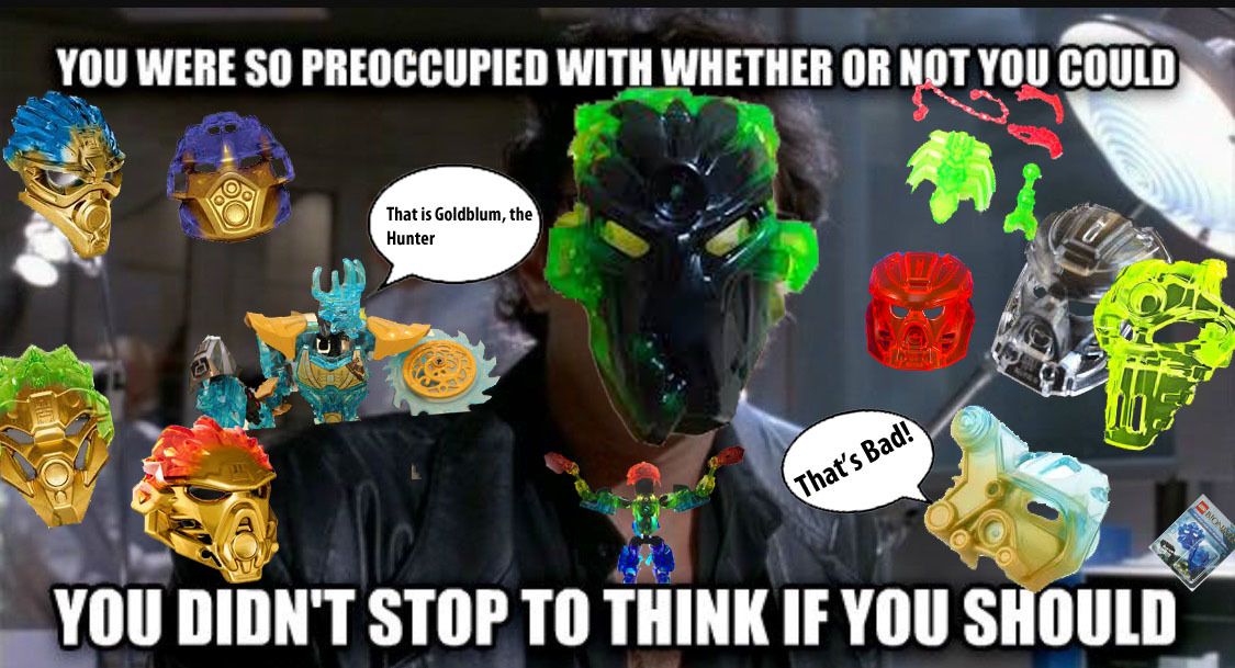
LEGO has seemed to be fond of putting trans armor pieces since the “Ordeal of Fire” Hero Factory wave, and this trait has seemed to be carried into Bionicle G2, in my opinion it’s a bit too much. What do the rest of you think?
We get it, LEGO, you’re really good at melding translucent and opaque plastics
I feel like the sheer amount of trans parts is a bit too much. It’s cool to get trans melded masks, and the occasional bone/ armor, however I find that often most sets of a wave have trans parts, and in the case of some Skull villains, the trans colors clash. In G1, (not that G2 needs to match it) trans parts were kind of special to get, they were kinda rare.
I agree, I loved the neon green bones on Pohatu, and the trans masks are really cool.
Edited for Double Post - Waj
Please refrain from posting on a topic twice in a row. If you want to reply to multiple people, just type the ‘@’ symbol in front of the user’s name that you want to reply to. Also, read this. Thank you
I like that we get a lot of them, but I wish they were done better. They look slapped on rather than integrated into the model to make it look like flowing energy. For example, Ekimu 2016 looks like something designed by small children for the reason of “just because”. And yet someof them DO pull it off pretty well, for example I thought Kopaka 2015 did it quite nicely. Same with Onua 2016.
I’m not a fan of trans armor though you could probably find uses for it. For instance, a being made completely of fire or water would look good covered in trans.
Trans takes some realism away though. To me, bionicle armor is just painted metal like car bodies in the real world. When was the last time you saw a translucent car that wasn’t a toy?
I like trans colors When they are used to represent something like maybe a super charged version of a weapon or stuff like that, but when you just make everything trans it’s like, oh yeah here we have Kopaka toa of glass limbs. Thats one of the reasons Lewa was my favorite toa in 2016
I actually don’t mind it on Ekimu because it makes it look like he’s bristling with energy
and by all means, this does look like just a bigger version of small ekimu, the only thing really different is the trans mask, its almost as if the mask is making him this way
On the one hand, it can get a little tiresome, but I dunno, for me it kinda makes the characters feel more detailed and lively, as if they look less ‘cheap’.