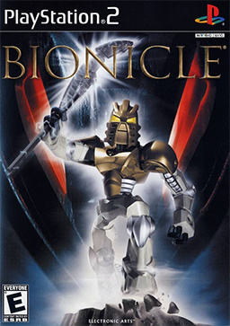
What is BIONICLE G1 Esthetics?

Right off the bat, an aesthetic is not the same as part usage. Some parts will lend themselves to an aesthetic more or less, but using a piece will not immediately break with an aesthetic. So while it’s fair to say that all 2.0+ Hero Factory sets had a different aesthetic to Bionicle G1, and that CCBS generally lends itself less to achieving that aesthetic, I do not believe that can be extrapolated to say that any usage of CCBS (or even an entirely CCBS MoC) can not be stylistically in line with G1.

So while you can justify “I avoided CCBS to make it feel more G1”, I don’t think it’s fair to say “that MoC has CCBS, therefore it cannot be G1.” You could say that the way it has been used breaks the style, but to say that the mere existence of a CCBS piece invalidates a build aesthetically is the wrong argument. That is trying to argue that CCBS should not belong in Bionicle canon at all, and while it’s a separate discussion, it’s got nothing to do with aesthetics.

All that out of the way, I don’t believe a hardline, qualitative “G1 aesthetic” even exists. However, there are various things that such a term may refer to when people use it:

  • Some people who say “G1 aesthetic” really mean “01 aesthetic”. They like the technic heavy builds of the Rahi, and the style of the sets from the “Golden Years”. While this is a much more specific style (characterized by an emphasis on the biomechanical, generally gappy builds, and other effects most easily replicated with technic parts) it should not be confused with “G1 aesthetic”. The Glatorian were from G1, therefore, they ought to belong in any hypothetical G1 aesthetic too.

  • Sometimes it means part usage from 2010 and prior, in an attempt to avoid using “anachronistic” pieces in G1 builds. This, as I explained above, is not an aesthetic at all - it’s a parts usage debate. Any part can be used to create any visual style, if used cleverly enough.

  • Sometimes “G1 aesthetic” just means “not G2 aesthetic”. G2 arguably had a more consistent and definable aesthetic than G1 (smoother builds, more recognisably humanoid shapes, bright colours, and blocky, filled-out silhouettes). G2 sets do look quite distinct from G1 sets - after seeing a few, most non-Bionicle fans could easily pick one out from the other - but the fact that G2 looks out-of-place in G1 does not make G1 more specific.

  • 99% of the time, G1 aesthetic means “G1 set aesthetic”. This means making the build match the visual style of the G1 sets without necessarily being strict on part usage. While these sets all have some things in common (for example, Nick Bluetooth would not fit this aesthetic) it’s really diverse and so it’s somewhat difficult to quantify.

Almost universally this term is used in reference to sets, something that annoys me personally. The Miramax films, “Bionicle: The Game”, TLR, Stuart Sayger’s comic art, and characters described in serials all are a part of G1. I get a bit cheesed off when people bash a MoC for “not looking like a G1 set” when it clearly imitates one or more of the things we’ve seen outside of the sets. Fully organic creatures, eldritch blobs of tentacled gelatin, completely invisible beings, entirely inorganic robots, pure elemental entities, and characters with hair all exist within the world of G1, which is why I say that a G1 aesthetic doesn’t exist at all.

I believe it’s more important for a build to fit the aesthetic of where it belongs in the G1 universe - something that looks overly organic or muscle-like would make a terrible Marendar but a great Gold-Skinned Being. Something made entirely with translucent parts and spikes would not at all be appropriate for a Toa of Lightning, but be a superb Avohkah. A humanoid made exclusively with pre-06 pieces would make a perfectly fine Toa, but would be very hard to make resemble a Skakdi. And someone like Annona will almost never look correct in a set form at all - yet she is just as much a part of G1 as anyone else.

It all depends on context, so I don’t think saying “this doesn’t look like G1 aesthetic” is a very strong argument because G1 is so styllistically diverse and cross-genre. The only stuff that really looks out of place, to me, is something with a very strong resemblance to real-world concepts that wouldn’t exist in Bionicle. Beyond that, most things can work if they are used in the right place.
10 Likes

This is the issue I have when people start policing the “G1 aesthetic”.

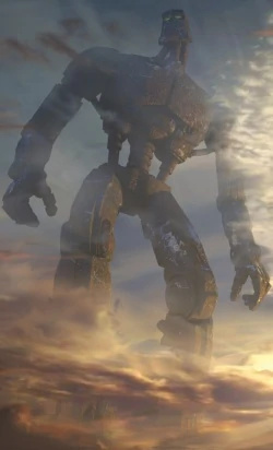
That we have pretty much the exact in-universe appearance of the GSR, but for a lot of people because it isn’t like the real-world-limited sets it’s not acceptable in their “aesthetic”.

If something is meant to look like an in-universe character, try to make it look like that character. Use whatever materials you want. Don’t waste time worrying if it will look too good next to a mass-market children’s toy from 2008.

2 Likes

I’d have more of an issue if people were prescribing that models must look a certain way. Instead it seems to be more that folks are aware of the wide range of G1 looks, and the model in question strays too far from any of them. There will be some overlap, so yes the most detailed/greebly G2 model could maybe fit in with G1, but that’s more on the edge of what G2 looked like overall.

1 Like

Thats not even policing. Its just not even lego. Literally the GSR hasn’t been able to receive an accurate moc by anyone because of how incredibly nonlego it is

Well, that because all the attemps are of a micro chibby GSR. If someone would make a real size GSR (proportionally to the rest of sets), I’m sure it would look like exactly like the this, but it would requiere more Lego pieces than there are in the world.

Sure it is.

Various people have said the “G1 aesthetic” is only how the G1 LEGO sets look. Others say the “G1 aesthetic” is how the actual characters look in-universe, ie the thing the sets are approximations of.

In the context of a contest to create official art of a character, I feel the latter usage is far more relevant.

3 Likes

I’ve never heard that as an issue tho. That’d be like someone complaining you have to make the beach of Ga-Koro using only G1 pieces. The GSR is as much as a scenery and location piece as it is a character/body

5 Likes

You’re right, but the thing with the GSR though is that it does somewhat follow some sort of the visual design logic established for early Toa, which makes sense because the GSR as a concept was designed simultaneously with the original 2001 sets.

image

Most noticeable is the midriff section that has the striated tube for the spine flanked by two pistons that allow it to flex left and right. This is the exact design used in the Toa Mata torso.

Of course, the head is also a near direct copy of the original Toa Mata head.

The rest of the robot is, I’d say, actually quite similar to the Bionicle: The Game visual designs, in the limbs particularly:

image

I want to clarify that I’m not really arguing against anything. It’s certainly correct to say that the GSR is impossible to make 1:1 as a LEGO MOC because, in essence, it is more akin to the realistic CG environments featured in many of the commercials than to an actual character meant to be sold or depicted using LEGO pieces.

I just think these are interesting points to draw attention to.

In terms of “G1” aesthetic as a whole, I guess I ought to throw my two cents in, as an art and character design guy.

Aesthetic really just means the visual design “rules” something adheres to, and while I don’t wholeheartedly agree with the notion that “G1 aesthetic doesn’t exist,” I can say for certain that many versions of Bionicle in different media have totally different visual guidelines.

Other people have brought this up, but the visual designs of the sets are different from the visuals of the comics which are different from the visuals of the games, which by themselves are different from each other. Within the actual world of the story, the visuals of the characters are also not consistent; there are a number of completely organic characters alongside a vast majority of mostly mechanical ones.

But I think that’s, speaking extremely generally here, the basic guiding aesthetic of Bionicle: “mechanical,” at least in terms of the characters. The world is always realistic, very natural, but usually a Bionicle character is mechanical, robot-esque, and usually quite industrial. We aren’t talking Asimo robot:

image

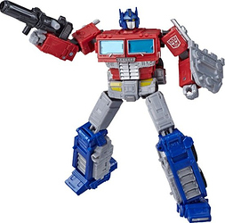
Or Transformers robot:

Bionicle characters are typically a mix of organic shapes (think Skakdi heads or Mistika Makuta bug shapes) with this sort of industrial look:

It’s closer to steampunk than to smooth, futuristic kinds of technology.

Of course, there are exceptions to the rule, as there is in any art form. Some characters like Tren Krom and Anona are completely organic, and I argue they purposfully break from the aesthetic rules to serve their characters: Tren Krom is a chaotic, primordial being, and Anona is literally a space alien. Standing out aesthetically from the rest of the characters helps them be “otherwordly.”

There is no one, definitive set of design principles that can clearly be labelled “BIONICLE G1,” for certain, but clearly there are certain elements that make things look “Bionicle” as opposed to “not Bionicle.”

To simplify, there must be visual distinctions that obviously makes something “Bionicle” and not “Transformer” or “Gundam” or “Evangelion.”

10 Likes

I can agree with the steampunk esq vibe. I think what G2 does is it makes itself look like hero factory a lot. The first time I saw a G2 Bionicle I didn’t even know they were coming back and I thought I was looking at the latest HF until I saw Bionicle and I had to double take myself

I think when most of us talks about a “G1 aesthetic”, we are talking about a set construction aesthetic. If we talk about the world in general, leaves, water, lava and maori designs are part of the aesthetic, since the characters live with them, but none of this things are Lego. In the case of GSR is a homage to the original sets, but is more like a enviroment rather than a set, like you said.

About the game, it doesn’t follow the same aesthetic and looks more like a G2 character, because they lack the gappiness. I think The Legend Reborn was the best media in mantaining the set visual (with exception of the commercials).

3 Likes

My definition of this is something that looks in line with the other g1 sets and within the universe considering this limitation.

Essentially a heavly system moc with intricate while smoother designs would not fall inside this definition nor something that looks like a hero factory set or is a system/ccbs hybrid.

What do fit within this definition however is a moc that either a) tries to replicate design choices and techniques found in g1 sets to create a cohesion with already establish figures within universe, b) Taking cues from the dh/rahi builds to create something using it as a template/basis, c) A moc with G1 astethic can utilize parts from system/ccbs but the distripution should be 80% or more g1 parts and 20% or less system/ccbs compared to the biocups standard which for most qualifiers are a 10% or more bionicle g1 parts and 90% system ccbs.

While its not wrong to make a moc in any of those styles for G1 I think the main reason for people bashing mocs for not looking like the sets especially in terms of canon contest entries I think have to do with Greg confirming that the sets are their canonical appearance. However to note that sets have their own limitations mainly with scaleing but its a problem that is an after effect caused by the ever expaning lore and toy range

2 Likes

Hello, foreign fan here. What are these LEGO “pistons” everyone seems to be speaking about? I tried to google but naturally I only got lego motors.

@ToaOfPlastic I’d say they were the first in second era G1 since they were the first sets to be build without gears. Not to mention the torso and leg pieces became very prevailent in the latter half of bionicle sets.

The trailers and piraka rap were their own aesthetic, I agree ^^’

Edited for Double Post- Prentice1215

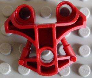
Pistons are those bars that stick out of a shaft. Those are often used as a detail in the design of limb pieces and armor pieces and look like an unfunctional mini sized version of the leg stabilizer from Tuma.

Thank you for the answer.

Apologises but I am still not sure what people mean with this. Can you post a link or a picture?

49423

I hope that works. It should be a picture from bricklink. The two bars that run symmetrical on the lower half of the piece. Those are pistons

3 Likes

Ah I see. those do indeed look like miniature versions of the large “pistons” Tuma and many other titan sets have.

And indeed as I look many torsos have those small pistons on them. Thank you very much!

2 Likes

yeah but a lot of inika parts had that engraved circle texture that no other previous parts had, and they generally had more curves than previous parts