Like a what?
Oh…
Like a what?
Oh…
Edited my topic’s title to fix the typo
It’s one of my favorite colors. You have more creative visions when seeing green.
Whoops sorry bout that
Every offense taken
/s
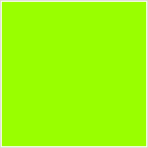
BRIGHTNESS OVERLOAD
I prefer grey or some yellow for soem reason, dunno
Personally and I think this might be an unpopular opinion, but I LOOOOOOOVE the new color.
Sorry if it came across like I hate that colour.
It was just very shocking.
From the name I was thinking it would be something softer…
it’s too bright, but we’ll probably get used to it till the next board reskin
The red? I dunno… It’s too aggressive of a color
@Lobstroke
That’s a very neutral chartreuse, darkening it helps a bit.
I think you need to reload your boards…
Lol refresh your browser, they aren’t red anymore, it’s a new blue
When I view the boards it’s still grey… I mean, it doesn’t say the Kahi Boards but still.
Mata Green. Favorite color.
Though this lightish blue is kinda nice.
This is a problem only mobile users have as far as I’m aware
Makes sense, seeing as I’m on mobile.
Oh that’s better. Blue triggers the wake receptors in your brain, making you more alert and active. Even more patient.
Perhaps this is a strategic way to unconsciously influence users to be more friendly and less hostile on the boards
Also, I find that the notifications blend in so it’s harder to see ![]()
Looking at it on desktop view, I really like this color, but it should be a bit darker. Not back to the original, but like, Mata Blue.
Hence why it is my favorite color.
After all i used to be BlueCel, so the new color doesnt bother me.