Hey Bionicle fans 
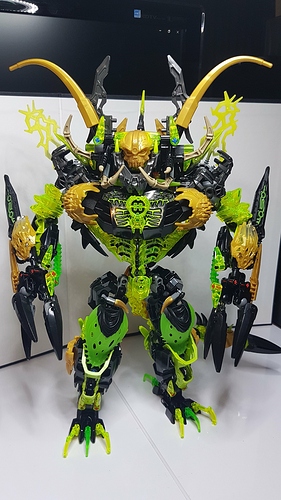
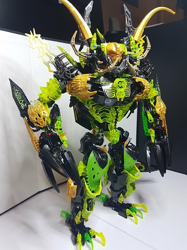
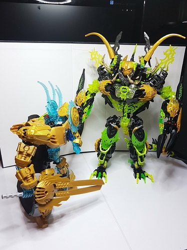
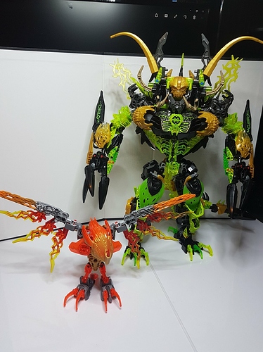
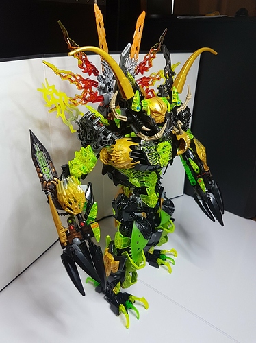
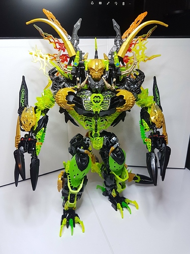
Today im gonna show you my older creation but i think this is my best verion of Umarak 
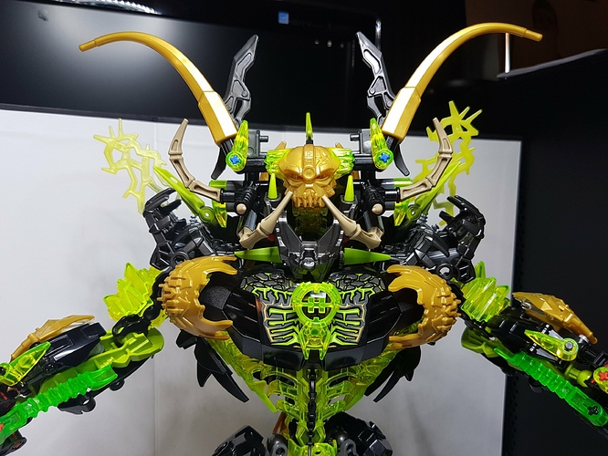
I know that alot of people hates hero factory core on his chest but its there only because of trans neon greenish color 
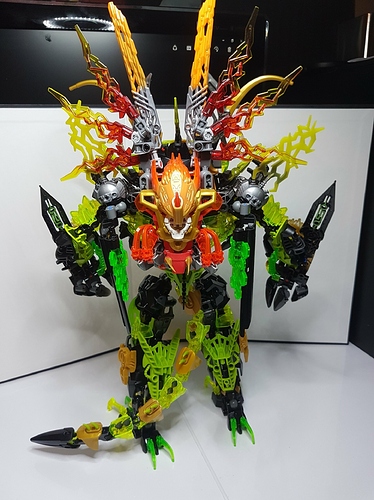
He have also combination mode with all creatures.
And also comparation with my self moc EKIMU 
You can find more pictures on my YT channel (Bionicle2015MOCS)
Soo what do you think ? 
why is Umarak a hero now. “Umarak XL”
He is definitely not hero  like i sad in title
  that hero core is there only because of trans grenish color
Umarak is leader of all Beasts and all 4 of them will be a SPECIAL GUARD for my new Makuta 
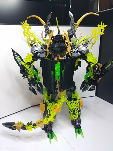
This is chaotic and I love it. Most would complain about texture clashing but it works on this guy. The only problem I have with is the back. Those large technic plates feel slapped on and are out of place.
This is insane.
That’s pretty much the only way to describe it.
this thing looks WAY too cluttered.
also, pick 1-2 green colors AND STICK WITH THEM.
I’ve seen this before. Still looks amazing though!
So he’s from the hero factory now? That explains his pretty bulky look.
Regardless, great moc.
Self-MOCs
I don’t think you know how they’re supposed to work
Anyway this MOC is…immensely cluttered and overkill.
Maybe it’s your thing, personally I’ve never liked this aesthetic. Size has NEVER impressed me on MOCs, and this is no exception.
Also, the amount of lime green is far overdone compared to the highlights of the original.
Its really cluttered and the large plates on the back don’t mesh well, and there are too many varying shades of green. Its also gotten rid of his kinda hunched over stature by just making him upright.
And so many emoji!
@Sammythekat Thanks for your opinion  well theres 3 tipes of green.I just dont have so much pieces in one green color you know
  but i think 3 types of green is not that big problem
  And cluttered or not i just love building this big mocs.I know that for someone can by this overkill but others may like it
  but other than that thank you so much for your opinion
@decepticonaiden Thank you 
@Ninjanicktf No no  hero core is there only because of trans greenish color nothing else.
Edited for Triple Post - Waj
H=Hell
mate.
umm
i see solid lime, trans-apple green, trans-neon green, partially-transparent apple green in the thighs, and a light yellow-green in Surge’s weapons on his shoulders.
also, i see another slightly different shade of green in the Skrall blades.
and mate, don’t constantly use emoji as punctuation.
just use a period, like the rest of the world.
but the distribution is laughable.
the trans-apple green looks like it shouldn’t be there, because it’s only in 2-3 spots in tiny amounts.
the random use of solid lime is also bad as well, only being used in the very inner parts of the arms, and as leg armor.
overall, this
moc is extremely cluttered, has no real cohesion, and just seems to be big for the sake of being big.
Dang maaan colm down 
I dont know why i feel so much hate from your comment haha.But thanks even for this type of your opinions 
Yes i love building this type of big mocs.Maybe he is soo cluttered and combination with ikir may be overkill but it soppose to look like this.Its a mutated monster beast bro  It supose to be big! Even the basic set that we get was big compared to beasts and toas soo …yeah
If you dont like it its ok i totally get it  but why you comment it ?
  Im just random builder and this is my 2 hours a day hobby.So sorry that i cant see sooo many different types of green on him hahaha.
And i will be using emoji where i want bro 
Dont get life soo serious  but thanks
Edited for explicit content -legomaster
Sammy was simply trying to give you constructive criticism. It’s the norm here. When you see something in a MOC you think could be improved upon, you tell the builder about it in a kind and respectful manner. CC builds community relationships and helps creators improve.
lemmie break this down for ya.
I’m known for being harsh.
doesn’t mean that he has to be a random mix of parts.
looking back, the textures seem random, with little cohesion.
yea, it really is, making him seem more cluttered.
but big =/= quality.
quality = quality.
@legomaster1378 already said why.
doesn’t mean that you’re impervious to criticism.
Criticism is here to show ya where ya goofed up, and where to improve.
OK.
Transparent Lime green, with the ribcage pieces, crystal addons, etc.
Transparent Apple green, in the arms (the HF upgraded thornax launchers), back, and feet,
Semi-Opaque Apple green, with the pod pieces on the thighs,
Standard Lime, with the stickers, Inika limbs on the arms, and the Piraka foot & Breez 1.0 shin armor on the legs,
the slightly off-Lime on the Skrall Blades,
and then the random inclusion of Surge 1.0’s weapons, and their yellow-green.
Doesn’t mean that you should use it to finish each sentence.
also, put a space after your periods.
He is a good guy then, cause he destroys Hell.
Bruh I’ve seen your Makuta MoC…
Also, do not criticize people’s punctuation until your punctuation is perfect.
Which it’s not (capitalization, man, capitalization).
Anyway, I agree that there’s a little too many shades of green on the MoC. Those black Technic plates on the back look a little out of place compared to the detail on the rest of the MoC. The hero core triggers me looks a little off to me, but you’ve made your stance on it clear enough.
All in all, I like the MoC, the unity feature is a nice touch.
…
Didn’t even notice that XD
Good eye, mate.
Yea, I know, I know.
Sorry, I’ve gotten overly-used to quick, mid-game typing XD
Just saying, don’t be a hypocrite (sorry I’m not trying to be harsh there’s not really another word for it).
Yeah… The name might need some work…
Yup yup. Sorry if I came across as rude.
