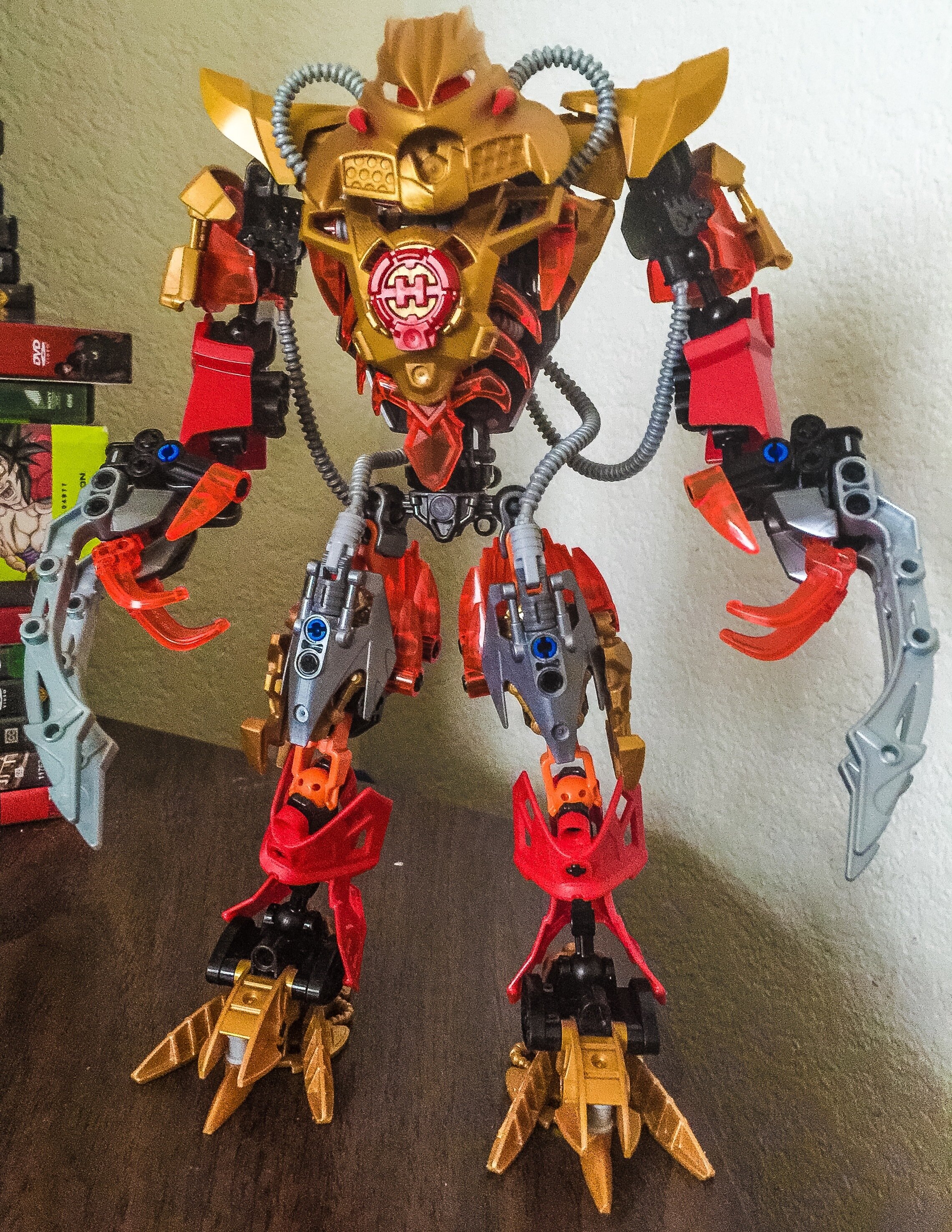
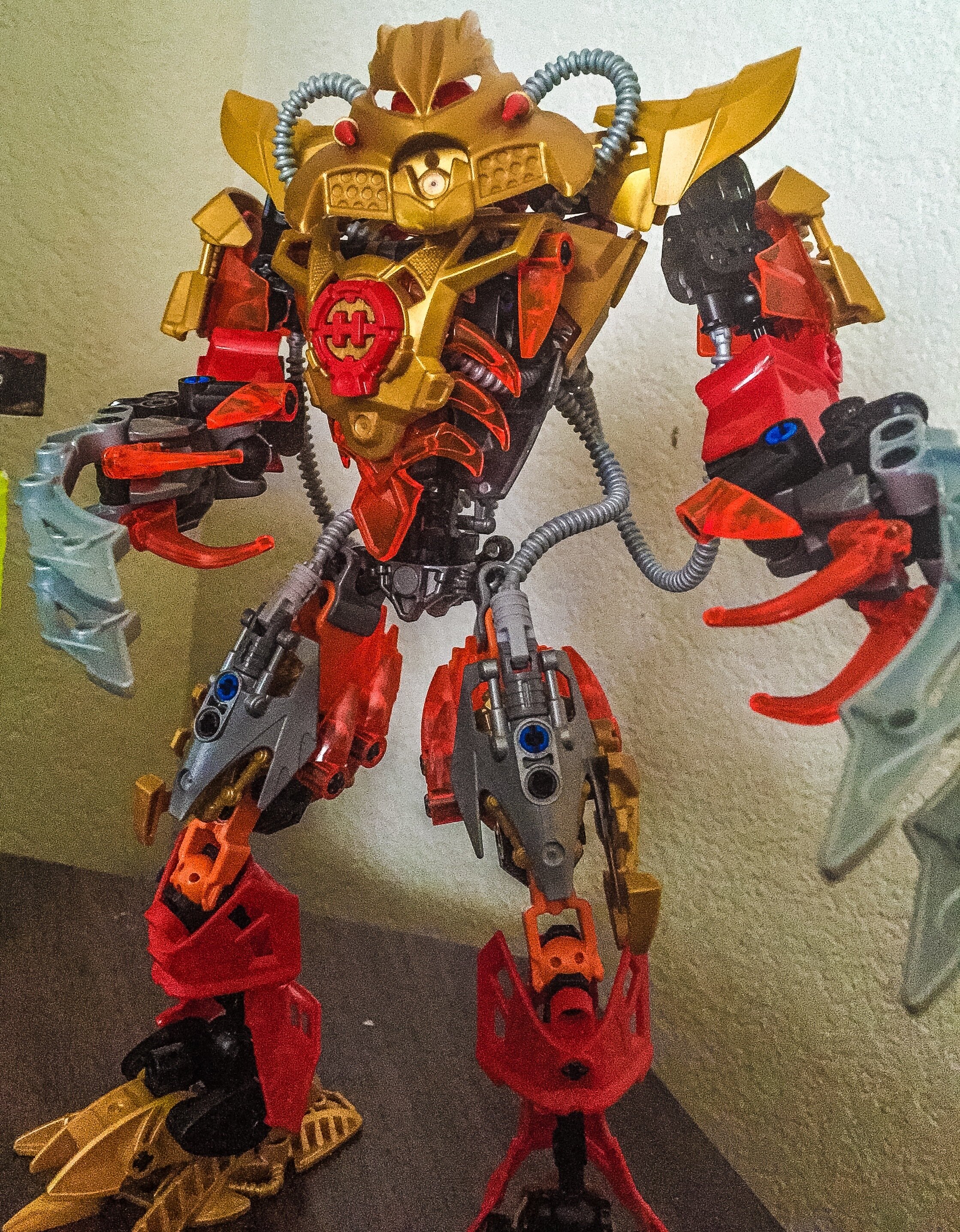
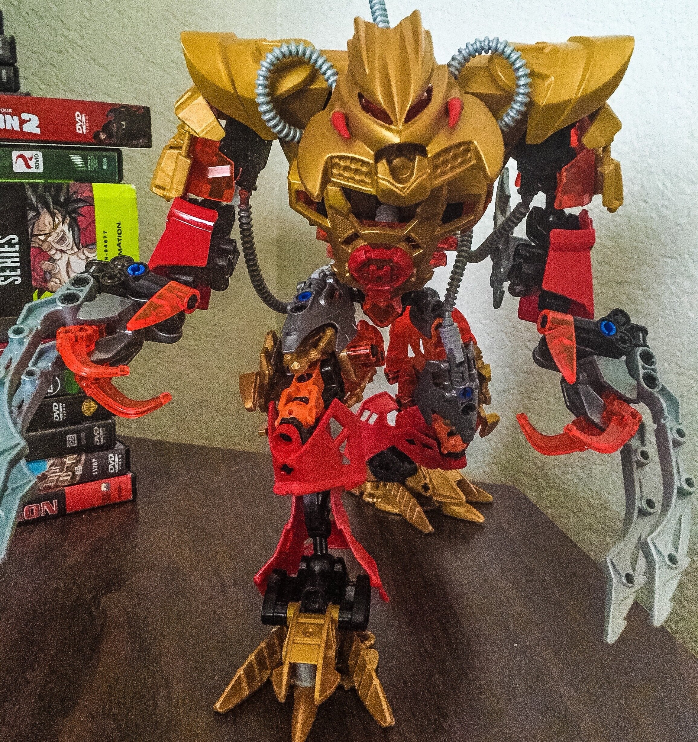

Interesting, but the solid orange on the thighs is very out of place.
Use my black on my umarak the destroyer
Something about the shoulders seems a little off. They make the arms look awkward when you pose them straight up and down.
It’s certainly an improvement
I think that the shoulders are too high. Also, besides the hands and pipes I can’t really see the difference. Can I have a picture of the old one for reference?
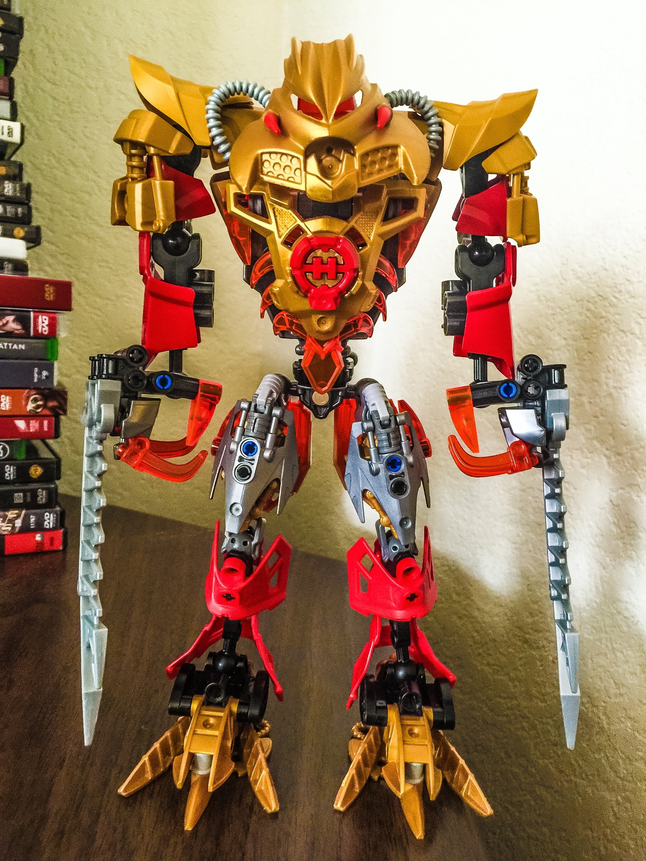
TBH I don’t see much change.
I don’t know much but I’m not certain if this really deserves an entirely new topic, let alone be called a V2.
But it still looks cool, so good job.
Still very indecisive. Maybe he wants his shoulders to get a good tan, so he’s raising them higher to the sun?
Not how that works, Brutaka my buddy.
The solid orange to me doesn’t look that out of place, considering how much trans-reddish-orange is used throughout, although I wish that exposed part of the bone could have been covered somehow nonetheless, and the solid orange hidden altogether.
I do like the shoulders where they’re at. Something tells me in any other mask it would look proper, but Brutaka’s freakishly huge Kanohi does seem to make the shoulders look way too high, as if he’s in constant shrug-mode.
It’s an “I dunno” that goes on forever…
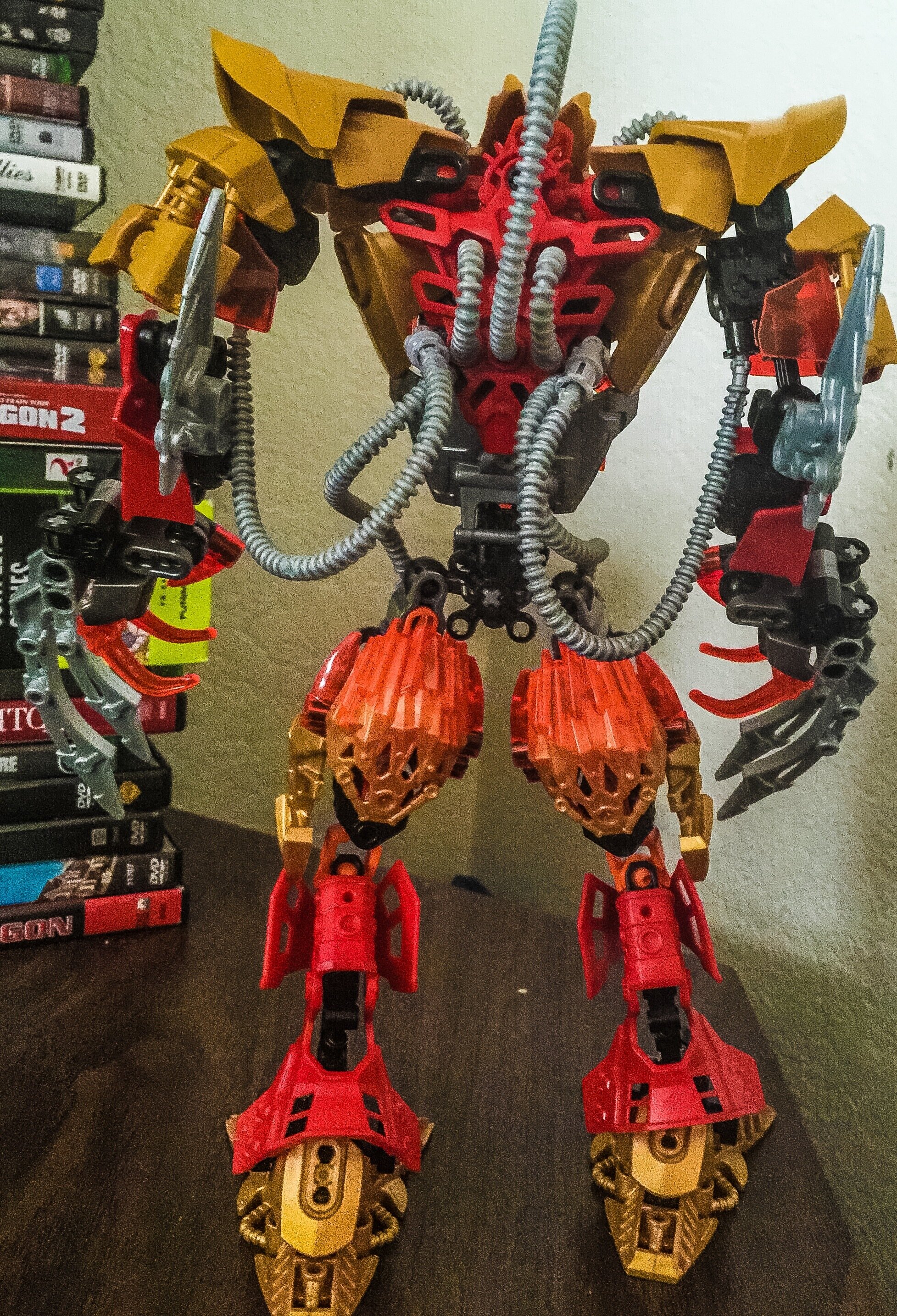
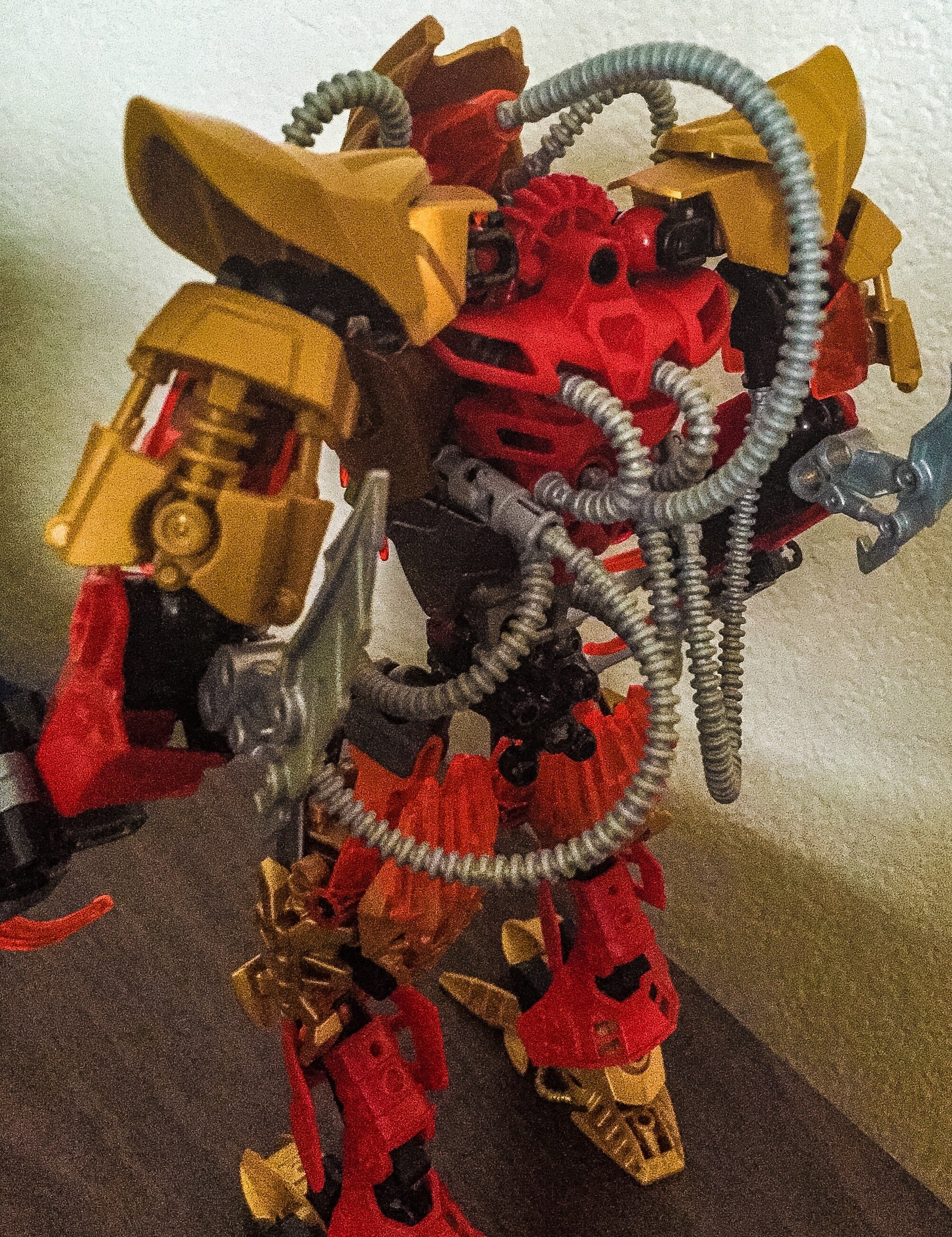
But it’s beefy, the torso does look pretty solid, and I like the hands an awful lot.
Nice work!
Thank you!!! The torso & hands are my favs about him
It’s str8 up savage, yo
So is this suppose to be brutaka if he was part of hero factory? Nice moc btw
Idk! I just love to build
Id suggest that you focus up the color scheme. personally, I dont think the red looks good.
The tubes and the bulky build remind me of Bane from Batman lol
Slightly lower shoulders would help a lot.
looks awesome, i love the colours and use of pipes
")
(Replace game system with moc)
I really like this, but that neck (or lack thereof) almost ruins it.