Ohura (Final Battle Armor)

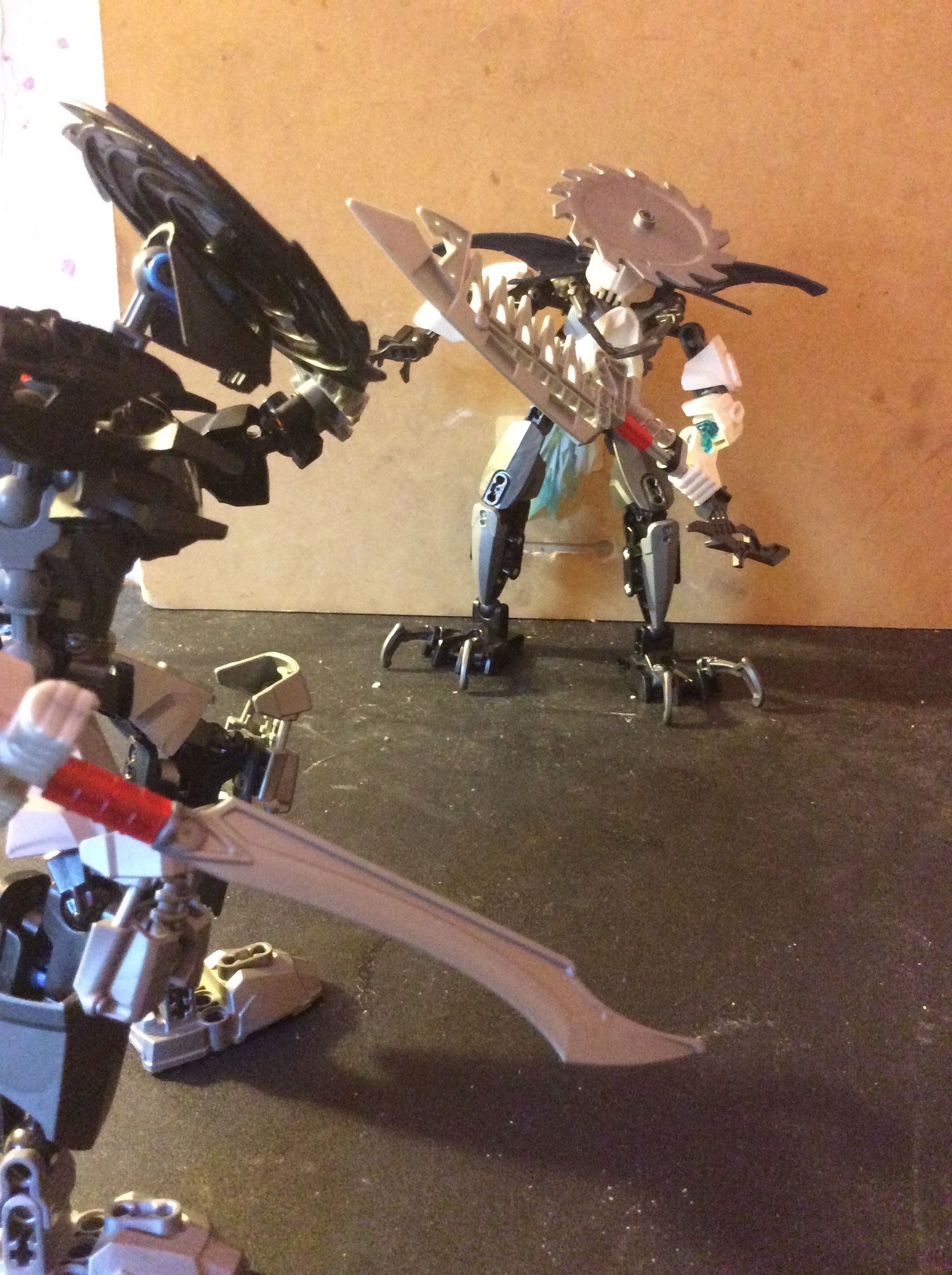
Brother, I did not want to fight, but you leave me no choice!

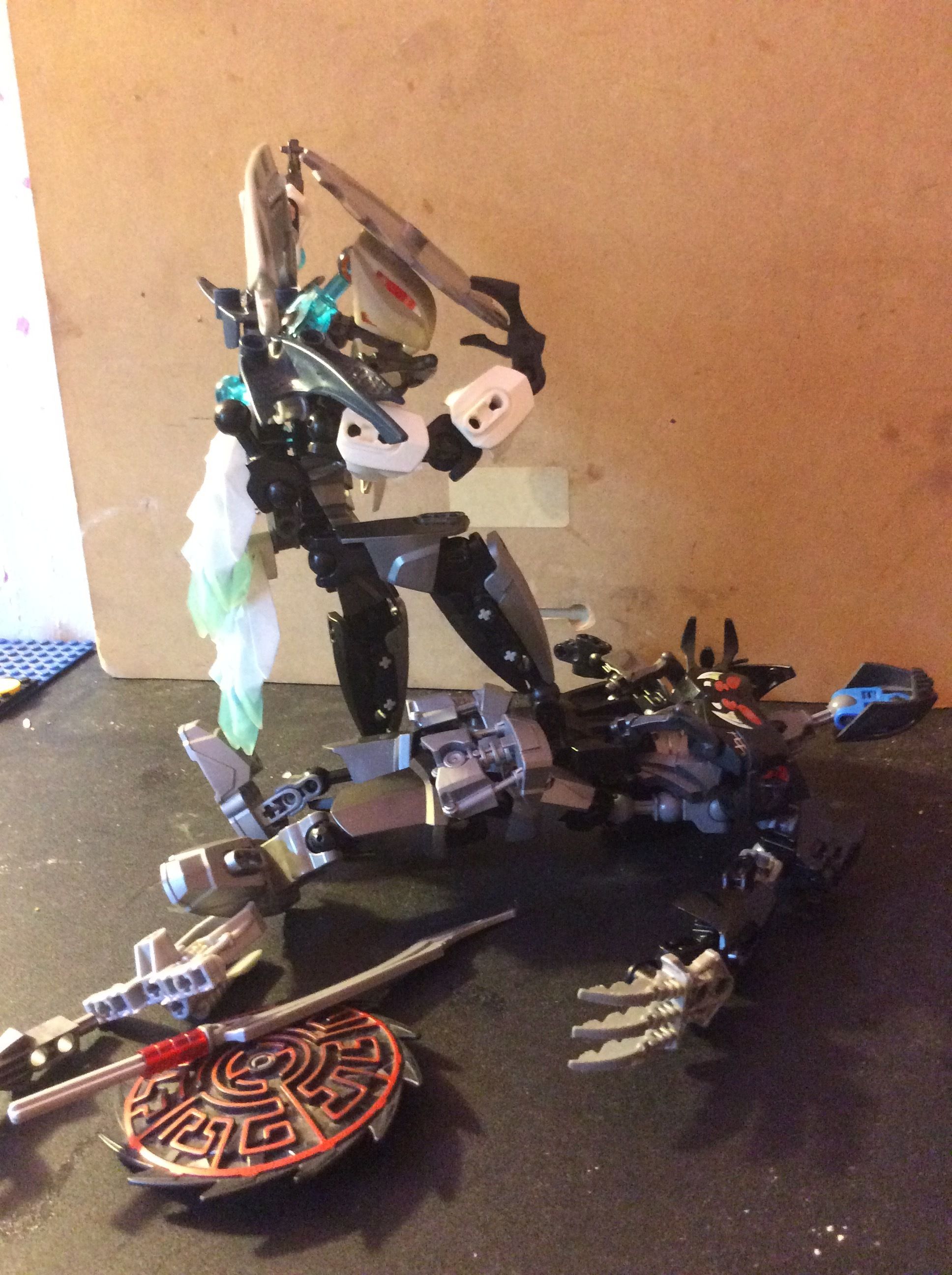
This armored upgrade of the first form Ohura enhances his speed and strength with a not-so-sleek look.

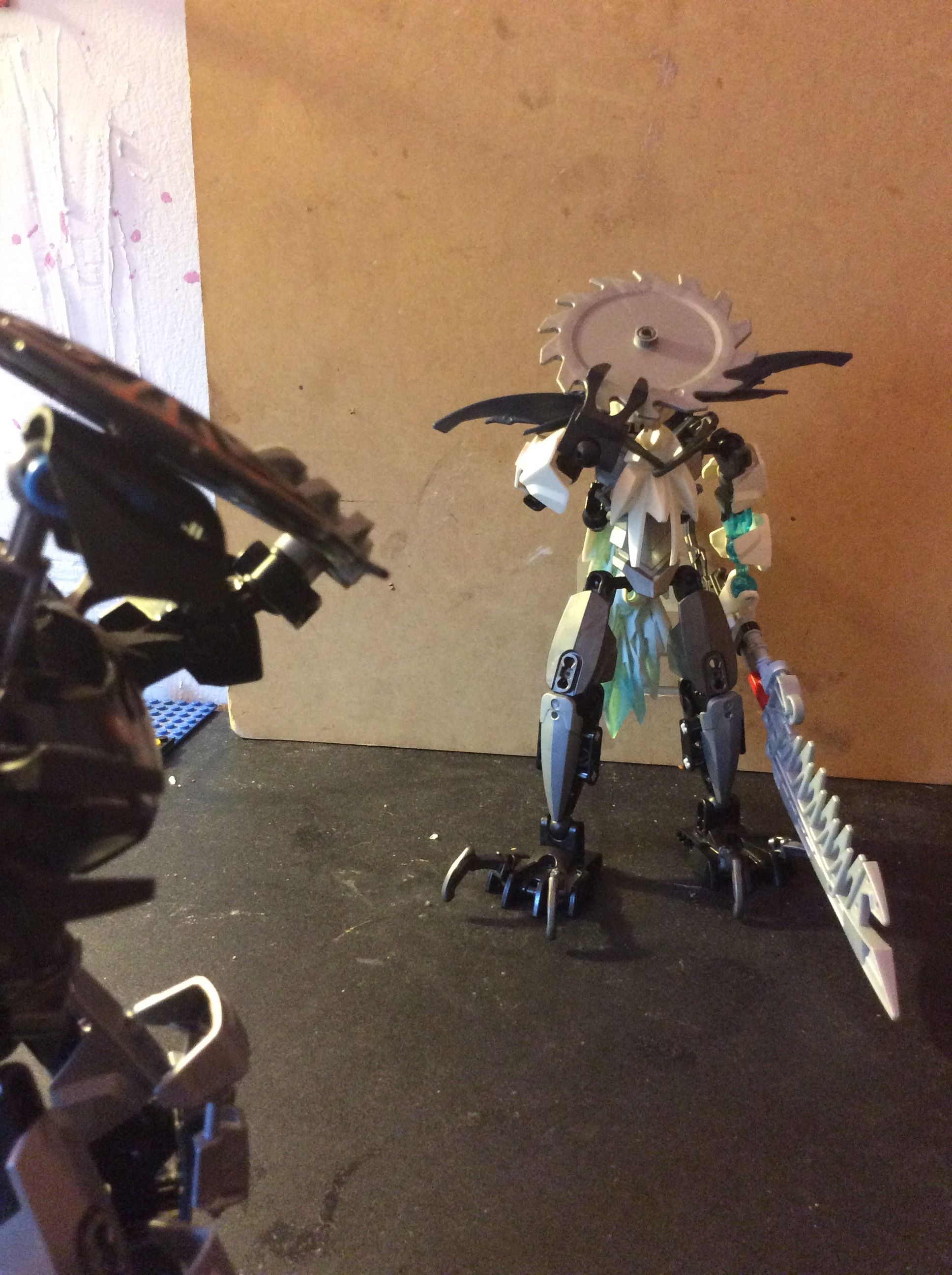
With a sword to match the power, Who knows what his Final Form might look like? (Final Form WIP)

Sporting Lynis’s trademark saw hat but in different colours and a blade to match his power he dominates over his brother, but in the end one of them is going to win Lynis’s own mind and body.


18 Likes

Nice. I like the ice armor fRom Strakk used on his back.

Don’t tell me this is like a David and Goliath type of MOC…

1 Like

ftfy

Either way, the MOC is okey…basic and somewhat interesting.

Too much simple CCBS, but I like the lower legs and the head a lot.

It’s pretty simple, but still cool. 8/10.

too much ccbs isn’t really a con

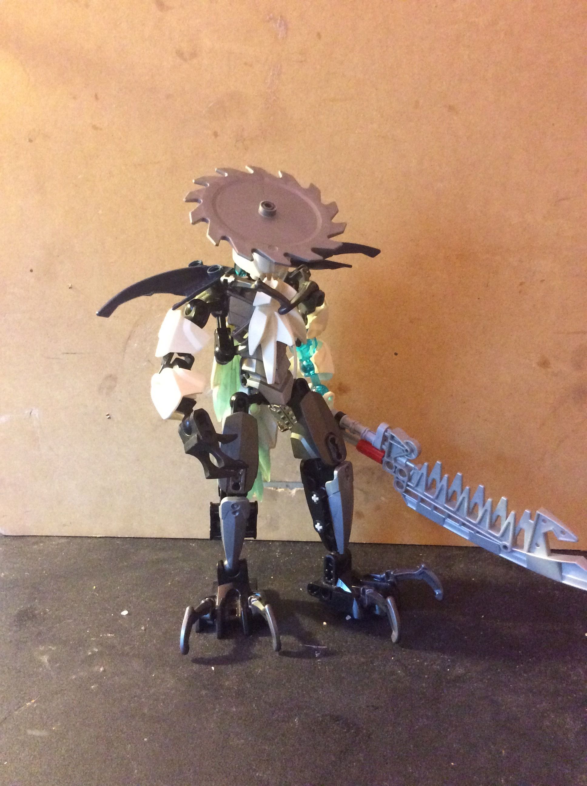
Anyways, I’m not too sure about the moc itself. I really like some features, like the lower legs and the shoulder pads. But overall, he looks kind of messy and cluttered. I can’t even tell what’s going on with his torso.

The torso looks a little messy, and I don’t understand why is left arm has that random trans blue bone on it.
Other than that, not bad, not bad at all…

Not bad, IMO.

This isn’t even his final form.

Interesting enough idea for the MOC, but I feel it suffers a bit from oversimplicity and also…the chest. The chest is really lackluster.

I quite like the legs though.

1 Like

It’s not, I based him off Dragonball’s Frieza and his transformations.

That’s not what I mean.

Have you ever heard of David and Goliath? You said this is the most powerful form of the MOC, and based on the pictures, he’s quite small. Kind of resembles the story…

But whatever you say, if you don’t believe that he is, then he’s not.

Yeah, only I never read it (no need for a full summary)
I will just change the title and a bit of the description.

What is with the asymmetry in his arms? it seems rather pointless, and also that head design has been used to the ends of the earth.

1 Like

Oh yay, rahkshi heads with plate-hats!

I really feel like the colour scheme looks wrong here, though these photos make it a bit hard to tell imo.

I’ve got to agree with this.

This head design is so overused it’s becoming kind of annoying.

Sorry…I had to.

1 Like