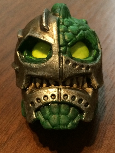
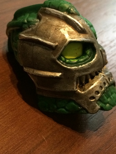
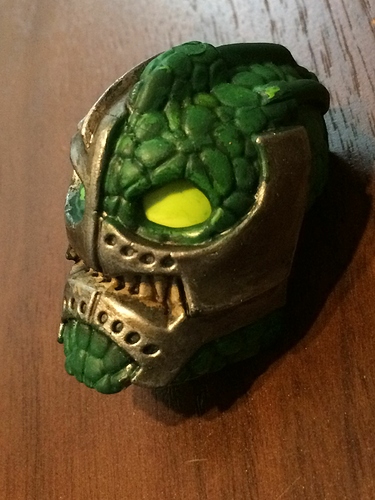
I always thought that while this mask had a good mold, I felt like one flat color ruined it.
I painted it to make it more realistic and stuff.
(If anyone knows where to put this, move it).
This is dank.
Looks awesome. Nice paint job. I especially like the how there is darker paint in the cracks. The Inika did always seem to stray from the bionicle look with the more organic masks.
It looks amazing. It looks like it’s a mask on a mask
Maskception
It also gives off a bit of a Hannibal Lector look
Moved to Artwork~ NoLongeraPiraka
Your paint job makes me appreciate the finer details that went into the mask that we wouldn’t have been able to discern very well from one colour. good job
That is so awesome! What kind of paint is that? I want to use that for a MOC!
Citadel paints.
Metallic basecoat: Leadbelcher
Washed using agrax earthshade for a browner tone.
Highlighted using runefang steel.
I drybrushed the scales using warpstone glow.
But yeah, citadel has some great paints, although they don’t bond super well to lego parts.
Teeth: Basecoat of zandri dust. Wash with agrax earthshade. highlight with ushabti bone.
#I
#LOVE
#IT.
Amazing work on one of my favorite masks.
Yeah. Once I find out what that means, I’m definitely using i! Thanks!
Thank you for making this “mask (XP)” look 10 times better now.
this looks nice
reminds me of one I did. The silver paint I used wasn’t so great
Edgy very edgy
Cyberkongu ftw
Awesome, really works for the aysymmetrical appearance of the mask.
VERY VERY VERY NICE!
It doesn’t even look like a toa anymore!
It must have taken forever to paint!
This looks really fantastic! I love the teeth. You should try painting the eyes, and maybe put a brown wash on the green to make it look less flat.
I really like this, makes it look like a silver helmet got shattered and all the green is organic stuff
I never really noticed the mask on mask look of the original.


