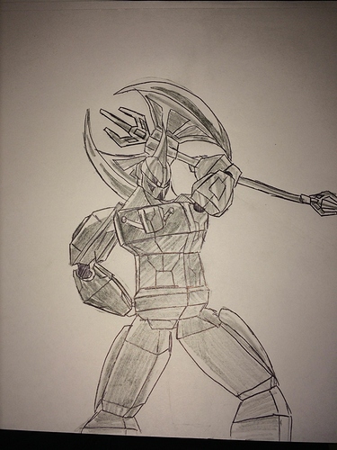
Hi, I tryef to replicate the 2015 style to Axonn, from 2006,
and I put him in a cool poseIdk he seems wayy too fat.
But the shading is pretty cool!
Hes a brute and thanks
I’m just wondering why his neck is on the left side of his torso
Oh yeah I messud up I bit…
I can tell /s ![]()
I love your drawing style, but the proportions seem a bit too exaggerated.
What should I fix?
Perspective seems off.
It loks a bit like the 2015 animations, so yay!
Too blocky, but the arms, axe and mask all look good.
Goar. JUSS!!!
He looks cool, but he looks very hurt by how twisted his neck is.
Torso is a tad blocky, otherwise fine.
looks pretty nice, I’d say a bit too blocky though
He looks to bulky
The drawing gives me the original Transformers vibes with the blocky body.
yea, kinda looks odd.
@anon68675807 said it best. looks like Getter Robo 1 just activated.
also, props, beef, for the GRA gif.

