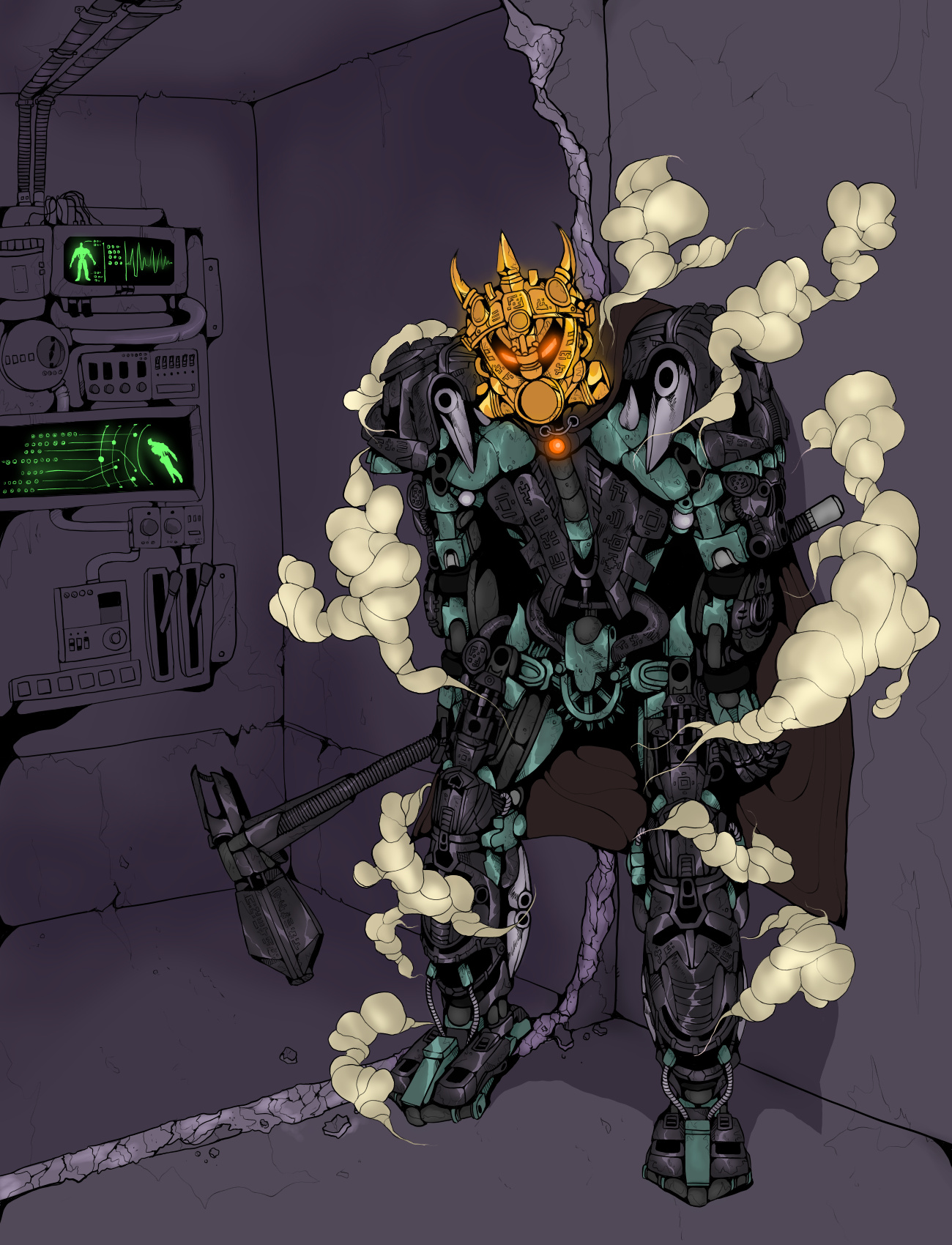
Tried to stick up to the early years’ comics design as much as I could.
The scene portrayed on my artwork is one of the most popular and loved by fans (myself included) scenes featuring Artakha, his first physical appearance.
The stuff on the background is a torn off by Tren-Leva-Krom wall panel and the machinery that was hidden behind it.
Some of you may wonder why is the maker himself surrounded by some sort of steam. Firstly, to add some dynamics to the shot. Secondly, Artakha has just teleported in a room hidden deep underground from a warm place like his island. Sudden change of temperature has made his armor cool down rapidly and give off this steam. But for the most part, it just looks menacing!
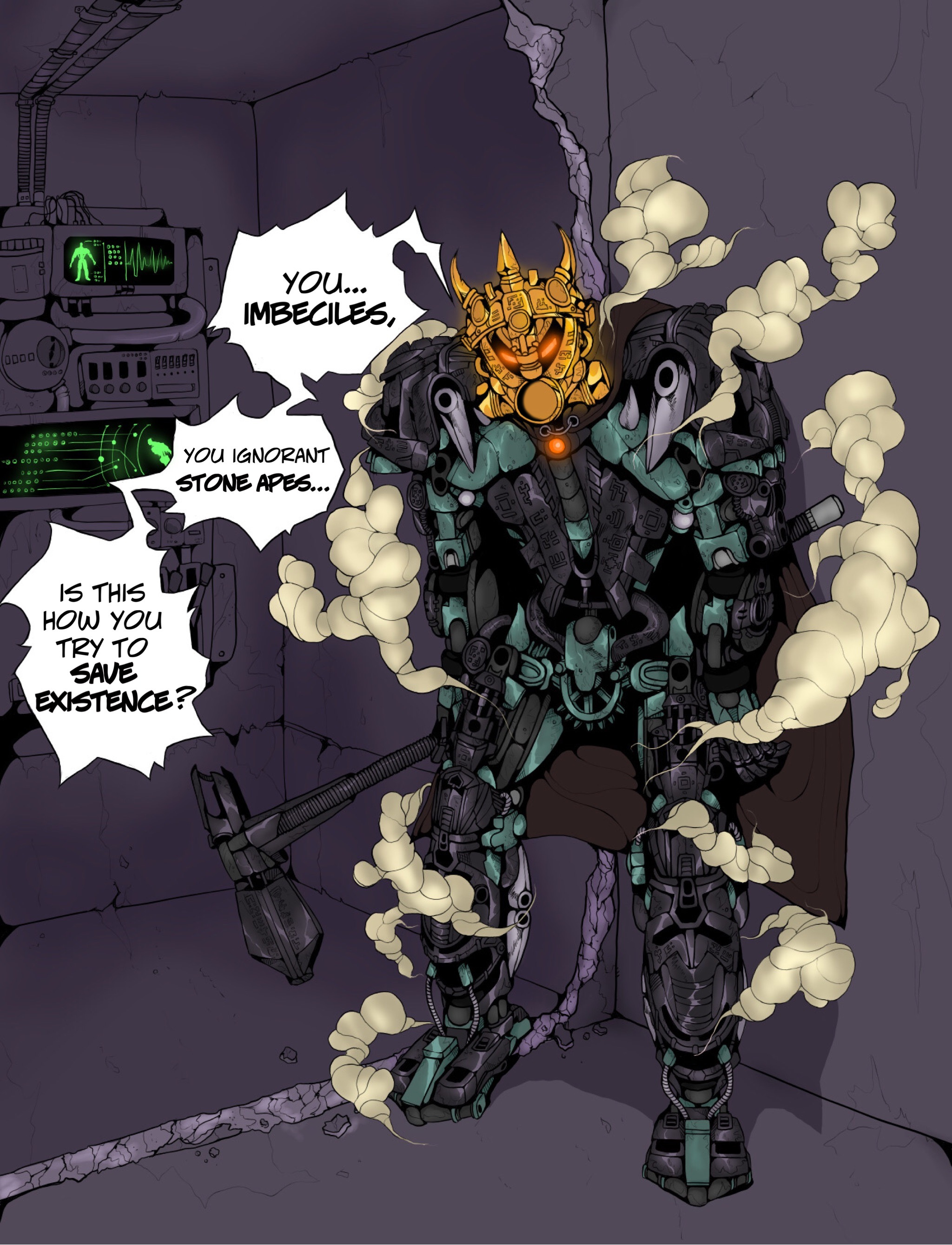
And here is version without text bubbles. If you’ll read the comments under the post you’ll find out that it actually was supposed to be the main picture, but after some time of thinking about it I made a hard decision for it not to be. The shot seems empty without them, it feels that it lacks something. I tried to do something with background like moving the machinery closer to a character, but after attaching the photo over here it removes almost a half of its contrast and I can do nothing about it. So, seems like I’ll leave everything the way it was in the beginning. Sorry to everyone who voted for the version without text.
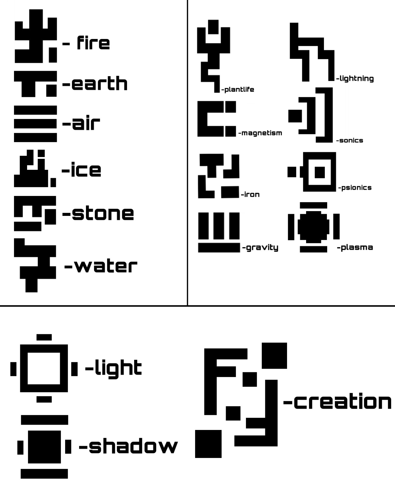
The runes on his mask, hammer and armor I created mysef. They may serve as primeval version of elemental symbols, that was forgotten as the time passed.
Probably my favorite entry so far, definitely top 3. I love the comic book style! I love the background! Artakha looks really menacing, which fits the theme. The speech bubbles are also a unique and cool touch.
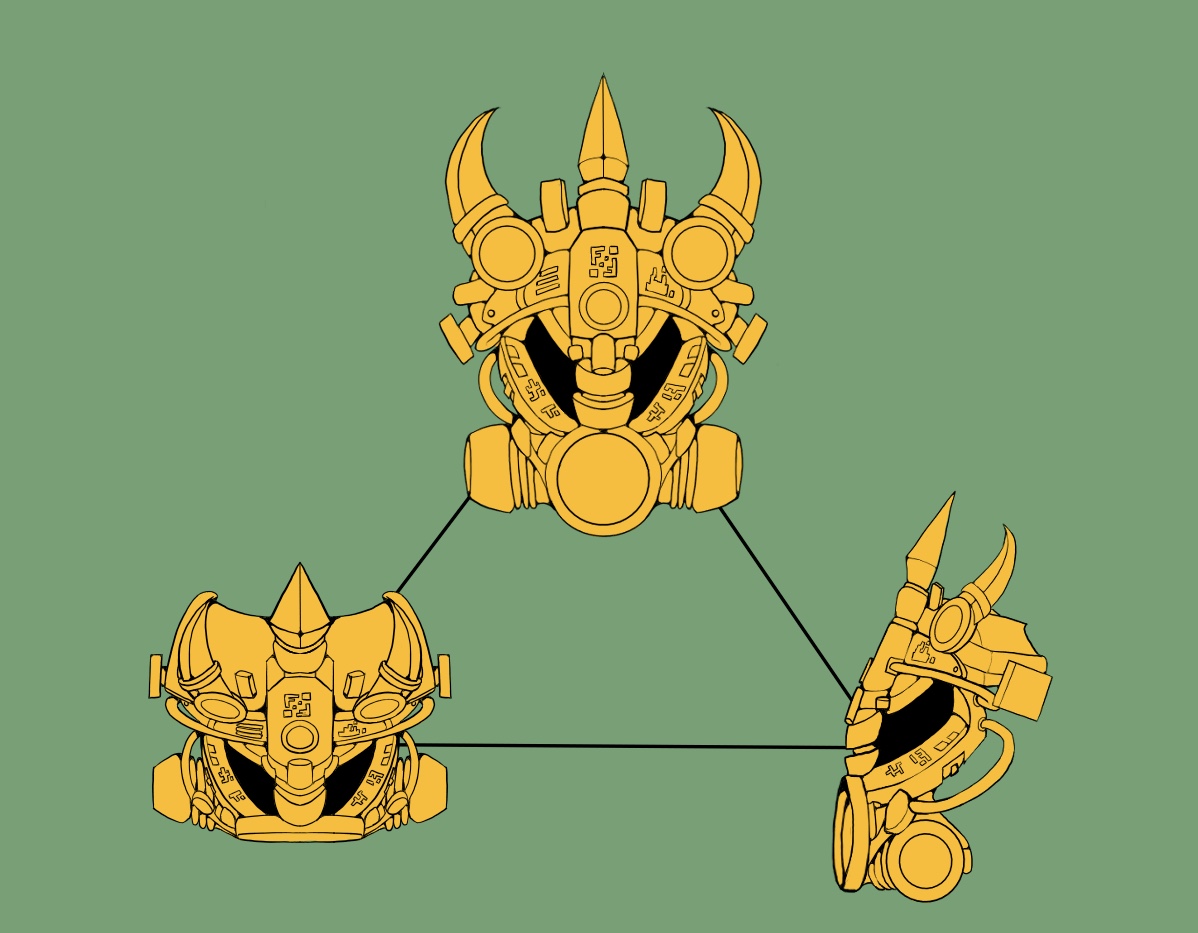
The onlything I don’t like is the mask. It’s a fine mask, just not what I personally imagined the g1 mask of creation to look. However, it doesn’t matter much to me, since I like to imagine that Artakha can change the mask’s physical appearance.
This would be my favourite entry so far, if it wasn’t for the speech bubbles. Yeah, honestly they kinda ruin it for me. I don’t see it as a “main” representative picture or Artakha, but rather some random page from a comic he appeared in. Which was the intent, I guess, but I think it’d be much better without them. Shame really, because I like this interpretation a lot, even the mask.
Thank you, i appreciate and respect your point, so if people think that it’d be better without text bubbles, i’ll remove them from the main picture.
Here’s the poll, I’ll host it for a few days and will let the viewers choose the main picture they prefer. I’ve added version without text as additional photo, check the updated post.
This is definitely my favourite. It checks all my my personal boxes in a way that no other entries have done (so far). It has a good art style and good posing, while also staying accurate to the MOC.
Then , as a bonus, it is a canon scene from the lore, and the mask is excellent (and gold!).
Also, I think the main image should have no text bubbles. The text bubble version definitely adds to the atmosphere, but it doesn’t really work as the main image of Artakha.
EDIT: I just noticed the interpretation of the viking horns on MOC’s ankles as hoses. I love it.
I absolutely love the style, the backgound, the bubbles, the coloration, the runes, but I really hate that circle in his mouth. It’s you vision, but I can’t understand it. Maybe if it was smaller, or deeper (like on Hau), or elongated, but not like this.
Completelly stunning! This is currently on the number 1 spot for sure!
Your mask is one of the few original designs that catches the lentiful cultures of the Matoran universe.
Thank you! I get your point and the circle is supposed to represent the Hau-like design. When I think about word “kanohi” the first thing that appears in my head is a picture of Hau’s Mata version, so i wanted to make some reference to this mask. It doesn’t exactly repeats the original circle’s design to make it look a bit more proportional, but i don’t think you’d enjoy it much better if it was deeper/less rounded (like the Hau’s one).
And you did an amazing job of that! Seriously, I can recognize that style with the Mata hand pieces and the shaping technique, very very well replicated! Definitely my favorite comic style!
But, to be honest, I don’t.
In combination with eyestalks form, it starts to portray certain emotion because of the shade, and this emotion looks kinda dumb to me. And the only reason is shading. The circle actually is supposed to be little deepened if you’ll look at the side view of the mask, but i decided not to make too much accent on this on the main picture to make it look less emotion-showing. Sorry.
Okay, the more I look at it, the more I start to like it… Let me chat with my pals and think about it for a bit and I may chage the final design. Anyway, thanks for your help!