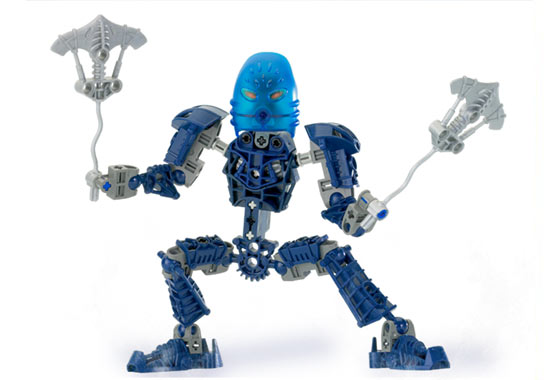
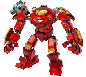
Well, Kongu was the gruff military captain of the Gukko force when he was a Matoran, so it’s kinda fitting I guess
Here are my thoughts on what I find as bad design
BIONICLE
2001
Eye piece connection
Mctorans being released at Mcdonald’s
2002
Toa Nuva masks are way too big
Eye piece connection yet again
2003
Bohrok-Kal sets are just Bohrok sets with silver
Makuta’s whole build and how it didn’t resemble the movie depiction (colour scheme, legs and torso being the main issue)
Takanuva’s oversized bike
2004
Vakama’s and Nokama’s masks
Metrutoran builds (bare back)
Kikanalo’s scale and difference between the movie
2005
Rhotuka spinner’s connection wasn’t sturdy
Toa’s same-y builds (I believe they should’ve depicted different Rahi)
Sidorak’s large claw and knife hands
Rhoodaka’s hair (should’ve been done differently)
2006
Inika heads and masks + stick necks
Voyatoran designs
Piraka’s torsos bumping with their heads and making it hard to pose + small left hands
2007
Pridak’s huge head and body build (i constantly had an issue with the upper half constantly falling if the figure was slightly moved)
Nocturn could’ve been better
Hewkii’s arm
Matoro’s red eyes
Karzahni build
2008
Av-matoran build and their oversized heads
Kopaka’s laser eye
Pohatu’s propellor hands (feel like they could’ve given him actual hands and have the propellors as his weapons/accessories) + Kongu Mahri similarity
Mazeka’s mask connection leaves a gap due to longer axel attached to it to slide in that blue Mahri piece
2009
Honestly the Agori were fine in my book, they looked way better than Av-matorans and I liked their unique builds
cons
Gresh’s torso gap
Tuma’s mask stickers weren’t really needed and his simple arm builds
Vastus’ feet were huge compared to the rest of his body
Telluris deserves a whole redo completely
2010
Simple builds and sudden cancellation
2015
Pohatu’s legs not having the function
Onua resembling a gorilla (he’s black, major racial controversies)
Skull Warrior’s mask colour (silver works better than gun-metal)
Kulta’s mask colour (gun-metal works better than silver)
Skull Scorpio’s legs (I mean they really could’ve made them movable but they just gave up)
Lack of Makuta’s mask maker set
2016
Tahu being way too gold
Gali and Lewa being overpowered by silver
Kopaka’s random golden thighs
Umarak the Destroyer’s hollowness
Lack of an official Makuta set
cAnCeLLaTiOn
Overall: Blue pins and red axles
.
.
.
Hero Factory
2010
One flat hollow arm piece
Hero size compared to the villains
2011
Heads
Clone build hero sets (OoF wave issue only, SP wave kinda fixed that)
Fire Lord’s legs and feet (Really? Ball-jointed feet with shells attached?)
Rocka XL’s legs and feet
Raw-Jaw’s black spiked add-on pieces (they keep disconnecting if the wide lower arm shell touches it, limited articulation)
Animal’s flat shell heads (creative concept though)
I might get hated but Witch Doctor, his build to me looks messy and it has the same issue with legs and feet like FL and RXL
2012
To be honest I didn’t mind this year that much
cons
Black Phantom being a clone build of Fire Lord
2013
Rocka’s design (Gold in the last 2 years and then all of a sudden gun-metal? Who’s he? Takanuva?)
Villain’s huge masks/faces
Brains’ tails kept popping out and limiting articulation (Piraka didn’t have that many problems with their spines)
2014
CCBS mechs (creative idea though)
Overall: Gaps
Not necessarily bad as set design - just bad for the BIONICLE remix culture.
that’s a marketing choice, not a set design choice, unless I’m misreading it.
that sounds like a cool concept, and could potentially tie them back to the Rahi sets of '01.
Considering what the Voyatoran represent in-story, a weird design is part of their character. I don’t consider them all that bad aside from the intentionally screwed up proportions.
this sounds way too nitpicky to me
I liked the size difference, gave them a David vs. Goliath feel.
how
Fair point
I would’ve preferred if they were sold in stores instead of being exclusives for a month and then disappear
You’re right ![]() it’s just something that bothers me especially with that huge yellow head that’s always sticking out way too much, they could’ve included that piece for the mask in the set
it’s just something that bothers me especially with that huge yellow head that’s always sticking out way too much, they could’ve included that piece for the mask in the set
Vakama’s mask looks way too big for the metru build, and not to mention the inaccuracy to the movie version
Nokama’s mask looks like some sort of a bug and seems too wide
what
the movie came after the sets
if anything it’s the reverse
…and they had enough foresight to include Jaller’s mask with Takanuva.
I’d change every single cracked socket joint from 2,005 to 2,010.
Interestingly enough, the vendor (that’s the right term, isn’t it?) known as Galvanized on Shapeways.com has been selling Flight-Adapted Nuva Kanohi amazing for any MOCists who want to do just that:
Tahu:
Gali:
Pohatu:
Kopaka:
Onua:
(For some reason, though, he hasn’t done Lewa’s, yet. I hope he adds it in the future, though! ![]() )
)
In my opinion, these mask designs tend to amazingly incorporate an evergreen feel for their respective characters that combines the looks and feels of both the Mata and Nuva versions of their masks in the same way the 2,015 sets did (especially Tahu’s, Pohatu’s, and Onua’s). ![]()
Can be bent out of shape very easily I’m guessing.
maybe he meant vahki?
Thats what I meant (derp)
Ah, that makes a lot more sense then.
Lol. ![]()
Excuse me if I’m wrong, but I believe both the sets and the movie were being developed around the same time. While the movies may have had prototypes of models, I don’t think they had a final product in hand while making them.
Keep in mind, it takes a good amount of time to produce a movie, even if the Nuva were released a year earlier, production could have already been in the making. Of course, if they were able, they could have gone with the Sonic Movie route to redo their models, but back in the early 2000’s this was still not an easy feat.
This isn’t really a complaint but lego should’ve made inorganic inika masks for the voyage matoran instead of reusing the same colored metru masks. Seeing Velika with a brown iden would’ve been sweet. Also give them actual brain stalks. Really, why were their heads empty?
why were their heads empty?
Because of the way they were constructed, it wouldn’t have fit with the bohrok foot, and the shorter eye stalk hadn’t been designed yet.
It might be that Lewa’s mask was just too ■■■■ good to redesign (but I would have liked to see Galva try).
hmm. I always thought that piece represented her teeth.
Maybe she’s supposed to have glow-in-the-dark lipstick?
I don’t own Nokama Metru, but In the pictures I’ve seen, her mask looks very bright compared to the rest of her body.

her mask looks very bright compared to the rest of her body.
that mask is transparent, at least partially, same with Gali Mata. I believe the eye holes on both are closed to somewhat resemble scuba masks.
also, don’t double post.
Honestly there are many, but I can’t think of them all. I’d say first of all clean up the boxor (keep the awesome function though) change the Nuva masks to look more like the Mata, and finally never ever introduce the trans light blue color because trans medium blue is sooooo much cooler especially with Kopaka.
-
Loose gearing. The completely floppy torsos of the Rahkshi, Vahki, and any loose Toa Arms for example were an absolute nuisance. I prefer the lack of functions we had in the later years honestly, though I do really enjoy the gearing in the G2 sets which didn’t affect poseability at all
-
The av-toran build. Never should they have had such a basic parts count, it ruined small sets (which is a huge shame because the 2007 matoran build was going places) and due to plastic quality in those years, most of those limbs just shatter.
-
the Rahaga’s eyes. Those orange 1x3 technic plates are an absolute nightmare to remove
-
Sets that use a socket joint with an open ball joint- think Pridaks arms, the Piraka’s shorter arms, etc; it just looks dumb to pose most of the time, though it does offer inwards arm articulation which is nice. So, trade offs.
