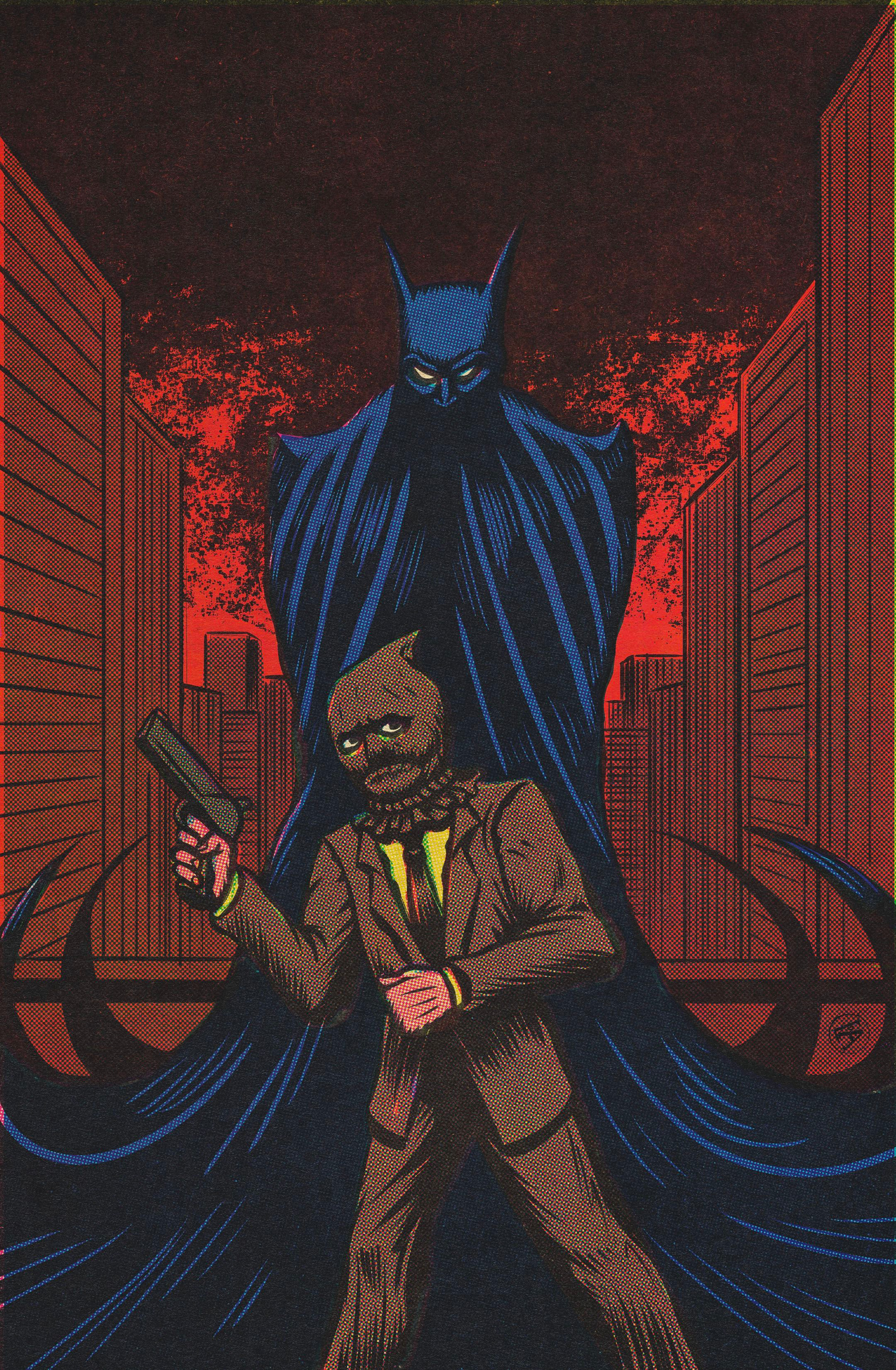
Cool art, I think Scarecrow’s pose feels a little stilted though. Batman on the other hand looks properly intimidating. Love the red background.
Scarecrow’s utterly terrified at the thought of Batman being right behind him, to such a degree that his arms and legs are swinging in unison instead of contrary to each other, making him less stable as a result and easier for Batman to knock over. It’s why he’s such an effective superhero ![]()
And honestly, I really want to see a version of Batman with horned shoulders and slightly dropping ears, like a proper gargoyle. It’s a really menacing look and a shame that nobody’s gone in that direction before (or I should say done it well, seeing as there’s been some “attempts”… ![]() )
)
Very nice work ![]()
The red tones make it look like gotham is on fire. It doesn’t feel like the menace batman inflicts. It feels more like batman is the villain, terrifying the poor scarecrow.
The colors are strange, who wears a yellow suit?, but Batman feels terrifying.
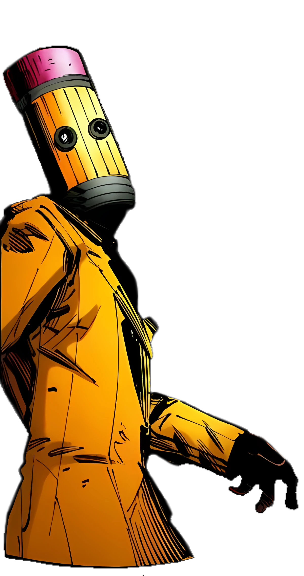
Who is that? That is a cartoon character. He also has a pencil for a head. So I would not count it.
Batman definitely looks imposing, as others have said. I think that neither I nor Scarecrow would want to run into him on a street, but it seems that Scarecrow was not that lucky…
I do agree with @Chronicler about Scarecrow’s pose, but Batman looks amazing. Great work!
I mean technically he’s not on a street, looks like a rooftop.
That’s The Eraser, a Batman villain I have also drawn actually. The Eraser
Thanks everyone!
Techically all Batman characters are since they were originally drawn as genuine cartoons in Bob Kane’s style.
The way you depicted Batman here is terrifying.

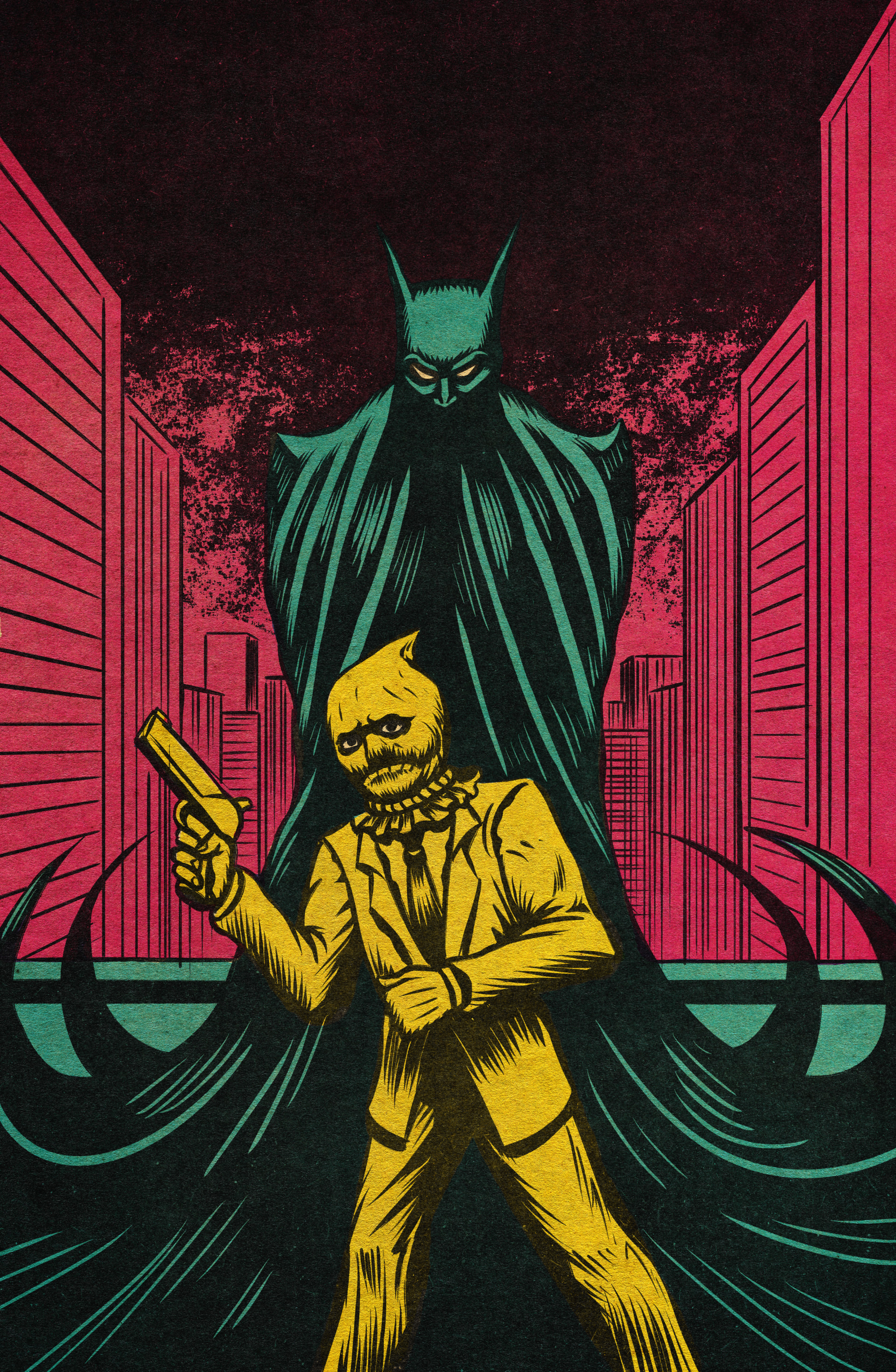
Wait there is a monochrome and a rercolored version of this? You never told me that. How many more variants of this are there?
Well I mean that’s all there is. I don’t really have another variant in mind
I thought you had one new variant using neon colors.
Yeah, that’s the one I just shared