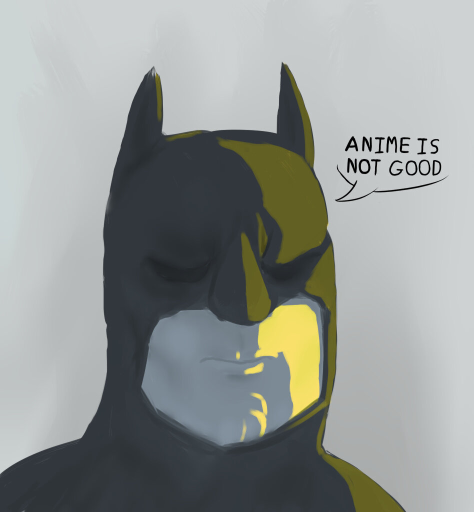
Simple test. Not really happy with it.
C&C Appreciated.
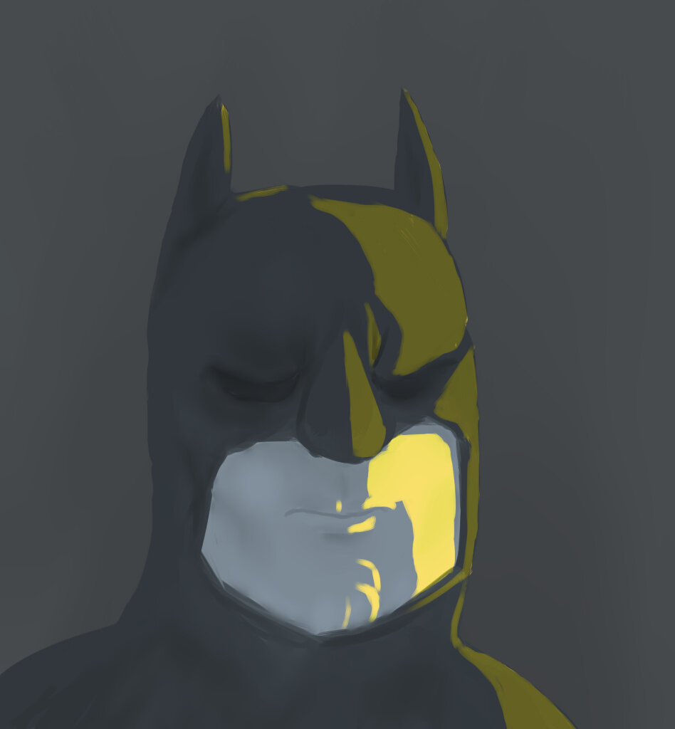
Looks good. The shapes are very sharp and faithful to the design, and I quite like the way you lighted his face.
Color choice is really nice, I like the choice in highlight color! The background could be a bit darker so as to bring his head out more.
Something does look off in the face, I’d just keep practicing anatomy! As it is, it isn’t bad at all, keep it up!
Yes, it is Batman.
anime is bad
For those who think he’s just spamming, he’s referencing a joke I made with the artwork: