2006 marketing lives again! Or it never dies, one or the other…
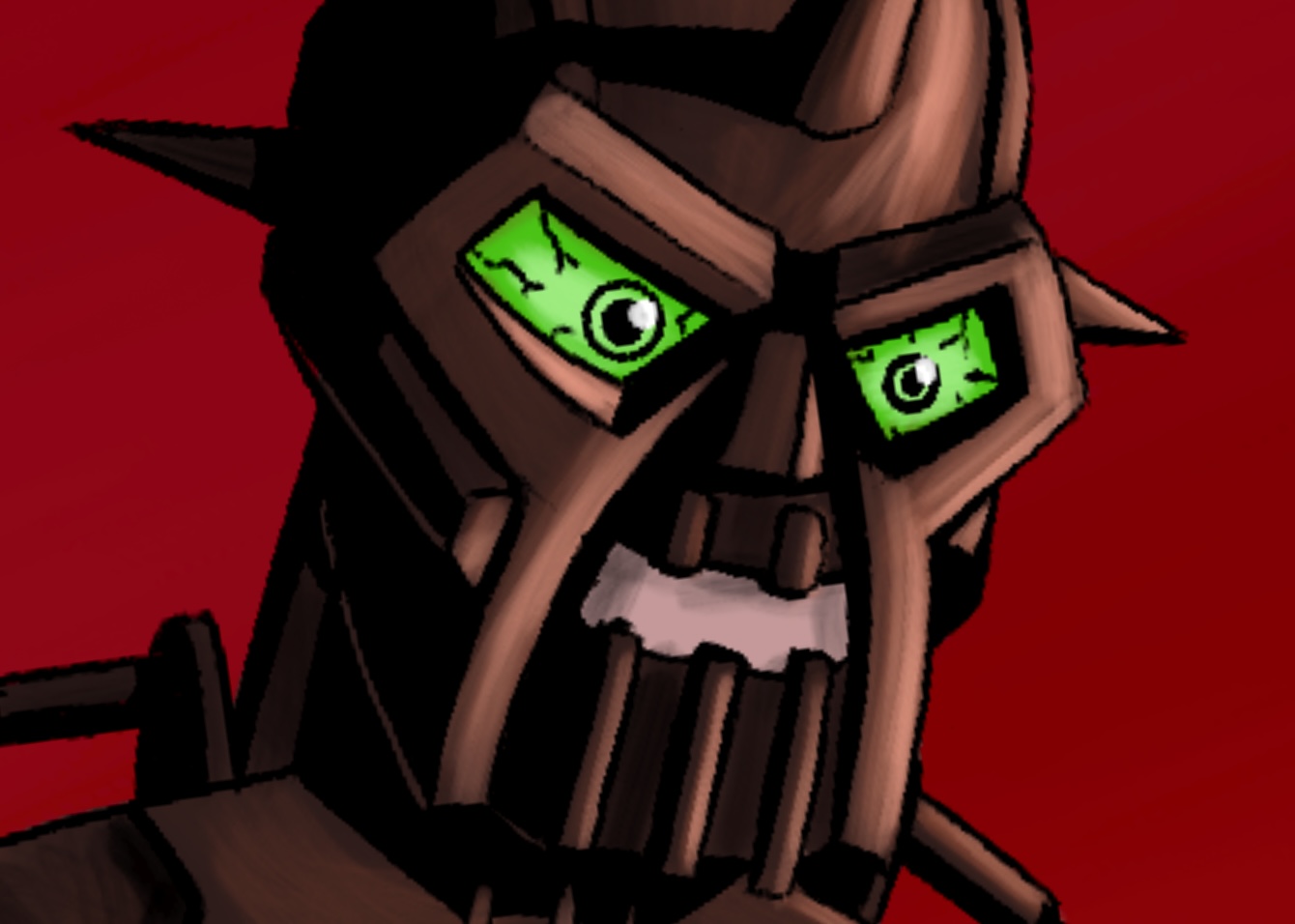
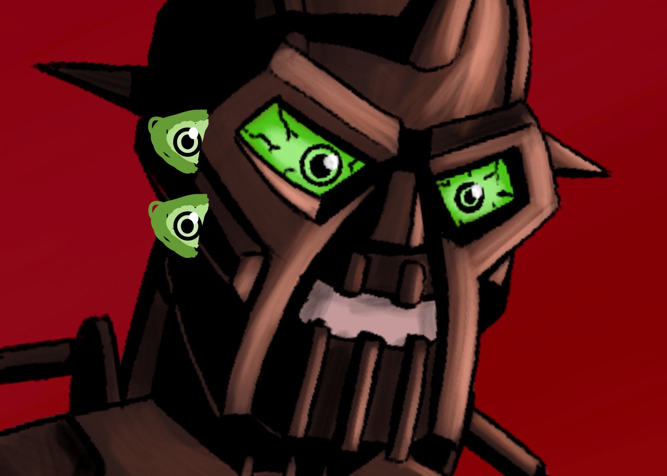
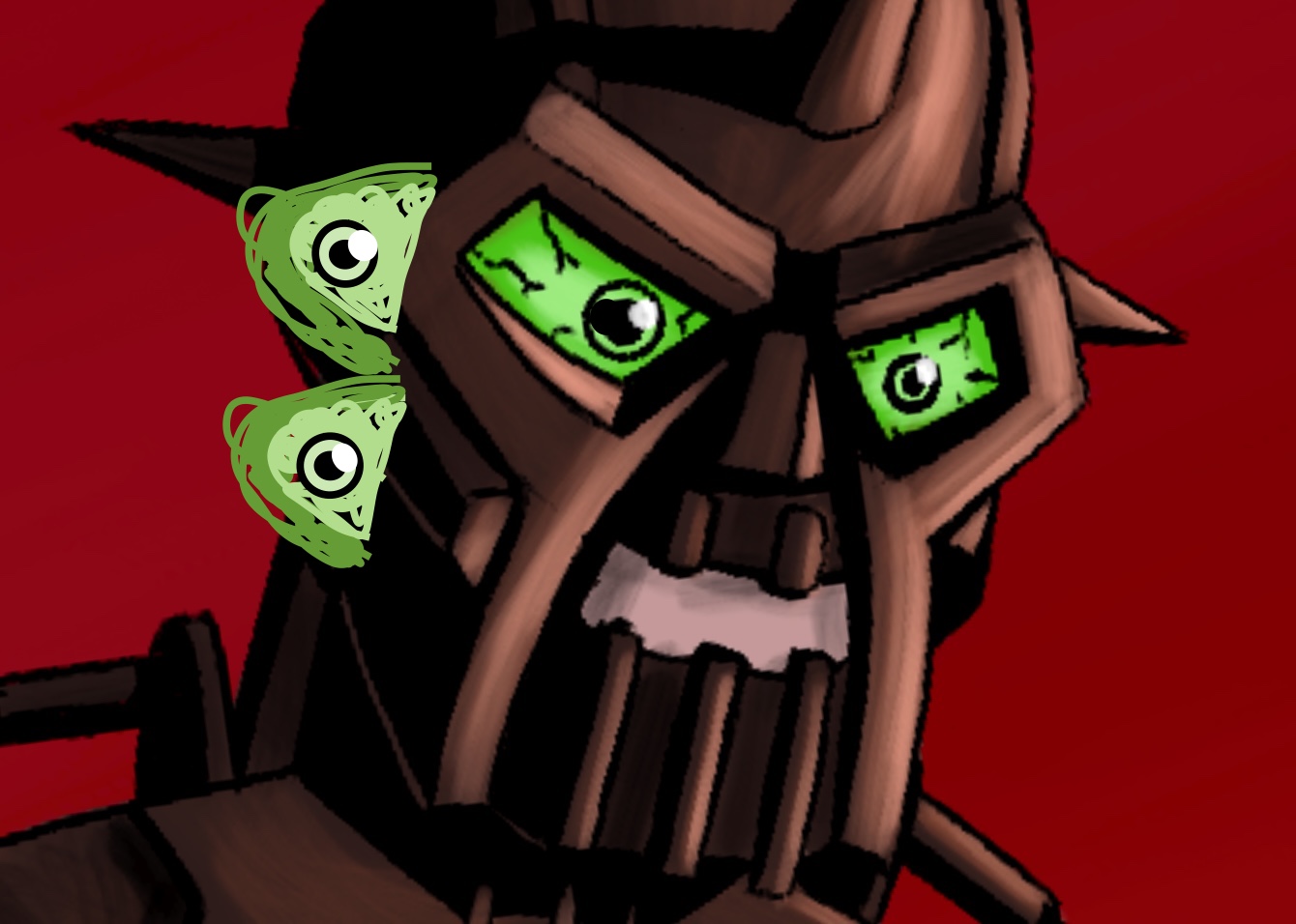
Very funny, and the artwork is quite good in itself. But the eyes you added are STINKIN’ CREEPY. The extra eyes that @Winger added are OH MY GOSH WHAT ON EARTH ARE YOU DOING level creepy.
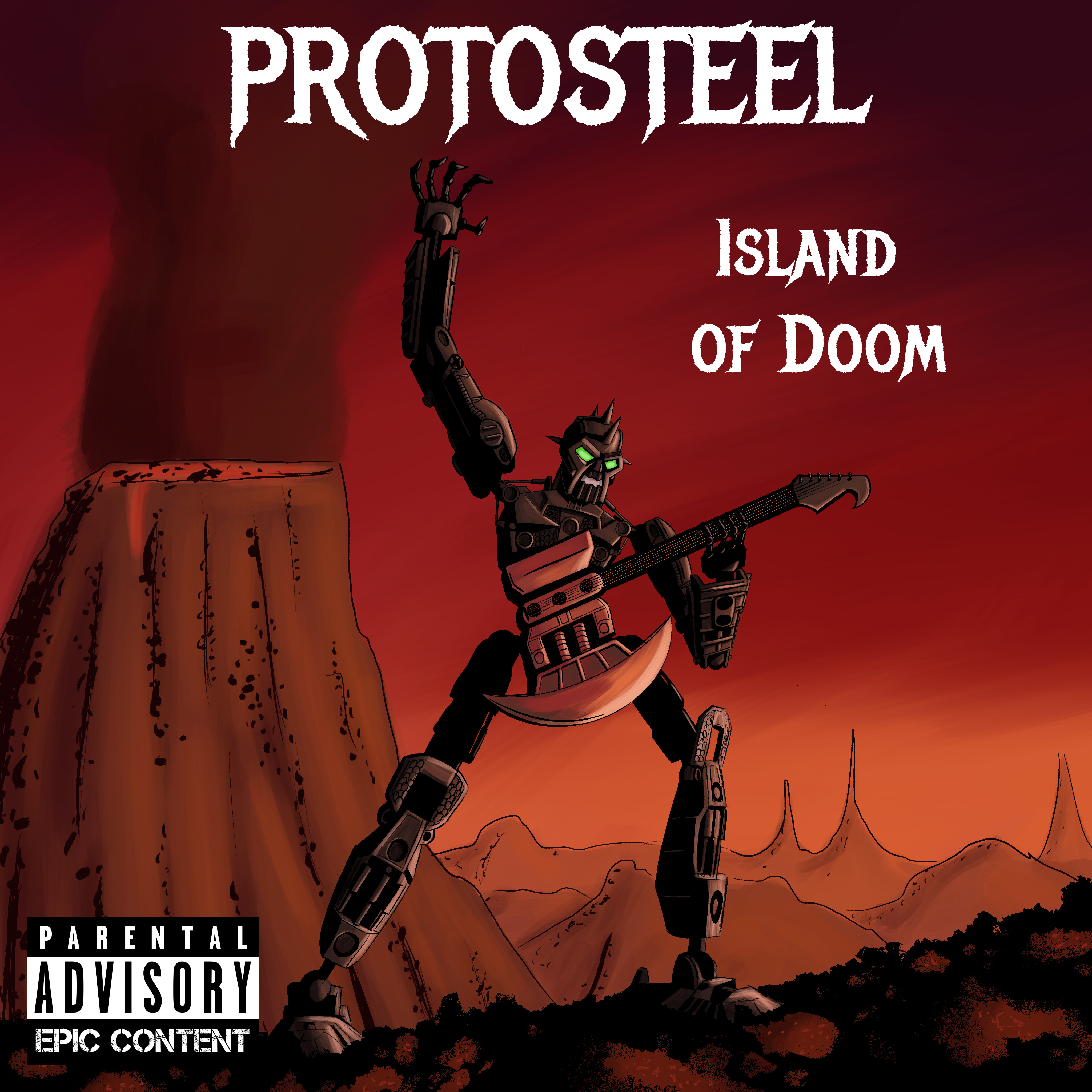
On topic, the greatest issue here isn’t the amount of empty space surrounding Nuparu, or the album label looking like the most painful font-graphic-overlay I have ever witnessed outside of inspirational book covers. It’s the fact that Nuparu, in spite of his nice lighting, has limbs that put Lanky Kong to shame.
I mean his head and torso are just so tiny in comparison to his gargantuan limbs. It’s really weird for a set with an abnormally large head.
Fair, I liked the sense of scale it gave but I see your point. I thought about adding a few piraka skulls on sticks to give it a more triangular composition, but I figured that’d be a bit too far. I might though if people like that idea.
FIRST OF ALL… no you’re absolutely right thats exactly what it is. I’m bad with fonts. Any idea how to make that look better?
Edit: I just took out the texture so it’s plain white
Ok, this was an intentional choice for the most part. I was challenging myself to actually draw him as a Bionicle without over-correcting to make him look more human in proportion and detail, a bad habit I get into sometimes. Proportionally, the Inika are freaking weird. I may have made the head too small though, but I’m kinda digging the weird look.
I really appreciate the feedback! I have been experimenting with brushes and lighting a lot lately, so I’m glad that’s getting noticed.
@Hawkflight hmm, maybe Brutaka? I thought it would be neat if the song was just his name, because he’s that cool. If that doesn’t work, maybe Mask of Evil? Don’t feel pressured to do this at all if you don’t want to, I just think it’s neat that you considered it