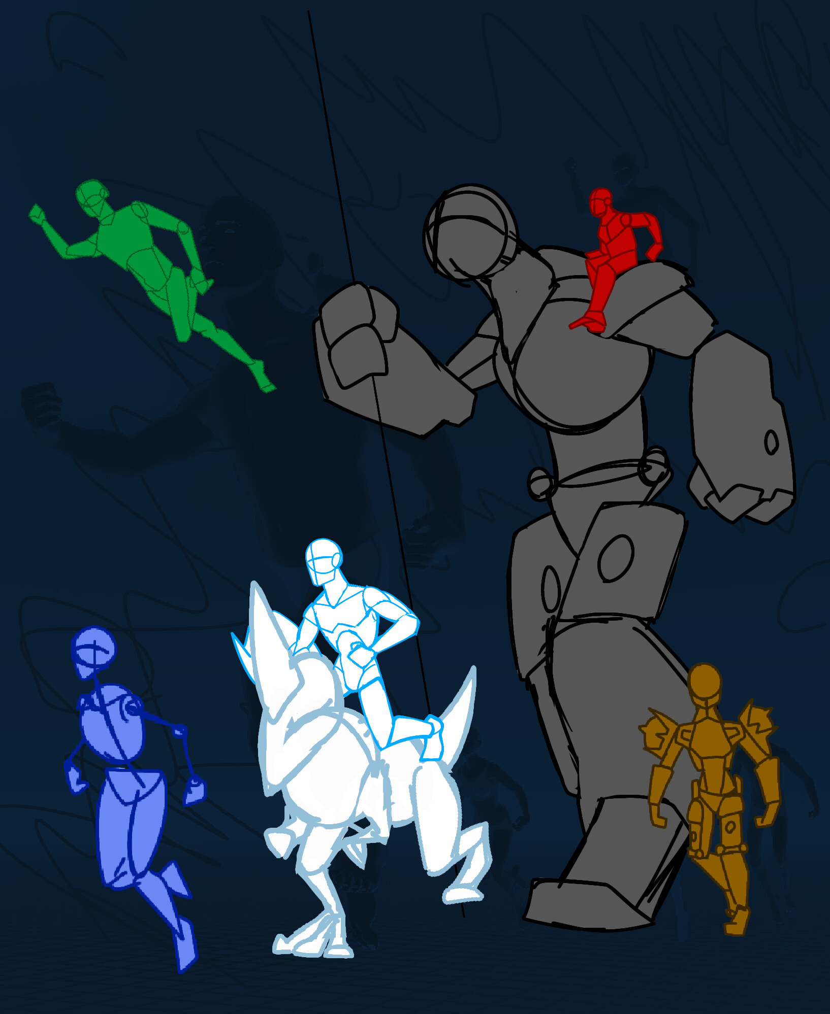
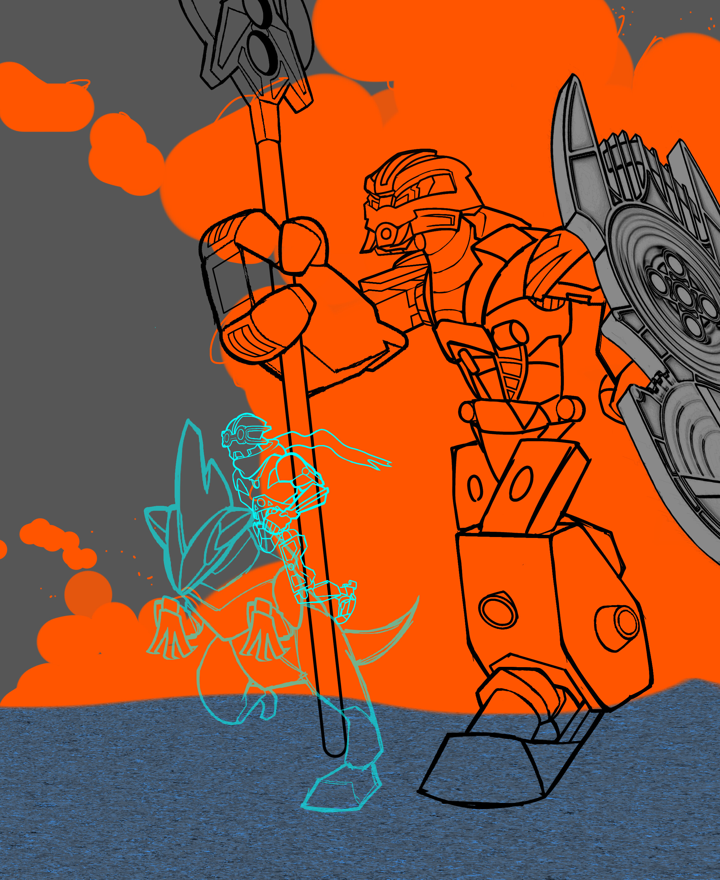
I really like the idea of showing the use of Kanohi powers where possible, though I think it could maybe be a bit more obvious in Bomonga and Norik’s cases; their Kanohi let them both change sizes far more than is shown here, though I suppose it might be difficult to show them both in adequate detail at such different scale. I’d be fine if Norik was drawn super tiny without much detail if necessary though, since we already know what he looks like.
Also, I feel like a supersized Bomonga would work better if he were closer to the background of the shot than the foreground.
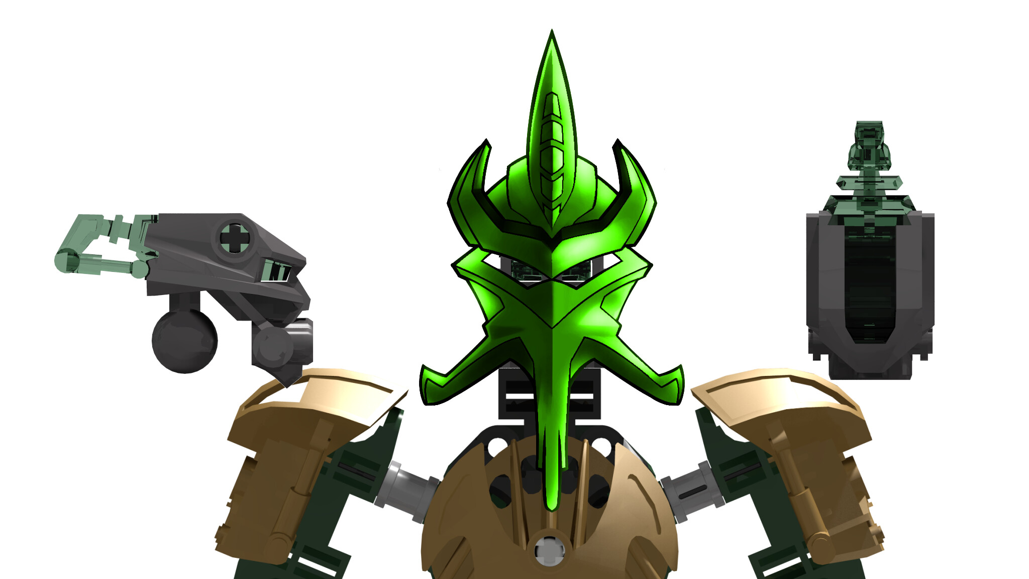
I can’t really complain about the other four though; good call to have Kualus riding a Rahi, and the overall positioning seems to be good enough to show details of all six figures.
Great call on Bomonga. I was planning on drawing each toa (minus Norik) on a separate canvas so that way I could paste their images onto the artwork and have close ups of the toa .
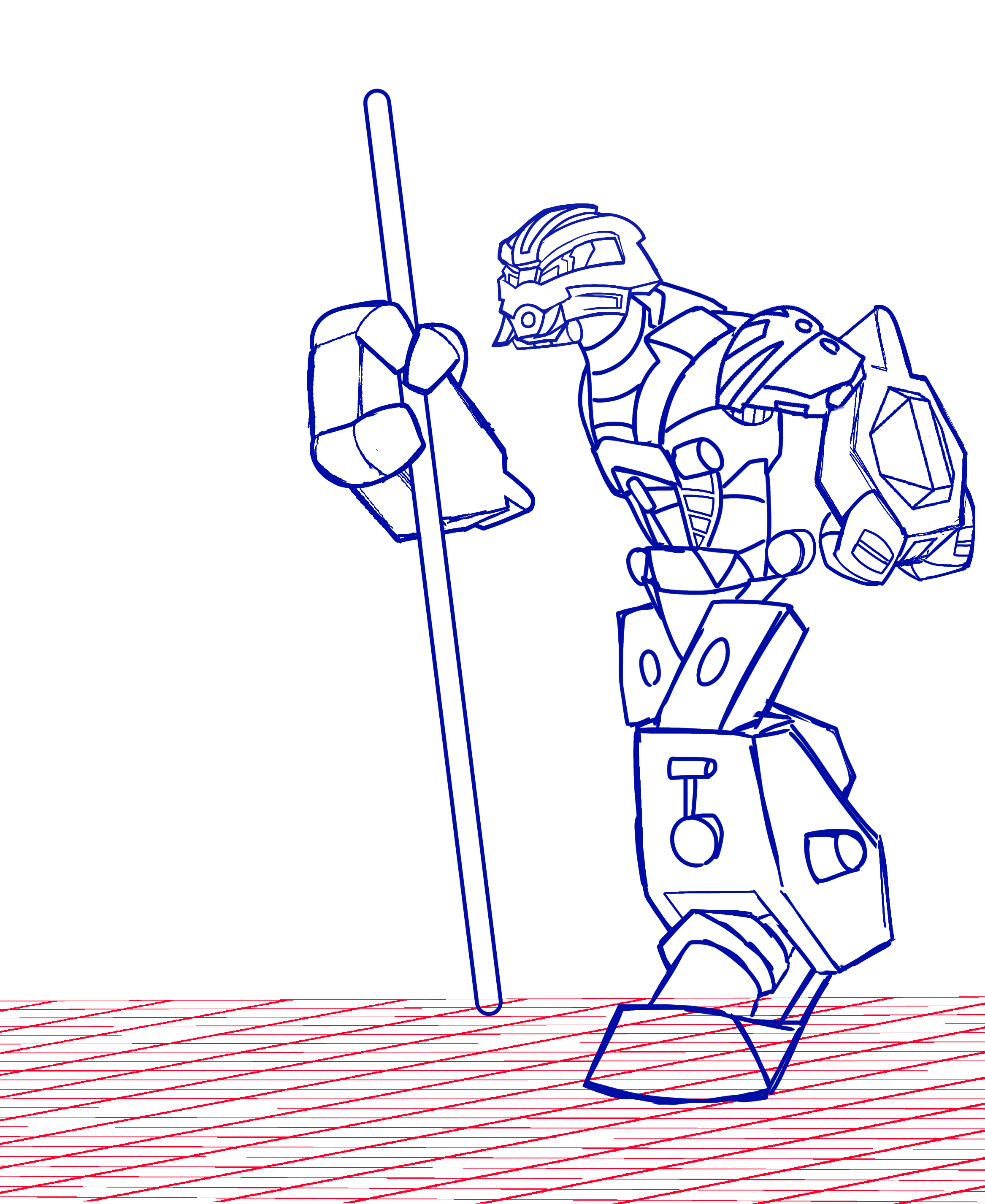
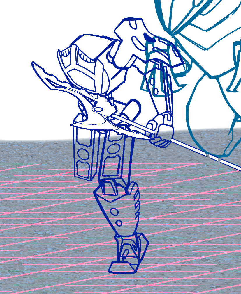
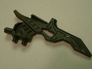
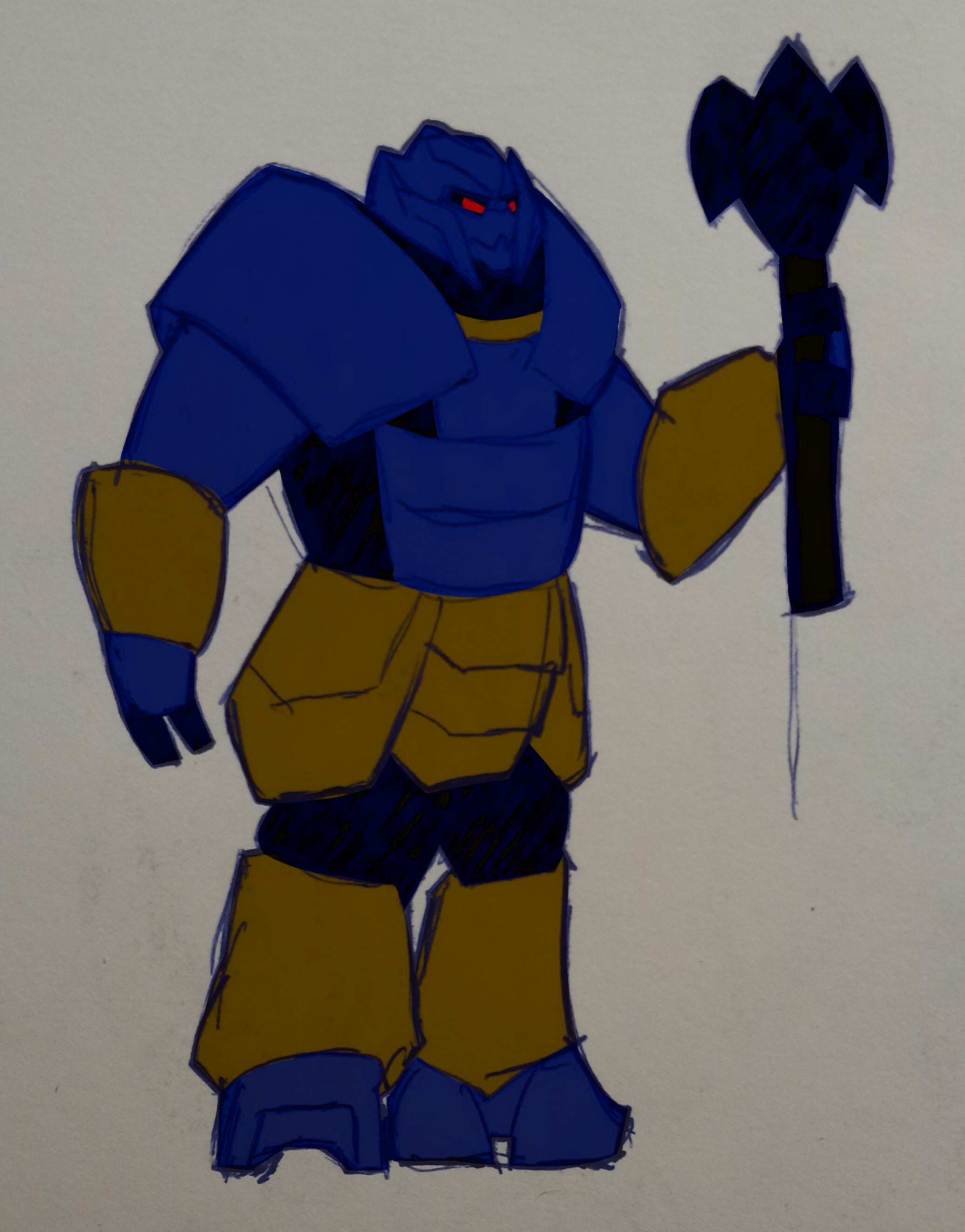
I guess it’s over designed but the original piece was crammed with details as well so I wanted to match the texture. I felt the need for a new blade because the original felt a little light in weight but I really liked that piece so I went and modified it.
I do have one suggestion though: if you move the added-on parts closer to the base of the blade, then they could be 3d-printed separately and attached to the official piece that Pouks currently uses.
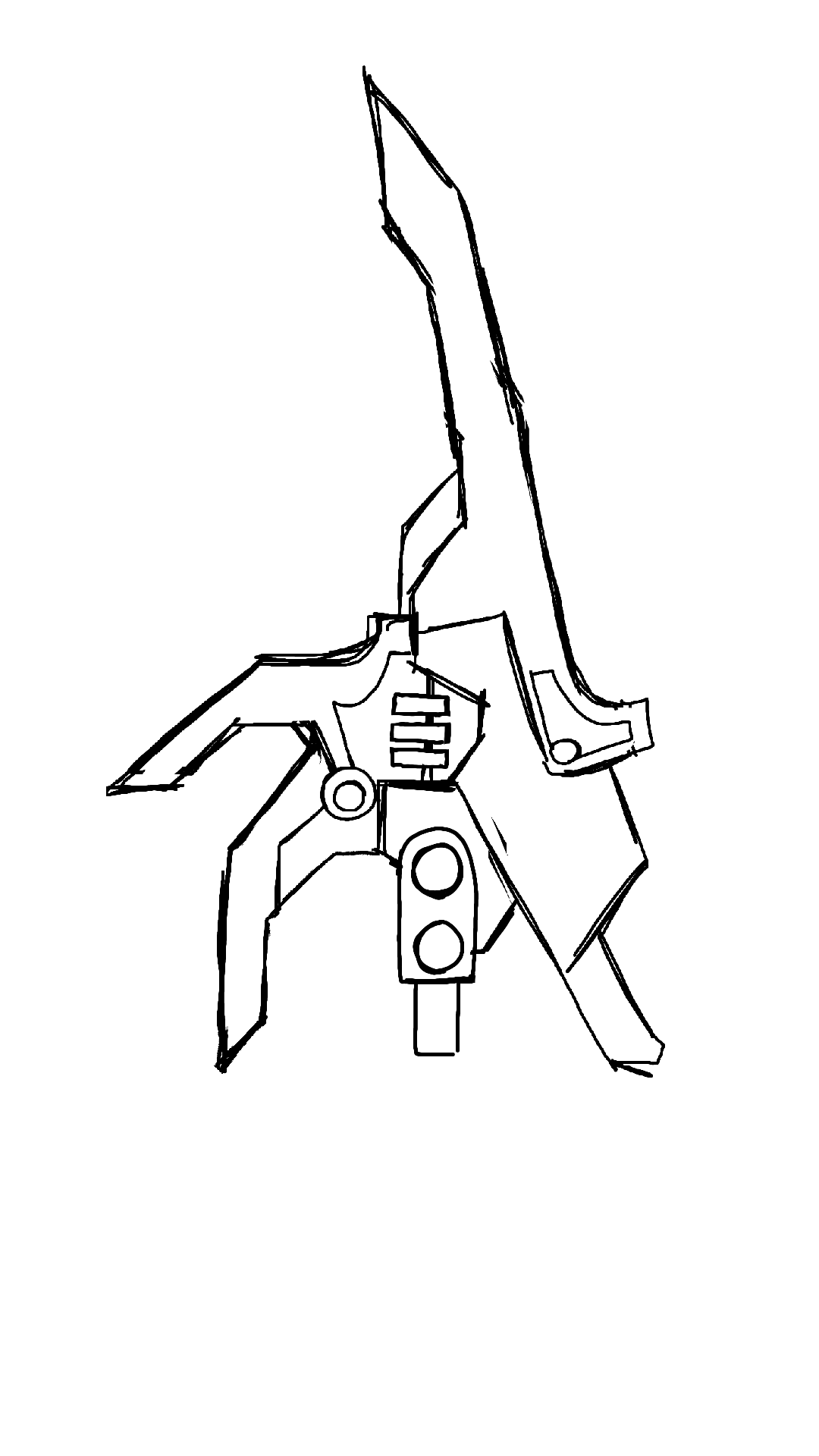
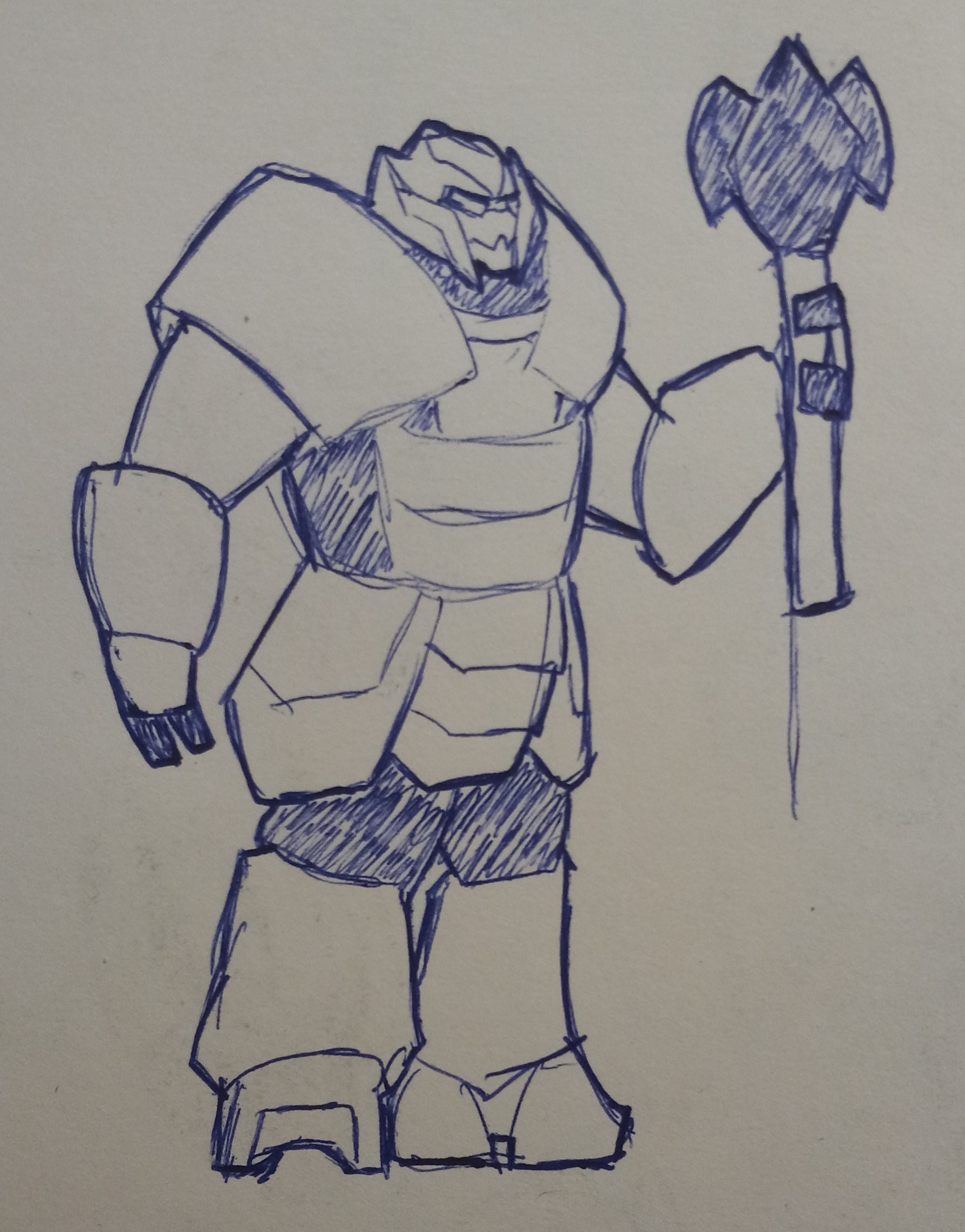
A sketch I’m using as a base for my next Orde design.
Things to note:
I imagined Orde as more of a brute so his body plan resembles that of a barbarian ie. Metal gauntlets, skirt and bare chest.
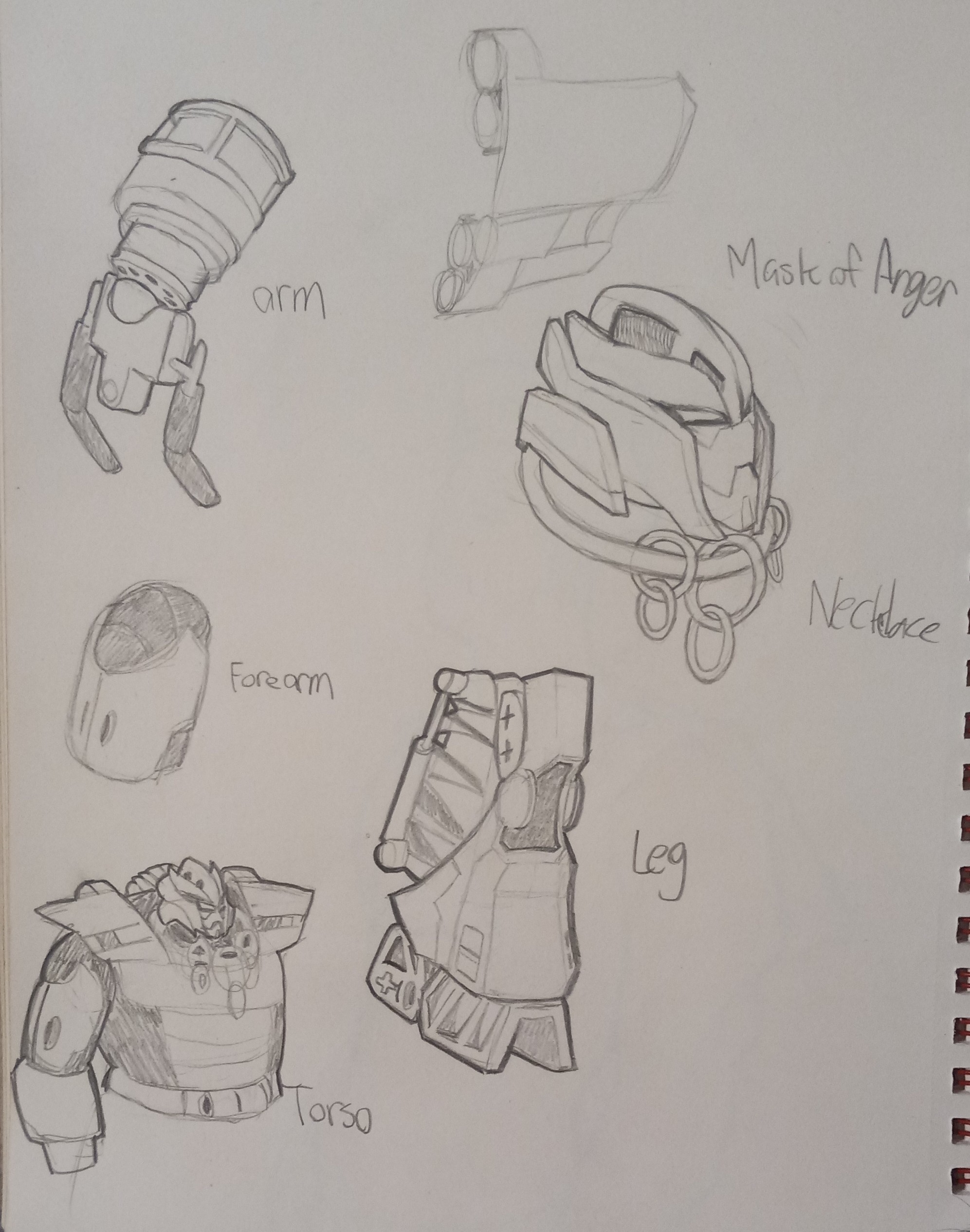
I’m still giving him a “mask of anger”, this time it’s based on Furno’s hero factory brain attack helmet. I like it more and it fits the design language of Bionicle quite well.
I just need to figure out what the skirt would look like irl. I can figure out the rest but it’s be nice if someone gave moc references.