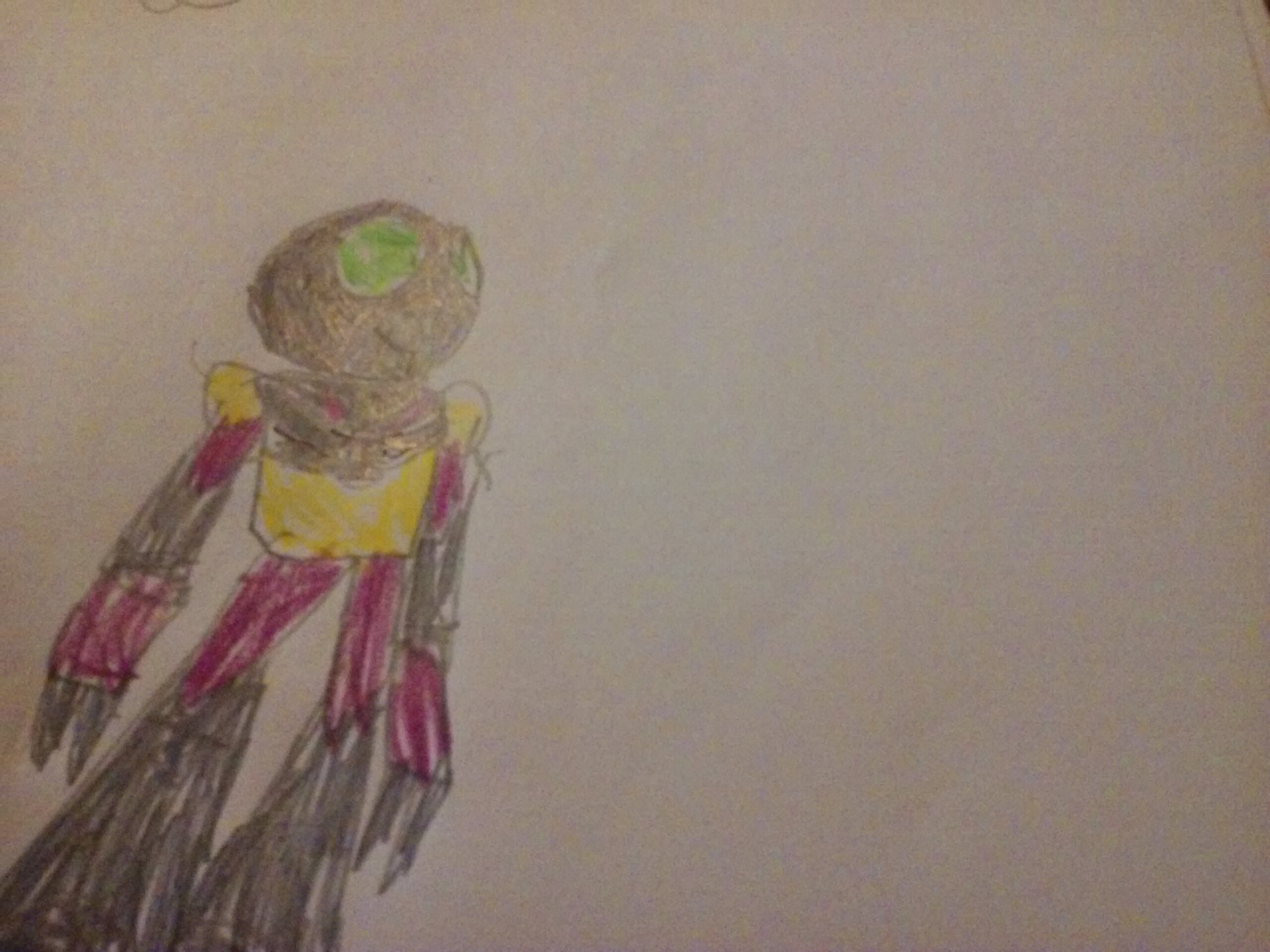
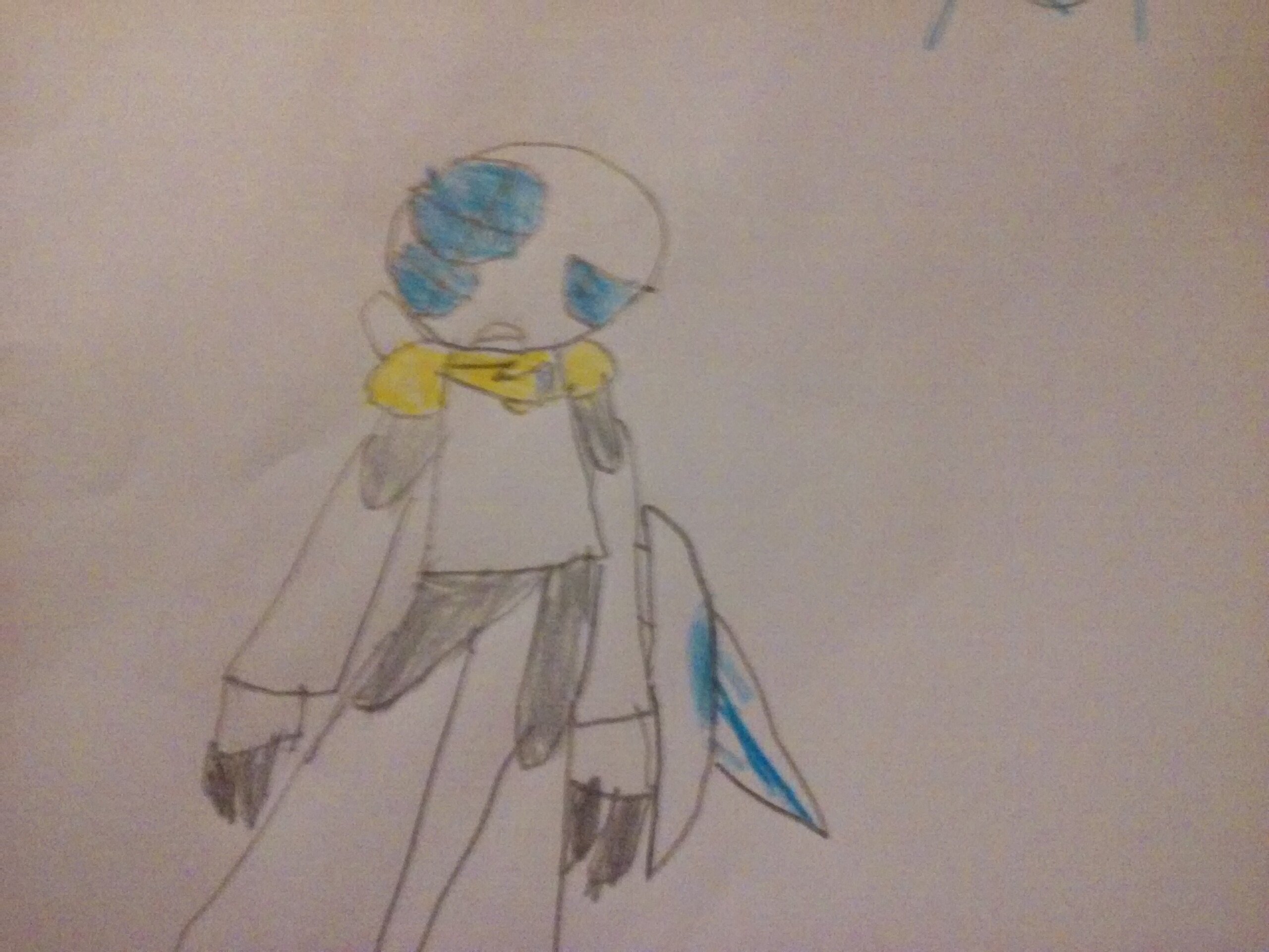
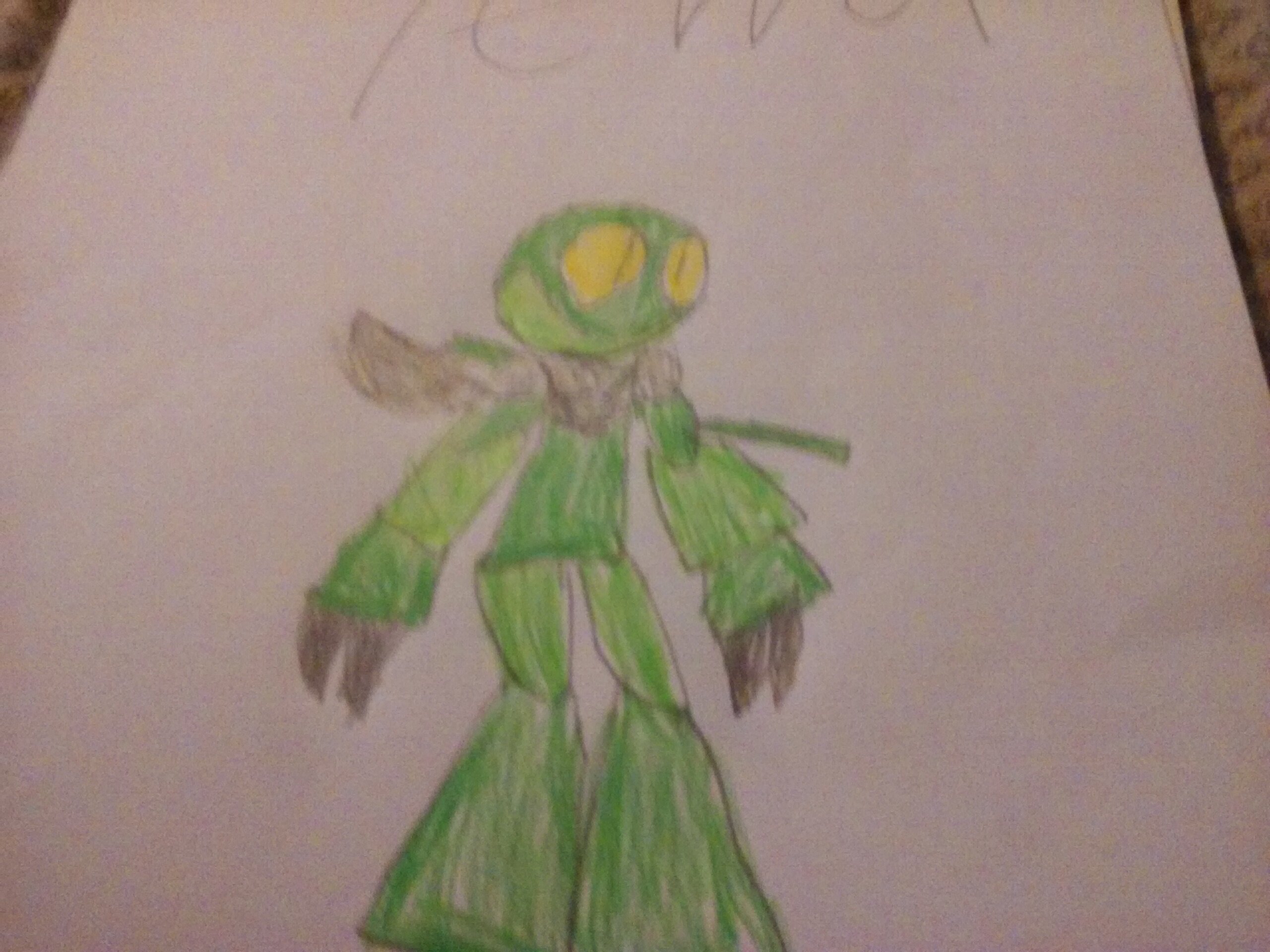


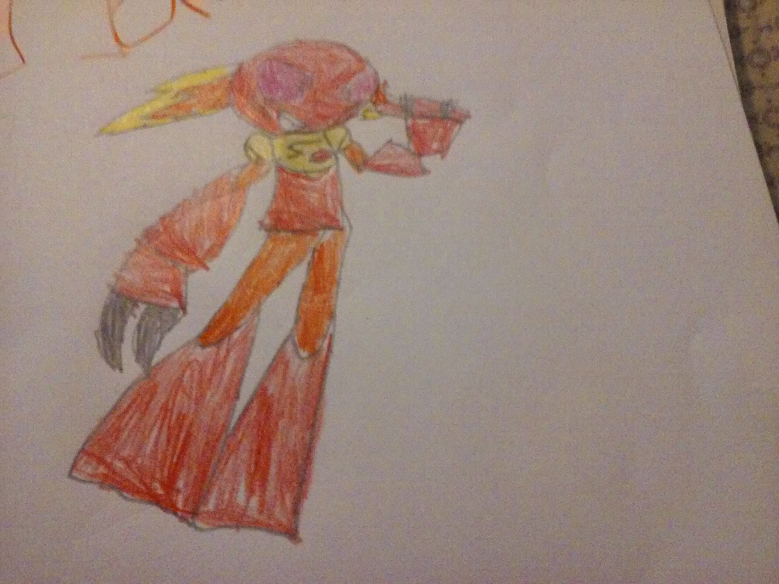
These look very hastily put together.
Changed Category - BioSquire
okay I am going to say this straight
this art is very basic
and the proportions seem off as well
and the colouring is terrible
here is a tip
try and colour most of the space in between the lines so that no white can be seen
also
I recommend a better camera and try to keep your hand a bit steadier when taking the photos
or a printer so you can scan the images to a computer
also they all look so similar
try and make the faces look more like the masks
since they are all just circles with eyes and a mouth
Cheap pens will do this to you; you can’t do smooth colouring with any crayons or pens from school and happy meals. Regardless, I think it’s good to have some colour in the drawings rather than having only the outlines.
I also like the expressive faces you’ve given to the Toa.
Honestly, I think that these could have been better. You could probably use a bit more practice. These would also have benefited from being scanned, because as is, the quality of the picture itself really detracts from the whole picture. Your style is very cute, I’ll give you that, but if you hadn’t called this topic bionicle art, I probably wouldn’t be able to tell that these are the Toa, as they look nothing like them. @Whaddon already pointed this out, and TBH, he was the one that made me realize this, but the proportion are way off. The heads are massive, the torsos are tiny (smaller than the heads, even!), and the limbs long and (especially with the legs) get wider at the bottom. However, I do believe that there is potential here, and with some time and practice, these could be fantastic, but as is, they need a lot of work. Anyways, I hope this could help you.
Although, to completely go against my own words, they are adorable!
These guys are cute, it might be a bit basic, but I can still tell who they are. Keep working at it!
Um… the G in Gali is backwards…
Ri know my lettering was terrible at the time