So I figured since we don’t have one, we could make a BIONICLE Boxart Discussion Topic! Here we can discussion what you love/hate about any set’s boxart throughout BIONICLE’s twelve year history. What gets your nostalgia juices pumping? What makes you cringe? Post it down below!
ps if the mods want to rename this to a general LEGO boxart discussion then be my guest.
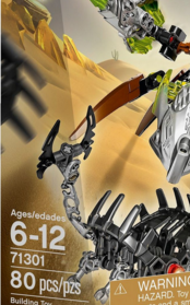
I like boxart when the set being advertised is actively worked into the environment, instead of them just standing on some rocks against a background. This started around 2005 and looks the worst in '09.
I like the direction G2 has been going with its box art lately, it’s very atmospheric and inspired. I like seeing the Toa in their respective environments and the sort of mystical feel some of them have. I also enjoy the small details some of them have, such as the twin moons and structures on the protectors boxart, making the characters feel like they’re part of an actual world.
LEGO did an exellent job overall with the boxart for G2, and I really hope they continue this style rather than going to the dull, samey boxart style present in G1s later years. Oh yeah, speaking of the later years, I like how dynamic the newer boxart is this time around, seeing the characters in action rather than just standing there.
I freaking love the box art for Uniter Tahu and Ikir. You got Tahu going for the mask while Ikir is like “Don’t worry Tahu, I totally got these shadow traps taken care of…”
And I also noticed how 2015 Tahu’s box art has LOSS on it. It’s very small, so have a sharp eye when you look for it. I don’t know why it’s like that. Why include LOSS when he wasn’t even at the location of the golden mask of fire and he’s so tiny?
not to mention the fact that on every creature box art it features their respective toa in the background and every toa has their receptive creature in the back ground on their box art
and of course kopaka and melum feature umarak in their back ground