My entry for the contest.
If you like this work, check out my twitter: Fusilli18
Looks really good. Nice drawing 
Really nice picture, cool stylization, but I miss Bionicle texture: pistons, gears etc.
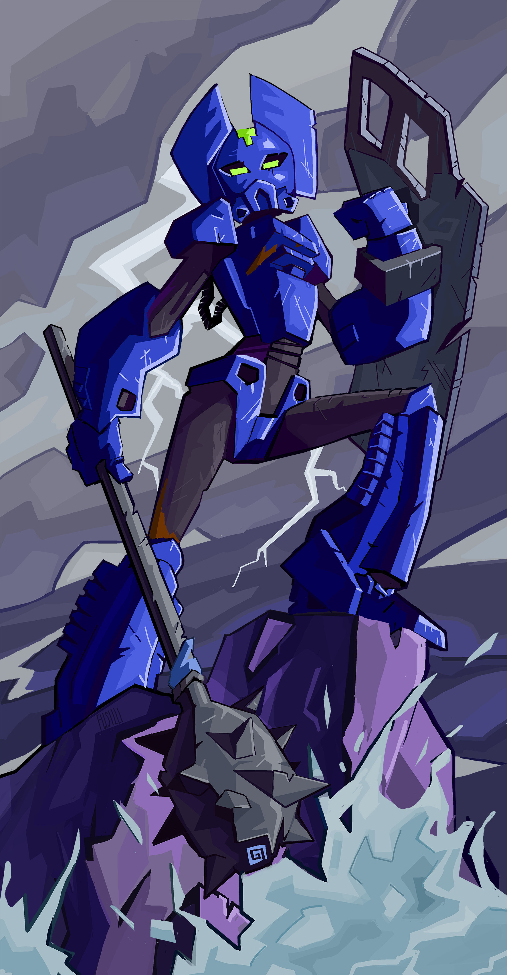
The mask design is by far my favourite out of all that were submitted, and I love the overall stylization. Just like Mister N’s submission, it reminds me of Toby Dutkiewicz’s illustrations from BIONICLE: World, as well as a little bit of 2015 online animations, which I find strangely fitting. Also, the Nuva symbol of water on the mace is a really nice touch 
Dang, people just keep making ones I want to vote for, this contest is getting really close! I love the style of your drawing, and the mask looks beautiful, very original and cool. 
Love this. I think you managed to pull off a feminine look that a lot of other masks didn’t.
Aw man, I want to vote for this one
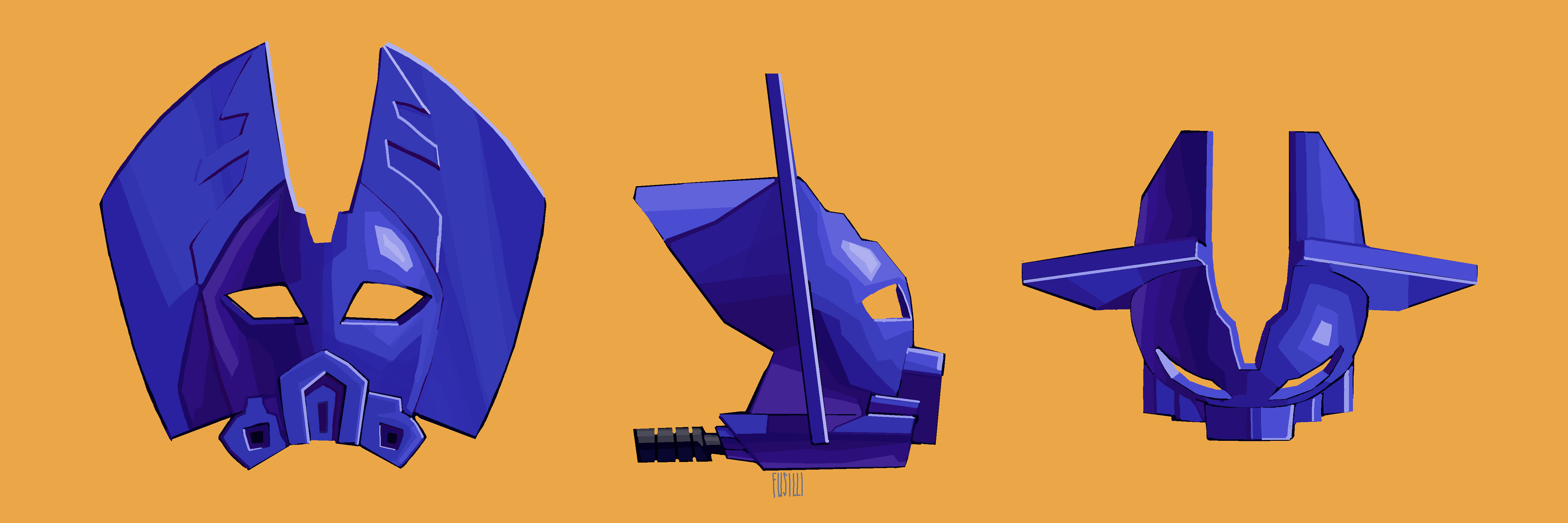
The intersections on that Kanohi are fascinating; I could look at them forever. This is also probably the only mask that I’ve seen from the top-down and still thought looked good, so hats off to you. I like the stylization you’ve gone for, and the weathering on her weapons and armor is on point.
Love it! Great dynamic pose, awesome background and lighting. I like that it’s stylised but recognisable, but also that mask would look cool on the real model. It reminds me a little of a bat. My only critique is that she looks a little younger.
That’s a very cool mask design, and you’ve made the mace and shield feel nice and beefy. I also like that you haven’t shyed away from making her look female.
Feminine look, battle damage, epic Toa feel… The only thing I don’t like is the mask. It isn’t bad, I just don’t care for it. But I’d vote for this entry, because it checks all the other boxes for me.
I really like the animated style of this piece! It looks ready to jump out of the screen. The flat surfaces make the design pop, and also simplifies it in such a way that I think will satisfy a wider audience than the original MOC does. It’s still clearly based on the build, but I like how it goes off in its own direction and doesn’t seem beholden to it. It adds a dose of both femininity and vigor to the design, and I think it goes a long way. Kudos!
Looks phenomenal, great work. I am looking forward to making a moc of this for display Live
It’s been said before, but I’ll say it again: the posing here is fantastic, and the stylized look dramatically improves the source material! The Nuva symbol on the mace is a nice touch.
I could see this as an official artwork, you did a pretty good job on this one
just found this, really like it.
It would be sick to see this printed