My good ol’ buddy Kini suggested I throw my hat in the ring with this here contest. I’m knee deep in assignments and the last Bionicle art contest I entered was … Nearly twelve years ago, so it’s quite honestly a miracle that I actually managed to get around to finishing this, it’ll be interesting to see if it gets anywhere.
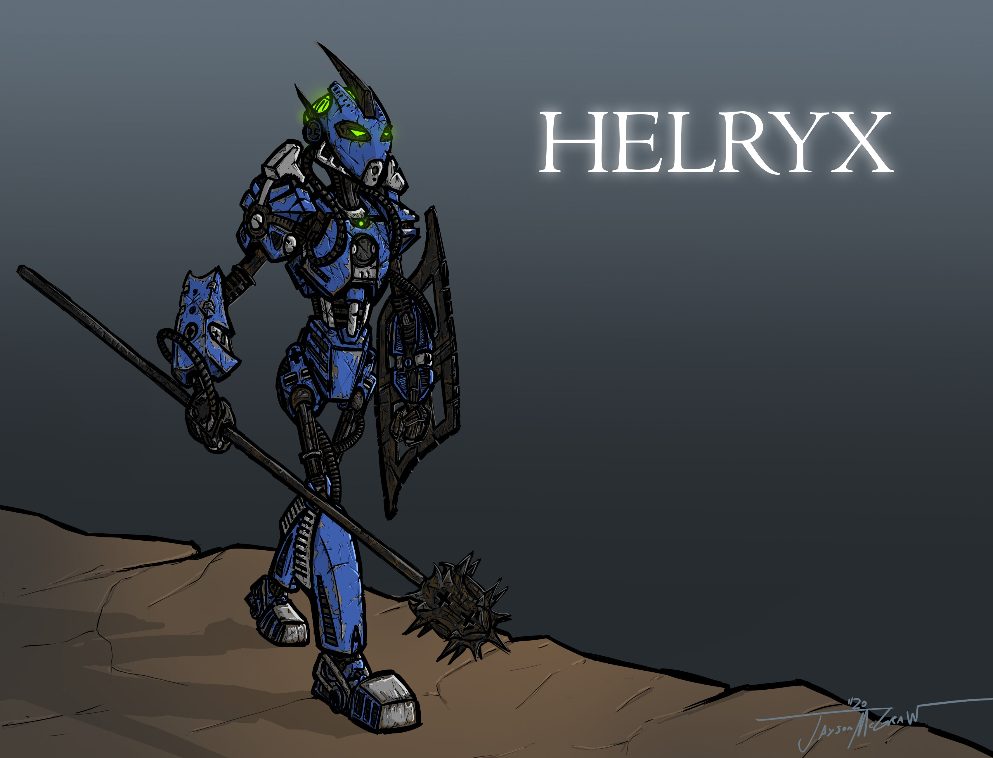
…Here’s my entry! Seeing as the lovely winning MoC by TheUnderscoredDouble was very reminiscent of the 2001 style, I too got the idea to draw a fair amount of inspiration from the Bionicle comics, namely the work of Carlos D’Anda and Randy Elliott. I thought I should do a decent amount with the weathering, seeing as Helryx is the first Toa and has supposedly seen a thousand battles and all.
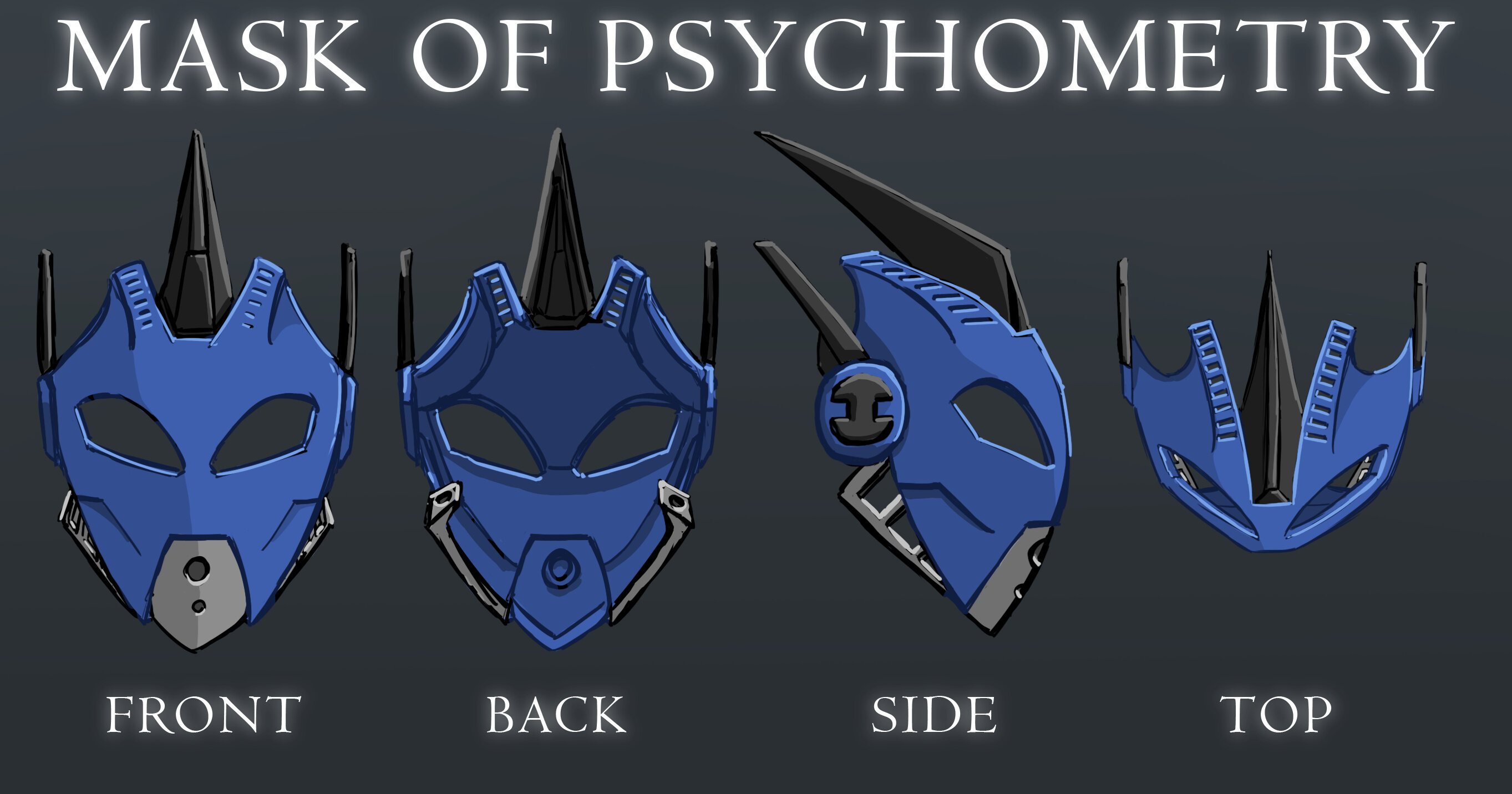
For the Kanohi, I thought I’d also give it a look similar to the first year, although I added some elements from later masks, and of course added some of my own personal tastes (Spikes, Spikes for all!). My defense is that they compliment the spiky mace nicely =P
And that’s all! As someone who usually just watches from the bleachers, I have to say there’s some amazing work done here already, this is looking like it’s shaping up to be a good contest.
Thanks a ton, both of you! That means a lot to hear =)
@Pylonmadness Yeah, it was honestly the only thing I wasn’t too fond of with the MOC myself, honestly. My excuse for that is that if Lego themselves can get away with changing Pohatu and Onua’s posture in the movies and such, then I ought to be able to as well =P I tried to make up for that a bit by sticking rather close in most other aspects to the MOC, as well as making the face-shoulder part things stick up higher to keep more of the sets silhouette.
@AlexanderTG Hmm… It is deliberately smaller for the sake of foreshortening, but even so, I think i agree, it does seem a smidge on the smaller side then what it should be… Not sure if there’s really anything I can do about it at this point, though =P
(Edit: In case there’s any confusion, since this conversation with Alexander I’ve updated my entry, and one of the changes was making the left leg slightly bigger =P)
@Kini_Hawkeye Eheheheh hey now, at least uh, at least right now I have a valid excuse for not being around xD My assignments aint gonna assignment themselves :L
Thanks mate. Definitely a wee bit of Pakari in there, I wanted to pay some homage to the MOC’s original mask =P
Hey everyone! Thank you so much for all the likes! this thing has already got a lot more attention then I thought it would =) I’ve had a bit more time to work on it, I’m thinking of updating my entry with this version below; i dunno if its a bit much though with the weathering, though. Let me know what yall think!
I love how this looks. The mask is great, and you’ve made her a bit more sleek, slender, and less hunched-over, while still clearly being based on the original moc.
From the design alone, this might be my favourite contender so far! Such perfect balance between staying faithful to the MOC and evolving it in such a way that adds detail, personality, and mystique. The course texturing on the armour is appropriate and well-executed. The mask design is one of the best I’ve seen and suits her character well, showing fluidity, wisdom, and a hint of severity. I think this would make an excellent Canon representation for the character. Nicely done!
Well folks, looks like I’m out of time. I was hoping to redo the full-body drawing with a more dynamic pose/maybe stretch my digital painting legs, but sadly, college takes precedence =p
Here’s a rough of what I was thinking of doing if I had had more time, was thinking it to be Helryx during that brief battle in the core processor from Chapter 9 of Reign of Shadows.