I love everything about this, the style, how you’ve translated the design’s features to art, and the mask is amazing, I love the reference to roboriders. Really, really cool.
Ah, the 2001 expert has gone with a 2006 style! Love the drawing, especially how much care was put into giving it the same language as the rest of the build. I was thinking of a more 2001-style mask for Helryx. I figured that the higher tech of latter years of masks could be explained as them being masks developed during the existence of the matoran universe by the matoran as their tech advanced. But I suppose that doesnt make much sense, for it would mean that the matoran would be more developed than the great beings.
1 Like
Oh wow, this looks so cool!
I’m in love with all the comic styles we’ve been seeing. This pose specifically is so Helryx!
You did such a good job with this!
This must win… However, I’d advice you to add a heartlight, maybe, to make it just a bit closer to canon. And, maybe this is just me, I’d have added a feeew tiny subtle hints of muscle tissue. Not too much. Miramax movies overdid, I feel, but maybe like Vrahno? Or less? More? Yeah… 
2 Likes
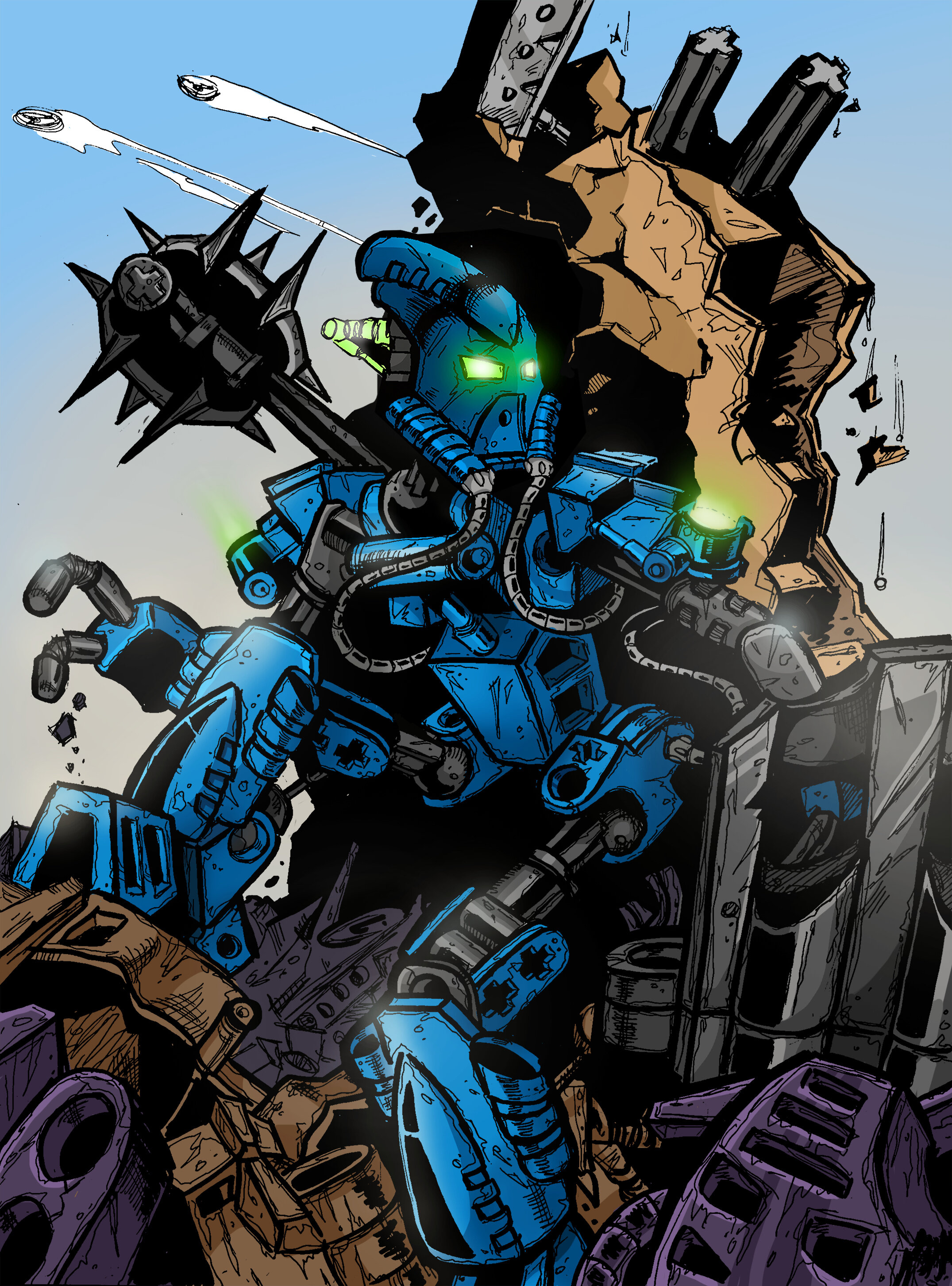
Somehow, every time I go through this forum, I find another entry that I could swear wasn’t there before. The drawing of Helryx herself is great, and I love the mask – the Roboriders inspiration was genius – but I can’t help but feel drawn to the setting itself. Spinners flying overhead, taking cover atop a pile of discarded pieces… and are those two axles I see in that broken chunk of wall? BIONICLE rebar, I guess.  More than giving us a static image or a portrait of a Toa, you’ve put forward a tentative action scene of Helryx. I love it.
(Voting is going to be so hard.)
5 Likes
Cool, Mr. N! Very good artistic style that turns (IMHO) boring MOC into interesting Toa. And mask is perfect!
2 Likes
This is great! I love the G1 comic style.
1 Like
Thank you all for your comments guys! It is really inspiring to keep working and develop your skill. I am very glad that many, like me, love the old style of G1 comics. This is what I grew up on, so trying to replicate its ‘spirit’ was important to me. I saw that many people also liked the idea of using the design of the original parts in the mask, including even other works. And that’s pretty cool.
@Lesnichiy As PuppeteerGaming rightly said, first I drew it on paper, then scanned and colored on the computer. I really love such process for its variety. It allows me to immerse myself into the atmosphere of old comic artists.
@Toa-of-Snow Thanks so much for such a great comment! Yes, I have plans to participate at least in Artakha competition. I want to create it in a completely different style, but I’ll listen to your preference anyway. Yes, I used ink. In places where there is a lot of black clor, I even have to use a brush. Glad you noticed my Pakari reference!
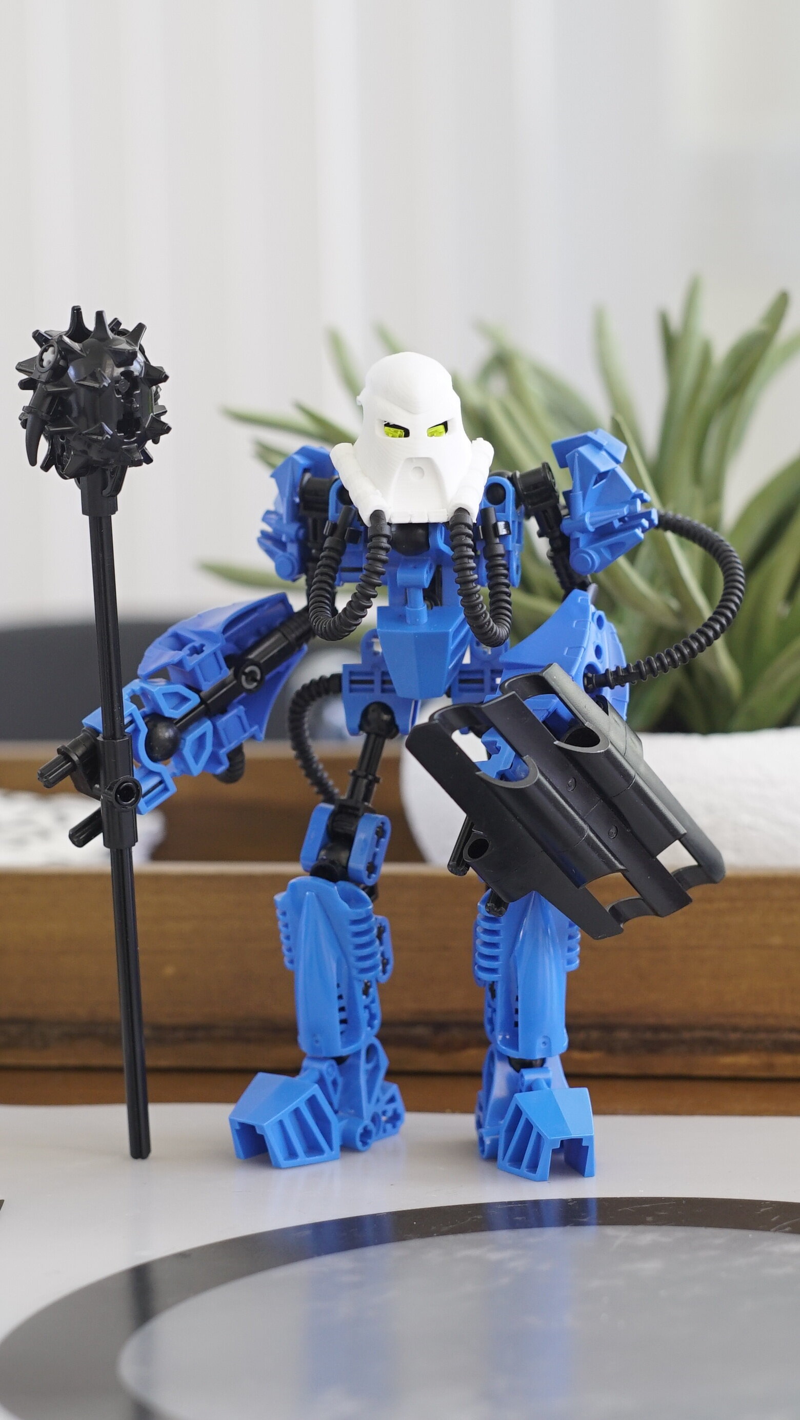
@Keplers Glad you liked the idea of using Lego pieces in the environment. This is important for me, because allows to create the feeling that the heroes and their world are one
6 Likes
While I like the art style, I’m not big on the pose; it looks like her hips are being bent off from her body.
@Racie02 Well, I see it as normal. For example, in MNOG they did this much more often, but it didn’t look bad.
BTW I noticed that many people liked one of the working versions of my art with a different background. So I decided to show it to you in higher resolution
17 Likes
This looks incredible. The stark black shading pops so much, I love it.
1 Like
Reminds me of the old Bionicle comics, nice one
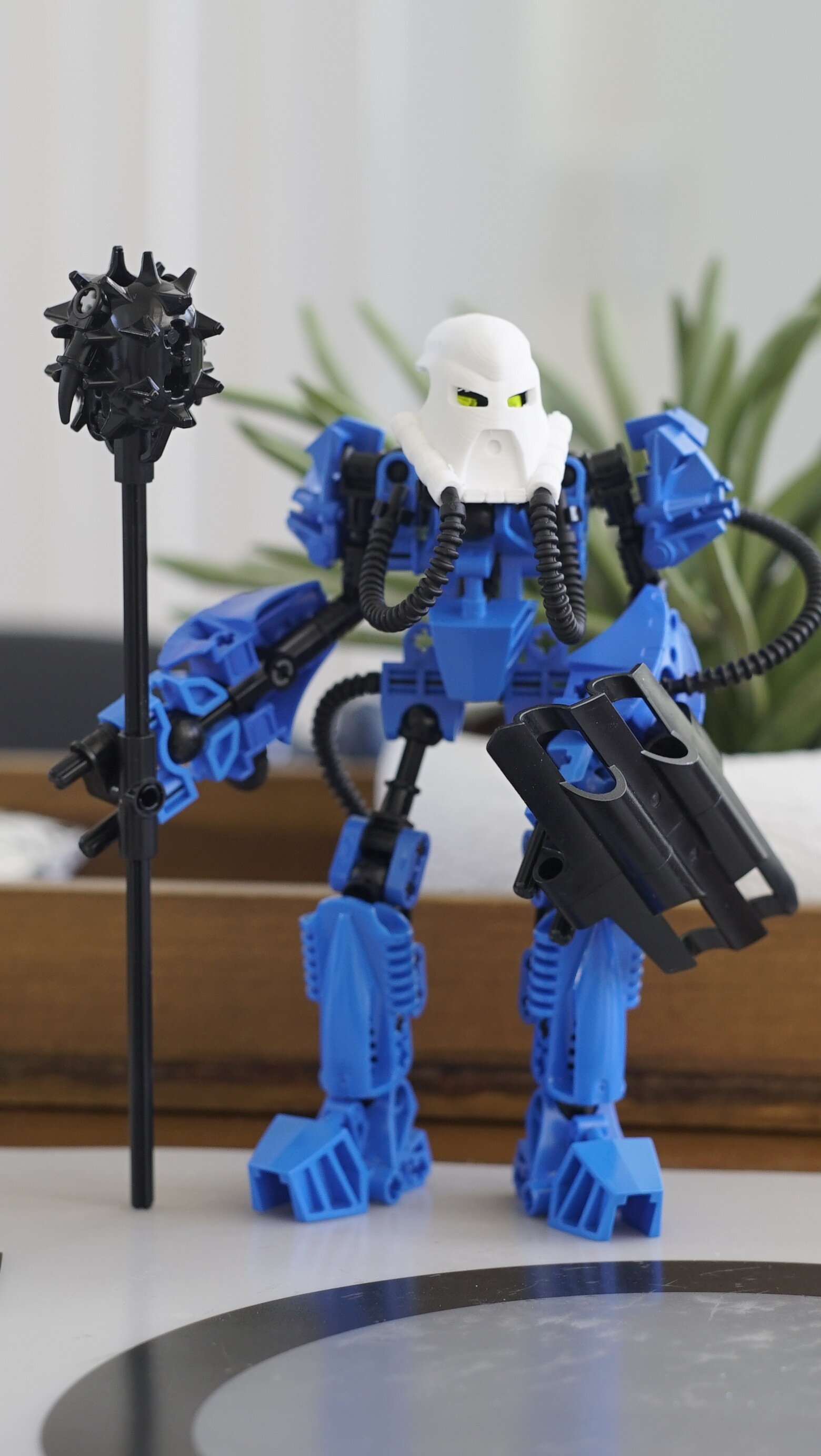
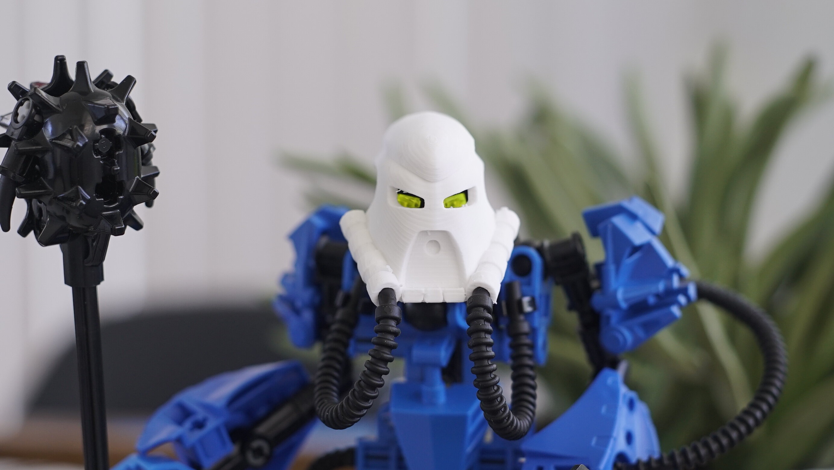
This is such a stellar piece of work. I have a really nitpicky question about the mask. In the Helryx image the hoses appear to fit flush against the mask’s tubes, but on the mask images the tube entrances are tapered. Does the mask design need to be altered, or have I misinterpreted something?
Asking because this looks likely to win and it’s something keen 3D-modellers will need to to know 
Love the art but the mask is just too much like the 04 ruru imo.
2 Likes
I realise I’m nearly two weeks late in replying, but I guess the MOC’s torso design didn’t present an obvious place to put a heartlight. That said, it appears the Great Beings gave her heart-shoulder-pad-lights instead!
Congrats on winning the contest! I loved your mask design and I look forward to using the 3d print in the future
2 Likes
Congrats on the win man!
Congratulations!
congratz