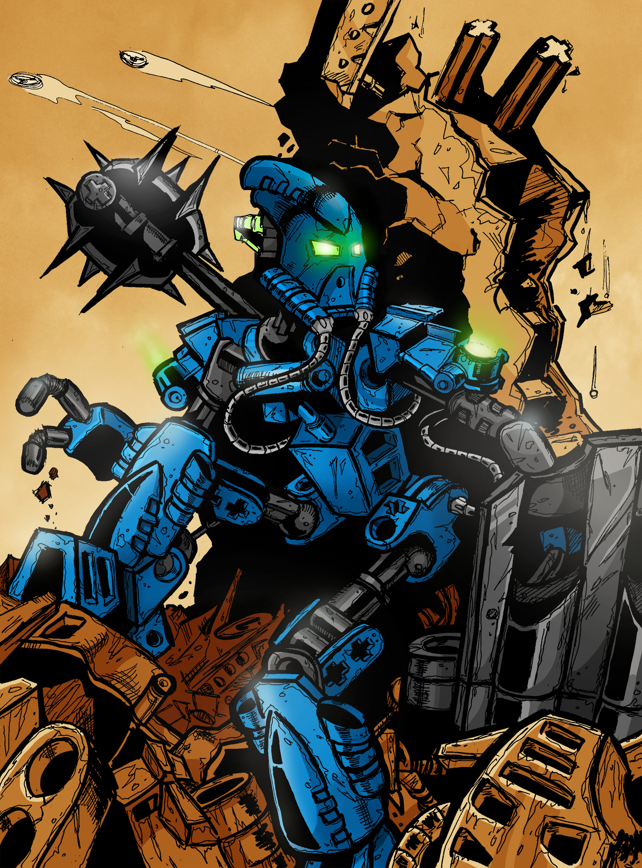
My submission for the Helryx Art Canon Contest. As you can see it mostly inspired by comic style. In my eyes it’s the best way to show BIONICLE world in the 2006 - 2010 time period. Many fractions, many events, alternative universes… feels kinda ‘comic’ to me (since Greg Farshtey was a big fan of DC/Marvel iirc).
Veeeery cool! How it was created really? Like in progress photos it is drawn by pencils and the final product looks like it was created on computer. HOW???
So far, probably my favorite. Love the style, although in the realm of feedback for next time (please enter next time too, aha), I do actually like that penultimate colouring better - there’s more visual contrast, and the individual aspects of the image are more easily discernible (although for a “profile pic” I can see why making the character “pop” from the background is also a good move).
The preliminary black-and-white stage looks epic, too - did you ink that like a genuine comic? Serious talent there.
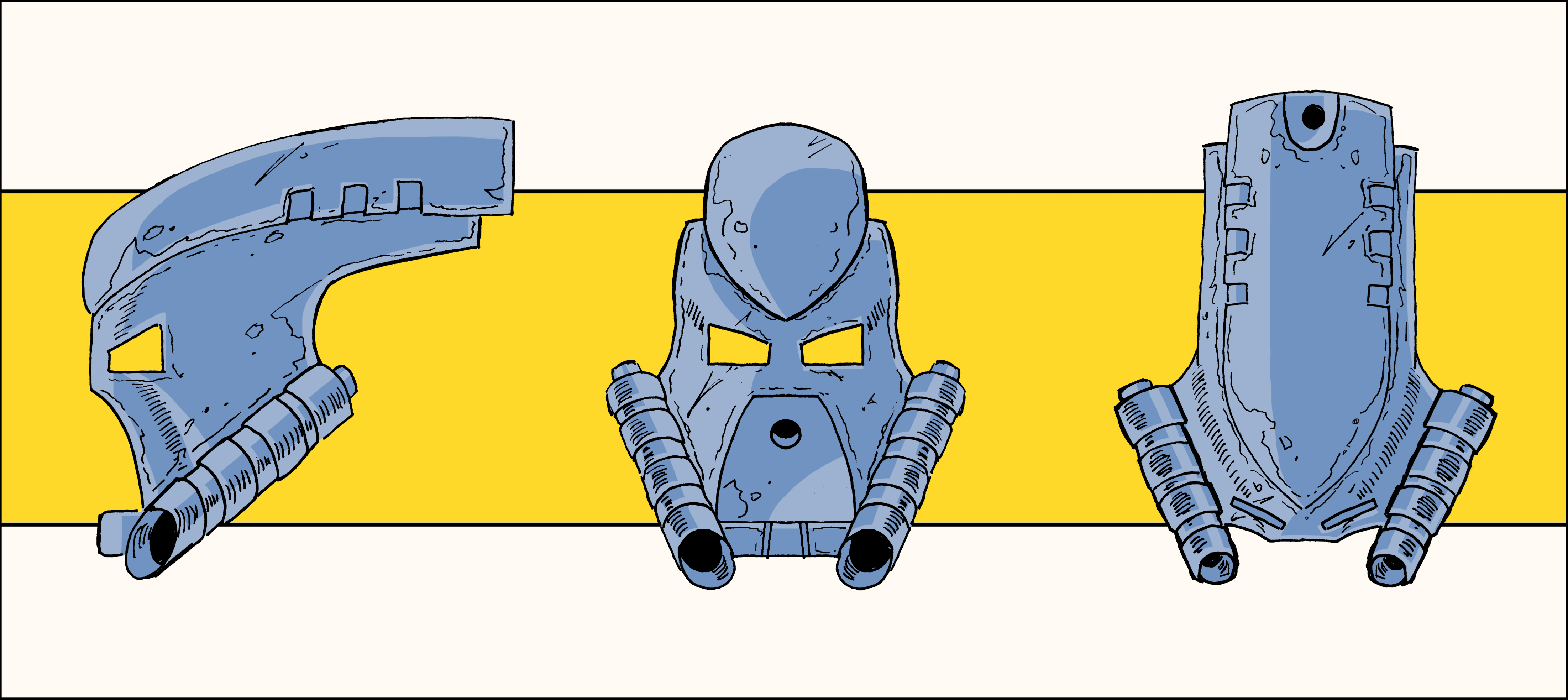
Not at all the mask aesthetic I envisioned for the character, but it’s one I could grow to quite like - has enough “Helryx” without being so unique as to make it unsuitable for other characters - an important criteria for a Kanohi that we don’t know the in-universe prevalence of. Works for male or female characters without feeling “off”, which is good.
I also like that it has a distinctive, unique shape and that it’s not crammed full of detail - most of the “Mask of Psychometry” designs I’ve seen look more like Legendary masks than a regular Kanohi. I’m getting Kiina vibes from it, which I kind of like from an out-of-universe perspective, considering Helryx is an '08 character. It looks like something that fits in any era of Bionicle.
I’m stilling in two minds as to whether or not I want to enter the contest, as not too many of the entries so far have really appealed to me - but I’d happily lose to something like this. It’s really good, and I’d have zero qualms seeing it on BS01. Well done!
(Also, I love how you’ve included technic parts in the makeup of the wall and a nod to the physical MoC with a Pakari hidden in the rubble - very nice.)
Not really a fan of the mask, though - reminds me too much of a cross between movie Nidhiki and Kiina’s helmet.
Also - though I don’t blame you for that one - it looks too close to the winning MOC (which I don’t like). I know that’s kinda the point of why the MOC contest was even held, but admittedly I’d prefer a depiction of Helryx that takes more liberties.
Still, definitely an awesome piece of artwork by itself.
Now THAT is a smart design choice! What better way to portray the prototypical Toa than to give it the face of Bionicle’s precursor? I sincerely hope this wins! Excellent work!


