I don’t typically keep up with the TTV Podcast and it had been a while since I watched the channel. I know that Brainstorm/ Brickonicle was put on indefinite hiatus. That being said I did these drawing before then.
I know that in the Podcasts the cast talked about a Bionicle G3 cartoon and as an artist who enjoys creating character/ reference art I thought it would be a fun challenge to create artwork for the hypothetical G3 designs.
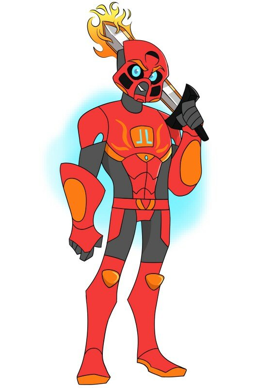
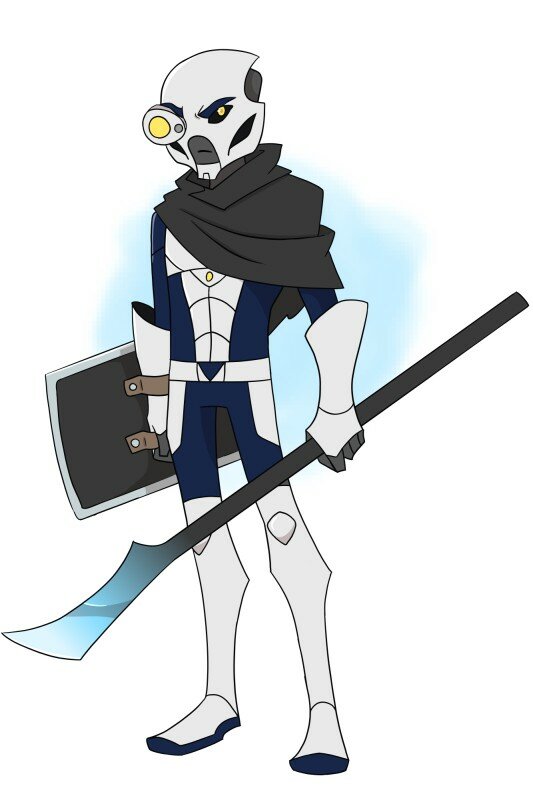
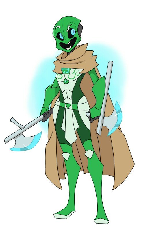
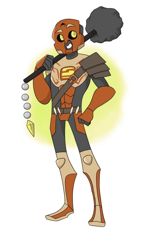
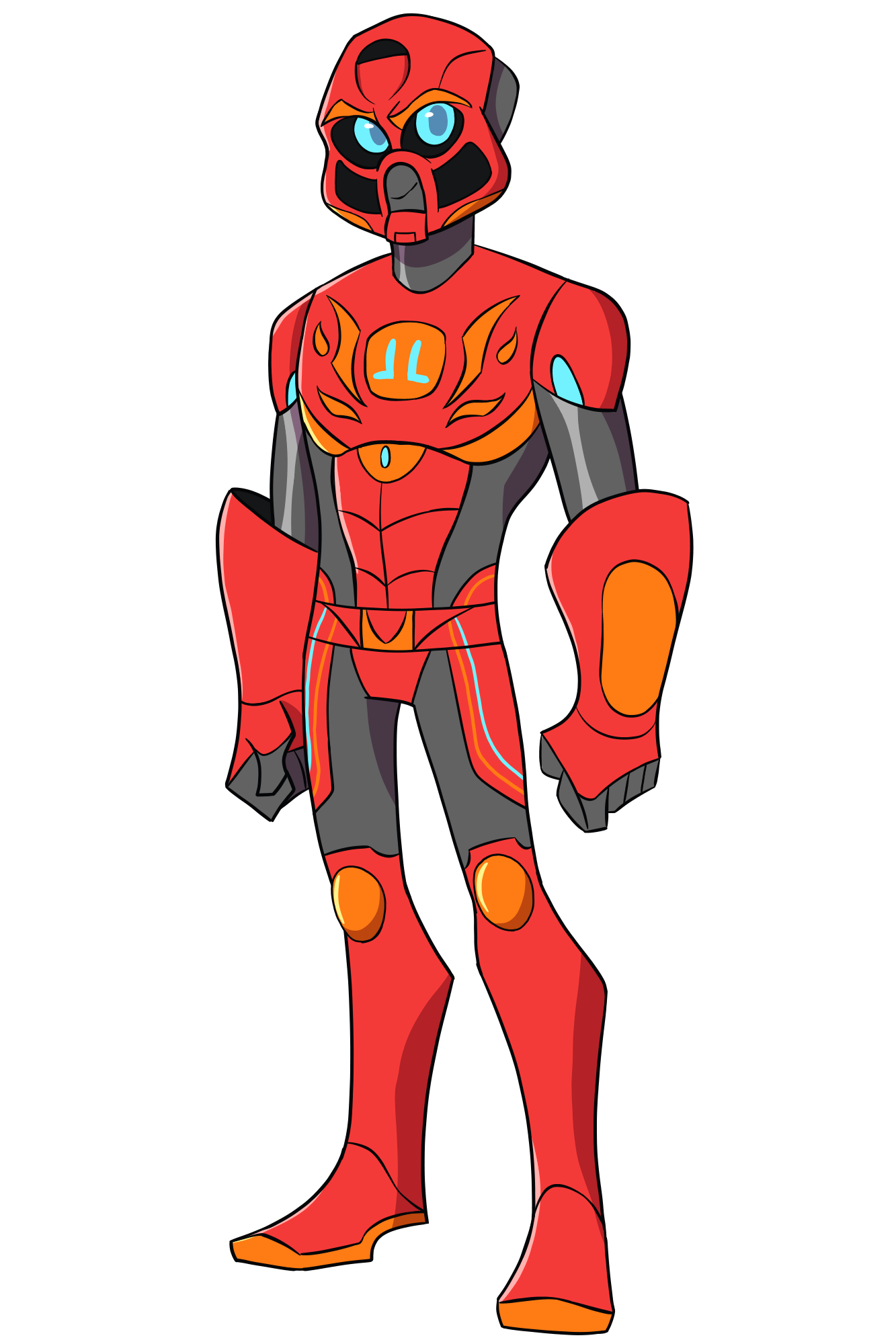
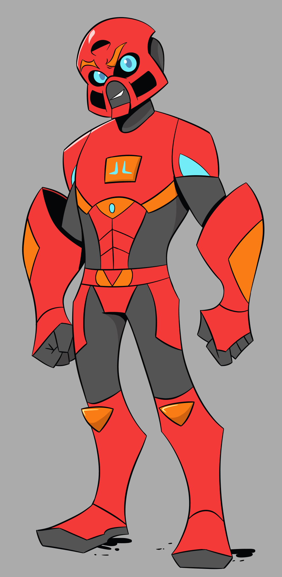
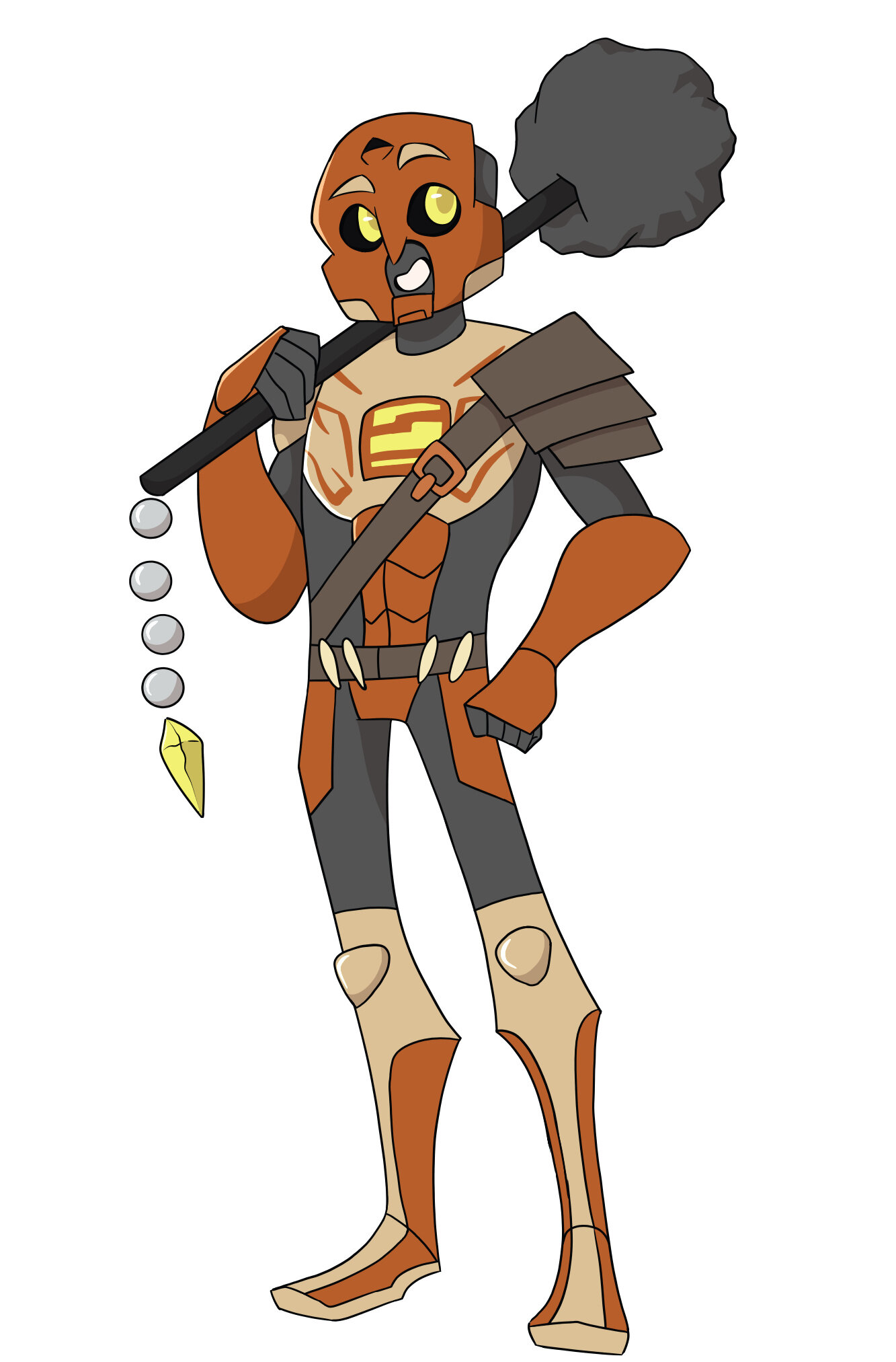
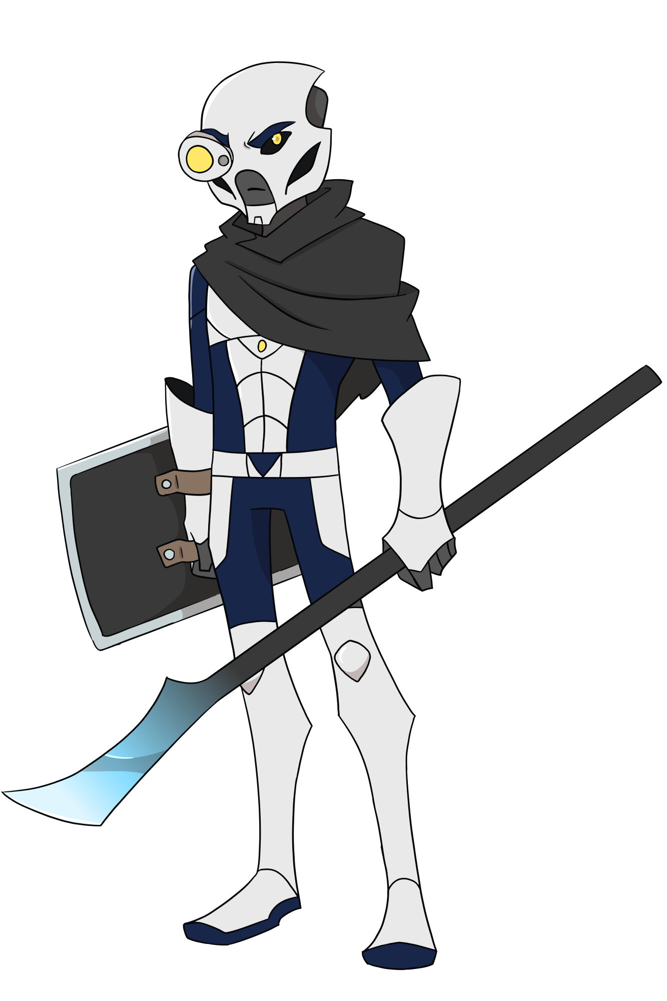
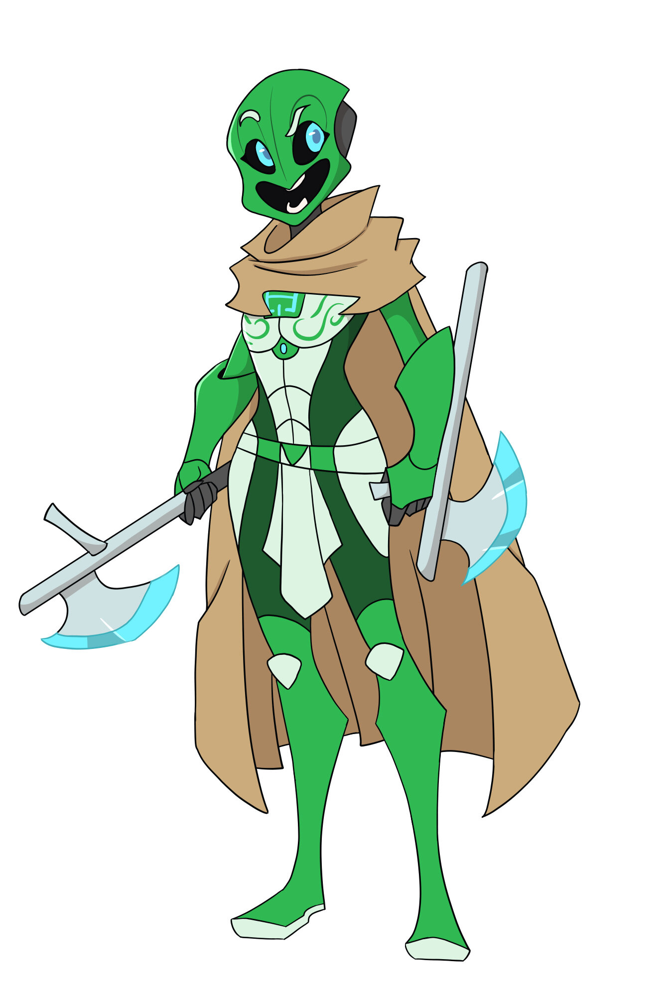
In the podcasts the members said they wanted a style similar to that of Star Wars: Clone Wars, Samurai Jack, and Transformers: Animated. Those first to shows had art done by Genndy Tartakovsky and Transformers: Animated’s art was designed by Derrick J. Wyatt who went on to design for Scooby Doo: Mystery Incorporated and Ben 10: Omniverse. I tried to keep those artist’s styles, as well as @IllustriousVar’s original designs, in mind when creating my versions, however, I still tried to let my style show through. I also tried to look at the complaints on Var’s original post and come up with some solutions. I personally didn’t “like”(like is a strong word I actually thought his art was really good and didn’t mind the “pencil legs” everybody else kept complaining about) Var’s designs because of the overly detailed mask and torso with the more simplified arms and legs. So I simplified the masks(sorry if they look too cute) and took out a lot of the unnecessary details on the body.
Design Evolution
V.1 - First design, My style, more detail
As someone who also has a great interest in character design, I think overall these designs have much more appeal than the original concepts. The proportions are a little more in check and balanced, and a lot of the things that bothered me in the originals (the giant feet, Pohatu’s nose) are fixed here. They look more human, more relatable, yet still recognizable as Bionicle.
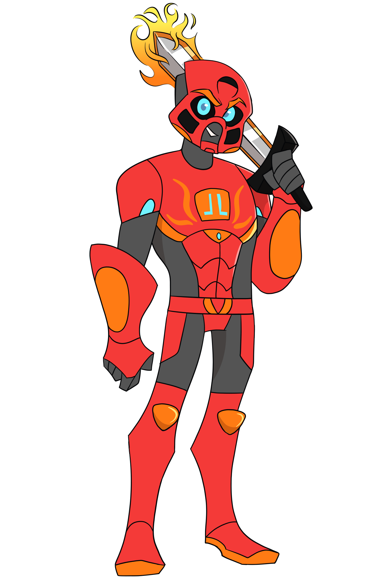
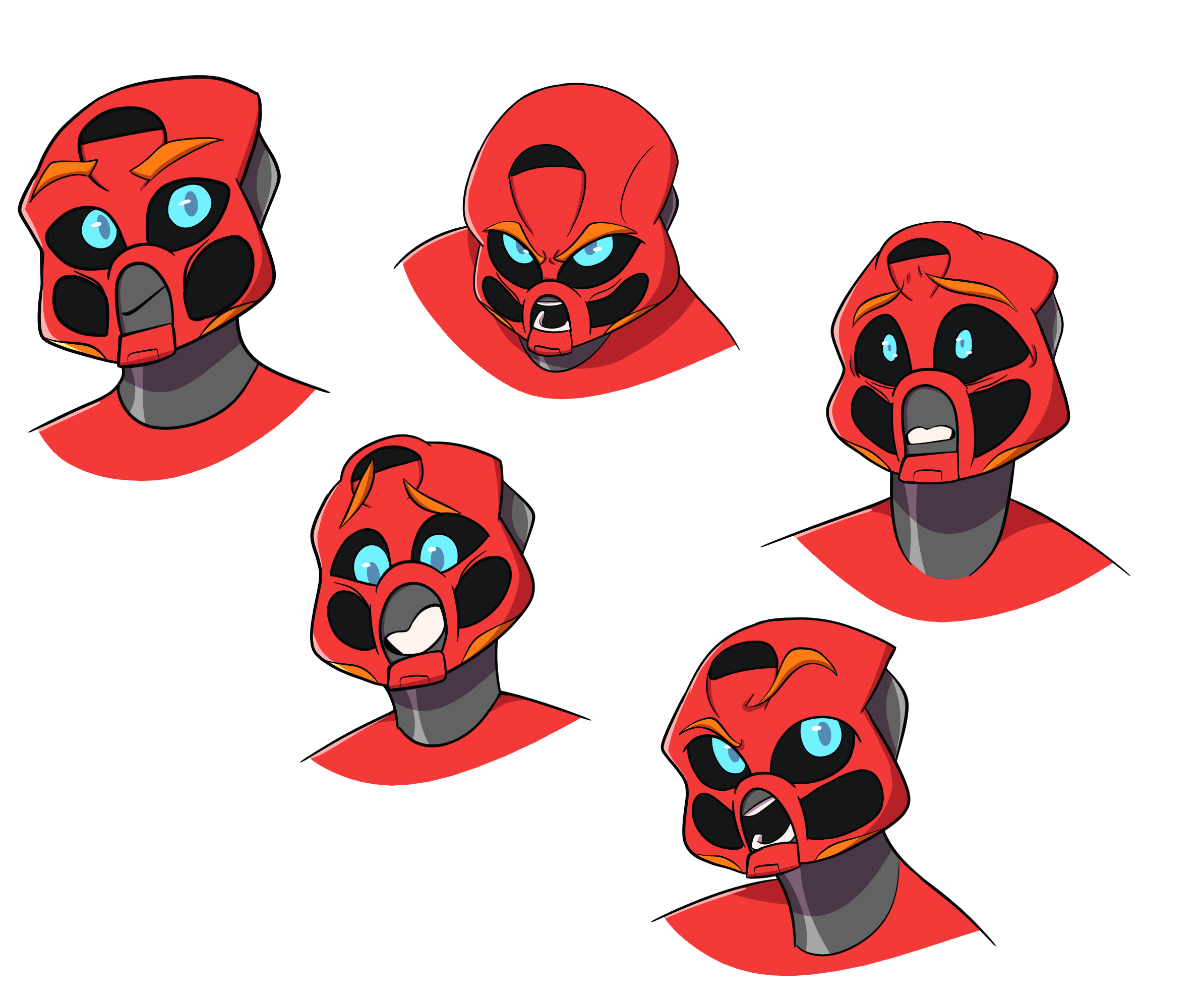
The only improvements I could think to add would be more contrast through the shading and maybe some more emphasis on angles. The main character images look a little flat, but the full background image of Tahu with the light from his flame really sells the form! More shading like that really helps! There’s also a lot of rounder shapes, which may just be from the newer designs the TTV cast adopted, but in my mind Star Wars: The Clone Wars and Samurai Jack are usually very angled and geometric. A little more that in places like the armor shells on their body or the edges of their masks might help them appear more mature.
Currently they look geared to a younger demographic, but heck, I’d watch this show if it looked like this!
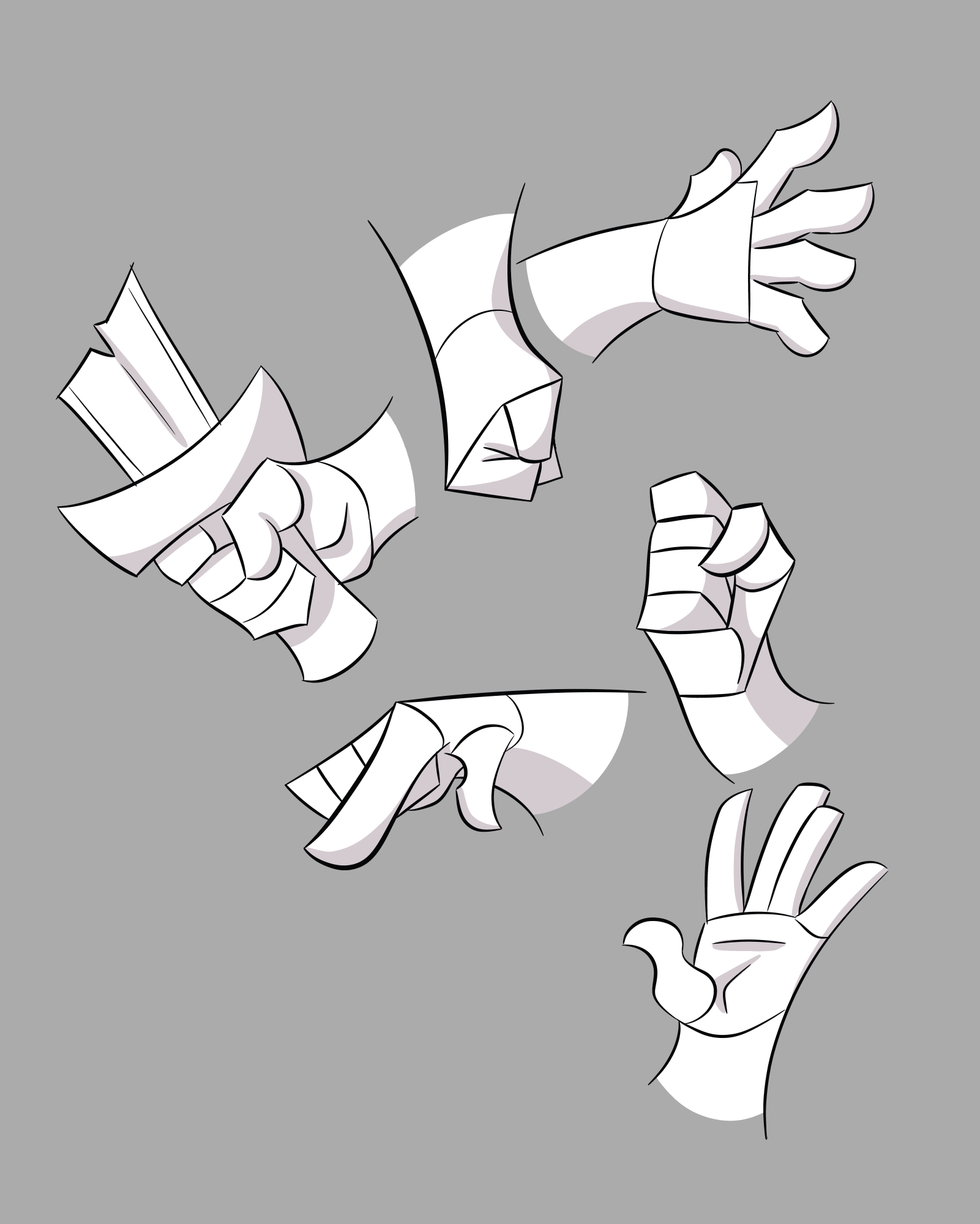
Also, your hands are top tier! Nice!
This is great! Hopefully this can draw the eye of the cast!
They’re a perfect blend of the classic action cartoon design (i.e. Justice League DCAU) with a little bit of the modern cartoon look (i.e. Steven Universe).
I could actually imagine this Tahu having the same voice actor as from CallanLoF’s videos. lol
Thank You for the feedback. I tried to keep the shading simple for the Toa since these are just concepts. In most of my art I try to go for a darker more saturated shading. And like I said in the post I tried to let my art style shine through and use Genndy Tartakovsky’s as more of a guide. Plus, I think my style is more influenced by Derrick J. Wyatt’s art. Also, it’s great to have more feedback than just “These look good/ awesome/great.”
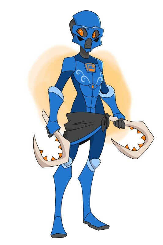
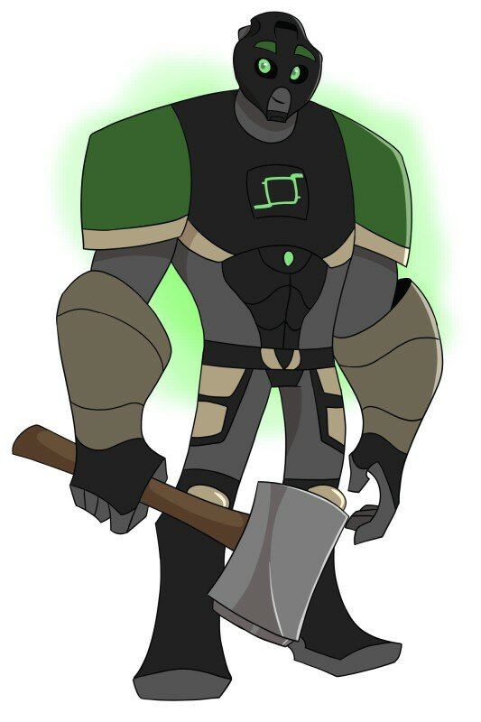
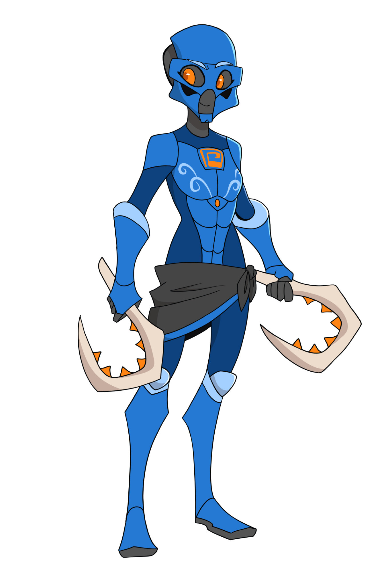
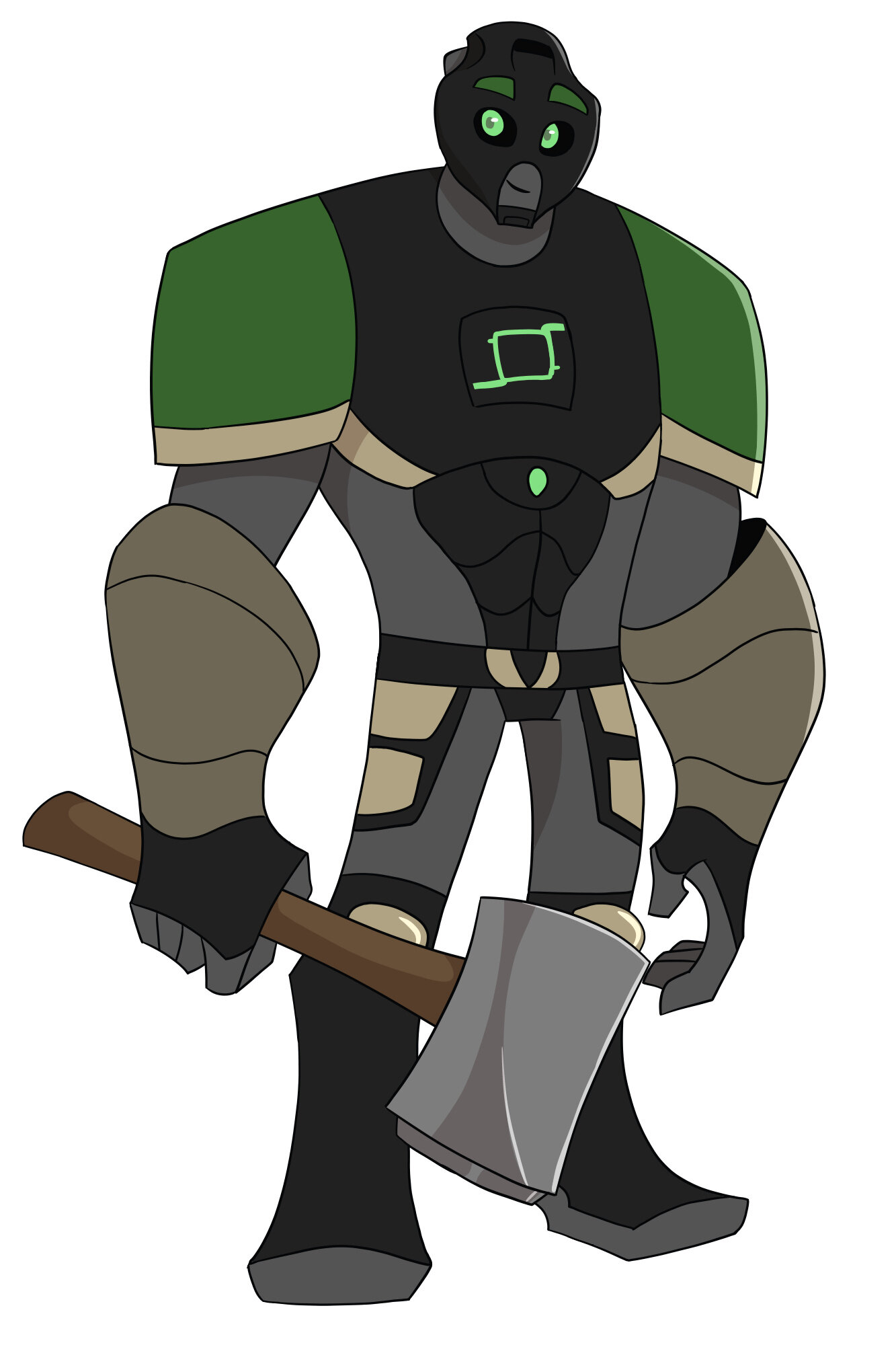
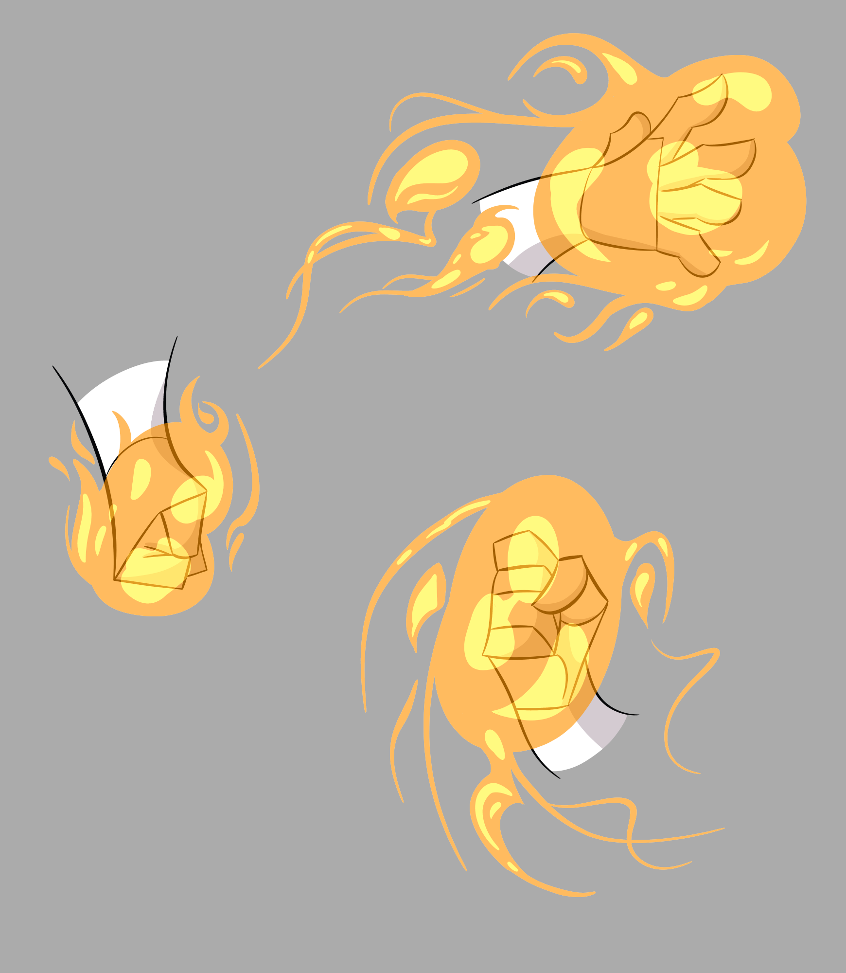
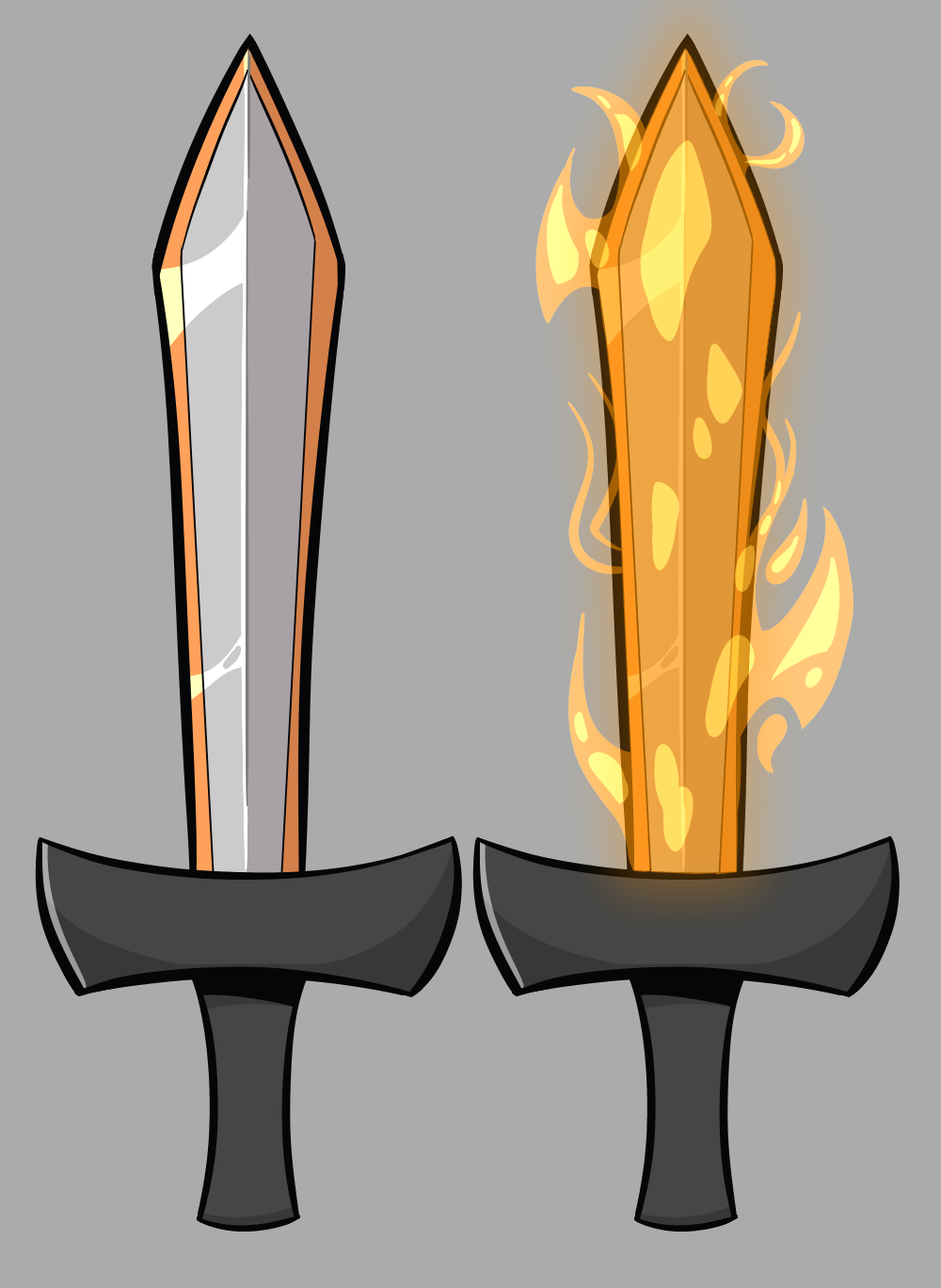
This is more a question for the cast than for you, but, why is Gali the only one with “clothes”? Besides that, most of my opinions for the previous drawings of the characters apply here, too: the only masks I really like are the Akaku, and to a much smaller extent, the Hau. The kakama is just shaped really weirdly; I always preferred to more alien/incetoid look of the original mask to any more mammalian face look. The Pakari is the mask that suffered the most for the sake of simplicity, as without the detailed holes and groves of its other forms, it just looks like a boring, formless husk. I don’t love the Miru, either, but to its credit, it looks the most like an actual mask (in the style of Greek masks, anyway). The only mask I think looks flat out bad is he Kaukau, mostly because of the mouth and chin. If it just had a solid piece (making it more similar to its basis’s “diver’s mask” look), it would be considerably less off putting, and more unique. The low angled shot of the Hau is by far the best looking mask here. I appreciate that in these designs, the masks don’t line perfectly up with the eye-holes, just like on the toys. Apart from the heads and faces, these designs are all around fantastic. Pohatu’s abs look a bit off compared to the width of his body, though, and I’m also not a big fan of the rock on his mace- maybe if it was more angular it would be better. I’m also not liking the decisions to make Tahu’s sword a conventional sword on fire, instead of a sword shaped like a flame. While it’s more practical, it’s considerably less unique. For similar reasons, I don’t like Kopaka’s European-style shield much. Over all though, this stuff is great. Also, why does Onua have no elemental designs on his chest?
I don’t consider capes and armor to be articles of clothing; I just mean things like ■■■■■■■■■■■■-like things and pants/pant-like things. I think her skirt/loincloth-thing seems to make a strange inconsistency.
I use Medibang Paint Pro. I love it because it has a desktop and mobile version so you can save your work to a cloud service and always access it. Plus it’s free which is great for someone in college like me.
Medibang is similar to FireAlpaca they use the same file type. I have used FireAlpaca though and I think Medibang is a little better in the way it’s set up, but there isn’t a whole lot of difference.