Fidda
November 4, 2017, 6:50pm
1
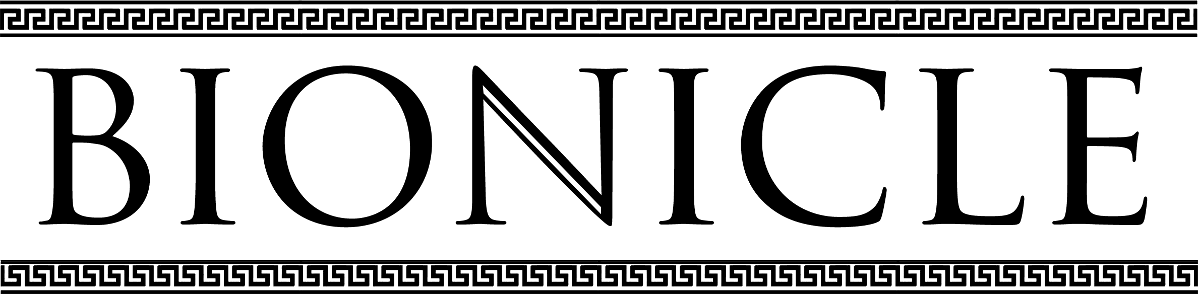
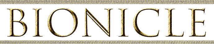
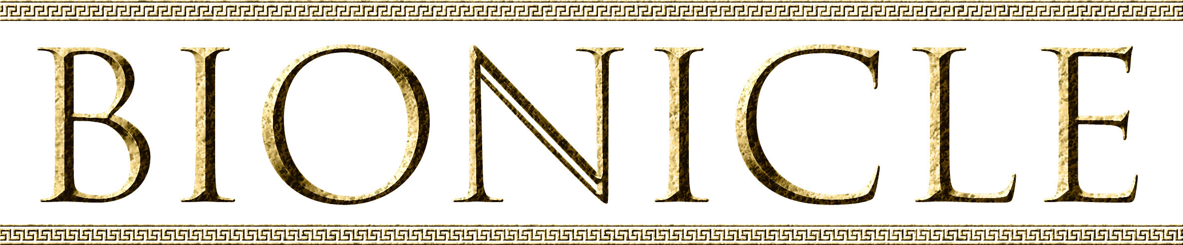
so, I was making a logo for brickonicle, put people say that it shouldn’t say “brickonicle”, and that it should rather be a different bionicle logo,
2.
3.
G1&G2 colored
1.
2.
3.
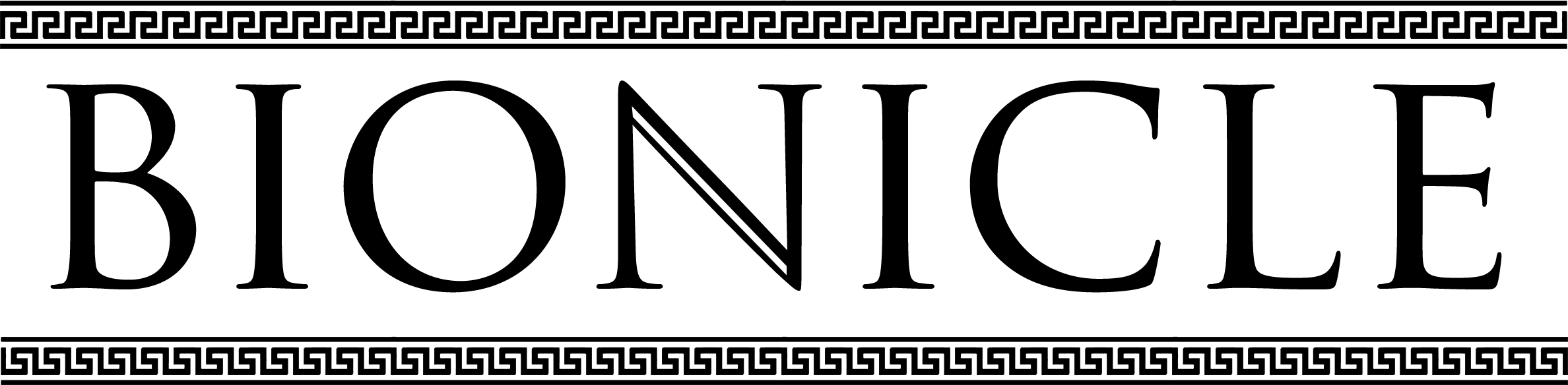
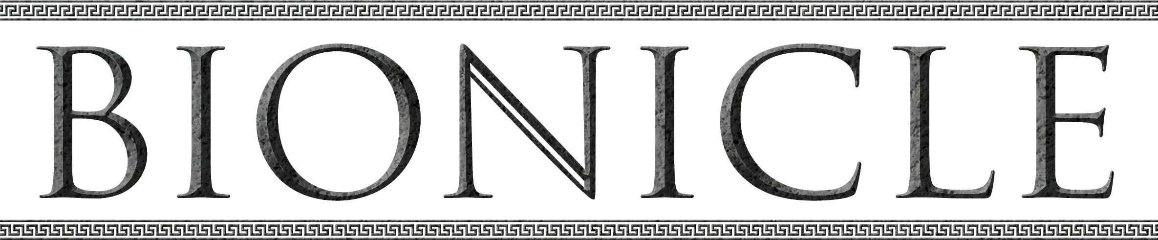
what version looks better?
Option 1
Option 2
Option 3
19 Likes
Not a huge fan, It looks kind a greek to me. And I feel like the edges of the letters should be sharper.
Fidda
November 4, 2017, 7:22pm
3
that what I was going for, because @Payinku told me that G3 draws inspiration from greek and norse culture
Fidda
November 4, 2017, 7:27pm
5
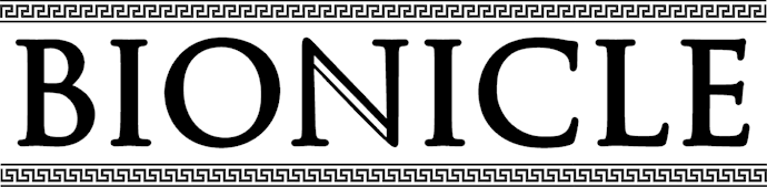
I guess I could make it edgier tho
looks better?
1 Like
As is the level of detail between the letters and borders clash, they need some form of detail, similar to the g2 logo.
Yeah, the smaller borders definitely look better.
I do feel like the letters should have some level of detail, like chiseled stone or similar.
Fidda
November 4, 2017, 7:39pm
9
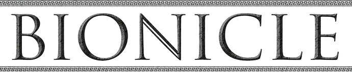
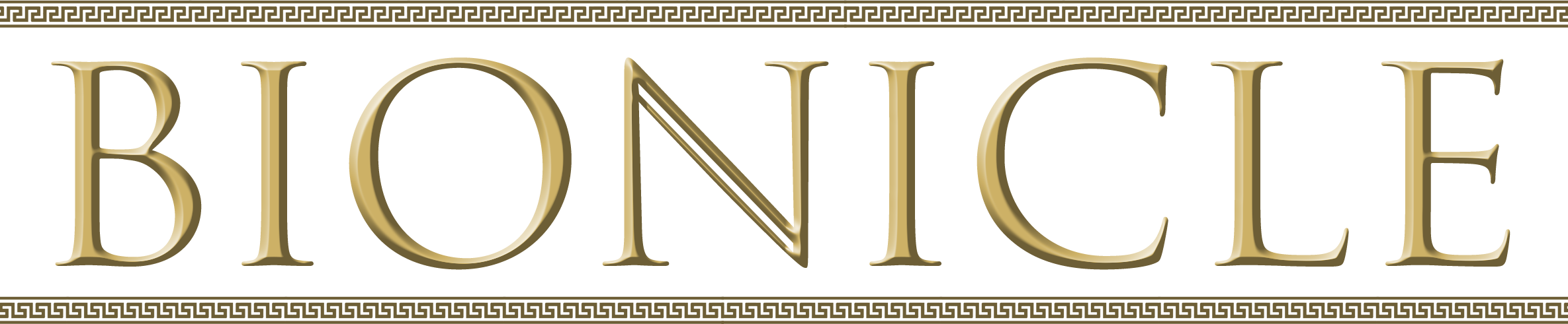
I really dont know how I could make that, let me try
Payinku
November 4, 2017, 7:43pm
10
Maybe there’s a Photoshop filter that could work?
Idk, the lettering just looks a little too clean and almost, metallic, to me.
Payinku
November 4, 2017, 7:57pm
13
Pretty close to perfect, I bet in color it looks great.
Payinku
November 4, 2017, 7:59pm
15
I mean, unless you were to go in and do all the stone detail by hand it won’t be perfect, but I think that’s pretty close.
Personally I think it captures the spirit of the original design while becoming its own thing.
Kahi
November 4, 2017, 10:10pm
16
I’ll be honest, it looks virtually identical to the original logo to me. I think a different look is in order.
2 Likes
This, but, you just added some Greek chiseling on top that doesn’t even relate to the letters themselves.
Fidda
November 4, 2017, 10:15pm
18
it was suggested to me that I did that, I just do what Im told to do
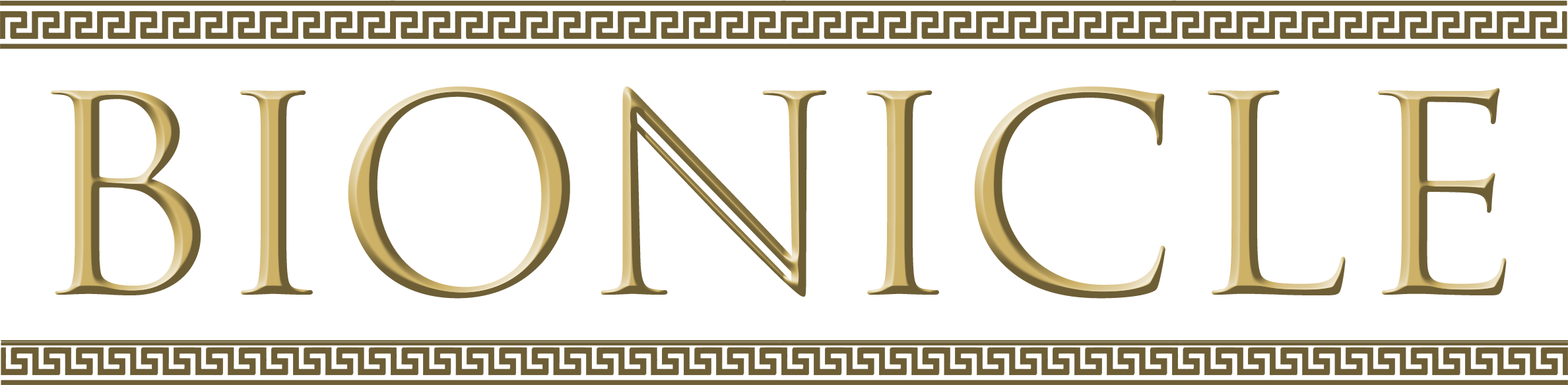
Number 3 option 3 is pretty good
_el
November 5, 2017, 12:40am
20
Option 3 looks way too much like the og logos