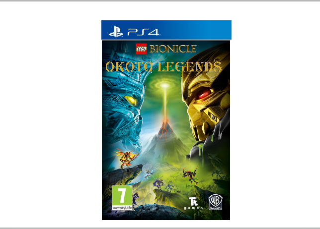
If we ever would have got a video game based on Bioncle G2, the cover would have looked like this!
If we ever would have got a video game based on Bioncle G2, the cover would have looked like this!
Um…
I’m not sure how exactly you came about the certainty that LEGO would absolutely make this the cover of their game, but I can easily argue that they probably would never make something like this for a game cover. The only thing about this game cover that I see likely if LEGO had ever made a Bionicle g2 game is the placement of WB Games and Tt Games’ logos similar to the LEGO Ninjago Movie, but only if WB Games was involved in any way, shape, or form.
Overall, this looks like a really poor formatting of an ugly font onto a Bionicle poster with the PS4 game logo slapped overtop, but not properly aligned or resised.
I did my best I could, I doubt you could make it look better then this! Pls apriciate people’s work.
People don’t automatically have to appreciate work because it exists. They appreciate when hard work creates a good product. When people say that they don’t like your work, they aren’t trying to attack you and the effort you put into this. They’re telling you that what you tried didn’t work, and you’d have to try something else to get a better piece of work. Every artist out there has gone through the same criticisms, and the best have learned from it.
OK, but do you like this thing yourself or do you share the same opinon as the other guy?
…Actually, I could probably do a lot better, seeing as I’ve taken multiple Photoshop classes and am actively pursuing a career in graphic design.
Am I going to do so just for the sake of this argument? No.
I cannot tell you how accurate this is. For a very long period of my life I received no actual critique on what I created and I didn’t move forward whatsoever with what I was doing, stuck with drawings that made MS Paint look masterful.
So don’t think we’re hating on you for this. We’re just pointing out the flaws.
I think that you should say “this is how I imagine the cover would look like”. Generally it looks rather well made. I would make the Bionicle logo bigger and definitely change the “Okoto Legends” font because it’s pretty pixel-y and lacks any depth (that the previously mentioned logo has). And I also think that a game would have an original cover art. I hope that what I said will help you improve your work.
Thank you. Of coures, this is how I imagine the cover would look like.