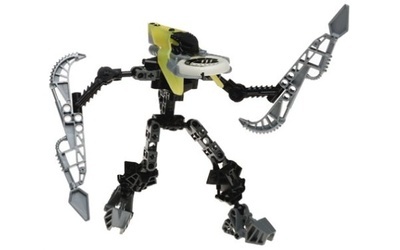
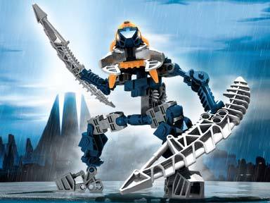
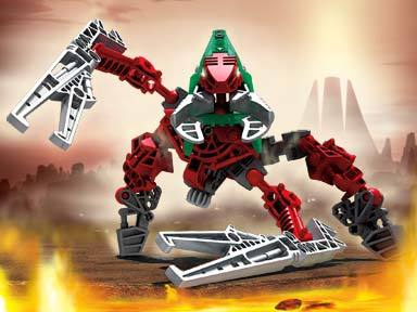
I know that a lot of people don’t really like the Vahki, but personally, I think they are pretty good. So I recently decided to ‘revamp’ a few.
Here is a Nuurakh.
Enjoy! Expect a Bordakh and Rorzakh soon!
I know that a lot of people don’t really like the Vahki, but personally, I think they are pretty good. So I recently decided to ‘revamp’ a few.
Here is a Nuurakh.
Enjoy! Expect a Bordakh and Rorzakh soon!
Coolio. I think that the Metru shoulder armor you used for knee-plates are slightly awkward, but given the fact that there aren’t many other good pieces to use for that, bravo!
Thanks! I was considering using the upper leg armour from Malum, but I decided to stay more with 2004 pieces.
Why the random black pins in the arms and legs?
Uh, otherwise, I think that it works, and uh, also, they Matau Aero Slicers look kinda weird. I feel like the whole “Attach Blades to Blades” only works if you have blades attached on both sides.
I love with you did with that Vahki… That was the Vahki I bought, and I’m glad to see someone revamped it!
I always liked the Vahki, though its pretty nostalgia shaded for me as 2004 was my first year. Anyway allow me to critique this.
Things I like:
Things I dislike
Why are there Matau Blades there? They dont seem to really add anything to it and the vanilla Vahki staff would have probably worked fine.
I don’t like the metru shoulder armor on the back. It just looks bad to me in both modes.
Over all pretty good MOC. I like it.
The Black pins are power cable ‘plugs’. And I was just trying to make the staffs longer.
Wow man this is pretty cool! (looks a lot more flexible than mine lol). I like the gears all over the place, and the body looks fantastic.
My only issues are the random black pins (sorry, not doing it for me) and the fact that the head is kinda high off the body. On a normal humanoid MOC it would be fine, but for the Vahki it doesn’t seem right.
They are Fine, I like em, but That “Inhumanish” Look is little too much… Atleast it feels like that for me! GJ anyways
They’re ROBOTS. They should look inhuman.
I think the Rorzakh is the best looking.
Heard of androids? No? + Im not allowed to say what i think?
All hail Rorzakh! The best Bonkle EVERRRRRR!!!11111!one!111!!!


I dunno. I kinda like Bordakh more. Their staffs make the most sense to me.

Don’t forget that Keerakh had some sick weapons too.
But Rorzakh has the jackhammer staffs, which makes sense because Onu Metru! Also, Rorzakh was my first Bionicle set…
The only one who’s staffs looked really odd to me was Nuurakh:

I’m not saying their staffs don’t make sense (and I completely understand the nostalgia you have). I just think Bordakh’s look the coolest IMO. I also really like his colors.