Not sure if anyone else has posted this before, but here I go anyway.
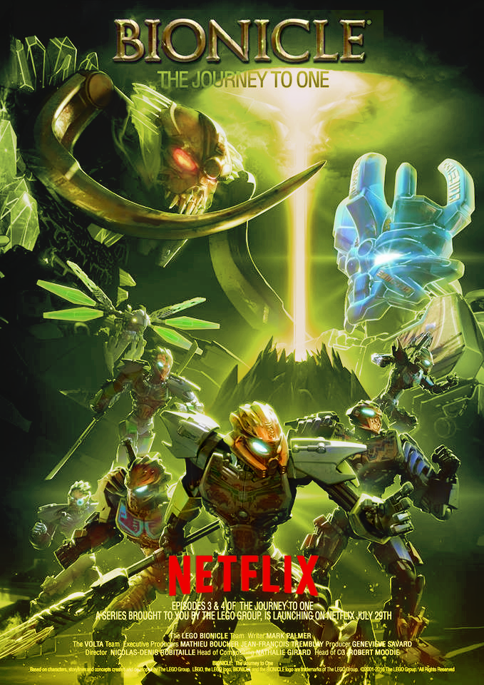
What’s struck me odd about the Journey to One poster we recently got is how they corrupted volcano/sky’s color “wrong.” All the summer box art and LEGO’s official poster depicts the sky as a sickly yellow-green color, the same color featured on Umarak. However, the Journey to One depicts the sky as purple instead. I don’t mind the purple, but it is strange that they went with the literally opposite color of what LEGO used.
So, I decided to “fix” it.
This was a very quick edit, but I think it turned out okay. If anyone’s curious here’s a comparison to the other posters:
You have a point there. I tried to fix the contrast a bit, but ultimately the problem lies with the hues. Yellow is naturally the brightest hue while purple is the darkest. So no matter what I do, a yellow-green sky will always look brighter than a blue-purple one.
Not sure what you’re trying to say here. If you’re saying this is a fake, I know. I edited the poster to match the summer wave’s box art.[quote=“PakariNation99, post:5, topic:25750, full:true”]
Hm, it looks okay, but still a little off.
The beam needs to be redish-orange[/quote]
Noted.
Yeah, that’s a bit of a problem, and one difficult to fix. The toa have a blueish-purple tint to them in the original poster, which clashes severely with the new green color. The best way to hide it was to let the green bleed into the Toa more.
Are you using Photoshop/GIMP? Maybe you could lasso each one out and then change the color settings around (or manually paint) to make it less harsh and make the light more like a reflection of the sky’s light?
GIMP 'cause I’m cheap. (Though I do miss all those photoshop features.)
I suppose it is possible, but that would take a lot of work, especially if I tried to manually paint over them. The edits I made to this poster were actually quite simple. I just made a duplicate layer of the poster, tinted it green and yellow and then used a layer mask to reveal some color of the original.
Anyway, I am playing around with the poster some more. Fixed the beam and I probably post any further edits in the morning.
Forgot to post it; the poster’s been slightly edited. Image is darker, removed some of the Toa’s blue tint to reveal more color, and added some red in the beam, plus with some other minor changes.