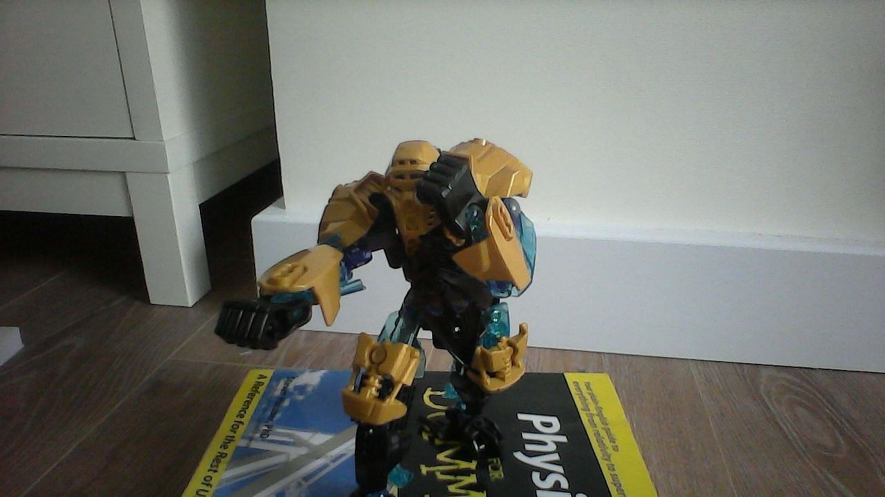
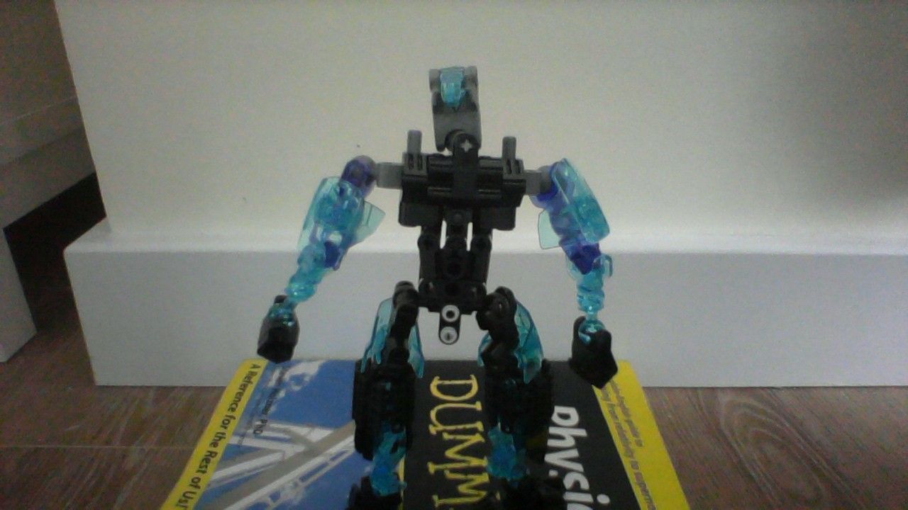
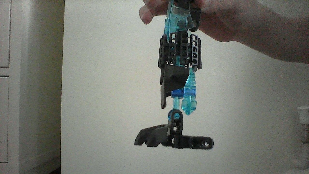
So I tried to revamp my samurai-esque moc from earlier. I wish I had took photos of the previous one, but it went from vaguely looking bulking silver and black samurai esque thing, to the same thing but with tons of translucent colours. LIke an eruption of translucent. Then I tried to balance it out, thought silver was boring so I replaced it with gold.
I can’t really excuse my shoddy photography. Though I try my best with a laptop webcam…
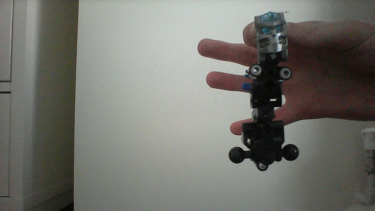
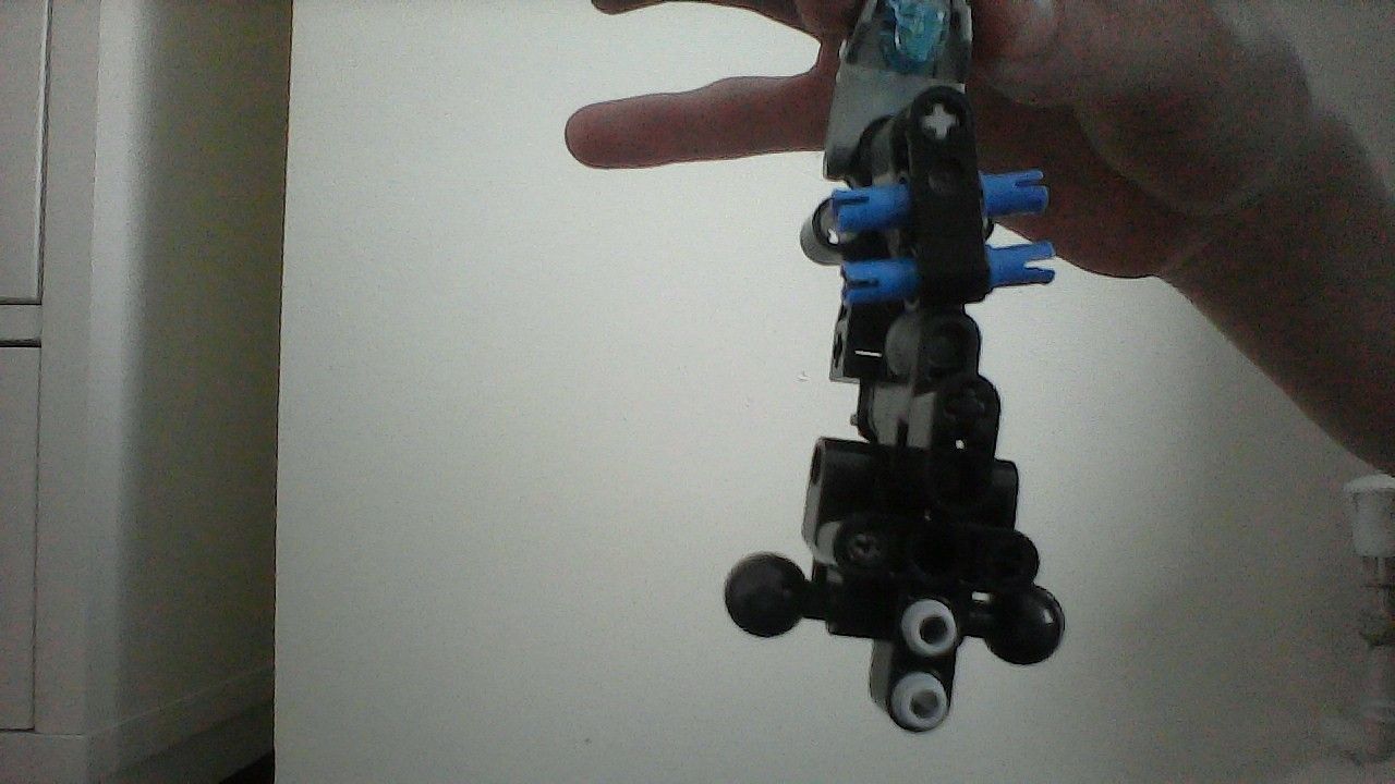
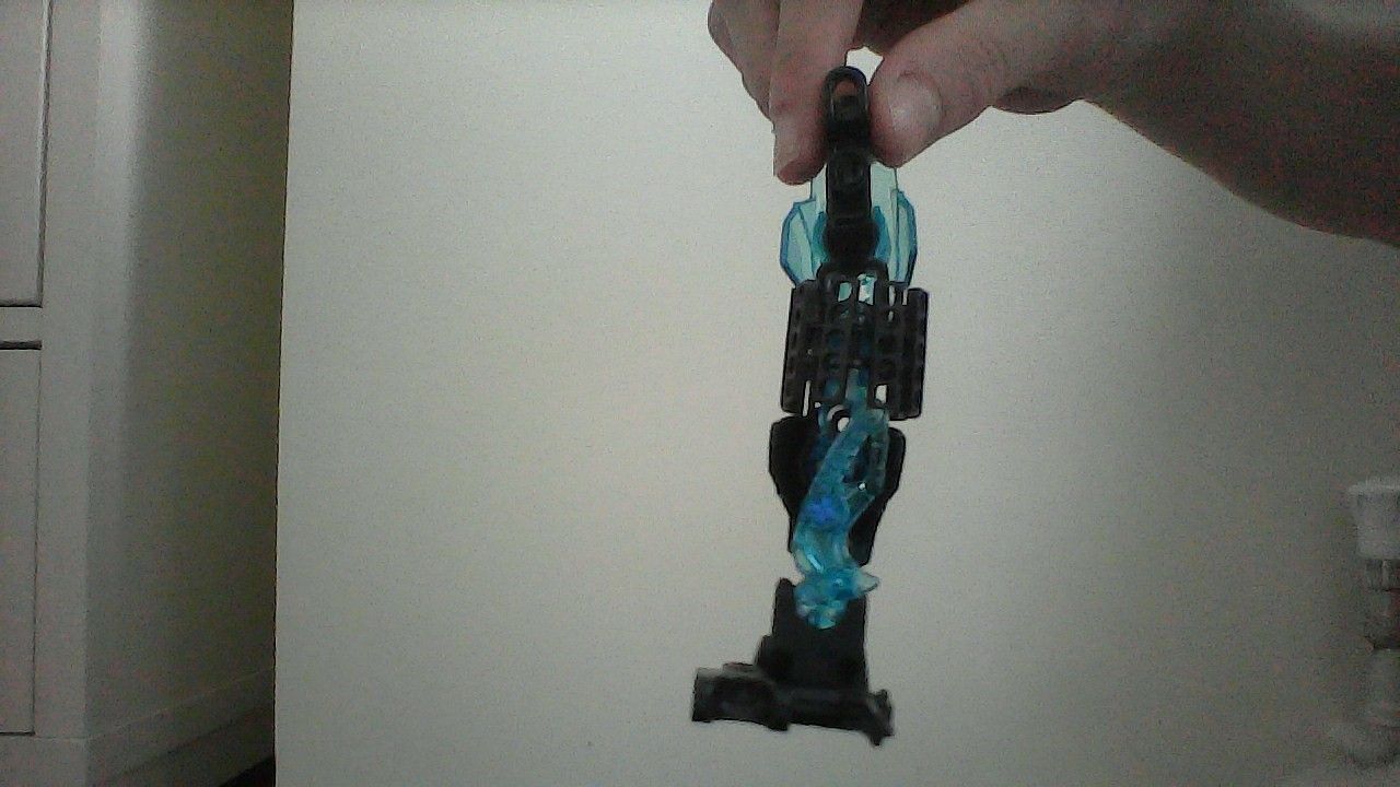
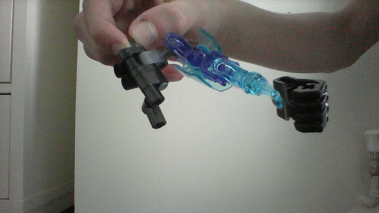
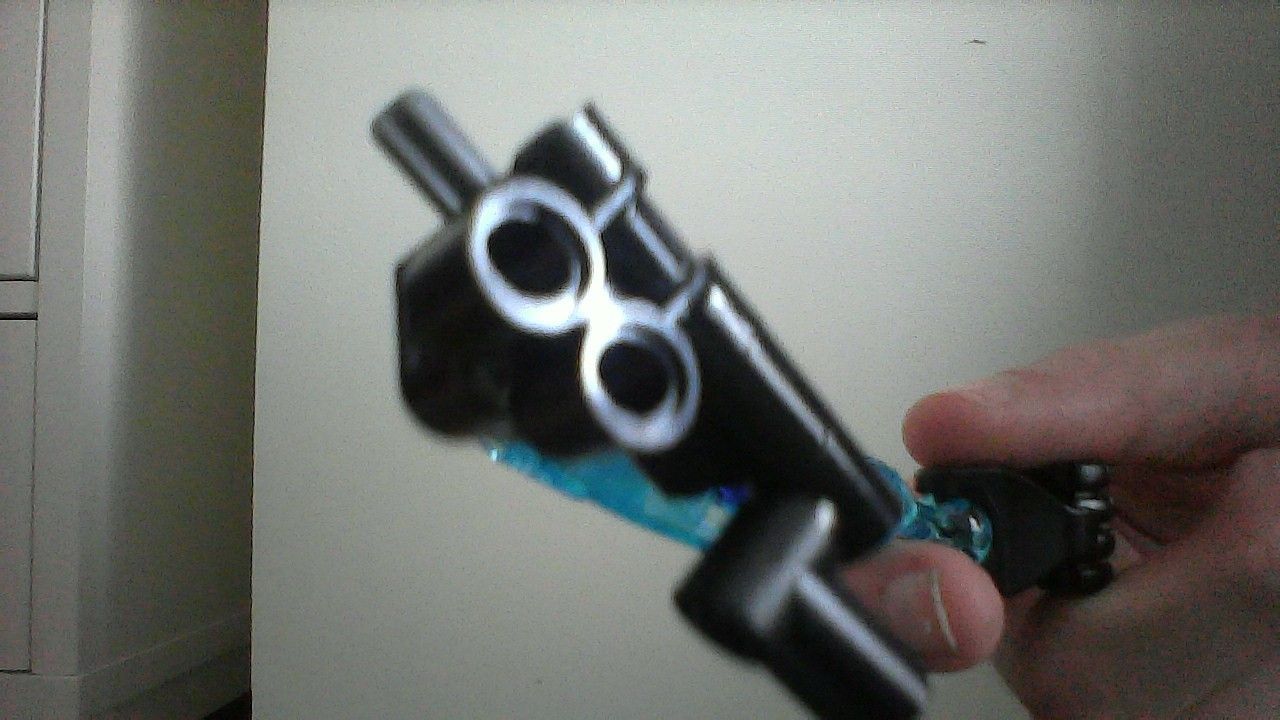
Wouldn’t mind harsh critique on the build, if you need any other “close ups”, ask for the specific area. Only thing I can make an excuse for is the light grey axle on the back; I ran out of black ones.
Thinking about it, it does partly look like a swimsuit. Though I can’t really think of any other pieces that solidify that much/bulk it up while keeping it somewhat sleek.
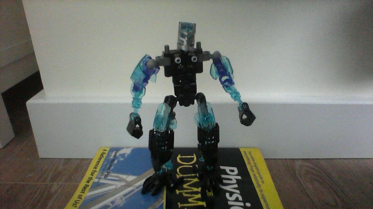
Maybe I should replace it with a black armour shell or two? I’m not sure…
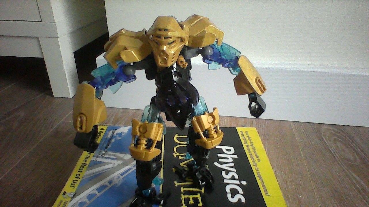
Meh is a way of saying it is in between OK and Bad. I personally prefer colors to stay at two main colors and one Highlight, but the MOC has that Trans. Purple, which Kind of throws the Consistency off the Bridge.
[quote=“Blaiz1t, post:11, topic:12722”]
Fair enough, though any ideas on better covering up the torso?
[/quote]You could ditch the Protector Mask.
It doesn’t change the Fact that they kind of add some unneeded, probably unintentional Greebling.
I have two different types of reviews:
Plural’s Quick Reviews; where I give some simple and somewhat easier to understand points of critique
and
Praise/Criticism: A reviewing style similar to PQR, but a bit more in-depth and analytical.
I usually go with PQR because it makes it quicker for the User to read and quicker for me to get it out.
Does a simple, small, un-memorable review need this many rules? No, but I kind of find this the best way to get everything out.
Noted, though it’s going to be difficult to see whether I want an Ekimu colourscheme or your average silver and black with the dash of blue… I’ll see what I can do.
You could ditch the Protector Mask.
Would a skull spider mask work or better to ignore masks for the time being?
add some unneeded, probably unintentional Greebling.
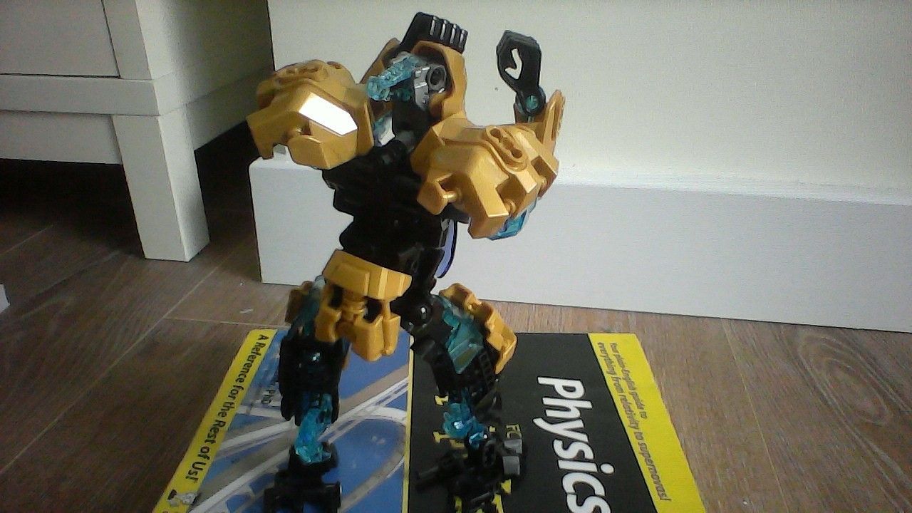
Not sure how I could make the legs filled up any other way, might have to branch out to custom limbs.
it makes it quicker for the User to read and quicker for me to get it out.
Fair enough, I can’t imagine making full on reviews on random people’s mocs every day.
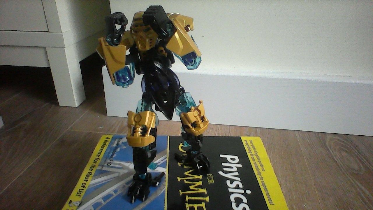
Really like the colour scheme on this guy, and most of the armour placement. Only bit that seems odd is the lower back. Would prob look better if it was stripped down to his “unarmoured” state. @Hawkflight I guess it’s a case of brawn over brain…


")