Uh, slime. Aren’t those the Hf color schemes?
1 Like
I assumed that went without saying. Doesn’t make sense to have a Toa of Lightning in the jungle, and a Toa of Plants in the desert.
Barring silver, gold, and orange, yes. Is there a problem with that?
But that doesn’t matter if over 50% wants it gone. This isn’t a matter of what’s below it, this is a matter of how many people want it; and going on the original, larger sample size, it’s clear that more people don’t want it in the main 6 characters.
It could be, people already have a problem with a reboot being a renamed Hf without the color similarities, that and I personally really don’t like yellow-purple.
I’m not really a fan of lightning over air either, especially with such a gaudy color scheme, changing pohatu to nature honestly doesn’t bother me, but I’d go with burnt orange over brown and thinking about it, if pohatu became a toa of nature I’d probably reverse the color order to retain his signature mask color-ish and just up the secondary percentage compared to the others to keep the green sales buff.
Of course, I’ve already gone over my element and color choices.
I’d honestly be interested in seeing my choices visualized in your minimalist preview-thing, if you’d be so charitably inclined. ![]()
2 Likes
Zaria using his powers on Chiara and Orde is still a case of manipulating metalic Protodermis, but the Vorox weapon example from The Yesterday Quest does actually stand.
@DarkHenrik: From a purely Wind perspective, I’d probably agree with that assessment, but some still associate Air with a forest or jungle region due to the oxygen production of the native plantlife. Seeing as to how a fair amount of people still view those words as interchangeable, it isn’t really that much of a leap as to why they ended up where they did, or why G2 Lewa seems to retain at least some of his older G1 abilities as well.
Personally, if Air was to remain separate from Plantlife, I’d associate it more with large fields with smaller patches of forest located here and there instead of an all-out jungle, but that’s just my opinion.
1 Like
I don’t think people would even notice the similarities, especially with it being a System line.
Whether you personally like it or not, yellow and purple are complementary colors. Like red and green, and blue and orange, their colors complement each other quite nicely.
You didn’t specify which shades you wanted for azure, blue, and green, so I went ahead and picked the most common ones.

I’m gonna be honest: most of these do not look good. Water looks great, but that was a given due to the complementary colors. Fire looks alright, but not quite fiery enough. There’s too much of a contrast with Ice. Having Air’s main color be light blue is gonna lead to major confusion with Water. Jungle isn’t bright enough in comparison to the others. Stone is extremely monochromatic compared to the others.
In addition, you’ve got four characters that use a shade of blue in their color schemes, two of which use it as their primary color. That’s going to make constructing individual sets for these characters extremely difficult. If a kid asks their parent for “the blue bionicle,” how will they know which one to pick? Having distinctive colors is a vital part of marketing. Just look at any other action theme Lego has done, and you’ll see that very few main characters are similar in shade.
Having said all that, I went ahead and revised my original concepts for the main six Toa:

I changed Onua into a gray, solving my earlier issue of black = evil. I also changed his secondary color to lime, a much more natural color that I feel works with his element more. Lewa’s secondary color was changed to purple, and Pohatu’s secondary shade was changed to a medium nougat.
5 Likes
simple solution
If Pohato isn’t Stone, then make him a Toa of Iron. Also give Toa of Earth to control crystals.
But if you look at the poll 60% want it to stay. The “choose six” poll isn’t a perfect representation of opinions, this is because of how it’s structured: you see, each element is evaluated by how many votes it got compared to the total number of voters, and then ranked according to the highest percentages. This is why if you add up all of the percentages it comes out to more than 100%. So yes only 38% of people chose stone as one of their six, but even less chose each of the other options. That is why I included the “should stone stay” poll. If the majority really wanted it to go, it would show. There’s no reason to assume when you can just ask and find out.
It’s not that simple. If you read above, that very suggestion led to three days of debate.
why can’t everyone agree on simple solutions then
2 Likes
Because not everyone likes them.
5 Likes
Because people have different opinions, which may or may not appeal to others.
(Kapura’d)
5 Likes
I was thinking about it, I’d swap the color order of air and nature, which would fix those issues, you’re right about ice, your choice is better, personally I really like the red-blue fire, but perhaps it would look better if it was red-orange-blue, and I’d change stone to dark grey-purple, though lime green does look nice as well.
What if instead of yellow-purple it was keetorange-magenta? Yellow looks really strange next to the others.
Yeah, the yellow looks a tad out-of-place.

eh
It does to a certain extent, but I’m not sure I like Ice, Air, and Fire all essentially sharing the same secondary color.
Too many colors for a minifigure. Having secondary colors + silver highlights is tricky enough.
Doesn’t look awful, but I still prefer the lime.
I’m not quite sure why you think yellow, a primary color, looks odd next to other primary colors, but I’ll give this a shot. There isn’t really a magenta color in Lego’s Color Palette, so I went with Bright Red Violet.

It doesn’t look bad, but IMO the yellow + purple catches your eye better.
Actually, can you try out keetorange+purple?

It works better with the regular yellow.
5 Likes
I think I prefer this over the original yellow. Keetorange is a more subdued color than bright yellow, so it fits in with the other colors.
1 Like
What program are you using for that, Slime, out of interest?
I have a crazy idea, red-keetorange for fire, white-azure for ice, I do agree on earth/stone, lime looks nice.
It’s mostly just that yellow is so vibrant next to the others, keetorange seems to more closely mesh with the other colors.
Yeah, what he said.
1 Like
I actually just thought of red/keetorange too. It works better than orange IMO, has a nice contrast to it. White/Medium Azure looks cool too.
I think you guys might be getting thrown off by the order in which I put the colors. For example, if I move yellow over a tad…

Yellow fits much more nicely.
Adobe Illustrator.
Also, since we’re talking so much about colors, I highly recommend that you guys check out Lego’s Official Color Palette for 2016:
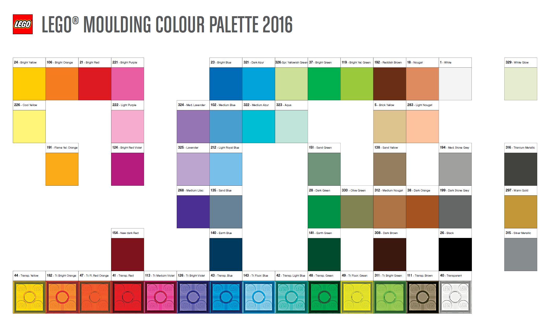
I’ve been taking colors specifically from here.
6 Likes