Here I will be posting my drawings of the civil war characters.
First up Iron man.
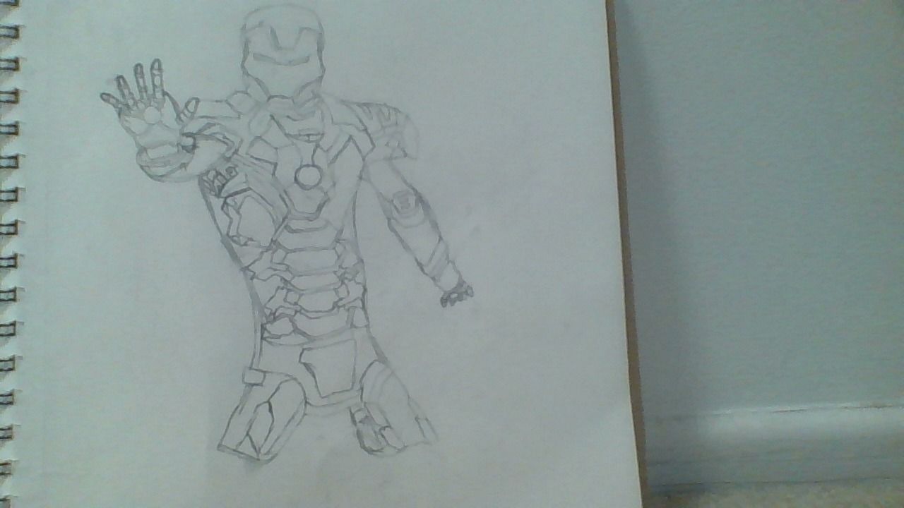
I apologize for the very light lines.
Here I will be posting my drawings of the civil war characters.
First up Iron man.
I apologize for the very light lines.
groovy
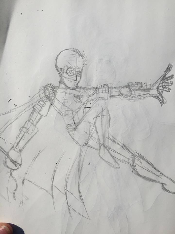
It looks good, but his left arm is too short.
It is bent, I drew this from a picture that I memorized.
so you drew this from memory? Awesome!
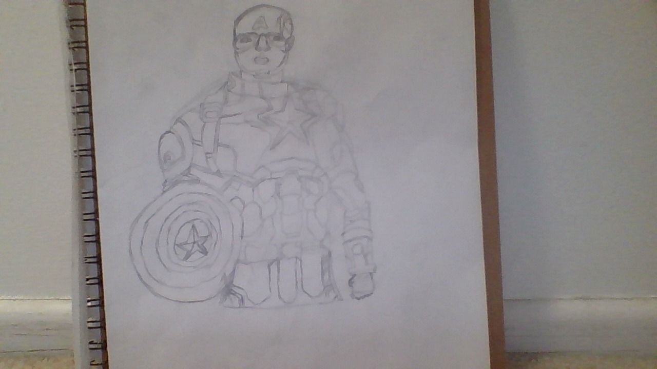
looks pretty cool man, I think caps shield is a bit too small
I like IM better.
But I’m on Team Cap.
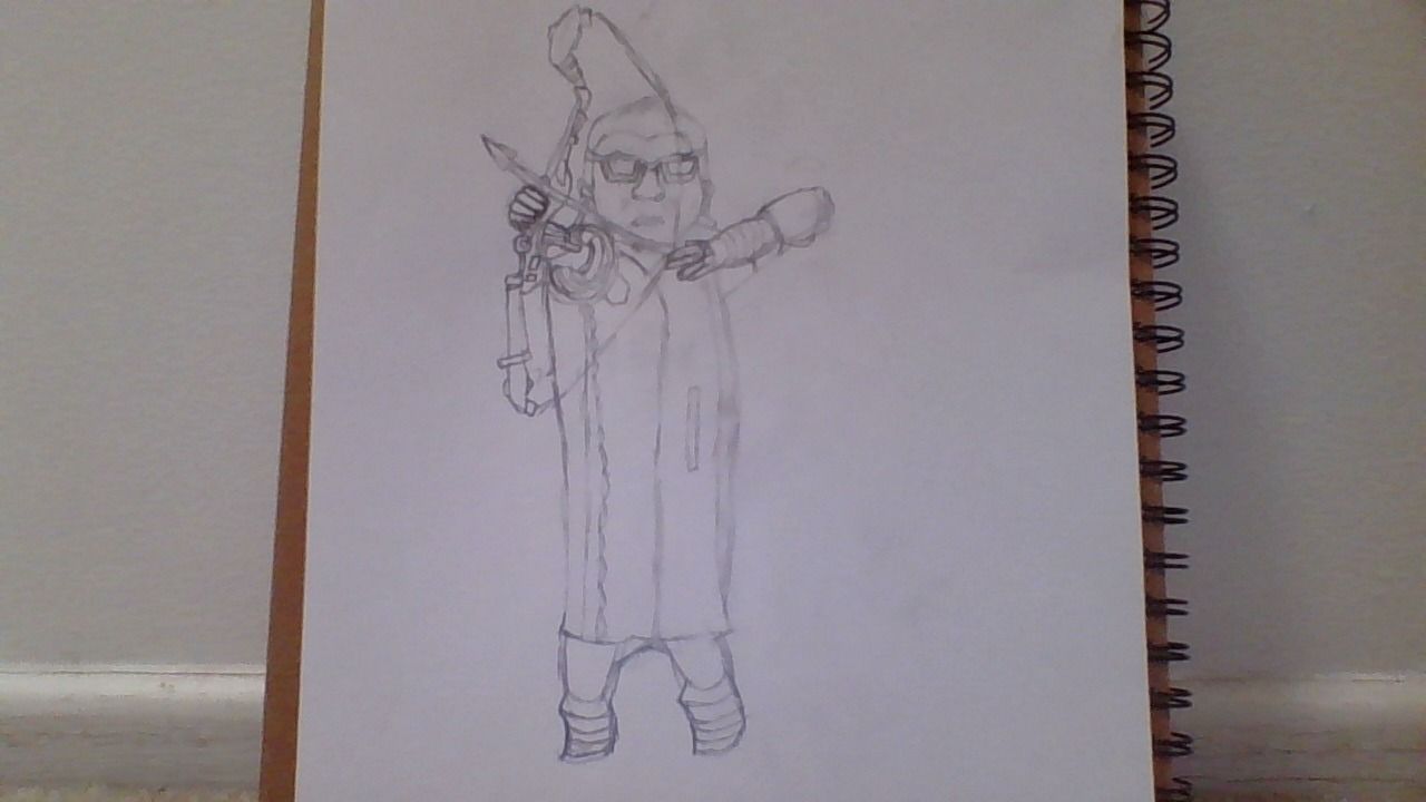
the technique seems fairly good, and you got all the details right.
The problem is in the proportions, and more specifically, the foreshortening. Let’s start with Iron Man. Both arms are whacky, the right one’s hand is way too small. if it’s coming at the “camera” it should be much larger. As for the other one, which you say is bent, we shouldn’t see the entire arm, but we should be seeing it angled differently and becoming larger the farther forward it is.
Cap’s a different story. The main problem with him comes from the fact that there’s nothing to tell you where you should put different parts, resulting in a drawing that, while the individual parts are fine, as a whole it looks inconsistent and badly proportioned.
The drawings are pretty good, but the proportions in general could be better.