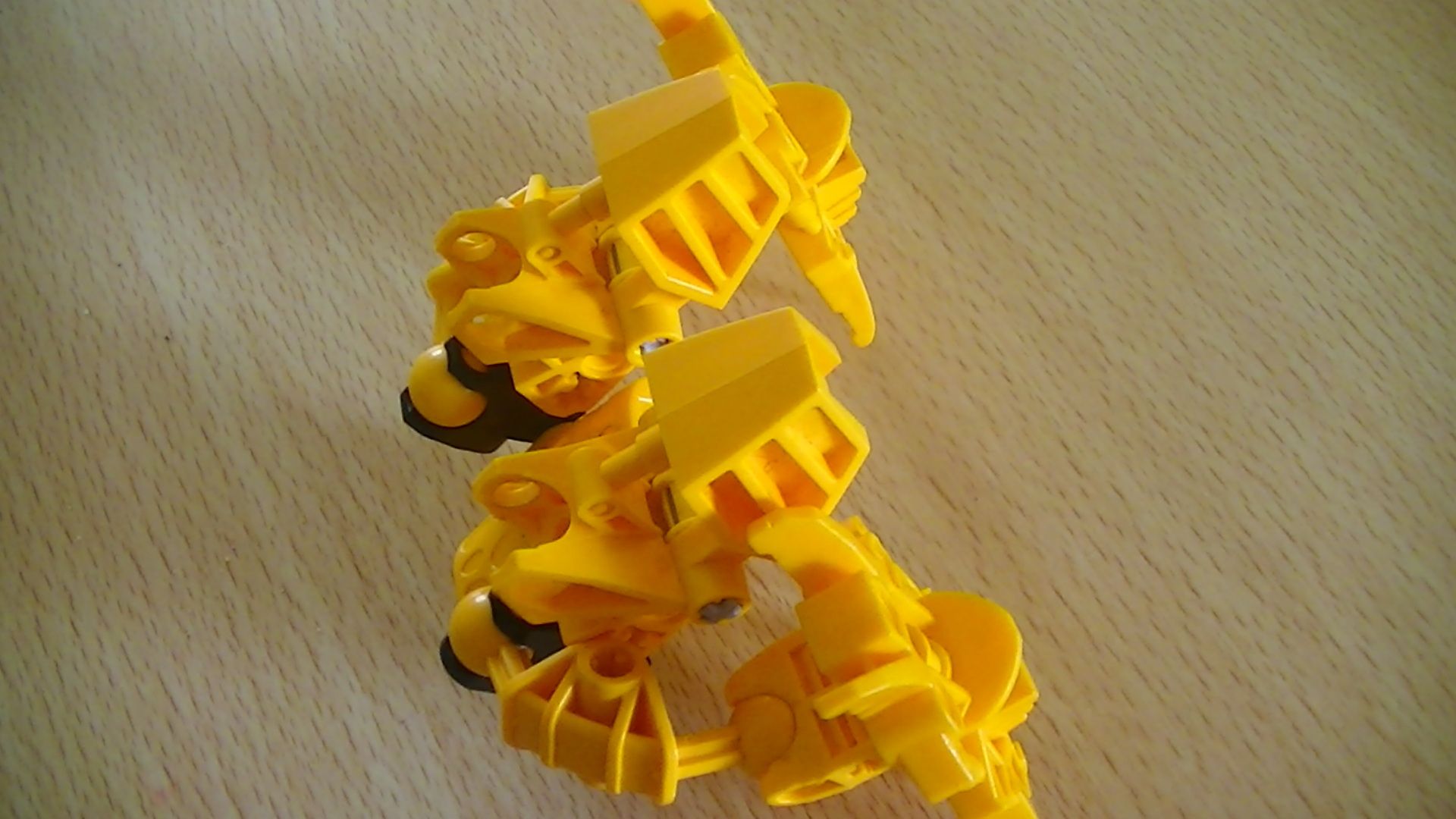
Name: Ciduis Element: Sand Occupation: Vigilante BIO
Ciduis has one goal Return his Team.
ever since he was a Rookie Toa Ciduis has shown his technological side.
after his teams death he started work on the Vahi Lock which allows him to stop time.
I think it might need a lowlight to brake up the color scheme. Maybe a keet orange, fire orange, or some tone of rust to go with the time astetic. It has pretty good armoring, but I personally don’t like the clip-ons on the feet. I would also develop his backstory a little more, seems a little bare bones. Also a yellow color scheme fits a toa of stone or psionics a bit more, also if you make him a toa of stone you can make sands of times a pun or something. the weapons also could use a little more attention.
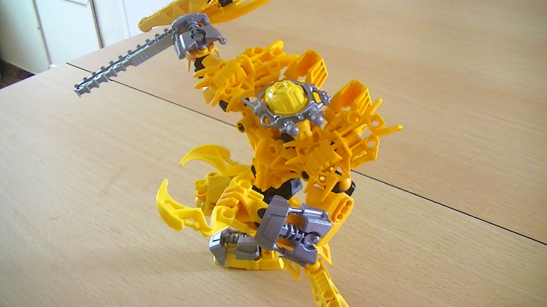
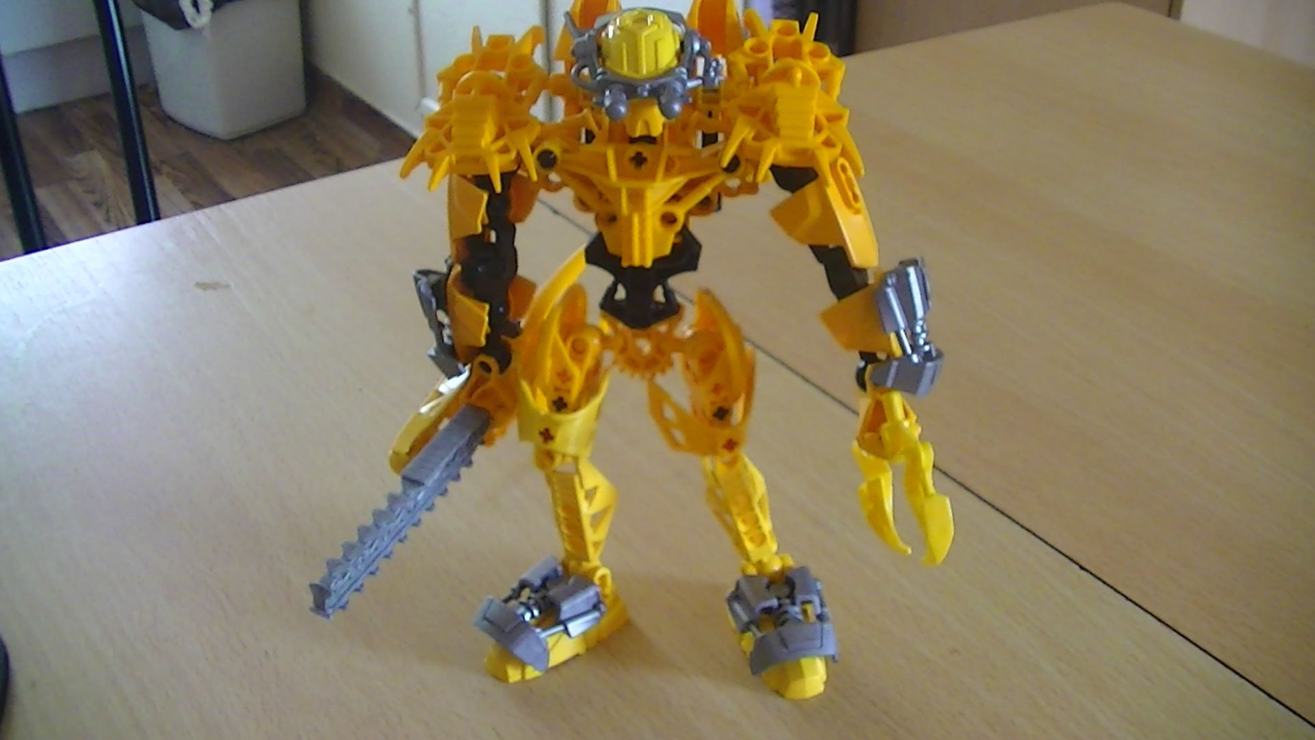
I think he has too much yellow/keetorange, and the separation of those colors into sections kinda makes it worse, tbh. If he is a toa of earth, then why does he have so little earth colors? The keetorange was a stone color. Anyway, the keetorange/yellow/black color-scheme is good, but it needs more balance.
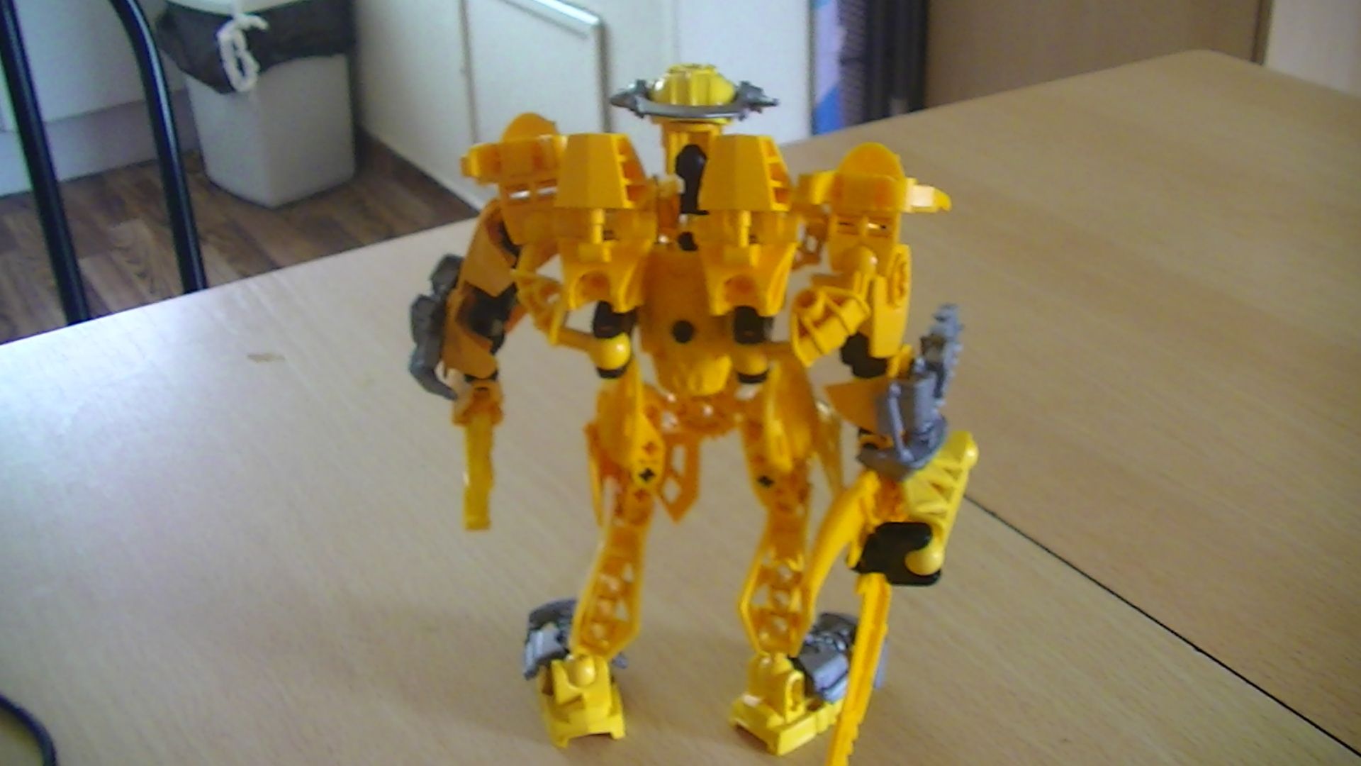
The black and yellow seem fairly well-balanced, although a bit more black on the legs wouldn’t hurt. I like the use of the silver as ‘technological’ bits, although the feet seem a little weird, and it makes the yellow blades seem out of place. With the vahi lock he looks good, but without it he seems fairly bland. Also, the feet over his shoulders seem to protrude too far. The open sockets on his back are annoying, as is the (mostly) standard inika build. Also, REEEEEED PIIIIIIINS!!!
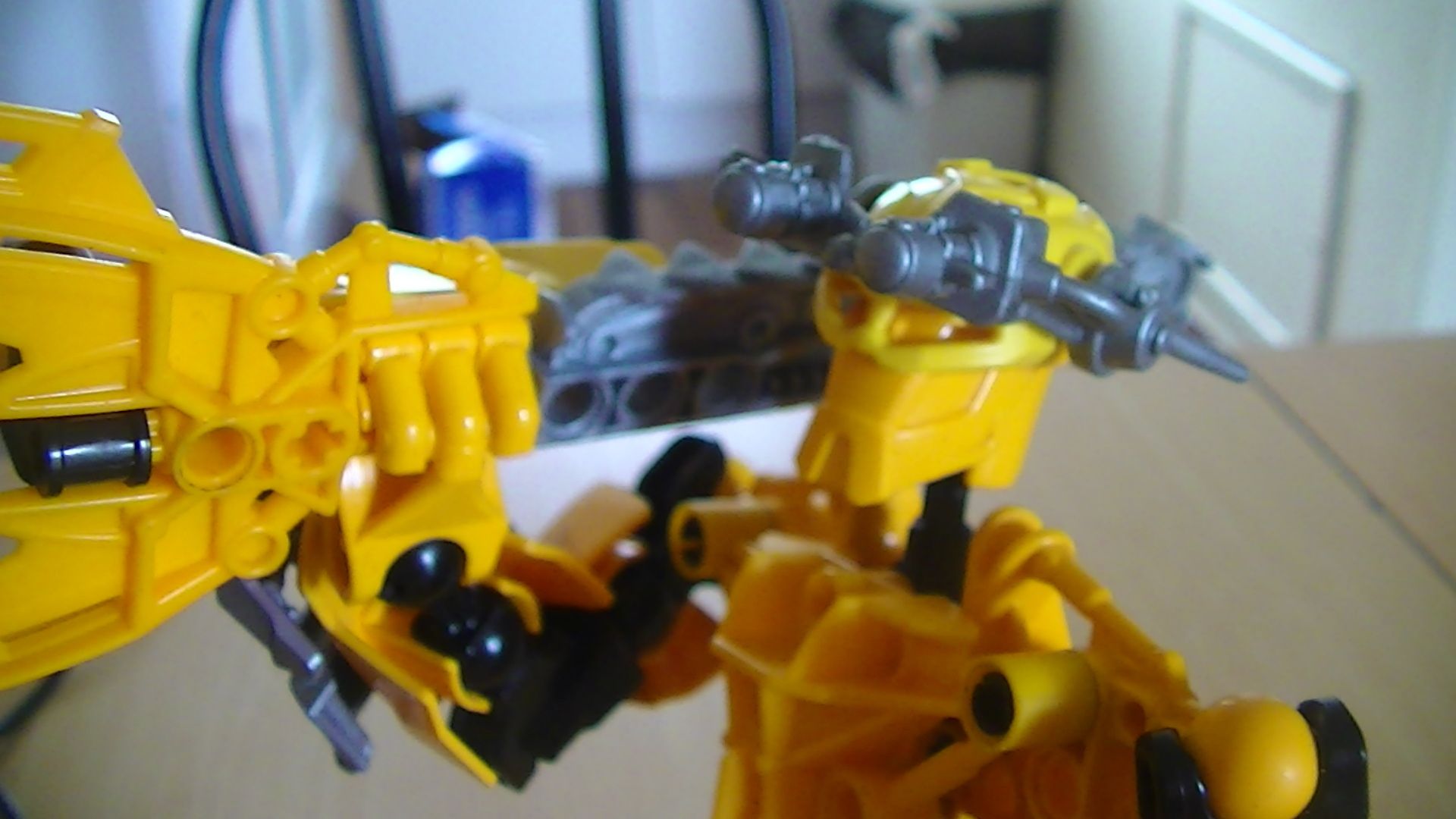
And to be really nitpicky, as a toa he should have a mask, and also, technically, he should be stone, since sand is stone. But that’s just my being picky.
I’d give a 6/10, Good work, but needs a few touch-ups.
Well a commenter put up a joke about sands of time and it just sticked with me
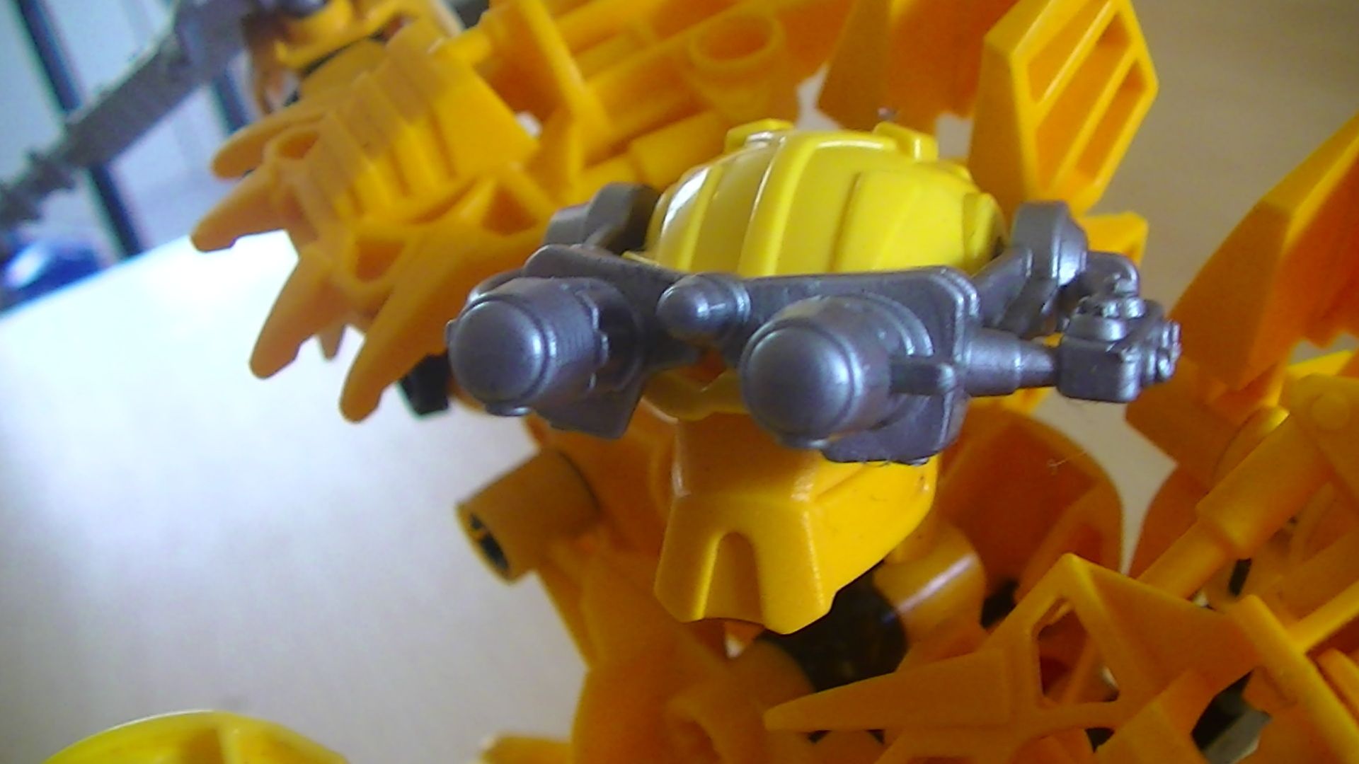
And he will have a mask the one there will be their for now until I get the right materials
Ya know, I had a MOC like this once… I called him “The Cheese”.
It looks cool though! I just feel that the “Pie Vision Goggles” (What I call Furno 2.0’s goggles. My HF universe is strange, as cool as it is…) break up the…um… Color.